by Robert A. Muenchen, updated 12/15/2022
Introduction
This is one of a series of reviews that aim to help non-programmers choose the Graphical User Interface (GUI) for R that is best for them. Additionally, these reviews include cursory descriptions of the programming support that each GUI offers. Additionally, these reviews include cursory descriptions of the programming support that each GUI offers.
I have joined the BlueSky Statistics development team and have written the BlueSky User Guide (online here), but you can trust this series of reviews, as I describe here. All my comments below are easily verifiable. There is no perfect user interface for everyone; each GUI for R has features that appeal to different people.
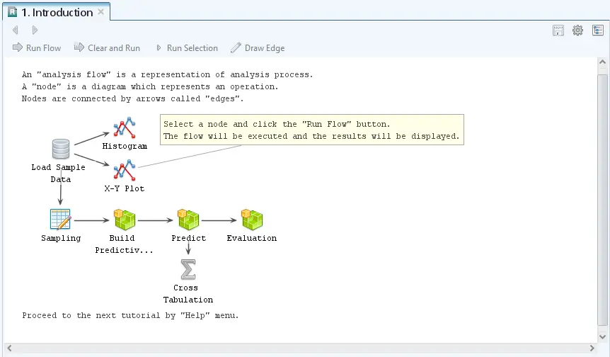
R AnalyticFlow (RAF) is a free and open-source graphical user interface (GUI) for the R language that focuses on beginners looking to point-and-click their way through analyses. What sets it apart from the other half-dozen GUIs for R is that it uses a flowchart-like workflow diagram to control the analysis instead of only menus. In my first programming class back in the Pleistocene Era, my professor told us to never begin a program without doing a flowchart of what you were trying to accomplish. With workflow tools, you get the benefit of the diagram outlining the big picture, while the dialog box settings in each node control what happens at each step. In Figure 1 you can get a good idea of what is happening without any further information.
Another advantage you get with most workflow tools is the ability to reuse workflows very easily because the dataset is read in only once at the beginning. Unfortunately, most of that advantage is missing from R AnalyticFlow (hereafter, “RAF”) since you must specify which dataset is used in every node. The downside to workflow tools is that they’re slightly harder to learn than menu-based systems. This involves learning how to draw a diagram, what flows through it (e.g. datasets, models), and how to generate a single comprehensive reports for the entire analysis.
This post is one of a series of comparative reviews which aim to help non-programmers choose the GUI that is best for them. The reviews all follow a standard template to make comparisons across products easier. These reviews also include a cursory description of the programming support that each GUI offers.
Terminology
There are various definitions of user interface types, so here’s how I’ll be using the following terms. Reviewing R GUIs keeps me quite busy, so I don’t have time also to review all the IDEs, though my favorite is RStudio.
GUI = Graphical User Interface using menus and dialog boxes to avoid having to type programming code. I do not include any assistance for programming in this definition. So, GUI users are people who prefer using a GUI to perform their analyses. They don’t have the time or inclination to become good programmers.
IDE = Integrated Development Environment which helps programmers write code. I do not include point-and-click style menus and dialog boxes when using this term. IDE users are people who prefer to write R code to perform their analyses.
Installation
The various user interfaces available for R differ quite a lot in how they’re installed. Some, such as BlueSky Statistics, jamovi, and RKWard, install in a single step. Others, such as Deducer, install in multiple steps (up to seven steps, depending on your needs). Advanced computer users often don’t appreciate how lost beginners can become while attempting even a simple installation. The Help Desks at most universities are flooded with such calls at the beginning of each semester!
RAF is available for Mac, and Linux. Its installation takes four steps:
- Install Java, if you don’t already have it installed. This can be tricky as you must match the type of Java to the type of R you use. Most computers these days have 64-bit operating systems. Whether 32-bit or 64-bit, you must use the same “bitness” on all of these steps, or it will not work.
- Next, install R if you haven’t already (available here).
- Install RAF itself after downloading it from here.
- Start RAF. It will prompt you to install some R packages, notably rJava. This step requires Internet access. To install if you don’t have such access, see the RAF website’s About R Packages section for important details on how to proceed (from another machine that does have Internet access, of course).
Plug-in Modules
When choosing a GUI, one of the most fundamental questions is: what can it do for you? What the initial software installation of each GUI gets you is covered in the Graphics, Analysis, and Modeling sections of this series of articles. Regardless of what comes built-in, it’s good to know how active the development community is. They contribute “plug-ins” which add new menus and dialog boxes to the GUI. This level of activity ranges from very low (RKWard, Deducer) through moderate (jamovi) to very active (R Commander).
RAF does not offer any plug-in modules, though its developers do provide instruction on how you can create your own.
Startup
Some user interfaces for R, such as BlueSky and jamovi, start by double-clicking on a single icon, which is great for people who prefer to not write code. Others, such as R Commander and JGR, have you start R, then load a package from your library, and then call a function. That’s better for people looking to learn R, as those are among the first tasks they’ll have to learn anyway.
You start RAF directly by double-clicking its icon from your desktop or choosing it from your Start Menu (i.e. not from within R itself). On my system, I had to right-click the icon and choose, “Run as Administrator” or I would get the message, “Failed to Launch R. Confirm Settings?” If I responded “Yes”, it showed the path to my installation of R, which was already correct. I tried a second computer and it did start, but when it tried to install the JavaGD and rJava packages, it said, “Warning in install.packages (c(“JavaGD”,”rJava”)) : ‘lib = “C:/Program Files/R/R-3.6.1/library” ‘ is not writable. Would you like to use a personal library instead?”
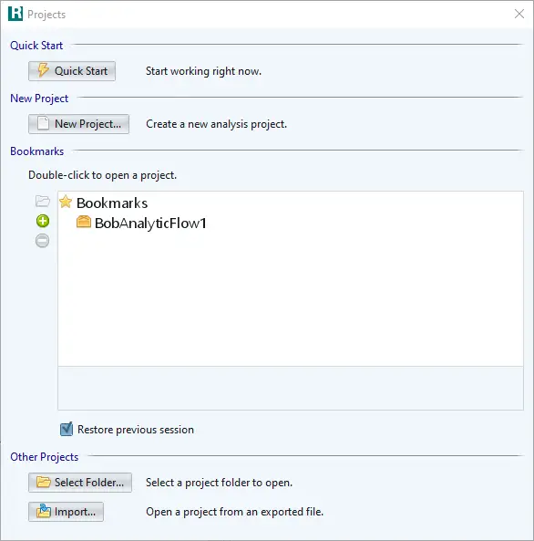
Upon startup, it displays its startup screen, shown in Figure 2. Quick Start puts you into the software with a new Flow window open. New Project starts a new workflow, and Bookmarks give you quick access to existing workflows.
Data Editor
A data editor is a fundamental feature in data analysis software. It puts you in touch with your data and lets you get a feel for it, if only in a rough way. A data editor is such a simple concept that you might think there would be hardly any differences in how they work in different GUIs. While there are technical differences, to a beginner what matters the most are the differences in simplicity. Some GUIs, including jamovi, let you create only what R calls a data frame. They use more common terminology and call it a data set: you create one, you save one, later you open one, then you use one. Others, such as RKWard trade this simplicity for the full R language perspective: a data set is stored in a workspace. So the process goes: you create a data set, you save a workspace, you open a workspace, and choose a data set from within it.
To start entering data, choose “Input> Enter Data” and drag the selection onto the workflow editor window. An empty spreadsheet will appear (Figure 3). You can enter variable names on the first line if you check the “Header: Use 1st Row” box at the bottom of the window. This is the first hint you’ll see that RAF leans on R terminology that can be somewhat esoteric. RAF’s developers could have labeled this choice as “Column Names” but went with the R terminology of “Header” instead. This approach may be confusing for beginners, but if their goal is to learn R, it will help in the long run.
To enter factors (R’s categorical variables), choose the “Options” tab and check, “Convert Characters to Factors”, then RAF will convert the character string variables you enter to factors. Otherwise, it will leave them as characters. Dates remain stored as characters; you have to use “Processing> Set Data Type” node to change them, and they must be entered in the form yyyy-mm-dd.
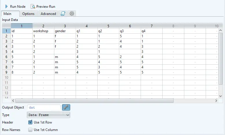
There is no limit to the number of rows and columns you can enter initially. However, once you choose “Run”, the data frame is created and can no longer be edited!
Saving the workflow is done with the standard “File > Save As” menu. You must save each one to its own file. To save the flow and the various objects that it uses such as data frames and models, use “Project > Export”. When receiving a project from a colleague, use “Project> Import” to begin using it.
Data Import
To analyze data, you must first read it. While many R GUIs can import a wide range of data formats such as files created by other statistics programs and databases, RAF can import only text and R objects.
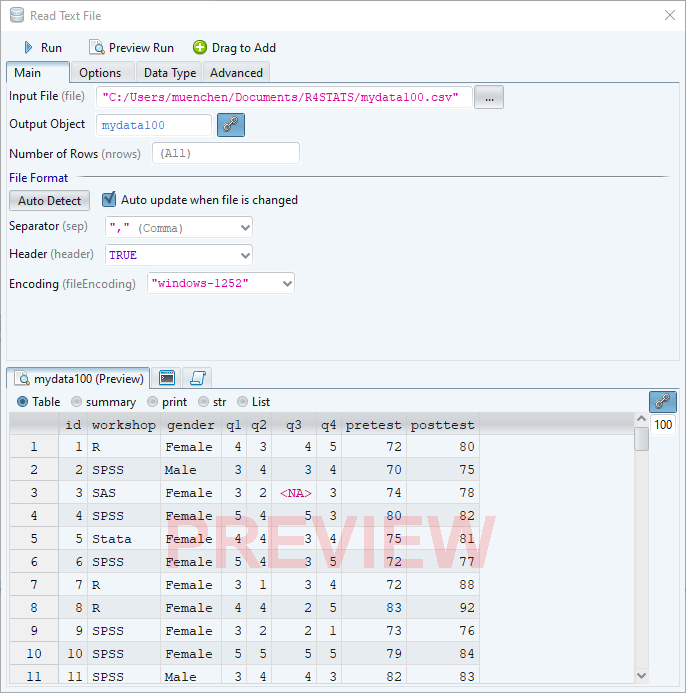
RAF’s text import feature is well done. Once you select an Input File, it quickly scans the file and figures out if variable names are present, the delimiters it uses to separate the columns, and so on. It then displays a “preview” (Figure 4, bottom). It does this quickly since its preview is only on the first 100 rows of data. If the preview displays errors, you then manually change the settings and check the preview until it’s correct. When the preview looks good, you click, “Run”, it will then read all the data.
Data Export
The ability to export data to a wide range of file types helps when you, or other members of your research team, have to use multiple tools to complete a task. Unfortunately, this is a very weak area for R GUIs. Deducer offers no data export at all, and R Commander, and rattle can export only delimited text files (an earlier version of this listed jamovi as having very limited data export; that has now been expanded). Only BlueSky offers a fairly comprehensive set of export options. Unfortunately, RAF falls into the former group, being able only to export data in text and R object files.
Data Management
It’s often said that 80% of data analysis time is spent preparing the data. Variables need to be transformed, recoded, or created; strings and dates need to be manipulated; missing values need to be handled; datasets need to be stacked or merged, aggregated, transposed, or reshaped (e.g. from wide to long and back). A critically important aspect of data management is the ability to transform many variables at once. For example, social scientists need to recode many survey items, biologists need to take the logarithms of many variables. Doing these types of tasks one variable at a time can be tedious. Some GUIs, such as jamovi and RKWard handle only a few of these functions. Others, such as BlueSky and the R Commander, can handle many, but not all, of them.
RAF handles a fairly basic set of data management tools:
- Add/Edit Columns
- Rename (variables)
- Set Data Type
- Select Rows
- Select Columns
- Missing Values – Sets values as missing, no imputation
- Sort
- Sampling
- Aggregate
- Merge – Various joins
- Merge – Adds rows
- Manage Objects – Copies, deletes, renames
Workflows, Menus & Dialog Boxes
The goal of pointing & clicking your way through an analysis is to save time by recognizing dialog box settings rather than performing the more difficult task of recalling programming commands. Some GUIs, such as BlueSky and jamovi, make this easy by sticking to menu standards and using simpler dialog boxes; others, such as RKWard, use non-standard menus that are unique to it and hence require more learning.
RAF uses a unique interface. There are two ways to add build a workflow that guides your analysis. First, you can click on a toolbar icon, which drops down a menu. Click on a selection, and – without releasing the mouse button – drag your selection onto the flow window. In that case, the dialog box with its options opens below the flow area (Figure 3, bottom right).
The second way to use it is to click on a toolbar icon, drop down its menu, click on a selection and immediately release the mouse button. This causes the dialog box to appear floating in the middle of the screen (not shown). When you finish choosing your settings, there is a “Drag to Add” button at the top of the dialog. Clicking that button causes the dialog box to collapse into an icon which you can then drag onto the workflow surface.
Regardless of which method you choose, if you drop the new icon onto the top of one that is already in the workflow, it will move the new icon to the right and draw an arrow (called an “edge”) connecting the older one to the new. If you don’t drop it onto an icon that’s already in your workflow, you can add a connecting arrow later by clicking on the first icon, then choose “Draw Edge” and an arrow will appear aimed to the right (workflows go mostly left to right). The arrow will float around as you move your mouse, until you click on the second icon. A third way to connect the nodes in a flow is to click one icon, hold the Alt key down, then drag to the second icon.
Figure 3 shows the entire RAF window. On the top right is the workflow. Here are the steps I followed to create it:
- I chose “Input> Read Text File” and dragged it onto the workflow. The icon’s settings appeared in the bottom right window.
- I filled in the dialog box’s settings, then clicked “Run”. It named the icon after the file mydata.csv and a spreadsheet appeared in the upper-right.
- I chose “Statistics> Cross Tabulation”, and dragged its icon onto the data icon.
- I clicked the downward-facing arrow in the “Group By” box, and chose the variables. The first one I chose (workshop) formed the rows and the second (gender) formed the columns. Unlike most GUIs, there’s no indication of row and column roles.
- I clicked “Run Node” at the top of the cross tabulation dialog box. The cross tabulation output appeared in the upper left window (right half). The code that RAF wrote to perform the task appears in the R Console window in the lower left.
You can run an entire flow by clicking “Run Flow” at the top left of the Flow window. While describing the process of building a workflow is tedious, learning to build one is quite easy to learn.

The goal of using a GUI is to make analysis easy, so GUI dialog boxes are usually quite simple to use and include everything that’s relevant within a single box. I looked at all the options in this dialog but could not find one to do a very common test for such a cross-tabulation table: the chi-squared test. RAF uses an aspect of R objects that ends up essentially creating two different types of dialog boxes in separate parts of its interface. R objects contain multiple bits of output. You can display them using generic R functions such as summary() and print(). The output window has radio buttons for those functions (Figure 3, right above the cross-tabulation table). Clicking the “summary” button will call R’s summary() function to display the chi-squared results where the table is currently shown. To study the pattern in the table and the chi-squared results requires clicking back and forth on Table and summary; you can’t get them to both appear on your screen at the same time.
Correlations provide another example. The statistics are shown, but their p-values are not shown until you click on the “summary” button. This approach is confusing for beginners, but good for people wishing to learn R.
A common data analysis task is repeating the same analysis across many variables. For example, you might want to repeat the above cross tabulation (or t-tests, etc.) on many variables at once. This is usually quite easy to accomplish in most GUIs, but not in RAF. Since R’s functions may not offer that ability without using R’s “apply” family of functions (or loops), and RAF does not support such functions, such simple tasks become quite a lot of work when using RAF. You need to add an node to your flow for each and every variable!
Each dialog box has an “Advanced” tab which allows you to enter the name of any R argument(s) in one column, and any value(s) you would like to pass to that argument in another. That’s a nice way to offer graphical control over common tasks, while assuring that every task a function is capable of is still available.
In a complex analysis, workflows can become quite complex and hard to read. A solution to this problem is the concept of a “metanode”. Metanodes allow you t take an entire section of your workflow and collapse it into what appears to be a single node. For example, you might commonly use eight nodes to prepare a dataset for analysis. You could combine all eight into a new node you call “Data Prep”, greatly simplifying the workflow. Unfortunately, RAF does not offer metanodes, as do other workflow-driven data science tools such as KNIME and RapidMiner.
One of the most surprising aspects of RAF’s workflow style is that every node specifies its input and output objects. That means that you can run any analysis with no connecting arrows in your diagram! Rather than be a required feature as with many workflow-based tools, in RAF they offer only the convenience of re-running an entire flow at once.
During GUI-driven analysis, the fact that R is doing the work is quite obvious as the code and any resulting messages appear in the Console window.
Documentation & Training
The only written documentation for RAF is the brief, but easy to follow, R AnalyticFlow 3 Starter Guide. Kamala Valarie has also done a 15-minute video on YouTube showing how to use RAF.
Help
R GUIs provide simple task-by-task dialog boxes that generate much more complex code. So for a particular task, you might want to get help on 1) the dialog box’s settings, 2) the custom functions it uses (if any), and 3) the R functions that the custom functions use. Nearly all R GUIs provide all three levels of help when needed. The notable exception is the R Commander, which lacks help on the dialog boxes themselves.
The level of help that RAF offers is only the built-in R help file for the particular function you’re using. However, I had problems with the help getting stuck and showing me the help file from previous tasks rather than the one I was currently using.
Graphics
The various GUIs available for R handle graphics in several ways. Some, such as R Commander and RKWard, focus on R’s built-in graphics. Others, such as BlueSky Statistics use the popular ggplot2 package. Still others, such as jamovi, use their own functions and integrate them into analysis steps.
GUIs also differ quite a lot in how they control the style of the graphs they generate. Ideally, you could set the style once, and then all graphs would follow it. That’s how BlueSky and jamovi work.
RAF uses both the lattice and ggplot2 packages for all of its graphics. Both allow it to display “small multiples” of the same plot repeated by levels of another variable or two. RAF supports ggplot2-style plots using the qplot function instead of the more popular ggplot function. To quote Hadley Wickham in the qplot help file, “It’s great for allowing you to produce plots quickly, but I highly recommend learning ggplot() as it makes it easier to create complex graphics”. That is something to keep in mind if you were looking for a GUI to help you learn ggplot2 code.
There does not appear to be any way to control the style of the plots.
While other GUIs such as BlueSky and R Commander can create over 25 plot types, RAF provides only 12. Given the lattice packages’ support for a wide range of graphs, I find this rather odd. Here are RAFs graphics methods:
- Histogram – Percent
- Histogram – Count
- Histogram – Density
- Bar Chart
- Box Plot
- X-Y Plot – Points
- X-Y Plot – Lines
- X-Y Plot – Steps
- X-Y Plot – Smoothing
- X-Y Plot – Loess
- X-Y Plot – Linear Regression
- X-Y Plot – Pointwise Average
Each plot type has the option to group by, or condition by, a categorical variable, or even to do both. However, when doing ggplot2 faceted plots, it can only facet by one factor and it offers no control over allowing axes to be independent.
RAF can export graphs in EMF, EPS, JPEG, PNG, and SVG file formats.
Let’s take a look at how RAF does scatter plots, using R’s lattice package behind the scenes. I’m using the same plot across all my reviews, which is shown in Figure 4. I chose “Plot> X-Y Chart” and dragged it on top of the data icon in my flow. Using the dialog box, I chose the X and Y variables. I was sure that the “Conditioned On” box was what I needed to complete the plot, but it only has one field for variable selection. I ended up having to do an Internet search on the syntax for how the lattice package conditions a plot on two factors. It turns out the form “gender*workshop” does the trick, but that’s the type of thing that all the other R GUIs make easier through the use of “Row” and “Column” conditioning choices. The lattice code that RAF wrote was fairly clean, with only a superfluous call to the print function (superfluous to an interactive R user):
print(
lattice::xyplot(x = posttest ~ pretest | gender*workshop,
  data = mydata100, type = c("p", "r"))
)

Figure 4. A conditioned (faceted) scatter plot created by R Analytic Flow and the lattice package.
Modeling
The way statistical models (which R stores in “model objects”) are created and used is an area in which R GUIs differ the most. Some, like RKWard, use a one-step approach to modeling. That approach tries to do everything you might need in a single dialog box. This is perfect for beginners, who appreciate being reminded of the various assumption tests and evaluation steps to take. But to an R programmer, that approach seems confining since R can do a lot of different tasks with model objects. However, neither SAS nor SPSS were able to save models for their first 35 years of existence, so each approach has its merits. For simple models like linear regression, standard compute statements can enter models to make predictions. Entering them manually is not much effort, and it saves you from having to learn what a model object is. However, some of the most powerful model types are essentially impossible to enter by hand, such as neural networks, random forests, and gradient boosting machines.
Other GUIs, such as BlueSky and R Commander do modeling using a two-step process. First you generate and save a model, then use it for scoring new datasets, calculating model-level measures of fit or observation-level scores of influence, diagnostic plotting, testing differences between models, and so on.
RAF can create several types of model objects, including those for linear regression, logistic regression, multinomial logistic regression, generalized linear models, tree models, neural networks, random forests, and gradient boosting models. It can then use them to make predictions and evaluate the effectiveness of those predictions.
Another way in which R GUIs differ is the model formula builder. Some, like JASP and RKWard, offer only the most popular model types, providing interactions and allowing you to force the y-intercept through zero. Others, such as R Commander and BlueSky, offer maximum power by including buttons to control nested factors, polynomials, splines, and so on.
RAF’s formula builder is fairly basic, offering to build interactions and to include or exclude the y intercept. It does display the formula for the R code, enabling you to change it if you know how R formulas work.
Analysis Methods
Most of the R GUIs offer a decent set of statistical analysis methods. Some also offer machine learning methods too. Combining both sets of methods, some GUIs offer well over 150 methods. As you can see in the list below, RAF offers a relatively limited set.
- Cross Tabulation – Chi-squared
- Correlation – Pearson, Kendall, Spearman
- Proportion Test
- t-test – Single Sample
- t-test – Independent Samples
- t-test – Paired Samples
- t-test – Pairwise Comparisons >2 Groups
- Wilcoxon-Mann-Whitney – Single Sample
- Wilcoxon-Mann-Whitney – Independent Samples
- Wilcoxon Signed Rank – Paired Samples
- Wilcoxon-Mann-Whitey – Pairwise Comparisons >2 Groups
- Logistic regression – binary
- Logistic regression – multinomial
- Generalized Linear Models
- Principal Components Analysis
- Cluster Analysis – Hierarchical
- Cluster Analysis – K-Means
- Tree Models
- Random Forests
- Gradient Boosting
- Neural Networks
Generated R Code
One of the aspects that most differentiates the various GUIs for R is the code they generate. If you decide you want to save code, what type of code is best for you? The base R code as provided by the R Commander which can teach you “classic” R? The “tidyverse” code written by BlueSky? The concise functions that mimic the simplicity of one-step dialogs such as jamovi provides? The completely transparent (and complex) code provided by RKWard, which might be the best for budding R power users?
RAF writes extremely clean base R code with lattice graphics (see Graphics section above for a code example). All the work it does to convert dialog box settings into that code is well hidden.
Here’s an example of code RAF wrote to do a group-by aggregation:
mydata100.aggregate <- aggregate(
formula = cbind(pretest, posttest) ~ workshop + gender,
data = mydata100, FUN = mean)
Support for Programmers
Some of the GUIs reviewed in this series of articles include extensive support for programmers. For example, RKWard offers much of the power of Integrated Development Environments (IDEs) such as RStudio or Eclipse StatET. Others, such as jamovi or the R Commander, offer little more than a simple text editor.
RAF’s R script editor is found under the Script toolbar icon. It’s easy to drag into a flow just like any other icon. You can also activate the script editor by double-clicking anywhere in the flow window. The script editor offers syntax highlighting, using different colors for each part of a function call. It also offers command completion suggestions. For example, if you type, “mean” it will offer mean, mean.date, mean.default and prompt you to use CTRL+Space to see a complete list of functions whose names begin with “mean”. Adding an open parenthesis, as in “mean(” will cause RAF to suggest arguments that belong within the parentheses. While RAF lacks the full-blown programming support of an IDE like RStudio, it’s still a big improvement over the simple text editor that is installed with R itself.
RAF’s console window, which is always visible, offers the same features as its script editor.
Reproducibility & Sharing
One of the biggest challenges that GUI users face is being able to reproduce their work. Reproducibility is useful for re-running everything on the same dataset if you find a data entry error. It’s also useful for applying your work to new datasets so long as they use the same variable names (or the software can handle name changes). Some scientific journals ask researchers to submit their files (usually code and data) along with their written report so that others can check their work.
As important a topic as it is, reproducibility is a problem for GUI users, a problem that has only recently been solved by some software developers. Most GUIs (e.g. the R Commander, Rattle) save only code, but since the GUI user didn’t write the code, they also can’t read it or change it! Others such as jamovi, RKWard, and the newest version of SPSS save the dialog box entries and allow GUI users to have reproducibility in the form they prefer.
RAF does have reproducibility in GUI form. However, one of the main advantages that workflow GUIs have over menu-based GUIs is their reusability, something that RAF is sadly lacking. For example, using the popular workflow data science tools KNIME or RapidMiner, you could create a complex analysis with dozens or even hundreds of steps, and by pointing the data input node to a new dataset, you could rerun the entire set. That’s because data and models flow through the diagram and do not need to be named in each node. RAF however, names every dataset and model in every node, making reusability quite a lot of work in a complex workflow.
If you wish to share your work with a colleague, you would export the workflow and include the data within it. They could then install the appropriate version of RAF to run it.
While RAF does its work using R code, there is no way to export that code or to reproduce what you’ve done using only R code. JASP is the only other R GUI that lacks such an ability.
Package Management
A topic related to reproducibility is package management. One of the major advantages of the R language is that it’s very easy to extend its capabilities through add-on packages. However, updates to these packages may break a previously functioning analysis. Years from now you may need to run a variation of an analysis, which would require you to find the version of R you used, plus the packages you used at the time. As a GUI user, you’d also need to find the version of the GUI that was compatible with that version of R.
Some GUIs, such as the R Commander and Deducer, depend on you to find and install R. For them, the problem of long-term stability yours to solve. Others, such as BlueSky and jamovi, distribute their own version of R, and all R packages. This requires a bigger installation file, but it makes dealing with long-term stability much simpler. Of course, this depends on all major versions being around for the long-term, but for open-source software, there are usually multiple archives available to store software even if the original project goes defunct.
RAF depends on you to maintain your own version of R. Since it uses mostly internal R functions rather than add-on packages, its future use is ensured. This is only possible due to RAFs limited selection of analysis methods. You can add your own extensions to RAF, and in that case, you need to manage your own packages.
Output & Report Writing
Ideally, output should be clearly labeled, well organized, and of publication quality. It might also delve into the realm of word processing through Sweave/knitr and Rmarkdown documents. At the moment, none of the GUIs covered in this series of reviews meets all of these requirements, though some come close. See the separate reviews to see how each of the other packages is doing on this important topic.
Standard menu-based GUIs have a linear flow that makes the order of tasks obvious. Report writing is a similarly linear flow of results. That’s what makes comprehensive reporting usually fairly straightforward in a menu-based GUI. However, workflow-based tools have a two-dimensional flow, making report writing a challenge. That challenge is usually met by adding reporting nodes to the flow. RAF’s approach is to skip comprehensive reporting altogether; you instead copy and paste each piece of output that you want to save into your word processor. RAF offers straight R output with no word processing style embellishments.
Group-By Analyses
Repeating an analysis on different groups of observations is a core task in data science. Software needs to provide an ability to select a subset of one group to analyze, then another subset to compare it to. All the R GUIs reviewed in this series can do this basic task. RAF does this type of single-group selection in “Processing> Select Rows”. It generates a subset that you can analyze in the same way as the entire dataset. Some of its dialogs also have “Select Rows” tabs to let you work on a subset without saving one.
Software also needs the ability to automate such selections so that you might generate dozens of analyses, one group at a time. While this has been available in commercial GUIs for decades (e.g. SPSS split-file, SAS “by” statement, etc.), RAF does not offer it (BlueSky is the only R GUI that does).
Output Management
Early in the development of statistical software, developers tried to guess what output would be important to save to a new dataset (e.g. predicted values, factor scores), and the ability to save such output was built into the analysis procedures themselves. However, researchers were far more creative than the developers anticipated. To better meet their needs, output management systems were created and tacked on to existing tools (e.g. SAS’ Output Delivery System, SPSS’ Output Management System). One of R’s greatest strengths is that every bit of output can be readily used as input. However, for the simplification that GUIs provide, that’s a challenge.
Output data can be observation-level, such as predicted values for each observation or case. When group-by analyses are run, the output data can also be observation-level, but now the (e.g.) predicted values would be created by individual models for each group, rather than one model based on the entire original data set (perhaps with group included as a set of indicator variables).
Group-by analyses can also create model-level data sets, such as one R-squared value for each group’s model. They can also create parameter-level data sets, such as the p-value for each regression parameter for each group’s model. (Saving and using single models is covered under “Modeling” above.)
For example, in our organization, we have 250 departments and want to see if any of them have a gender bias on salary. We write all 250 regression models to a data set, and then search to find those whose gender parameter is significant (hoping to find none, of course!)
RAF supports only observation-level output and does so using its “Model> Predict” node. BlueSky is the only R GUI at the moment that offers all three types of output.
Developer Issues
There are two ways developers can contribute to RAF’s open source project:
- Programmers who want to add new menus and dialog boxes can do so using the “Custom” menu. This process is documented in the Customize section of the R AnalyticFlow 3 Starter Guide. However, there is no centralized distribution site for add-ons to RAF.
- Developers who want to add/modify the application itself, i.e. modify the essential aspects to the way RAF works, can find the source code here.
Conclusion
R AnalyticFlow is a fascinating piece of software. Its use of workflow diagrams helps you organize your analysis and explain it to colleagues. It makes it easy to re-run a complex set of analyses. It writes very clean base R code and provides easy access to the powerful lattice graphics package. It also lets you extend its capability making it easier for R power users to interact with non-programmers.
However, RAF has some serious limitations. Its set of analytic and graphical methods is quite sparse. It also lacks the important advantage that most workflow-based tools have: the ability to re-use the workflow on a new dataset by changing only the data input nodes.
RAF seems to have a solid infrastructure on which to build. I hope to see its developers address its shortcomings in future versions.
For a summary of all my R GUI software reviews, see the article, R Graphical User Interface Comparison.
Acknowledgements
Thanks to the RAF team who have done a lot of hard work and made it free and open source. Thanks also to Rachel Ladd, Ruben Ortiz, Christina Peterson, and Josh Price for their editorial suggestions.