Blog

A Review of Qualtrics, QuestionPro, REDCap, SurveyGizmo, & SurveyMonkey

 Introduction

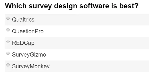
Web-based surveys offer a quick and effective way to collect data. Several companies sell software-as-a-service which makes the construction of surveys quite easy using only a web browser. At the University of Tennessee, we currently have a system-wide site license for Qualtrics.  Initial discussions suggested an intent from Qualtrics to more than double its price from the previous year. This article describes the process we followed to evaluate and select an alternative, in the interest of providing similar functionality at a reasonable cost.

In choosing the options to review, our first step was to search for online software reviews of tools that we knew were already in use by various groups across all UT campuses and institutes. If one of those provided similar features at a lower price, we could minimize our training and migration expenses. A summary of the reviews’ overall ratings is shown in Table 1.

Source Qualtrics Question Pro REDcap Survey Gizmo Survey Monkey
Captera 5 4.5 5 4.5
Comparisons 4.4 4.45 4.55 4.6
G2Crowd 4.4 4 4.5 4.5
GetApp 5 4.56 5 4.5
SMB Guru 4.25 4.5 3.75
TopTen Reviews   4.965 4.735
Mean Score 4.61 4.5 4 4.75 4.43

Table 1. Summary of web survey ratings from online review sites. Some scores are rescaled to range from 1 through 5. While most scores are available directly from the Source link, to get a score on the Comparisons site you must first choose a comparison of two products, then click on one of them to get its full review.


The tools were all highly rated, but we wondered if the raters needed as many features as we use for academic research. A search using Google Scholar confirmed that these were the five survey tools most widely used in scholarly research.

We read all we could find regarding the financial state of each company, read about what  employees said about them on Glassdoor.com, and searched for complaints of any sort regarding the companies or their products. We found no significant problems in any of those areas. The companies all seem to be growing quite rapidly.

We also considered using open source software. However, the most popular open source web survey tool is LimeSurvey, and our previous experience with it was not positive. We investigated reviews of LimeSurvey to see if it had improved since we used it last, but there were very few of them compared to the others.

Selection Process

We formed a committee of ten university faculty and staff, all with substantial survey design expertise. The committee compiled a list of 141 web survey features that we considered important. We then surveyed the university research community, including our current survey tool users, asking them to rate the importance of each feature on a 5-point Likert scale. The detailed table of features and importance ratings appears in the appendix.

We used the features list to write the specifications for a Request for Qualified Suppliers (RFQ-S), a type of Request for Proposal. We specified a 5-year contract including separate pricing for: individuals, groups (e.g. departments, colleges, or institutes), single campus, and multi-campuses; as well as internal use, external use with not-for-profit clients, and external use with for-profit clients.

External use is important because the University of Tennessee is a Carnegie Engaged University, which means one of its prime goals is to perform collaborative research with external organizations. The for-profit category was included because students like to solve the types of problems that companies provide. Our Institute for Public Service also occasionally does surveys for companies in Tennessee. Such use is often prohibited from academic software licenses.

The RFQ-S was sent to the five vendors shown in Table 1. To keep things comparable, REDcap Cloud was chosen as the vendor for REDcap. They offer the same type of software-as-a-service as the other venders, though REDcap is also available for on-premises installations for free.

The bids we received covered an extremely wide range, with the highest price more than ten times larger than the lowest. Each of the responding vendors specified which of the 141 features they offered. Only one vendor, Qualtrics, stated that it was not acceptable to use their software for the benefit of any type of external organizations. Qualtrics requires an expensive commercial license when third parties are involved.

We then tested each feature, verifying the companies’ claims. We considered rating each for ease-of-use and effectiveness, but found that if the feature was implemented at all, it was generally both easy to use and effective.

We then created a composite score which weighted each feature according to the ratings from the feature importance survey. Our purchasing department prefers 1,000-point scales, so we adjusted the scores accordingly. A perfect score of 1,000 would indicate software that offered every feature that a demanding person would describe as Very Important. The resulting scores are shown in Table 2. Readers can use the data in the appendix to develop their own scores. Since REDcap Cloud did not respond to our bid, we did not evaluate or score it. However, does offer an extensive feature set including some very advanced features for database use and clinical trials. We are already using the free on-site version for projects that require those features, but it’s not as easy to use as the other products.

Qualtrics QuestionPro SurveyGizmo SurveyMonkey
Total number
of features
(out of 141)
134 132 130 111
Raw Score 541 529 524 456
Scaled score
(x 1.418)
767 750 744 647

Table 2. Feature counts and scores weighted by feature importance. Each feature is listed in the appendix. See vendors for pricing.


QuestionPro and SurveyGizmo offered nearly identical feature sets to Qualtrics, with equivalent ease-of-use, at significantly lower prices. SurveyMonkey offered a smaller set of features, at a price that was much lower than Qualtrics, but still much higher than the others.

We called the three references that QuestionPro and SurveyGizmo had each provided. They all reported that the software worked well, had close to zero downtime, had technical support that was quick and competent, and they all reported planning to continue using their chosen vendor well into the future.

QuestionPro not only scored the highest on the 141 attributes we initially focused on, but it also currently offers advanced features that we had not even considered. The company’s future features roadmap is substantially more advanced than any other product currently on the market, and anything we heard regarding the other vendors’ future plans. As a result, we decided to go with QuestionPro.

Migration Issues

We have changed web survey tools twice before, so we are well aware of the challenges involved. When moving to a new software platform, the software cost is important, but so are migration costs. For example, if we were to attempt a migration from SAS to R in one year’s time, the cost to train people and convert tens of thousands of programs would far outweigh the savings (at least at educational prices). However, survey software is relatively easy to learn, taking an hour to learn how to set up a typical survey. We estimate that a typical survey could be migrated in well under an hour. Complex ones might take much longer, especially those that must migrate longitudinal data along with the survey.

The Qualtrics administrative dashboard allows us to download extensive details about how our people have used the software over the last five years. The total number of accounts is intimidating, at just over  11,000. However, thousands of accounts contain only a single survey with a single response, indicating that the person was simply trying the software out. Thousands more accounts have not been logged into in years. We learned that 80% of surveys each year are created by new users who are starting from scratch and thus have no work to migrate.

We have developed preliminary estimates of migration effort from current usage, and they range between a total of 1,000 and 4,000 hours. Our support staff will be available to help users migrate their projects. We are developing a survey to get more details from current users to better assess migration needs. This will allow us to determine the number of projects that entail additional complexity such as multi-institutional collaboration or longitudinal studies that must maintain long-term data compatibility. We will also be recording the time it takes to move surveys and data to the new system. As we collect such data, we will be able to forecast how long the migration will take.

Conclusion

Our work resulted in the selection of a software package, QuestionPro, which is comparable to Qualtrics at a much lower price. Comparing our final expenditure to the initial price increase that our Qualtrics sales rep requested, the savings over the 5-year life of the contract is over $900,000. In addition, we now have a product that members of the university community can use to solve problems for companies, helping to engage UT more fully into the economy of Tennessee.

If you found this post useful, I invite you to check out many more on my website or follow me on Twitter.


Appendix: Web survey tool features and their importance ratings

The importance of each feature (1=very low importance…5= very important) was determined by current users of web survey tools at the University of Tennessee. A rating of zero indicates that the software lacks that feature. This information was current as of 12/1/2017; the vendors all regularly add new features so check their web sites for their latest information.

Feature Qualtrics QuestionPro SurveyGizmo SurveyMonkey
Display Text (e.g. instructions) 4.46 4.46 4.46 4.46
Skip Logic 4.65 4.65 4.65 4.65
Display Logic 4.65 4.65 4.65 4.65
Required Questions / Required Answers 4.64 4.64 4.64 4.64
Redirect Browser at end of survey 3.83 3.83 3.83 3.83
Anonymous Responses (separate survey data from distribution/contact information) 4.51 4.51 4.51 4.51
Embedded Data/Hidden Values/Custom Values 3.85 3.85 3.85 3.85
Survey Collaboration 4.51 4.51 4.51 4.51
Single Response 4.68 4.68 4.68 4.68
Multiple Response 4.70 4.70 4.70 4.70
Likert Grid/Matrix 4.60 4.60 4.60 4.60
Open-ended text 4.60 4.60 4.60 4.60
Email distribution 4.72 4.72 4.72 4.72
Contact Management 4.50 4.50 4.50 4.50
Send Reminders 4.57 4.57 4.57 4.57
Export to CSV 4.69 4.69 4.69 4.69
Export to at least one statistics package (such as SAS, SPSS…) 4.51 4.51 4.51 4.51
SSO login 4.51 4.51 4.51 4.51
Phone Support (for users and admins) 4.51 4.51 4.51 4.51
Integrated Question Design Methodology Advice 0.00 0.00 0.00 3.96
Machine Learning to Improve Response Rate 0.00 3.84 0.00 3.84
Randomization of Questions 3.71 3.71 3.71 3.71
Randomization of Responses 3.57 3.57 3.57 3.57
A/B Test Questions (Split respondents between scenarios) 3.82 3.82 3.82 3.82
Multi-Lingual Surveys 3.68 3.68 3.68 3.68
Quiz Development 3.74 3.74 3.74 3.74
Score Survey 3.89 3.89 3.89 3.89
Custom Survey Templates 4.23 4.23 4.23 4.23
Branch Logic 4.62 4.62 4.62 4.62
Preview Survey for Standard Screen Size 4.58 4.58 4.58 4.58
Preview Survey for Phone Screen Size 4.58 4.58 4.58 4.58
Easy to Create Interface 3.95 3.95 3.95 3.95
Recode Values/Set Reporting Values (i.e. set Yes to 1 and No to 0  or recode on an unsual scale such as 0,1,3,5) 4.16 4.16 4.16 4.16
Custom Javascript Support 3.59 3.59 3.59 0.00
Loop&Merge / Page Piping (loop through the same set of questions a given number of times) 3.94 3.94 3.94 3.94
Insert Piped Text from question or custom value into question text 4.02 4.02 4.02 4.02
Insert Piped Text from question or custom value into question response 3.95 3.95 3.95 3.95
Carry Forward selected answers to populate future questions 4.11 4.11 4.11 4.11
Carry Forward response choices to populate responses on future questions 4.10 4.10 4.10 0.00
Soft-Require Question (request response) 4.41 4.41 4.41 0.00
Optional Progress Bar 4.21 4.21 4.21 4.21
API Integration 3.89 3.89 3.89 3.89
GoogleForm Integration 0.00 3.82 0.00 3.82
Email Triggers/Action Alerts (trigger emails automatically to be sent based on survey responses) 4.17 4.17 4.17 4.17
Contact List Triggers (add people to contact list automatically based on how they answer a survey) 3.98 3.98 0.00 0.00
Edit Next, Submit and Close Button Text 4.23 4.23 4.23 4.23
Hide Next, Submit or Close buttons 4.03 4.03 4.03 0.00
File Library 4.08 4.08 4.08 4.08
Import Surveys Questions from Word 0.00 4.28 4.28 4.28
Export Survey Questions to Word 4.39 4.39 4.39 0.00
Import/Export Survey file (to create a copy that can be exported/imported) 4.61 4.61 4.61 4.61
Copy Survey within survey tool 4.64 4.64 4.64 4.64
Revert to previous versions 4.16 4.16 4.16 0.00
Password/contact list  authentication within a survey (respondent must authenticate with credentials saved within the contact list to continue) 3.90 3.90 3.90 3.90
SSO authentication within a survey (respondent must authenticate with SSO credentials to continue) 3.78 3.78 3.78 3.78
Connect to Web Services (such as random number generator) 3.79 3.79 3.79 0.00
Survey Collaboration within the university/license/brand 4.30 4.30 4.30 4.30
Survey Collaboration outside of the university/license/brand 3.81 0.00 3.81 3.81
Numeric Entry 4.41 4.41 4.41 4.41
Constant Sum 3.56 3.56 3.56 0.00
Slider 3.63 3.63 3.63 3.63
Ranking 4.19 4.19 4.19 4.19
Descriptive Text/Graphic 4.46 4.46 4.46 4.46
Side by Side 3.99 3.99 3.99 3.99
Captcha 3.01 3.01 3.01 0.00
Signature 3.25 3.25 3.25 0.00
Closed Card Sort Questions 3.08 3.08 3.08 0.00
Image Heatmap Questions 2.88 2.88 2.88 0.00
Open Card Sort Questions 0.00 3.08 3.08 0.00
Semantic Differential Questions 3.28 3.28 3.28 3.28
Text Highlighter Questions 3.53 3.53 3.53 0.00
Choice Based Conjoint 3.35 3.35 3.35 0.00
Max Differential (Max Diff) Questions 3.39 3.39 3.39 0.00
Track Time Respondent Stays on a Question or  Page 3.55 3.55 3.55 0.00
Audio/Video Sentiment Questions (slider recording response while video/audio plays) 0.00 3.45 3.45 0.00
File Upload 4.07 4.07 4.07 4.07
Geo-Targeting/Tracking 3.20 3.20 3.20 3.20
Embed External Audio and Video Files 3.81 3.81 3.81 3.81
Real-time Responses 4.13 4.13 4.13 4.13
Filter Responses 4.39 4.39 4.39 4.39
Printed Reports 4.37 4.37 4.37 4.37
Cross-Tabulation Reporting 4.31 4.31 4.31 4.31
Variable Creation 4.20 4.20 0.00 0.00
Response Editing 4.05 4.05 4.05 4.05
View Reports Online 4.67 4.67 4.67 4.67
Export report from within offline report (pdf or other format) 4.51 4.51 4.51 4.51
Import response data from Excel or other format 4.26 4.26 4.26 0.00
Manually enter response data collected externally 4.16 4.16 4.16 4.16
Export reports (Please attach list formats) 4.67 4.67 4.67 4.67
Export Individual Charts 4.39 4.39 4.39 4.39
Create reports from multiple data sources 4.35 4.35 4.35 4.35
Share Contact Lists 4.19 4.19 4.19 4.19
Group organization 4.33 4.33 4.33 4.33
Social Media Distribution 3.88 3.88 3.88 3.88
SMS Distribution 3.60 3.60 0.00 0.00
Template Library of Messages 4.06 4.06 0.00 4.06
Embed First Question in Email Invite 3.29 3.29 3.29 3.29
Mobile First UX 3.95 3.95 3.95 3.95
Response Panels 2.86 2.86 2.86 2.86
URL Shortener 3.91 3.91 3.91 3.91
Survey Quotas 3.43 3.43 3.43 3.43
Schedule email invites and reminders 4.41 4.41 4.41 4.41
Schedule survey to close 4.53 4.53 4.53 4.53
Resend Link after completion 3.31 3.31 3.31 3.31
Send email to Contact List without survey link 3.32 0.00 3.32 3.32
Optional opt out link in emails 4.07 4.07 4.07 4.07
Stand alone Mobile App 4.17 4.17 0.00 4.17
Offline Mode 3.65 3.65 3.65 0.00
SPSS 4.32 4.32 4.32 4.32
PDF 4.31 4.31 4.31 4.31
PowerPoint 3.93 3.93 3.93 3.93
Change variable labels and/or response values before export 4.19 0.00 4.19 4.19
Select if data are exported as Response Text or Response Value 4.37 4.37 4.37 4.37
Export subset of data 4.43 4.43 4.43 4.43
Word Cloud 3.48 3.48 3.48 3.48
Tag Text Themes Manually 3.60 3.60 3.60 3.60
Sentiment Analysis 3.61 3.61 0.00 0.00
Nvivo Integration 3.77 0.00 3.77 3.77
Automatic Tagging 3.56 0.00 3.56 0.00
Admin Dashboard 3.95 3.95 3.95 3.95
Ability to log into user account through Admin account 3.95 0.00 3.95 0.00
Encryption at Rest 3.95 3.95 3.95 3.95
Email Support (for users and admins) 3.95 3.95 3.95 3.95
Chat Support (for users and admins) 3.95 3.95 3.95 0.00
Set up User Groups (for shared access) 3.95 3.95 3.95 3.95
Dedicated Account Manager 3.95 3.95 3.95 3.95
Migrate Survey and Respondent Data 4.25 4.25 4.25 4.25
Account Management 3.95 3.95 3.95 3.95
Ability to set email limits per account 3.95 0.00 3.95 0.00
Ability to set access to different question types 3.95 0.00 0.00 0.00
Multiple Admin Accounts 3.95 3.95 3.95 3.95
Auto creation of accounts (via SSO) 3.95 3.95 3.95 3.95
HIPPA Compliant 3.95 3.95 3.95 3.95
FERPA Compliant 3.95 3.95 3.95 3.95
ADA Compliance (Fully Accessible/508 Compliant) 3.95 3.95 3.95 3.95
SAS no. 70
PCI DSS 0.00 3.95 3.95 3.95
ISO 27001 3.95 3.95 0.00 3.95
OWASP 3.95 0.00 3.95 0.00
Data Encryption in transit 3.95 3.95 3.95 3.95
Data Encryption at rest 3.95 3.95 3.95 3.95
Data Encryption on all backups 3.95 3.95 3.95 3.95

Using Excel for Data Entry

This article shows you how to enter data so that you can easily open in statistics packages such as R, SAS, SPSS, or jamovi (code or GUI steps below). Excel has some statistical analysis capabilities, but they often provide incorrect answers. For a comprehensive list of these limitations, see http://www.forecastingprinciples.com/paperpdf/McCullough.pdf and http://www.burns-stat.com/documents/tutorials/spreadsheet-addiction.

Simple Data Sets

Most data sets are easy to enter using the following rules.

  • All your data should be in a single spreadsheet of a single file (for an exception to this rule, see Relational Data Sets below.)
  • Enter variable names in the first row of the spreadsheet.
  • Consider the length of your variable names. If you know for sure what software you will use, follow its rules for how many characters names can contain. When in doubt, use variable names that are no longer than 8 characters, beginning with a letter. Those short names can be used by any software.
  • Variable names should not contain spaces, but may use the underscore character.
  • No other text rows such as titles should be in the spreadsheet.
  • No blank rows should appear in the data.
  • Always include an ID variable on your original data collection form and in the spreadsheet to help you find the case again if you need to correct errors. You may need to sort the data later, after which the row number in Excel would then apply to a different subject or sampling unit, making it hard to find.
  • Position the ID variable in the left-most column for easy reference. 
  • If you have multiple groups, put them in the same spreadsheet along with a variable that indicates group membership (see Gender example below).
  • Many statistics packages don’t work well with alphabetic characters representing categorical values. For example to enter political party, you might enter 1 instead of Democrat, 2 instead of Republican and 3 instead of Other.
  • Avoid the use of special characters in numeric columns. Currency signs ($, €, etc.) can cause trouble in some programs.
  • If your group has only two levels, coding them 0 and 1 makes some analyses (e.g. linear regression) much easier to do. If the data are logical, use 0 for false, and 1 for true.
    If the data represent gender, it’s common to use 0 for female, 1 for male.
  • For missing values, leave the cell blank. Although SPSS and SAS use a period to represent a missing value, if you actually type a period in Excel, some software (like R) will read the column as character data so you will not be able to, for example, calculate the mean of a column without taking action to address the situation.
  • You can enter dates with slashes (8/31/2018) and times with colons (12:15 AM). Note that dates are recorded differently across countries, so make sure you are using a format that matches your locale.
  • For text analysis, you can enter up to 32K of text, or about 8 pages, in a single cell. However, if you cut & paste if from elsewhere, remove carriage returns first as they will cause it to jump to a new cell.

Relational Data Sets

Some data sets contain observations that are related in some way. They may be people who all live in the same home, or samples that all came from the same site. There may be higher levels of relations, such as students within classrooms, then classrooms within schools. Data that contains such relations (a.k.a. nesting) may be stored in a “relational” database, but those are harder to learn than spreadsheet software. Relational data can easily be entered as two or more spreadsheets and combined later during data analysis. This saves quite a lot of data entry as the higher level data (e.g. family house value, socio-economic status, etc.) only needs to be entered once, instead of on several lines (e.g. for each family member).

If you have such data, make sure that each data set contains a “key” variable that acts as a  common ID number for family, site, school, etc. You can later read two files at a time and combine them matching on that key variable. R calls this combination a join or merge; SAS calls it a merge; and SPSS calls it Add Variables.

Example of a Good Data Structure

This data set follows all the rules for simple data sets above. Any statistics software can read it easily.

ID
Gender Income

1

0

32000

2

1

23000

3

0

137000

4

1

54000

5

1

48500

Example of a Bad Data Structure

This is the same data shown above, but it violates the rules for simple data sets in several ways: there is no column for gender, the income values contain dollar signs and commas, variable names appear on more than one line, variable names are not even consistent (income vs. salary), and there is a blank line in the middle. This would not be easy to read!

Data for Female Subjects
ID Income

1

$32,000

3

$137,000

   
Data for Male Subjects
ID Salary

2

$23,000

4

$54,000

5

$48,500

Excel Tips for Data Entry

  • You can make sure your variable names are always visible at the top of your Excel spreadsheet by choosing View> Freeze Panes> Freeze Top Row. This helps you enter data in the proper columns.
  • Avoid using Excel to sort your data. It’s too easy to sort one column independent of the others, which destroys your data! Statistics packages can sort data and they understand the importance of keeping all the values in each row locked together.
  • If you need to enter a pattern of consecutive values such as an ID number with values such as 1,2,3 or 1001,1002,1003, enter the first two, select those cells, then drag the tiny square in the lower right corner as far downward as you wish. Excel will see the pattern of the first two entries and extend it as far as you drag your selection. This works for days of the week and dates too. You can create your own lists in Options>Lists, if you use a certain pattern often.
  • To help prevent typos, you can set minimum and maximum values, or create a list of valid values. Select a column or set of similar columns, then go to the Data tab, then the Data Tools group, and choose Validation. To set minimum and maximum values, choose Allow: Whole Number or Decimals and then fill in the values in the Minimum and Maximum boxes. To create a list of valid values, choose Allow: List and then fill in the numeric or character values separated by commas in the Source box. Note that these rules only operate as you enter data, they will not help you find improper values that you have already entered.
  • The gold standard for data accuracy is the dual entry method. With this method you actually enter all the data twice. Only this method can catch errors that are within the normal range of values, but still wrong. Excel can show you where the values differ. Enter the data first in Sheet1. Then enter it again using the exact same layout in Sheet2. Finally, in Sheet1 select all cells using CTRL-A. Then choose Conditional Formatting> New Rule. Choose “Use a formula to determine which cells to format,” enter this formula:
    =A1<>Sheet2!A1
    then click the Format button, make sure the Fill tab is selected, and choose a color. Then click OK twice. The inconsistencies between the two sheets will then be highlighted in Sheet1. You then check to see which entry was wrong and fix it. When you read the data into a statistics package, you will only need to read the data in Sheet1.
  • When looking for data errors, it can be very helpful to display only a subset of values. To do this, select all the columns you wish to scan for errors, then click the Filter icon on the Data tab. A downward-pointing triangle will appear at the top of each column selected. Clicking it displays a list of the values contained in that column. If you have entered values that are supposed to be, for example, between 1 and 5 and you see 6 on this list, choosing it will show you only those rows in which you made that error. Then you can fix them. You can also use click on Number Filters to use simple logic to find, for example, all rows with values greater than 5. When you are finished, click on the filter icon again to turn it off.

Backups

Save your data frequently and make backup copies often. Don’t leave all your backup copies connected to a computer which would leave them vulnerable to attack by viruses. Don’t store them all in the same building or you risk losing all your hard work in a fire or theft. Get a free account at http://drive.google.com, http://dropbox.com, or http://onedrive.live.com and save copies there.

 Steps for Reading Excel Data Into R

There are several ways to read an Excel file into R. Perhaps the easiest method uses the following commands. They read an excel file named mydata.xlsx into an R data frame called mydata. For examples on how to read many other file formats into R, see:
http://r4stats.com/examples/data-import/.

# Do this once to install:
install.packages("readxl")

# Each time you read a file, follow these steps
library("readxl")
mydata <- read_excel("mydata.xlsx")
mydata 

Steps for Reading Excel Data Into SPSS

  1. In SPSS, choose File> Open> Data.
  2. Change the “Files of file type” box to “Excel (*.xlsx)”
  3. When the Read Excel File box appears, select the Worksheet name and check the box for Read variable names from the first row of data, then click OK.
  4. When the data appears in the SPSS data editor spreadsheet, Choose File: Save as and leave the Save as type box to SPSS (*.sav).
  5. Enter the name of the file without the .sav extension and then click Save to save the file in SPSS format.
  6. Next time open the .sav version, you won’t need to convert the file again.
  7. If you create variable or value labels in the SPSS file and then need to read your data from Excel again you can copy them into the new file. First, make sure you use the same variable names. Next, after opening the file in SPSS, use Copy Data Properties from the Data menu. Simply name the SPSS file that has properties (such as labels) that you want to copy, check off the things you want to copy and click OK. 

Steps for Reading Excel Data Into SAS

The code below will read an excel file called mydata.xlsx and store it as a permanent SAS dataset called sasuser.mydata. If your organization is considering migrating from SAS to R, I offer some tips here: http://r4stats.com/articles/migrate-to-r/

proc import datafile="mydata.xlsx"
dbms=xlsx out=sasuser.mydata replace;
getnames=yes;
run;

Steps for Reading Excel Data into jamovi

At the moment, jamovi can open CSV, JASP, SAS, SPSS, and Stata files, but not Excel. So you must open the data in Excel and Save As a comma separated value (CSV) file. The ability to read Excel files should be added to a release in the near future. For more information about the free and open source jamovi software, see my review here:
http://r4stats.com/2018/02/13/jamovi-for-r-easy-but-controversial/.

More to Come

If you found this post useful, I invite you to check out many more on my website or follow me on Twitter where I announce my blog posts.

Gartner’s 2018 Take on Data Science Tools

I’ve just updated The Popularity of Data Science Software to reflect my take on Gartner’s 2018 report, Magic Quadrant for Data Science and Machine Learning Platforms. To save you the trouble of digging though all 40+ pages of my report, here’s just the new section:

IT Research Firms

IT research firms study software products and corporate strategies, they survey customers regarding their satisfaction with the products and services, and then provide their analysis on each in reports they sell to their clients. Each research firm has its own criteria for rating companies, so they don’t always agree. However, I find the detailed analysis that these reports contain extremely interesting reading. While these reports focus on companies, they often also describe how their commercial tools integrate open source tools such as R, Python, H2O, TensoFlow, and others.

While these reports are expensive, the companies that receive good ratings usually purchase copies to give away to potential customers. An Internet search of the report title will often reveal the companies that are distributing such free copies.

Gartner, Inc. is one of the companies that provides such reports.  Out of the roughly 100 companies selling data science software, Gartner selected 16 which had either high revenue, or lower revenue combined with high growth (see full report for details). After extensive input from both customers and company representatives, Gartner analysts rated the companies on their “completeness of vision” and their “ability to execute” that vision. Hereafter, I refer to these as simply vision and ability. Figure 3a shows the resulting “Magic Quadrant” plot for 2018, and 3b shows the plot for the previous year.

The Leader’s Quadrant is the place for companies who have a future direction in line with their customer’s needs and the resources to execute that vision. The further to the upper-right corner, the better the combined score. KNIME is in the prime position, with H2O.ai showing greater vision but lower ability to execute. This year KNIME gained the ability to run H2O.ai algorithms, so these two may be viewed as complementary tools rather than outright competitors.

Alteryx and SAS have nearly the same combined scores, but note that Gartner studied only SAS Enterprise Miner and SAS Visual Analytics. The latter includes Visual Statistics, and Visual Data Mining and Machine Learning. Excluded was the SAS System itself since Gartner focuses on tools that are integrated. This lack of integration may explain SAS’ decline in vision from last year.

KNIME and RapidMiner are quite similar tools as they are both driven by an easy to use and reproducible workflow interface. Both offer free and open source versions, but the companies differ quite a lot on how committed they are to the open source concept. KNIME’s desktop version is free and open source and the company says it will always be so. On the other hand, RapidMiner is limited by a cap on the amount of data that it can analyze (10,000 cases) and as they add new features, they usually come only via a commercial license. In the previous year’s Magic Quadrant, RapidMiner was slightly ahead, but now KNIME is in the lead.

Figure 3a. Gartner Magic Quadrant for Data Science and Machine Learning Platforms
Figure 3b. Gartner Magic Quadrant for Data Science Platforms 2017.

The companies in the Visionaries Quadrant are those that have a good future plans but which may not have the resources to execute that vision. Of these, IBM took a big hit by landing here after being in the Leader’s Quadrant for several years. Now they’re in a near-tie with Microsoft and Domino. Domino shot up from the bottom of that quadrant to towards the top. They integrate many different open source and commercial software (e.g. SAS, MATLAB) into their Domino Data Science Platform. Databricks and Dataiku offer cloud-based analytics similar to Domino, though lacking in access to commercial tools.

Those in the Challenger’s Quadrant have ample resources but less customer confidence on their future plans, or vision. Mathworks, the makers of MATLAB, continues to “stay the course” with its proprietary tools while most of the competition offers much better integration into the ever-expanding universe of open source tools.  Tibco replaces Quest in this quadrant due to their purchase of Statistica. Whatever will become of the red-headed stepchild of data science? Statistica has been owned by four companies in four years! (Statsoft, Dell, Quest, Tibco) Users of the software have got to be considering other options. Tibco also purchased Alpine Data in 2017, accounting for its disappearance from Figure 3b to 3a.

Members of the Niche Players quadrant offer tools that are not as broadly applicable. Anaconda is new to Gartner coverage this year. It offers in-depth support for Python. SAP has a toolchain that Gartner calls “fragmented and ambiguous.”  Angoss was recently purchased by Datawatch. Gartner points out that after 20 years in business, Angoss has only 300 loyal customers. With competition fierce in the data science arena, one can’t help but wonder how long they’ll be around. Speaking of deathwatches, once the king of Big Data, Teradata has been hammered by competition from open source tools such as Hadoop and Spark. Teradata’s net income was higher in 2008 than it is today.

As of 2/26/2018, RapidMiner is giving away copies of the Gartner report here.

jamovi for R: Easy but Controversial

[An updated version of this post is located here.]

jamovi is software that aims to simplify two aspects of using R. It offers a point-and-click graphical user interface (GUI). It also provides functions that combines the capabilities of many others, bringing a more SPSS- or SAS-like method of programming to R.

The ideal researcher would be an expert at their chosen field of study, data analysis, and computer programming. However, staying good at programming requires regular practice, and data collection on each project can take months or years. GUIs are ideal for people who only analyze data occasionally,  since they only require you to recognize what you need in menus and dialog boxes, rather than having to recall programming statements from memory. This is likely why GUI-based research tools have been widely used in academic research for many years.

Several attempts have been made to make the powerful R language accessible to occasional users, including R Commander, Deducer, Rattle, and Bluesky Statistics. R Commander has been particularly successful, with over 40 plug-ins available for it. As helpful as those tools are, they lack the key element of reproducibility (more on that later).

jamovi’s developers designed its GUI to be familiar to SPSS users. Their goal is to have the most widely used parts of SPSS implemented by August of 2018, and they are well on their way. To use it, you simply click on Data>Open and select a comma separate values file (other formats will be supported soon). It will guess at the type of data in each column, which you can check and/or change by choosing Data>Setup and picking from: Continuous, Ordinal, Nominal, or Nominal Text.

Alternately, you could enter data manually in jamovi’s data editor. It accepts numeric, scientific notation, and character data, but not dates. Its default format is numeric, but when given text strings, it converts automatically to Nominal Text. If that was a typo, deleting it converts it immediately back to numeric. I missed some features such as finding data values or variable names, or pinning an ID column in place while scrolling across columns.

To analyze data, you click on jamovi’s Analysis tab. There, each menu item contains a drop-down list of various popular methods of statistical analysis. In the image below, I clicked on the ANOVA menu, and chose ANOVA to do a factorial analysis. I dragged the variables into the various model roles, and then chose the options I wanted. As I clicked on each option, its output appeared immediately in the window on the right. It’s well established that immediate feedback accelerates learning, so this is much better than having to click “Run” each time, and then go searching around the output to see what changed.

The tabular output is done in academic journal style by default, and when pasted into Microsoft Word, it’s a table object ready to edit or publish:

You have the choice of copying a single table or graph, or a particular analysis with all its tables and graphs at once. Here’s an example of its graphical output:

Interaction plot from jamovi using the “Hadley” style. Note how it offsets the confidence intervals to for each workshop automatically to make them easier to read when they overlap.

jamovi offers four styles for graphics: default a simple one with plain background, minimal which – oddly enough – adds a grid at the major tick-points; I♥SPSS, which copies the look of that software; and Hadley, which follows the style of Hadley Wickham’s popular ggplot2 package.

At the moment, nearly all graphs are produced through analyses. A set of graphics menus is in the works. I hope the developers will be able to offer full control over custom graphics similar to Ian Fellows’ powerful Plot Builder used in his Deducer GUI.

The graphical output looks fine on a computer screen, but when using copy-paste into Word, it is a fairly low-resolution bitmap. To get higher resolution images, you must right click on it and choose Save As from the menu to write the image to SVG, EPS, or PDF files. Windows users will see those options on the usual drop-down menu, but a bug in the Mac version blocks that. However, manually adding the appropriate extension will cause it to write the chosen format.

jamovi offers full reproducibility, and it is one of the few menu-based GUIs to do so. Menu-based tools such as SPSS or R Commander offer reproducibility via the programming code the GUI creates as people make menu selections. However, the settings in the dialog boxes are not currently saved from session to session. Since point-and-click users are often unable to understand that code, it’s not reproducible to them. A jamovi file contains: the data, the dialog-box settings, the syntax used, and the output. When you re-open one, it is as if you just performed all the analyses and never left. So if your data collection process came up with a few more observations, or if you found a data entry error, making the changes will automatically recalculate the analyses that would be affected (and no others).

While jamovi offers reproducibility, it does not offer reusability. Variable transformations and analysis steps are saved, and can be changed, but the data input data set cannot be changed. This is tantalizingly close to full reusability; if the developers allowed you to choose another data set (e.g. apply last week’s analysis to this week’s data) it would be a powerful and fairly unique feature. The new data would have to contain variables with the same names, of course. At the moment, only workflow-based GUIs such as KNIME offer re-usability in a graphical form.

As nice as the output is, it’s missing some very important features. In a complex analysis, it’s all too easy to lose track of what’s what. It needs a way to change the title of each set of output, and all pieces of output need to be clearly labeled (e.g. which sums of squares approach was used). The output needs the ability to collapse into an outline form to assist in finding a particular analysis, and also allow for dragging the collapsed analyses into a different order.

Another output feature that would be helpful would be to export the entire set of analyses to Microsoft Word. Currently you can find Export>Results under the main “hamburger” menu (upper left of screen). However, that saves only PDF and HTML formats. While you can force Word to open the HTML document, the less computer-savvy users that jamovi targets may not know how to do that. In addition, Word will not display the graphs when the output is exported to HTML. However, opening the HTML file in a browser shows that the images have indeed been saved.

Behind the scenes, jamovi’s menus convert its dialog box settings into a set of function calls from its own jmv package. The calculations in these functions are borrowed from the functions in other established packages. Therefore the accuracy of the calculations should already be well tested. Citations are not yet included in the package, but adding them is on the developers’ to-do list.

If functions already existed to perform these calculations, why did jamovi’s developers decide to develop their own set of functions? The answer is sure to be controversial: to develop a version of the R language that works more like the SPSS or SAS languages. Those languages provide output that is optimized for legibility rather than for further analysis. It is attractive, easy to read, and concise. For example, to compare the t-test and non-parametric analyses on two variables using base R function would look like this:

> t.test(pretest ~ gender, data = mydata100)

Welch Two Sample t-test

data: pretest by gender
t = -0.66251, df = 97.725, p-value = 0.5092
alternative hypothesis: true difference in means is not equal to 0
95 percent confidence interval:
 -2.810931 1.403879
sample estimates:
mean in group Female mean in group Male 
 74.60417 75.30769

> wilcox.test(pretest ~ gender, data = mydata100)

Wilcoxon rank sum test with continuity correction

data: pretest by gender
W = 1133, p-value = 0.4283
alternative hypothesis: true location shift is not equal to 0

> t.test(posttest ~ gender, data = mydata100)

Welch Two Sample t-test

data: posttest by gender
t = -0.57528, df = 97.312, p-value = 0.5664
alternative hypothesis: true difference in means is not equal to 0
95 percent confidence interval:
 -3.365939 1.853119
sample estimates:
mean in group Female mean in group Male 
 81.66667 82.42308

> wilcox.test(posttest ~ gender, data = mydata100)

Wilcoxon rank sum test with continuity correction

data: posttest by gender
W = 1151, p-value = 0.5049
alternative hypothesis: true location shift is not equal to 0

While the same comparison using the jamovi GUI, or its jmv package, would look like this:

Output from jamovi or its jmv package.

Behind the scenes, the jamovi GUI was executing the following function call from the jmv package. You could type this into RStudio to get the same result:

library("jmv")
ttestIS(
 data = mydata100,
 vars = c("pretest", "posttest"),
 group = "gender",
 mann = TRUE,
 meanDiff = TRUE)

In jamovi (and in SAS/SPSS), there is one command that does an entire analysis. For example, you can use a single function to get: the equation parameters, t-tests on the parameters, an anova table, predicted values, and diagnostic plots. In R, those are usually done with five functions: lm, summary, anova, predict, and plot. In jamovi’s jmv package, a single linReg function does all those steps and more.

The impact of this design is very significant. By comparison, R Commander’s menus match R’s piecemeal programming style. So for linear modeling there are over 25 relevant menu choices spread across the Graphics, Statistics, and Models menus. Which of those apply to regression? You have to recall. In jamovi, choosing Linear Regression from the Regression menu leads you to a single dialog box, where all the choices are relevant. There are still over 20 items from which to choose (jamovi doesn’t do as much as R Commander yet), but you know they’re all useful.

jamovi has a syntax mode that shows you the functions that it used to create the output (under the triple-dot menu in the upper right of the screen). These functions come with the jmv package, which is available on the CRAN repository like any other. You can use jamovi’s syntax mode to learn how to program R from memory, but of course it uses jmv’s all-in-one style of commands instead of R’s piecemeal commands. It will be very interesting to see if the jmv functions become popular with programmers, rather than just GUI users. While it’s a radical change, R has seen other radical programming shifts such as the use of the tidyverse functions.

jamovi’s developers recognize the value of R’s piecemeal approach, but they want to provide an alternative that would be easier to learn for people who don’t need the additional flexibility.

As we have seen, jamovi’s approach has simplified its menus, and R functions, but it offers a third level of simplification: by combining the functions from 20 different packages (displayed when you install jmv), you can install them all in a single step and control them through jmv function calls. This is a controversial design decision, but one that makes sense to their overall goal.

Extending jamovi’s menus is done through add-on modules that are stored in an online repository called the jamovi Library. To see what’s available, you simply click on the large “+ Modules” icon at the upper right of the jamovi window. There are only nine available as I write this (2/12/2018) but the developers have made it fairly easy to bring any R package into the jamovi Library. Creating a menu front-end for a function is easy, but creating publication quality output takes more work.

A limitation in the current release is that data transformations are done one variable at a time. As a result, setting measurement level, taking logarithms, recoding, etc. cannot yet be done on a whole set of variables. This is on the developers to-do list.

Other features I miss include group-by (split-file) analyses and output management. For a discussion of this topic, see my post, Group-By Modeling in R Made Easy.

Another feature that would be helpful is the ability to correct p-values wherever dialog boxes encourage multiple testing by allowing you to select multiple variables (e.g. t-test, contingency tables). R Commander offers this feature for correlation matrices (one I contributed to it) and it helps people understand that the problem with multiple testing is not limited to post-hoc comparisons (for which jamovi does offer to correct p-values).

Though only at version 0.8.1.2.0, I only found only two minor bugs in quite a lot of testing. After asking for post-hoc comparisons, I later found that un-checking the selection box would not make them go away. The other bug I described above when discussing the export of graphics. The developers consider jamovi to be “production ready” and a number of universities are already using it in their undergraduate statistics programs.

In summary, jamovi offers both an easy to use graphical user interface plus a set of functions that combines the capabilities of many others. If its developers, Jonathan Love, Damian Dropmann, and Ravi Selker, complete their goal of matching SPSS’ basic capabilities, I expect it to become very popular. The only skill you need to use it is the ability to use a spreadsheet like Excel. That’s a far larger population of users than those who are good programmers. I look forward to trying jamovi 1.0 this August!

Acknowledgements

Thanks to Jonathon Love, Josh Price, and Christina Peterson for suggestions that significantly improved this post.

Data Science Tool Market Share Leading Indicator: Scholarly Articles

Below is the latest update to The Popularity of Data Science Software. It contains an analysis of the tools used in the most recent complete year of scholarly articles. The section is also integrated into the main paper itself.

New software covered includes: Amazon Machine Learning, Apache Mahout, Apache MXNet, Caffe, Dataiku, DataRobot, Domino Data Labs, GraphPad Prism, IBM Watson, Pentaho, and Google’s TensorFlow.

Software dropped includes: Infocentricity (acquired by FICO), SAP KXEN (tiny usage), Tableau, and Tibco. The latter two didn’t fit in with the others due to their limited selection of advanced analytic methods.

Scholarly Articles

Scholarly articles provide a rich source of information about data science tools. Their creation requires significant amounts of effort, much more than is required to respond to a survey of tool usage. The more popular a software package is, the more likely it will appear in scholarly publications as an analysis tool, or even an object of study.

Since graduate students do the great majority of analysis in such articles, the software used can be a leading indicator of where things are headed. Google Scholar offers a way to measure such activity. However, no search of this magnitude is perfect; each will include some irrelevant articles and reject some relevant ones. Searching through concise job requirements (see previous section) is easier than searching through scholarly articles; however only software that has advanced analytical capabilities can be studied using this approach. The details of the search terms I used are complex enough to move to a companion article, How to Search For Data Science Articles.  Since Google regularly improves its search algorithm, each year I re-collect the data for the previous years.

Figure 2a shows the number of articles found for the more popular software packages (those with at least 750 articles) in the most recent complete year, 2016. To allow ample time for publication, insertion into online databases, and indexing, the was data collected on 6/8/2017.

SPSS is by far the most dominant package, as it has been for over 15 years. This may be due to its balance between power and ease-of-use. R is in second place with around half as many articles. SAS is in third place, still maintaining a substantial lead over Stata, MATLAB, and GraphPad Prism, which are nearly tied. This is the first year that I’ve tracked Prism, a package that emphasizes graphics but also includes statistical analysis capabilities. It is particularly popular in the medical research community where it is appreciated for its ease of use. However, it offers far fewer analytic methods than the other software at this level of popularity.

Note that the general-purpose languages: C, C++, C#, FORTRAN, MATLAB, Java, and Python are included only when found in combination with data science terms, so view those counts as more of an approximation than the rest.

Figure 2a. Number of scholarly articles found in the most recent complete year (2016) for the more popular data science software. To be included, software must be used in at least 750 scholarly articles.

The next group of packages goes from Apache Hadoop through Python, Statistica, Java, and Minitab, slowly declining as they go.

Both Systat and JMP are packages that have been on the market for many years, but which have never made it into the “big leagues.”

From C through KNIME, the counts appear to be near zero, but keep in mind that each are used in at least 750 journal articles. However, compared to the 86,500 that used SPSS, they’re a drop in the bucket.

Toward the bottom of Fig. 2a are two similar packages, the open source Caffe and Google’s Tensorflow. These two focus on “deep learning” algorithms, an area that is fairly new (at least the term is) and growing rapidly.

The last two packages in Fig 2a are RapidMiner and KNIME. It has been quite interesting to watch the competition between them unfold for the past several years. They are both workflow-driven tools with very similar capabilities. The IT advisory firms Gartner and Forester rate them as tools able to hold their own against the commercial titans, SPSS and SAS. Given that SPSS has roughly 75 times the usage in academia, that seems like quite a stretch. However, as we will soon see, usage of these newcomers are growing, while use of the older packages is shrinking quite rapidly. This plot shows RapidMiner with nearly twice the usage of KNIME, despite the fact that KNIME has a much more open source model.

Figure 2b shows the results for software used in fewer than 750 articles in 2016. This change in scale allows room for the “bars” to spread out, letting us make comparisons more effectively. This plot contains some fairly new software whose use is low but growing rapidly, such as Alteryx, Azure Machine Learning, H2O, Apache MXNet, Amazon Machine Learning, Scala, and Julia. It also contains some software that is either has either declined from one-time greatness, such as BMDP, or which is stagnating at the bottom, such as Lavastorm, Megaputer, NCSS, SAS Enterprise Miner, and SPSS Modeler.

Figure 2b. The number of scholarly articles for the less popular data science (those used by fewer than 750 scholarly articles in 2016.

While Figures 2a and 2b are useful for studying market share as it stands now, they don’t show how things are changing. It would be ideal to have long-term growth trend graphs for each of the analytics packages, but collecting that much data annually is too time consuming. What I’ve done instead is collect data only for the past two complete years, 2015 and 2016. This provides the data needed to study year-over-year changes.

Figure 2c shows the percent change across those years, with the “hot” packages whose use is growing shown in red (right side); those whose use is declining or “cooling” are shown in blue (left side). Since the number of articles tends to be in the thousands or tens of thousands, I have removed any software that had fewer than 500 articles in 2015. A package that grows from 1 article to 5 may demonstrate 500% growth, but is still of little interest.


Figure 2c. Change in the number of scholarly articles using each software in the most recent two complete years (2015 to 2016). Packages shown in red are “hot” and growing, while those shown in blue are “cooling down” or declining.

Caffe is the data science tool with the fastest growth, at just over 150%. This reflects the rapid growth in the use of deep learning models in the past few years. The similar products Apache MXNet and H2O also grew rapidly, but they were starting from a mere 12 and 31 articles respectively, and so are not shown.

IBM Watson grew 91%, which came as a surprise to me as I’m not quite sure what it does or how it does it, despite having read several of IBM’s descriptions about it. It’s awesome at Jeopardy though!

While R’s growth was a “mere” 14.7%, it was already so widely used that the percent translates into a very substantial count of 5,300 additional articles.

In the RapidMiner vs. KNIME contest, we saw previously that RapidMiner was ahead. From this plot we also see that it’s continuing to pull away from KNIME with quicker growth.

From Minitab on down, the software is losing market share, at least in academia. The variants of C and Java are probably losing out a bit to competition from several different types of software at once.

In just the past few years, Statistica was sold by Statsoft to Dell, then Quest Software, then Francisco Partners, then Tibco! Did its declining usage drive those sales? Did the game of musical chairs scare off potential users? If you’ve got an opinion, please comment below or send me an email.

The biggest losers are SPSS and SAS, both of which declined in use by 25% or more. Recall that Fig. 2a shows that despite recent years of decline, SPSS is still extremely dominant for scholarly use.

I’m particularly interested in the long-term trends of the classic statistics packages. So in Figure 2d I have plotted the same scholarly-use data for 1995 through 2016.

Figure 2d. The number of scholarly articles found in each year by Google Scholar. Only the top six “classic” statistics packages are shown.

As in Figure 2a, SPSS has a clear lead overall, but now you can see that its dominance peaked in 2009 and its use is in sharp decline. SAS never came close to SPSS’ level of dominance, and its use peaked around 2010. GraphPAD Prism followed a similar pattern, though it peaked a bit later, around 2013.

Note that the decline in the number of articles that used SPSS, SAS, or Prism is not balanced by the increase in the other software shown in this particular graph. Even adding up all the other software shown in Figures 2a and 2b doesn’t account for the overall decline. However, I’m looking at only 46 out of over 100 data science tools. SQL and Microsoft Excel could be taking up some of the slack, but it is extremely difficult to focus Google Scholar’s search on articles that used either of those two specifically for data analysis.

Since SAS and SPSS dominate the vertical space in Figure 2d by such a wide margin, I removed those two curves, leaving only two points of SAS usage in 2015 and 2016. The result is shown in Figure 2e.


Figure 2e. The number of scholarly articles found in each year by Google Scholar for classic statistics packages after the curves for SPSS and SAS have been removed.

Freeing up so much space in the plot allows us to see that the growth in the use of R is quite rapid and is pulling away from the pack. If the current trends continue, R will overtake SPSS to become the #1 software for scholarly data science use by the end of 2018. Note however, that due to changes in Google’s search algorithm, the trend lines have shifted before as discussed here. Luckily, the overall trends on this plot have stayed fairly constant for many years.

The rapid growth in Stata use seems to be finally slowing down.  Minitab’s growth has also seemed to stall in 2016, as has Systat’s. JMP appears to have had a bit of a dip in 2015, from which it is recovering.

The discussion above has covered but one of many views of software popularity or market share. You can read my analysis of several other perspectives here.

Dueling Data Science Surveys: KDnuggets & Rexer Go Live

What tools do we use most for data science, machine learning, or analytics? Python, R, SAS, KNIME, RapidMiner,…? How do we use them? We are about to find out as the two most popular surveys on data science tools have both just gone live. Please chip in and help us all get a better understanding of the tools of our trade.

For 18 consecutive years, Gregory Piatetsky has been asking people what software they have actually used in the past twelve months on the KDnuggets Poll.  Since this poll contains just one question, it’s very quick to take and you’ll get the latest results immediately. You can take the KDnuggets poll here.

Every other year since 2007 Rexer Analytics has surveyed data science professionals, students, and academics regarding the software they use.  It is a more detailed survey which also asks about goals, algorithms, challenges, and a variety of other factors.  You can take the Rexer Analytics survey here (use Access Code M7UY4).  Summary reports from the seven previous Rexer surveys are FREE and can be downloaded from their Data Science Survey page.

As always, as soon as the results from either survey are available, I’ll post them on this blog, then update the main results in The Popularity of Data Science Software, and finally send out an announcement on Twitter (follow me as @BobMuenchen).


Group-By Modeling in R Made Easy

There are several aspects of the R language that make it hard to learn, and repeating a model for groups in a data set used to be one of them. Here I briefly describe R’s built-in approach, show a much easier one, then refer you to a new approach described in the superb book,  R for Data Science, by Hadley Wickham and Garrett Grolemund.

For ease of comparison, I’ll use some of the same examples in that book. The gapminder data set contains a few measurements for countries around the world every five years from 1952 through 2007.

> library("gapminder")
> gapminder

# A tibble: 1,704 × 6
 country continent year lifeExp pop gdpPercap
 <fctr> <fctr> <int> <dbl> <int> <dbl>
1 Afghanistan Asia 1952 28.801 8425333 779.4453
2 Afghanistan Asia 1957 30.332 9240934 820.8530
3 Afghanistan Asia 1962 31.997 10267083 853.1007
4 Afghanistan Asia 1967 34.020 11537966 836.1971
5 Afghanistan Asia 1972 36.088 13079460 739.9811
6 Afghanistan Asia 1977 38.438 14880372 786.1134
7 Afghanistan Asia 1982 39.854 12881816 978.0114
8 Afghanistan Asia 1987 40.822 13867957 852.3959
9 Afghanistan Asia 1992 41.674 16317921 649.3414
10 Afghanistan Asia 1997 41.763 22227415 635.3414
# ... with 1,694 more rows

Let’s create a simple regression model to predict life expectancy from year. We’ll start by looking at just New Zealand.

> library("tidyverse")
> nz <- filter(gapminder, 
+              country == "New Zealand")
> nz_model <- lm(lifeExp ~ year, data = nz)
> summary(nz_model)

Call:
lm(formula = lifeExp ~ year, data = nz)

Residuals:
 Min 1Q Median 3Q Max 
-1.28745 -0.63700 0.06345 0.64442 0.91192

Coefficients:
 Estimate Std. Error t value Pr(>|t|) 
(Intercept) -307.69963 26.63039 -11.55 4.17e-07 ***
year 0.19282 0.01345 14.33 5.41e-08 ***
---
Signif. codes: 0 ‘***’ 0.001 ‘**’ 0.01 ‘*’ 0.05 ‘.’ 0.1 ‘ ’ 1

Residual standard error: 0.8043 on 10 degrees of freedom
Multiple R-squared: 0.9536, Adjusted R-squared: 0.9489 
F-statistic: 205.4 on 1 and 10 DF, p-value: 5.407e-08

If we had just a few countries, and we wanted to simply read the output (rather than processing it further) we could write a simple function and apply it using R’s built-in by() function. Here’s what that might look like:

my_lm <- function(df) {
  summary(lm(lifeExp ~ year, data = df))
}
by(gapminder, gapminder$country, my_lm)
...
----------------------------------------------- 
gapminder$country: Zimbabwe

Call:
lm(formula = lifeExp ~ year, data = df)

Residuals:
 Min 1Q Median 3Q Max 
-10.581 -4.870 -0.882 5.567 10.386 

Coefficients:
 Estimate Std. Error t value Pr(>|t|)
(Intercept) 236.79819 238.55797 0.993 0.344
year -0.09302 0.12051 -0.772 0.458

Residual standard error: 7.205 on 10 degrees of freedom
Multiple R-squared: 0.05623, Adjusted R-squared: -0.03814 
F-statistic: 0.5958 on 1 and 10 DF, p-value: 0.458

Since we have so many countries, that wasn’t very helpful. Much of the output scrolled out of sight (I’m showing only the results for the last one, Zimbabwe). But in a simpler case, that might have done just what you needed. It’s a bit more complex than how SAS or SPSS would do it since it required the creation of a function, but it’s not too difficult.

In our case, it would be much more helpful to save the output to a file for further processing. That’s when things get messy. We could use the str() function to study the structure of the output, then write another function to extract the pieces we need, then apply that function, then continue to process the result until we get what we finally end up with a useful data frame of results. Altogether, that is a lot of work! To make matters worse, what you learned from all that is unlikely to generalize to a different function. The output’s structure, parameter names, and so on, are often unique to each of R’s modeling functions.

Luckily, David Robinson made a package called broom that simplifies all that. It has three ways to “clean up” a model, each diving more deeply into its details. Let’s see what it does with our model for New Zealand.

> library("broom")
> glance(nz_model)

  r.squared adj.r.squared sigma statistic p.value df
1 0.9535846 0.9489431 0.8043472 205.4459 5.407324e-08 2

   logLik      AIC    BIC   deviance df.residual
1 -13.32064 32.64128 34.096 6.469743     10

The glance() function gives us information about the entire model, and it puts it into a data frame with just one line of output. As we head towards doing a model for each country, you can imagine this will be a very convenient format.

To get a bit more detail, we can use broom’s tidy() function to clean up the parameter-level view.

> tidy(nz_model)
        term     estimate  std.error statistic p.value
1 (Intercept) -307.699628 26.63038965 -11.55445 4.166460e-07
2 year           0.192821  0.01345258  14.33339 5.407324e-08

Now we have a data frame with two rows, one for each model parameter, but getting this result was just as simple to do as the previous example.

The greatest level of model detail is provided by broom’s augment() function. This function adds observation-level detail to the original model data:

> augment(nz_model)

 lifeExp year  .fitted   .se.fit     .resid
1 69.390 1952 68.68692 0.4367774 0.70307692
2 70.260 1957 69.65103 0.3814859 0.60897203
3 71.240 1962 70.61513 0.3306617 0.62486713
4 71.520 1967 71.57924 0.2866904 -0.05923776
5 71.890 1972 72.54334 0.2531683 -0.65334266
6 72.220 1977 73.50745 0.2346180 -1.28744755
7 73.840 1982 74.47155 0.2346180 -0.63155245
8 74.320 1987 75.43566 0.2531683 -1.11565734
9 76.330 1992 76.39976 0.2866904 -0.06976224
10 77.550 1997 77.36387 0.3306617 0.18613287
11 79.110 2002 78.32797 0.3814859 0.78202797
12 80.204 2007 79.29208 0.4367774 0.91192308

        .hat    .sigma      .cooksd .std.resid
1 0.29487179 0.8006048 0.2265612817 1.04093898
2 0.22494172 0.8159022 0.1073195744 0.85997661
3 0.16899767 0.8164883 0.0738472863 0.85220295
4 0.12703963 0.8475929 0.0004520957 -0.07882389
5 0.09906760 0.8162209 0.0402635628 -0.85575882
6 0.08508159 0.7194198 0.1302005662 -1.67338100
7 0.08508159 0.8187927 0.0313308824 -0.82087061
8 0.09906760 0.7519001 0.1174064153 -1.46130610
9 0.12703963 0.8474910 0.0006270092 -0.09282813
10 0.16899767 0.8451201 0.0065524741 0.25385073
11 0.22494172 0.7944728 0.1769818895 1.10436232
12 0.29487179 0.7666941 0.3811504335 1.35014569

Using those functions was easy. Let’s now get them to work repeatedly for each country in the data set. The dplyr package, by Hadly Wickham and Romain Francois, provides an excellent set of tools for group-by processing. The dplyr package was loaded into memory as part of the tidyverse package used above. First we prepare the gapminder data set by using the group_by() function and telling it what variable(s) make up our groups:

> by_country <- 
+   group_by(gapminder, country)

Now any other function in the dplyr package will understand that the by_country data set contains groups, and it will process the groups separately when appropriate. However, we want to use the lm() function, and that does not understand what a grouped data frame is. Luckily, the dplyr package has a do() function that takes care of that problem, feeding any function only one group at a time. It uses the period “.” to represent each data frame in turn. The do() function wants the function it’s doing to return a data frame, but that’s exactly what broom’s functions do.

Let’s repeat the three broom functions, this time by country. We’ll start with glance().

> do(by_country, 
+    glance( 
+       lm(lifeExp ~ year, data = .)))

Source: local data frame [142 x 12]
Groups: country [142]

      country r.squared adj.r.squared sigma
    <fctr>      <dbl>      <dbl>    <dbl>
1 Afghanistan 0.9477123     0.9424835 1.2227880
2 Albania     0.9105778     0.9016355 1.9830615
3 Algeria     0.9851172     0.9836289 1.3230064
4 Angola      0.8878146     0.8765961 1.4070091
5 Argentina   0.9955681     0.9951249 0.2923072
6 Australia   0.9796477     0.9776125 0.6206086
7 Austria     0.9921340     0.9913474 0.4074094
8 Bahrain     0.9667398     0.9634138 1.6395865
9 Bangladesh  0.9893609     0.9882970 0.9766908
10 Belgium    0.9945406     0.9939946 0.2929025

# ... with 132 more rows, and 8 more variables:
# statistic <dbl>, p.value <dbl>, df <int>,
# logLik <dbl>, AIC <dbl>, BIC <dbl>,
# deviance <dbl>, df.residual <int>

Now rather than one row of output, we have a data frame with one row per country. Since it’s a data frame, we already know how to manage it. We could sort by R-squared, or correct the p-values for the number of models done using p.adjust(), and so on.

Next let’s look at the grouped parameter-level output that tidy() provides. This will be the same code as above, simply substituting tidy() where glance() had been.

> do(by_country, 
+    tidy( 
+      lm(lifeExp ~ year, data = .)))

Source: local data frame [284 x 6]
Groups: country [142]

country term estimate std.error
    <fctr>      <chr>        <dbl>     <dbl>
1 Afghanistan (Intercept) -507.5342716 40.484161954
2 Afghanistan year           0.2753287  0.020450934
3 Albania     (Intercept) -594.0725110 65.655359062
4 Albania     year           0.3346832  0.033166387
5 Algeria     (Intercept) -1067.8590396 43.802200843
6 Algeria     year            0.5692797  0.022127070
7 Angola      (Intercept)  -376.5047531 46.583370599
8 Angola      year            0.2093399 0.023532003
9 Argentina   (Intercept)  -389.6063445 9.677729641
10 Argentina  year            0.2317084 0.004888791

# ... with 274 more rows, and 2 more variables:
# statistic <dbl>, p.value <dbl>

Again, this is a simple data frame allowing us to do whatever we need without learning anything new. We can easily search for models that contain a specific parameter that is significant. In our organization, we search through salary models that contain many parameters to see if gender is an important predictor (hoping to find none, of course).

Finally, let’s augment the original model data by adding predicted values, residuals and so on. As you might expect, it’s the same code, this time with augment() replacing the tidy() function.

> do(by_country, 
+ augment( 
+ lm(lifeExp ~ year, data = .)))
Source: local data frame [1,704 x 10]
Groups: country [142]

   country   lifeExp year .fitted  .se.fit
    <fctr>     <dbl> <int> <dbl>    <dbl>
1 Afghanistan 28.801 1952 29.90729 0.6639995
2 Afghanistan 30.332 1957 31.28394 0.5799442
3 Afghanistan 31.997 1962 32.66058 0.5026799
4 Afghanistan 34.020 1967 34.03722 0.4358337
5 Afghanistan 36.088 1972 35.41387 0.3848726
6 Afghanistan 38.438 1977 36.79051 0.3566719
7 Afghanistan 39.854 1982 38.16716 0.3566719
8 Afghanistan 40.822 1987 39.54380 0.3848726
9 Afghanistan 41.674 1992 40.92044 0.4358337
10 Afghanistan 41.763 1997 42.29709 0.5026799

# ... with 1,694 more rows, and 5 more variables:
# .resid <dbl>, .hat <dbl>, .sigma <dbl>,
# .cooksd <dbl>, .std.resid <dbl>

If we were to pull out just the results for New Zealand, we would see that we got exactly the same answer in the group_by result as we did when we analyzed that country by itself.

We can save that augmented data to a file to reproduce one of the residual plots from R for Data Science.

> gapminder_augmented <-
+ do(by_country, 
+   augment( 
+     lm(lifeExp ~ year, data = .)))
> ggplot(gapminder_augmented, aes(year, .resid)) +
+   geom_line(aes(group = country), alpha = 1 / 3) + 
+   geom_smooth(se = FALSE)

`geom_smooth()` using method = 'gam'

This plots the residuals of each country’s model by year by setting “group=country” then it follows it with a smoothed fit (geom_smooth) for all countries (blue line) by leaving out “group=country”. That’s a clever approach that I haven’t thought of before!

The broom package has done several very helpful things. As we have seen, it contains all the smarts needed to extract the important parts of models at three different levels of detail. It doesn’t just do this for linear regression though. R’s methods() function will show you what types of models broom’s functions are currently capable of handling:

> methods(tidy) 
 [1] tidy.aareg* 
 [2] tidy.acf* 
 [3] tidy.anova* 
 [4] tidy.aov* 
 [5] tidy.aovlist* 
 [6] tidy.Arima* 
 [7] tidy.betareg* 
 [8] tidy.biglm* 
 [9] tidy.binDesign* 
[10] tidy.binWidth* 
[11] tidy.boot* 
[12] tidy.brmsfit* 
[13] tidy.btergm* 
[14] tidy.cch* 
[15] tidy.character* 
[16] tidy.cld* 
[17] tidy.coeftest* 
[18] tidy.confint.glht* 
[19] tidy.coxph* 
[20] tidy.cv.glmnet* 
[21] tidy.data.frame* 
[22] tidy.default* 
[23] tidy.density* 
[24] tidy.dgCMatrix* 
[25] tidy.dgTMatrix* 
[26] tidy.dist* 
[27] tidy.ergm* 
[28] tidy.felm* 
[29] tidy.fitdistr* 
[30] tidy.ftable* 
[31] tidy.gam* 
[32] tidy.gamlss* 
[33] tidy.geeglm* 
[34] tidy.glht* 
[35] tidy.glmnet* 
[36] tidy.glmRob* 
[37] tidy.gmm* 
[38] tidy.htest* 
[39] tidy.kappa* 
[40] tidy.kde* 
[41] tidy.kmeans* 
[42] tidy.Line* 
[43] tidy.Lines* 
[44] tidy.list* 
[45] tidy.lm* 
[46] tidy.lme* 
[47] tidy.lmodel2* 
[48] tidy.lmRob* 
[49] tidy.logical* 
[50] tidy.lsmobj* 
[51] tidy.manova* 
[52] tidy.map* 
[53] tidy.matrix* 
[54] tidy.Mclust* 
[55] tidy.merMod* 
[56] tidy.mle2* 
[57] tidy.multinom* 
[58] tidy.nlrq* 
[59] tidy.nls* 
[60] tidy.NULL* 
[61] tidy.numeric* 
[62] tidy.orcutt* 
[63] tidy.pairwise.htest* 
[64] tidy.plm* 
[65] tidy.poLCA* 
[66] tidy.Polygon* 
[67] tidy.Polygons* 
[68] tidy.power.htest* 
[69] tidy.prcomp* 
[70] tidy.pyears* 
[71] tidy.rcorr* 
[72] tidy.ref.grid* 
[73] tidy.ridgelm* 
[74] tidy.rjags* 
[75] tidy.roc* 
[76] tidy.rowwise_df* 
[77] tidy.rq* 
[78] tidy.rqs* 
[79] tidy.sparseMatrix* 
[80] tidy.SpatialLinesDataFrame* 
[81] tidy.SpatialPolygons* 
[82] tidy.SpatialPolygonsDataFrame*
[83] tidy.spec* 
[84] tidy.stanfit* 
[85] tidy.stanreg* 
[86] tidy.summary.glht* 
[87] tidy.summary.lm* 
[88] tidy.summaryDefault* 
[89] tidy.survexp* 
[90] tidy.survfit* 
[91] tidy.survreg* 
[92] tidy.table* 
[93] tidy.tbl_df* 
[94] tidy.ts* 
[95] tidy.TukeyHSD* 
[96] tidy.zoo* 
see '?methods' for accessing help and source code
>

Each of those models contain similar information, but often stored in a completely different data structure and named slightly different things, even when they’re nearly identical. While that covers a lot of model types, R has hundreds more. David Robinson, the package’s developer, encourages people to request adding additional ones by opening an issue here.

I hope I’ve made a good case that doing group-by analyses in R can be done easily through the combination of dplyr’s do() function and broom’s three functions. That approach handles the great majority of group-by problems that I’ve seen in my 35-year career. However, if your needs are not met by this approach, then I encourage you to read Chapter 25 of R for Data Science (update: in the printed version of the book, it’s Chapter 20, Many Models with purrr and broom.) But as the chapter warns, it will “stretch your brain!”

If your organization is interested in a hands-on workshop that covers many similar topics, please drop me a line. Have fun with your data analyses!

Keeping Up with Your Data Science Options

The field of data science is changing so rapidly that it’s quite hard to keep up with it all. When I first started tracking The Popularity of Data Science Software in 2010, I followed only ten packages, all of them classic statistics software. The term data science hadn’t caught on yet, data mining was still a new thing. One of my recent blog posts covered 53 packages, and choosing them from a list of around 100 was a tough decision!

To keep up with the rapidly changing field, you can read the information on a package’s web site, see what people are saying on blog aggregators such as R-Bloggers.com or StatsBlogs.com, and if it sounds good, download a copy and try it out. What’s much harder to do is figure out how they all relate to one another. A helpful source of information on that front is the book Disruptive Analtyics, by Thomas Dinsmore.

I was lucky enough to be the technical reviewer for the book, during which time I ended up reading it twice. I still refer to it regularly as it covers quite a lot of material. In a mere 262 pages, Dinsmore manages to describe each of the following packages, how they relate to one another, and how they fit into the big picture of data science:

  • Alluxio
  • Alpine Data
  • Alteryx
  • APAMA
  • Apex
  • Arrow
  • Caffe
  • Cloudera
  • Deeplearning4J
  • Drill
  • Flink
  • Giraph
  • Hadoop
  • HAWQ
  • Hive
  • IBM SPSS Modeler
  • Ignite
  • Impala
  • Kafka
  • KNIME Analytics Platform
  • Kylin
  • MADLib
  • Mahout
  • MapR
  • Microsoft R Aerver
  • Phoenix
  • Pig
  • Python
  • R
  • RapidMiner
  • Samza
  • SAS
  • SINGA
  • Skytree Server
  • Spark
  • Storm
  • Tajo
  • Tensorflow
  • Tez
  • Theano
  • Trafodion

As you can tell from the title, a major theme of the book is how open source software is disrupting the data science marketplace. Dinsmore’s blog, ML/DL: Machine Learning, Deep Learning, extends the book’s coverage as data science software changes from week to week.

I highly recommend both the book and the blog. Have fun keeping up with the field!

Python and R Vie for Top Spot in Kaggle Competitions

I’ve just updated the Competition Use section of The Popularity of Data Science Software. Here’s just that section for your convenience.

Competition Use

Kaggle.com is a web site that sponsors data science contests. People post problems there along the amount of money they are willing pay the person or team who solves their problem the best. Both money and the competitors’ reputations are on the line, so there’s strong motivation to use the best possible tools. Figure 9 compares the usage of the top two tools chosen by the data scientists working on the problems. From April 2015 through July 2016, we see the usage of both R and Python growing at a similar rate. At the most recent time point Python has pulled ahead slightly. Much more detail is available here.

Figure 9. Software used in data science competitions on Kaggle.com in 2015 and 2016.

The Tidyverse Curse

I’ve just finished a major overhaul to my widely read article, Why R is Hard to Learn. It describes the main complaints I’ve heard from the participants to my workshops, and how those complaints can often be mitigated. Here’s the only new section:

The Tidyverse Curse

There’s a common theme in many of the sections above: a task that is hard to perform using base a R function is made much easier by a function in the dplyr package. That package, and its relatives, are collectively known as the tidyverse. Its functions help with many tasks, such as selecting, renaming, or transforming variables, filtering or sorting observations, combining data frames, and doing by-group analyses. dplyr is such a helpful package that Rdocumentation.org shows that it is the single most popular R package (as of 3/23/2017.) As much of a blessing as these commands are, they’re also a curse to beginners as they’re more to learn. The main packages of dplyr, tibble, tidyr, and purrr contain a few hundred functions, though I use “only” around 60 of them regularly. As people learn R, they often comment that base R functions and tidyverse ones feel like two separate languages. The tidyverse functions are often the easiest to use, but not always; its pipe operator is usually simpler to use, but not always; tibbles are usually accepted by non-tidyverse functions, but not always; grouped tibbles may help do what you want automatically, but not always (i.e. you may need to ungroup or group_by higher levels). Navigating the balance between base R and the tidyverse is a challenge to learn.

A demonstration of the mental overhead required to use tidyverse function involves the usually simple process of printing data. I mentioned this briefly in the Identity Crisis section above. Let’s look at an example using the built-in mtcars data set using R’s built-in print function:

> print(mtcars)
                  mpg cyl disp  hp drat    wt  qsec vs am gear carb
Mazda RX4         21.0 6 160.0 110 3.90 2.620 16.46  0  1    4    4
Mazda RX4 Wag     21.0 6 160.0 110 3.90 2.875 17.02  0  1    4    4
Datsun 710        22.8 4 108.0  93 3.85 2.320 18.61  1  1    4    1
Hornet 4 Drive    21.4 6 258.0 110 3.08 3.215 19.44  1  0    3    1
Hornet Sportabout 18.7 8 360.0 175 3.15 3.440 17.02  0  0    3    2
Valiant           18.1 6 225.0 105 2.76 3.460 20.22  1  0    3    1
...

We see the data, but the variable names actually ran off the top of my screen when viewing the entire data set, so I had to scroll backwards to see what they were. The dplyr package adds several nice new features to the print function. Below, I’m taking mtcars and sending it using the pipe operator “%>%” into dplyr’s as_data_frame function to convert it to a special type of tidyverse data frame called a “tibble” which prints better. From there I send it to the print function (that’s R’s default function, so I could have skipped that step). The output all fits on one screen since it stopped at a default of 10 observations. That allowed me to easily see the variable names that had scrolled off the screen using R’s default print method.  It also notes helpfully that there are 22 more rows in the data that are not shown. Additional information includes the row and column counts at the top (32 x 11), and the fact that the variables are stored in double precision (<dbl>).

> library("dplyr")
> mtcars %>%
+   as_data_frame() %>%
+   print()
# A tibble: 32 × 11
   mpg   cyl  disp    hp  drat    wt  qsec    vs   am   gear  carb
* <dbl> <dbl> <dbl> <dbl> <dbl> <dbl> <dbl> <dbl> <dbl> <dbl> <dbl>
 1 21.0   6   160.0  110  3.90 2.620 16.46    0     1     4     4
 2 21.0   6   160.0  110  3.90 2.875 17.02    0     1     4     4
 3 22.8   4   108.0   93  3.85 2.320 18.61    1     1     4     1
 4 21.4   6   258.0  110  3.08 3.215 19.44    1     0     3     1
 5 18.7   8   360.0  175  3.15 3.440 17.02    0     0     3     2
 6 18.1   6   225.0  105  2.76 3.460 20.22    1     0     3     1
 7 14.3   8   360.0  245  3.21 3.570 15.84    0     0     3     4
 8 24.4   4   146.7   62  3.69 3.190 20.00    1     0     4     2
 9 22.8   4   140.8   95  3.92 3.150 22.90    1     0     4     2
10 19.2   6   167.6  123  3.92 3.440 18.30    1     0     4     4
# ... with 22 more rows

The new print format is helpful, but we also lost something important: the names of the cars! It turns out that row names get in the way of the data wrangling that dplyr is so good at, so tidyverse functions replace row names with 1, 2, 3…. However, the names are still available if you use the rownames_to_columns() function:

> library("dplyr")
> mtcars %>%
+   as_data_frame() %>%
+   rownames_to_column() %>%
+   print()
Error in function_list[[i]](value) : 
 could not find function "rownames_to_column"

Oops, I got an error message; the function wasn’t found. I remembered the right command, and using the dplyr package did cause the car names to vanish, but the solution is in the tibble package that I “forgot” to load. So let’s load that too (dplyr is already loaded, but I’m listing it again here just to make each example stand alone.)

> library("dplyr")
> library("tibble")
> mtcars %>%
+   as_data_frame() %>%
+   rownames_to_column() %>%
+   print()
# A tibble: 32 × 12
 rowname            mpg   cyl disp    hp   drat   wt   qsec   vs    am   gear carb
  <chr>            <dbl> <dbl> <dbl> <dbl> <dbl> <dbl> <dbl> <dbl> <dbl> <dbl> <dbl>
1 Mazda RX4         21.0   6   160.0  110  3.90  2.620 16.46   0     1     4     4
2 Mazda RX4 Wag     21.0   6   160.0  110  3.90  2.875 17.02   0     1     4     4
3 Datsun 710        22.8   4   108.0   93  3.85  2.320 18.61   1     1     4     1
4 Hornet 4 Drive    21.4   6   258.0  110  3.08  3.215 19.44   1     0     3     1
5 Hornet Sportabout 18.7   8   360.0  175  3.15  3.440 17.02   0     0     3     2
6 Valiant           18.1   6   225.0  105  2.76  3.460 20.22   1     0     3     1
7 Duster 360        14.3   8   360.0  245  3.21  3.570 15.84   0     0     3     4
8 Merc 240D         24.4   4   146.7   62  3.69  3.190 20.00   1     0     4     2
9 Merc 230          22.8   4   140.8   95  3.92  3.150 22.90   1     0     4     2
10 Merc 280         19.2   6   167.6  123  3.92  3.440 18.30   1     0     4     4
# ... with 22 more rows

Another way I could have avoided that problem is by loading the package named tidyverse, which includes both dplyr and tibble, but that’s another detail to learn.

In the above output, the row names are back! What if we now decided to save the data for use with a function that would automatically display row names? It would not find them because now they’re now stored in a variable called rowname, not in the row names position! Therefore, we would need to use either the built-in names function or the tibble package’s column_to_rownames function to restore the names to their previous position.

Most other data science software requires row names to be stored in a standard variable e.g. rowname. You then supply its name to procedures with something like SAS’
“ID rowname;” statement. That’s less to learn.

This isn’t a defect of the tidyverse, it’s the result of an architectural decision on the part of the original language designers; it probably seemed like a good idea at the time. The tidyverse functions are just doing the best they can with the existing architecture.

Another example of the difference between base R and the tidyverse can be seen when dealing with long text strings. Here I have a data frame in tidyverse format (a tibble). I’m asking it to print the lyrics for the song American Pie. Tibbles normally print in a nicer format than standard R data frames, but for long strings, they only display what fits on a single line:

> songs_df %>%
+   filter(song == "american pie") %>%
+   select(lyrics) %>%
+   print()
# A tibble: 1 × 1
 lyrics
 <chr>
1 a long long time ago i can still remember how that music used

The whole song can be displayed by converting the tibble to a standard R data frame by routing it through the as.data.frame function:

> songs_df %>%
+   filter(song == "american pie") %>%
+   select(lyrics) %>%
+   as.data.frame() %>%
+   print()
 ... <truncated>
1 a long long time ago i can still remember how that music used 
to make me smile and i knew if i had my chance that i could make 
those people dance and maybe theyd be happy for a while but 
february made me shiver with every paper id deliver bad news on 
the doorstep i couldnt take one more step i cant remember if i cried 
...

These examples demonstrate a small slice of the mental overhead you’ll need to deal with as you learn base R and the tidyverse packages, such as dplyr. Since this section has focused on what makes R hard to learn, it may make you wonder why dplyr is the most popular R package. You can get a feel for that by reading the Introduction to dplyr. Putting in the time to learn it is well worth the effort.