Graphical User Interfaces (GUIs) for the R language help beginners get started learning R, help non-programmers get their work done, and help teams of programmers and non-programmers work together by turning code into menus and dialog boxes. There has been quite a lot of progress on R GUIs since my last post on this topic. Below I describe some of the features added to several R GUIs.
BlueSky Statistics
BlueSky Statistics has added mixed-effects linear models. Its dialog shows an improved model builder that will be rolled out to the other modeling dialogs in future releases. Other new statistical methods include quantile regression, survival analysis using both Kaplan-Meier and Cox Proportional Hazards models, Bland-Altman plots, Cohen’s Kappa, Intraclass Correlation, odds ratios and relative risk for M by 2 tables, and sixteen diagnostic measures such as sensitivity, specificity, PPV, NPV, Youden’s Index, and the like. The ability to create complex tables of statistics was added via the powerful arsenal package. Some examples of the types of tables you can create with it are shown here.
Several new dialogs have been added to the Data menu. The Compute Dummy Variables dialog creates dummy (aka indicator) variables from factors for use in modeling. That approach offers greater control over how the dummies are created than you would have when including factors directly in models.
A new Factor Levels menu item leads to many of the functions from the forcats package. They allow you to reorder factor levels by count, by occurrence in the dataset, by functions of another variable, allow you to lump low-frequency levels into a single “Other” category, and so on. These are all helpful in setting the order and nature of, for example, bars in a plot or entries in a table.
The BlueSky Data Grid now has icons that show the type of variable i.e. factor, ordered factor, string, numeric, date or logical. The Output Viewer adds icons to let you add notes to the output (not full R Markdown yet), and a trash can icon lets you delete blocks of output.
A comprehensive list of the changes to this release is located here and my updated review of it is here.
jamovi
New modules expand jamovi’s capabilities to include time-based survival analysis, Bland-Altman analysis & plots, behavioral change analysis, advanced mediation analysis, differential item analysis, and quantiles & probabilities from various continuous distributions.
jamovi’s new Flexplot module greatly expands the types of graphs it can create, letting you take a single graph type and repeat it in rows and/or columns making it easy to visualize how the data is changing across groups (called facet, panel, or lattice plots).
You can read more about Flexplot here, and my recently-updated review of jamovi is here.
JASP
The JASP package has added two major modules, machine learning, and network analysis. The machine learning module includes boosting, K-nearest neighbors, and random forests for both regression and classification problems. For regression, it also adds regularized linear regression. For clustering, it covers hierarchical, K-means, random forest, density-based, and fuzzy C-means methods. It can generate models and add predictions to your dataset, but it still cannot save models for future use. The main method it is missing is a single decision tree model. While less accurate predictors, a simple tree model can often provide insight that is lacking from other methods.
Another major addition to JASP is Network Analysis. It helps you to study the strengths of interactions among people, cell phones, etc. With so many people working from home during the Coronavirus pandemic, it would be interesting to see what this would reveal about how our patterns of working together have changed.
A really useful feature in JASP is its Data Library. It greatly speeds your ability to try out a new feature by offering a completely worked-out example including data. When trying out the network analysis feature, all I had to do was open the prepared example to see what type of data it would use. With most other data science software, you’re left to dig about in a collection of datasets looking for a good one to test a particular analysis. Nicely done!
I’ve updated my full review of JASP, which you can read here.
RKWard
The main improvement to the RKWard GUI for R is adding support for R Markdown. That makes it the second GUI to support R Markdown after R Commander. Both the jamovi and BlueSky teams are headed that way. RKWard’s new live preview feature lets you see text, graphics, and markdown as you work. A comprehensive list of new features is available here, and my full review of it is here.
Conclusion
R GUIs are gaining features at a rapid pace, quickly closing in on the capabilities of commercial data science packages such as SAS, SPSS, and Stata. I encourage R GUI users to contribute their own additions to the menus and dialog boxes of their favorite(s). The development teams are always happy to help with such contributions. To follow the progress of these and other R GUIs, subscribe to my blog, or follow me on twitter.
Data science is being used in many ways to improve healthcare and reduce costs. We have written a textbook, Introduction to Biomedical Data Science, to help healthcare professionals understand the topic and to work more effectively with data scientists. The textbook content and data exercises do not require programming skills or higher math. We introduce open source tools such as R and Python, as well as easy-to-use interfaces to them such as BlueSky Statistics, jamovi, R Commander, and Orange. Chapter exercises are based on healthcare data, and supplemental YouTube videos are available in most chapters.
For instructors, we provide PowerPoint slides for each chapter, exercises, quiz questions, and solutions. Instructors can download an electronic copy of the book, the Instructor Manual, and PowerPoints after first registering on the instructor page.
The book is available in print
and various electronic formats. Because it is self-published, we plan to update it more rapidly than would be
possible through traditional publishers.
Below you will find a detailed table of contents and a list
of the textbook authors.
Table of Contents
OVERVIEW OF BIOMEDICAL DATA SCIENCE
Introduction
Background and history
Conflicting perspectives
the statistician’s perspective
the machine learner’s perspective
the database administrator’s perspective
the data visualizer’s perspective
Data analytical processes
raw data
data pre-processing
exploratory data analysis (EDA)
predictive modeling approaches
types of models
types of software
Major types of analytics
descriptive analytics
diagnostic analytics
predictive analytics (modeling)
prescriptive analytics
putting it all together
Biomedical data science tools
Biomedical data science education
Biomedical data science careers
Importance of soft skills in data science
Biomedical data science resources
Biomedical data science challenges
Future trends
Conclusion
References
SPREADSHEET TOOLS AND TIPS
Introduction
basic spreadsheet functions
download the sample spreadsheet
Navigating the worksheet
Clinical application of spreadsheets
formulas and functions
filter
sorting data
freezing panes
conditional formatting
pivot tables
visualization
data analysis
Tips and tricks
Microsoft Excel shortcuts – windows users
Google sheets tips and tricks
Conclusions
Exercises
References
BIOSTATISTICS PRIMER
Introduction
Measures of central tendency & dispersion
the normal and log-normal distributions
Descriptive and inferential statistics
Categorical data analysis
Diagnostic tests
Bayes’ theorem
Types of research studies
observational studies
interventional studies
meta-analysis
orrelation
Linear regression
Comparing two groups
the independent-samples t-test
the wilcoxon-mann-whitney test
Comparing more than two groups
Other types of tests
generalized tests
exact or permutation tests
bootstrap or resampling tests
Stats packages and online calculators
commercial packages
non-commercial or open source packages
online calculators
Challenges
Future trends
Conclusion
Exercises
References
DATA VISUALIZATION
Introduction
historical data visualizations
visualization frameworks
Visualization basics
Data visualization software
Microsoft Excel
Google sheets
Tableau
R programming language
other visualization programs
Visualization options
visualizing categorical data
visualizing continuous data
Dashboards
Geographic maps
Challenges
Conclusion
Exercises
References
INTRODUCTION TO DATABASES
Introduction
Definitions
A brief history of database models
hierarchical model
network model
relational model
Relational database structure
Clinical data warehouses (CDWs)
Structured query language (SQL)
Learning SQL
Conclusion
Exercises
References
BIG DATA
Introduction
The seven v’s of big data related to health care data
Technical background
Application
Challenges
technical
organizational
legal
translational
Future trends
Conclusion
References
BIOINFORMATICS and PRECISION MEDICINE
Introduction
History
Definitions
Biological data analysis – from data to discovery
Biological data types
genomics
transcriptomics
proteomics
bioinformatics data in public repositories
biomedical cancer data portals
Tools for analyzing bioinformatics data
command line tools
web-based tools
Genomic data analysis
Genomic data analysis workflow
variant calling pipeline for whole exome sequencing data
quality check
alignment
variant calling
variant filtering and annotation
downstream analysis
reporting and visualization
Precision medicine – from big data to patient care
Examples of precision medicine
Challenges
Future trends
Useful resources
Conclusion
Exercises
References
PROGRAMMING LANGUAGES FOR DATA ANALYSIS
Introduction
History
R language
installing R & rstudio
an example R program
getting help in R
user interfaces for R
R’s default user interface: rgui
Rstudio
menu & dialog guis
some popular R guis
R graphical user interface comparison
R resources
Python language
installing Python
an example Python program
getting help in Python
user interfaces for Python
reproducibility
R vs. Python
Future trends
Conclusion
Exercises
References
MACHINE LEARNING
Brief history
Introduction
data refresher
training vs test data
bias and variance
supervised and unsupervised learning
Common machine learning algorithms
Supervised learning
Unsupervised learning
dimensionality reduction
reinforcement learning
semi-supervised learning
Evaluation of predictive analytical performance
classification model evaluation
regression model evaluation
Machine learning software
Weka
Orange
Rapidminer studio
KNIME
Google TensorFlow
honorable mention
summary
Programming languages and machine learning
Machine learning challenges
Machine learning examples
example 1 classification
example 2 regression
example 3 clustering
example 4 association rules
Conclusion
Exercises
References
ARTIFICIAL INTELLIGENCE
Introduction
definitions
History
Ai architectures
Deep learning
Image analysis (computer vision)
Radiology
Ophthalmology
Dermatology
Pathology
Cardiology
Neurology
Wearable devices
Image libraries and packages
Natural language processing
NLP libraries and packages
Text mining and medicine
Speech recognition
Electronic health record data and AI
Genomic analysis
AI platforms
deep learning platforms and programs
Artificial intelligence challenges
General
Data issues
Technical
Socio economic and legal
Regulatory
Adverse unintended consequences
Need for more ML and AI education
Future trends
Conclusion
Exercises
References
Authors
Brenda Griffith Technical Writer Data.World Austin, TX
Robert Hoyt MD, FACP, ABPM-CI, FAMIA Associate Clinical Professor Department of Internal Medicine Virginia Commonwealth University Richmond, VA
David Hurwitz MD, FACP, ABPM-CI Associate CMIO Allscripts Healthcare Solutions Chicago, IL
Madhurima Kaushal MS Bioinformatics Washington University at St. Louis, School of Medicine St. Louis, MO
Robert Leviton MD, MPH, FACEP, ABPM-CI, FAMIA Assistant Professor New York Medical College Department of Emergency Medicine Valhalla, NY
Karen A. Monsen PhD, RN, FAMIA, FAAN Professor School of Nursing University of Minnesota Minneapolis, MN
Robert Muenchen MS, PSTAT Manager, Research Computing Support University of Tennessee Knoxville, TN
Dallas Snider PhD Chair, Department of Information Technology University of West Florida Pensacola, FL
A special thanks to Ann Yoshihashi MD for her help with the publication of this textbook.
The WPS Analytics’ version of the SAS language is now available in a Community Edition. This edition allows you to run SAS code on datasets of any size for free. Purchasing a commercial license will get you tech support and the ability to run it from the command line, instead of just interactively. The software license details are listed in this table.
While the WPS version of the SAS language doesn’t do everything the version from SAS Institute offers, it does do quite a lot. The complete list of features is available here.
Back in 2009, the SAS Institute filed a lawsuit against the creators of WPS Analytics,World Programming Limited (WPL), in the High Court of England and Wales. SAS Institute lost the case on the grounds that copyright law applies to software source code, not to its functionality. WPL never had access to SAS Institute’s source code, but they did use a SAS educational license to study how it works. SAS Institute lost another software copyright battle in North Carolina courts, but won over the use of their educational license. SAS Institute is suing a third time, hoping to do better by carefully choosing a pro-patent court in East Texas.
Although I prefer using R, I’m a big fan of the SAS language, as well as SAS Institute, which offers superb technical support. However, I agree with the first two court findings. Copyright law should not apply to a computer language, only to a particular set of source code that creates the language.
One of us (Muenchen) has been tracking The Popularity of Data Science Software using a variety of different approaches. One approach is to use Google Scholar to count the number of scholarly articles found each year for each software. He chose Google Scholar since it searches “across many disciplines and sources: articles, theses, books, abstracts, and court opinions, from academic publishers, professional societies, online repositories, universities, and other web sites.” Figure 1 shows the results from 1995 through 2016. Data collected in 2018 showed that while SPSS use dropped 39% drop from 2017 to 2018, its use was still 66% higher than R in 2018.
Figure 1. Number of citations per year for each statistics package, found by Google Scholar, from 1995 to 2016.
We see in the plot that SPSS was extremely dominant for most of that time period. Even after its precipitous decline, it still beats the rest by more than a 2 to 1 margin. Over the years, several people questioned the accuracy of Figure 1. In a time when scholarly publications are proliferating, how could SPSS use be in such decline?
One hypothesis that has often been suggested revolves around one of the most bizarre product name changes in the history of marketing. As a result of a legal battle for control of the name “SPSS”, the SPSS company changed the name of the product to “PASW”, an acronym for Predictive Analytics Software. The change made about as much sense as Coke people renaming Coke to “BSW”, for Bubbly Sugar Water. The battle was settled and in 2011 and the product name reverted back to SPSS.
Could that name change account for the apparent
decline in its use? A search on Google Scholar from 2009 to 2012 on the string:
“PASW” -“SPSS”
-“Amos”
yielded 12,000 hits. That sounds like quite a few, but when “SPSS” was substituted for “PASW” in that search, we found 701,000 references. At first glance, it seems that the scholarly use of SPSS was undercounted by 1.7%. However, when searching a vast volume of documents, each string may have problems with over-counting. For example, PASW stands for “Plant Available Soil Water” which accounts for 138 of those 12,000 articles. There may be many other such abbreviations. That’s the type of analysis Muenchen did several years ago, before concluding that PASW was more trouble than it was worth (details are here). In 2018 that search yields only 361 hits, and the title of the very first article begins with, “Projections Analysis of Surface Waves (PASW)…”
Muenchen’s hypothesis regarding the apparent decline of SPSS is that it was caused by competition. Back in 2002, SPSS shared the statistical software market with SAS and a couple of others. Its momentum carried it upward for a few more years, then the competition started chipping away at it. GraphPad Prism improved significantly with the release of its version 5 in 2007 and medical users of SPSS found an alternative that was as easy to use while focusing more on their needs. R added enough useful packages around the same time to become competitive. By now there are probably hundreds of packages that people can use to analyze data, only a few of which are shown in Figure 1.
Mackinnon remained skeptical of this hypothesis because the overall graph appears to show decreases in statistical software citation over time. This would seem to contradict evidence that the number of journal articles published has been increasing at about 3% per year over the last 3 centuries, and about 3.9% per year in the past decade (2018 STM Report, pg. 25). Thus, the total number of citations to statistical software as a collective group should be increasing concurrently with this overall increase.
Mackinnon gathered data from a different source: Scopus. According to Wikipedia, “Scopus covers nearly 36,377 titles from approximately 11,678 publishers, of which 34,346 are peer-reviewed journals in top-level subject fields: life sciences, social sciences, physical sciences, and health sciences.” Mackinnon limited the search to reference lists, reasoning that such citations are likely an indicator of using the software in the paper. Two search strings were used:
REF(“the R software” OR “the R
project” OR “r-project.org” OR “R development core”)
REF(SPSS)
These searches are being a bit generous to SPSS by including Modeler and AMOS, and very conservative for R by not including citations to common packages (e.g., ggplot2). The resulting data are plotted in Figure 2.
Figure 2. Number of citations per year for each statistics package, found by Scopus, from 2000 to 2018.
Above
we see that the citations of R in scholarly journals exceeded that of SPSS back
in 2012. However, the scale of Figure 2 tops out at 30,000 while Figure 1’s
scale peaks at 300,000. Google is finding a lot more documents! So, which of
these software packages is used the most in scholarly work? Good question! We would like to hear your comments below,
especially from readers who collect data from other sources.
In my ongoing quest to track The Popularity of Data Science Software, I’ve just updated my analysis of the job market. To save you from reading the entire tome, I’m reproducing that section here.
Job Advertisements
One of the best ways to measure the popularity or market share of software for data science is to count the number of job advertisements that highlight knowledge of each as a requirement. Job ads are rich in information and are backed by money, so they are perhaps the best measure of how popular each software is now. Plots of change in job demand give us a good idea of what is likely to become more popular in the future.
Indeed.com is the biggest job site in the U.S., making its collection of job ads the best around. As their co-founder and former CEO Paul Forster stated, Indeed.com includes “all the jobs from over 1,000 unique sources, comprising the major job boards – Monster, CareerBuilder, HotJobs, Craigslist – as well as hundreds of newspapers, associations, and company websites.” Indeed.com also has superb search capabilities. It used to have a job trend plotter, but that tool has apparently been shut down.
Searching for jobs using Indeed.com is easy, but searching for software in a way that ensures fair comparisons across packages is challenging. Some software is used only for data science (e.g. SPSS, Apache Spark) while others are used in data science jobs and more broadly in report-writing jobs (e.g. SAS, Tableau). General-purpose languages (e.g. Python, C, Java) are heavily used in data science jobs, but the vast majority of jobs that use them have nothing to do with data science. To level the playing field, I developed a protocol to focus the search for each software within only jobs for data scientists. The details of this protocol are described in a separate article, How to Search for Data Science Jobs. All of the graphs in this section use those procedures to make the required queries.
I collected the job counts discussed in this section on May 27, 2019 and February 24, 2017. One might think that a sample of on a single day might not be very stable, but the large number of job sources makes the counts in Indeed.com’s collection of jobs quite consistent. Data collected in 2017 and 2014 using the same protocol correlated r=.94, p=.002.
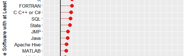
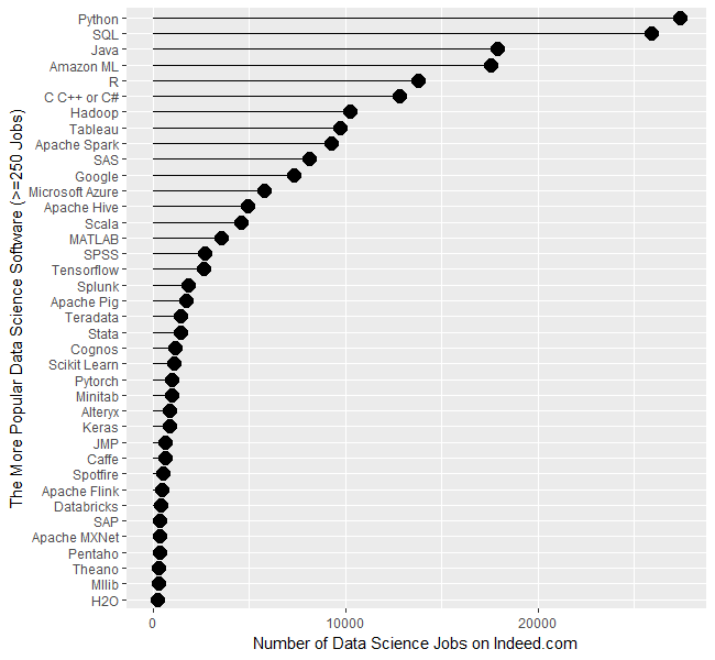
Figure 1a shows that Python is in the lead with 27,374 jobs, followed by SQL with 25,877. Java and Amazon’s Machine Learning (ML) tools are roughly 25% further below, with jobs in the 17,000s. R and the C variants come next with around 13,000. People frequently compare R and Python, but when it comes to getting a data science job, there are only half as many for R as for Python. That doesn’t mean they’re the same sort of job, of course. I still see more statisticians using R and machine learning people preferring Python, but Python is definitely on a roll! From Hadoop on down, there is a slow decline in jobs. R is also frequently compared to SAS, which has only 8,123 compared to R’s 13,800.
The scale of Figure 1a is so wide that the bottom package, H20 appears to be zero, when in fact there are 257 jobs for it.
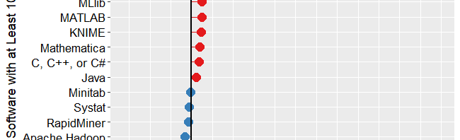
Figure 1a. Number of data science jobs for the more popular software.
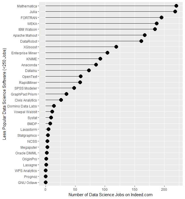
To let us compare the less popular software, I plotted them separately in Figure 1b. Mathematica and Julia are the leaders of this set, with around 219 jobs each. The ancient FORTRAN language is still hanging on to life with 195 jobs. The open source WEKA software and IBM’s Watson are next, with around 185 each. From XGBOOST on down, there is a fairly steady slow decline.
There are several tools that use a workflow interface: Enterprise Miner, KNIME, RapidMiner, and SPSS Modeler. They’re all around the same area between 50 and 100 jobs. In many of the other measures of popularity, RapidMiner beats the very similar KNIME tool, but here there are 50% more jobs for the latter. Alteryx is also a workflow-based tool, however, it has pulled away from the pack, appearing back on Figure 1a with 901 jobs.
Figure 1b. Number of jobs for less popular data science software tools, those with fewer than 250 advertisements.
When interpreting the scale on Figure 1b, what looks like zero is indeed zero. From Systat on down, none of the packages have more than 10 job listings.
It’s important to note that the values shown in Figures 1a and 1b are single points in time. The number of jobs for the more popular software do not change much from day to day. Therefore, the relative rankings of the software shown in Figure 1a is unlikely to change much over the coming year or two. The less popular packages shown in Figure 1b have such low job counts that their ranking is more likely to shift from month to month, though their position relative to the major packages should remain more stable.
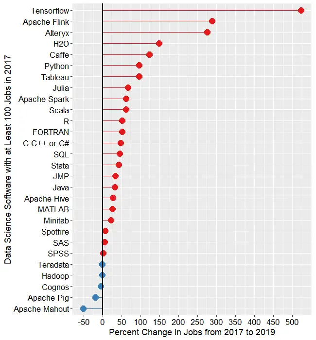
Next, let’s look at the change in jobs from the 2017 data to now (2019). Figure 1c shows the percent change for those packages that had at least 100 job listings back in 2017. Without such a limitation, software that goes from 1 job in 2017 to 5 jobs in 2019 would have a 500% increase, but still would be of little interest. Software whose job market is heating up, or growing, is shown in red, while those that are cooling down are shown in blue.
Figure 1c. Percent change in job listings from 2017 to 2019. Only software that had at least 100 jobs in 2017 is shown.
Tensorflow, the deep learning software from Google, is the fastest growing at 523%. Next is Apache Flink, a tool that analyzes streaming data, at 289%. H2O is next, with 150% growth. Caffe is another deep learning framework and its 123% growth reflects the popularity of artificial intelligence algorithms.
Python shows “only” 97% growth, but its popularity was already so high that the 13,471 jobs that it added surpasses the total jobs of many of the other packages!
Tableau is showing a similar rate of growth, though it was a comparably small number of additional jobs, at 4,784.
From the Julia language on down, we see a slowing decrease in growth. I’m surprised to see that jobs for SAS and SPSS are still growing, though barely at 6% and 1%, respectively.
If you enjoyed reading this article, you might be interested in my recent series of reviews on point-and-click front-ends for the R language. I invite you to subscribe to this blog, or follow me on Twitter.
Now that I’ve completed seven detailed reviews of Graphical User Interfaces (GUIs) for R, let’s compare them. It’s easy enough to count their features and plot them, so let’s start there. I’m basing the counts on the number of menu items in each category. That’s not too hard to get, but it’s far from perfect. Some software has fewer menu choices, depending instead on dialog box choices. Studying every menu and dialog box would be too time-consuming, so be aware of this limitation. I’m putting the details of each measure in the appendixso you can adjust the figures and create your own graphs. If you decide to make your own graphs, I’d love to hear from you in the comments below.
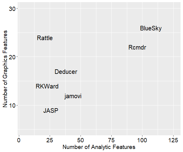
Figure 1 shows the number of analytic methods each software supports on the x-axis and the number of graphics methods on the y-axis. The analytic methods count combines statistical features, machine learning / artificial intelligence ones (ML/AI), and the ability to create R model objects. The graphics features count totals up the number of bar charts, scatterplots, etc. each package can create.
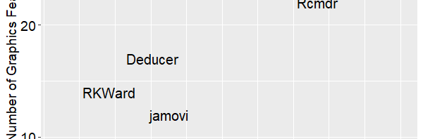
The ideal place to be in this graph is in the upper right corner. We see that BlueSky and R Commander offer quite a lot of both analytic and graphical features. Rattle stands out as having the second greatest number of graphics features. JASP is the lowest on graphics features and 3rd from the bottom on analytic ones.
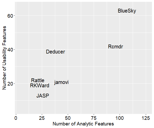
Next, let’s swap out the y-axis for general usability features. These consist of a variety of features that make your work easier, including data management capabilities (see appendix for details).
Figure 2 shows that BlueSky and R Commander still in the top two positions overall, but now Deducer has nearly caught up with R Commander on the number of general features. That’s due to its reasonably strong set of data management tools, plus its output is in true word processing tables saving you the trouble of formatting it yourself. Rattle is much lower in this plot since, while its graphics capabilities are strong (at least in relation to ML/AI tasks), it has minimal data management capabilities.
These plots help show us three main overall feature sets, but each package offers things that the others don’t. Let’s look at a brief overview of each. Remember that each of these has a detailed review that follows my standard template. I’ll start with the two that have come out on top, then follow in alphabetical order.
The R Commander – This is the oldest GUI, having been around since at least 2005. There are an impressive 41 plug-ins developed for it. It is currently the only R GUI that saves R Markdown files, but it does not create word processing tables by default, as some of the others do. The R code it writes is classic, rarely using the newer tidyverse functions. It works as a partner to R; you install R separately, then use it to install and start R Commander. It makes it easy to blend menu-based analysis with coding. If your goal is to learn to code in classic R, this is an excellent choice.
BlueSky Statistics – This software was created by former SPSS employees and it shares many of SPSS’ features. BlueSky is only a few years old, and it converted from commercial to open source just a few months ago. Although BlueSky and R Commander offer many of the same features, they do them in different ways. When using BlueSky, it’s not initially apparent that R is involved at all. Unless you click the “Syntax” button that every dialog box has, you’ll never see the R code or the code editor. Its output is in publication-quality tables which follow the popular style of the American Psychological Association.
Deducer – This has a very nice-looking interface, and it’s probably the first to offer true word processing tables by default. Being able to just cut and paste a table into your word processor saves a lot of time and it’s a feature that has been copied by several others. Deducer was released in 2008, and when I first saw it, I thought it would quickly gain developers. It got a few, but development seems to have halted. Deducer’s installation is quite complex, and it depends on the troublesome Java software. It also used JGR, which never became as popular as the similar RStudio. The main developer, Ian Fellows, has moved on to another very interesting GUI project called Vivid.
jamovi– The developers who form the core of the jamovi project used to be part of the JASP team. Despite the fact that they started a couple of years later, they’re ahead of JASP in several ways at the moment. Its developers decided that the R code it used should be visible and any R code should be executable, something that differentiated it from JASP. jamovi has an extremely interactive interface that shows you the result of every selection in each dialog box. It also saves the settings in every dialog box, and lets you re-use every step on a new dataset by saving a “template.” That’s extremely useful since GUI users often don’t want to learn R code. jamovi’s biggest weakness its dearth of data management tasks, though there are plans to address that.
JASP– The biggest advantage JASP offers is its emphasis on Bayesian analysis. If that’s your preference, this might be the one for you. At the moment JASP is very different from all the other GUIs reviewed here because it won’t show you the R code it’s writing, and you can’t execute your own R code from within it. Plus the software has not been open to outside developers. The development team plans to address those issues, and their deep pockets should give them an edge.
Rattle– If your work involves ML/AI (a.k.a. data mining) instead of standard statistical methods, Rattle may be the best GUI for you. It’s focused on ML/AI, and its tabbed-based interface makes quick work of it. However, it’s the weakest of them all when it comes to statistical analysis. It also lacks many standard data management features. The only other GUI that offers many ML/AI features is BlueSky.
RKWard– This GUI blends a nice point-and-click interface with an integrated development environment that is the most advanced of all the other GUIs reviewed here. It’s easy to install and start, and it saves all your dialog box settings, allowing you to rerun them. However, that’s done step-by-step, not all at once as jamovi’s templates allow. The code RKWard creates is classic R, with no tidyverse at all.
Conclusion
I hope this brief comparison will help you choose the R GUI that is right for you. Each offers unique features that can make life easier for non-programmers. If one catches your eye, don’t forget to read the full review of it here.
Acknowledgements
Writing this set of reviews has been a monumental undertaking. It would not have been possible without the assistance of Bruno Boutin, Anil Dabral, Ian Fellows, John Fox, Thomas Friedrichsmeier, Rachel Ladd, Jonathan Love, Ruben Ortiz, Christina Peterson, Josh Price, Eric-Jan Wagenmakers, and Graham Williams.
Appendix: Guide to Scoring
In figures 1 and 2, Analytic Features adds up: statistics, machine learning / artificial intelligence, the ability to create R model objects, and the ability to validate models using techniques such as k-fold cross-validation. The Graphics Features is the sum of two rows, the number of graphs the software can create plus one point for small multiples, or facets, if it can do them. Usability is everything else, with each row worth 1 point, except where noted.
Feature
Definition
Simple installation
Is it done in one step?
Simple start-up
Does it start on its own without starting R, loading packages, etc.?
Import Data Files
How many files types can it import?
Import Database
How many databases can it read from?
Export Data Files
How many file formats can it write to?
Data Editor
Does it have a data editor?
Can work on >1 file
Can it work on more than one file at a time?
Variable View
Does it show metadata in a variable view, allowing for many fast edits to metadata?
Data Management
How many data management tasks can it do?
Transform Many
Can it transform many variables at once?
Graph Types
How many graph types does it have?
Small Multiples
Can it show small multiples (facets)?
Model Objects
Can it create R model objects?
Statistics
How many statistical methods does it have?
ML/AI
How many ML / AI methods does it have?
Model Validation
Does it offer model validation (k-fold, etc.)?
R Code IDE
Can you edit and execute R code?
GUI Reuse
Does it let you re-use work without code?
Code Reuse
Does it let you rerun all using code?
Package Management
Does it manage packages for you?
Table of Contents
Does output have a table of contents?
Re-order
Can you re-order output?
Publication Quality
Is output in publication quality by default?
R Markdown
Can it create R Markdown?
Add comments
Can you add comments to output?
Group-by
Does it do group-by repetition of any other task?
Output as Input
Does it save equivalent to broom’s tidy, glance, augment? (They earn 1 point for each)
In my neverending quest to track The Popularity of Data Science Software, it’s time to update the section on Scholarly Articles. The rapid growth of R could not go on forever and, as you’ll see below, its use actually declined over the last year.
Scholarly Articles
Scholarly articles provide a rich source of information about data science tools. Because publishing requires significant amounts of effort, analyzing the type of data science tools used in scholarly articles provides a better picture of their popularity than a simple survey of tool usage. The more popular a software package is, the more likely it will appear in scholarly publications as an analysis tool, or even as an object of study.
Since scholarly articles tend to use cutting-edge methods, the software used in them can be a leading indicator of where the overall market of data science software is headed. Google Scholar offers a way to measure such activity. However, no search of this magnitude is perfect; each will include some irrelevant articles and reject some relevant ones. The details of the search terms I used are complex enough to move to a companion article, How to Search For Data Science Articles. Since Google regularly improves its search algorithm, each year I collect data again for the previous years (with one exception noted below).
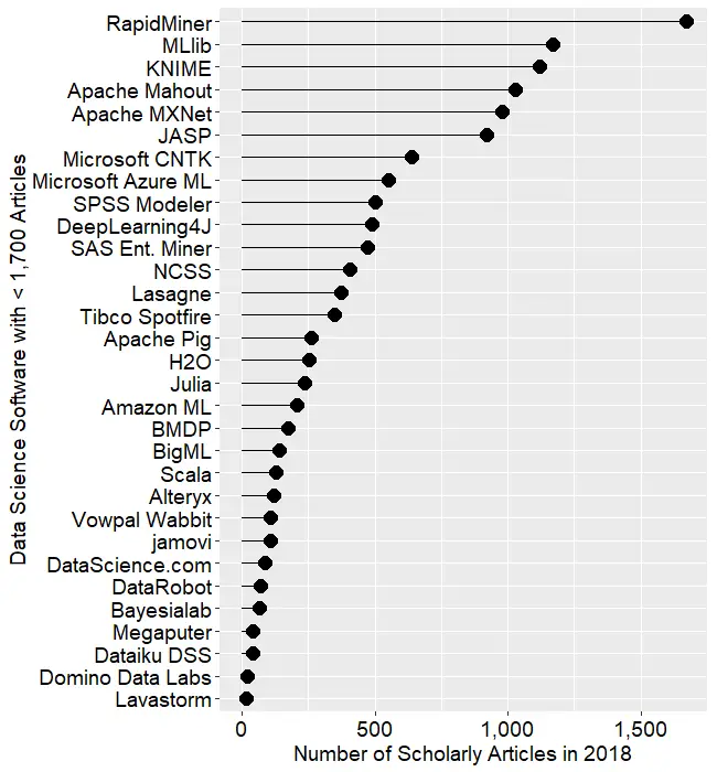
Figure 2a shows the number of articles found for the more popular software packages and languages (those with at least 1,700 articles) in the most recent complete year, 2018. To allow ample time for publication, insertion into online databases, and indexing, the was data collected on 3/28/2019.
Figure 2a. The number of scholarly articles found on Google Scholar, for data science software. Only those with more than 1,700 citations are shown.
SPSS is by far the most dominant package, as it has been for over 20 years. This may be due to its balance between power and ease-of-use. R is in second place with around half as many articles. It offers extreme power, though with less ease of use. SAS is in third place, with a slight lead over Stata, MATLAB, and GraphPad Prism, which are nearly tied.
Note that the general-purpose languages: C, C++, C#, FORTRAN, Java, MATLAB, and Python are included only when found in combination with data science terms, so view those counts as more of an approximation than the rest.
The next group of packages goes from Python through C, with usage declining slowly. The next set starts at Caffe, dropping nearly 50%, and continuing to IBM Watson with a slow decline.
The last two packages in Fig 2a are Weka and Theano, which are quite a drop from IBM Watson, though it’s getting harder to see as the lines shrink.
To continue on this scale would make the remaining packages all appear too close to the y-axis to read, so Figure 2b shows the remaining software on a much smaller scale, with the y-axis going to only 1,700 rather than the 80,000 used on Figure 2a.
Figure 2b. Number of scholarly articles using each data science software found using Google Scholar. Only those with fewer than 1,700 citations are shown.
I chose to begin Figure 2b with software that has fewer than 1,700 articles because it allows us to see RapidMiner and KNIME on the same scale. They are both workflow-driven tools with very similar capabilities. This plot shows RapidMiner with 49% greater usage than KNIME. RapidMiner uses more marketing, while KNIME depends more on word-of-mouth recommendations and a more open source model. The IT advisory firms Gartner and Forrester rate them as tools able to hold their own against the commercial titans, IBM’s SPSS and SAS. Given that SPSS has roughly 50 times the usage in academia, that seems like quite a stretch. However, as we will soon see, usage of these newer packages are growing, while the use of the older ones is shrinking quite rapidly.
Figure 2b also lets us see IBM’s SPSS Modeler, SAS Enterprise Miner, and Alteryx on the same plot. These three are also workflow-driven tools which are quite expensive. None are doing as well here as RapidMiner or KNIME, tools that much less expensive – or free – depending on how you use them (KNIME desktop is free but server is not; RapidMiner is free for analyzing fewer than 10,000 cases).
Another interesting comparison on Figure 2b is JASP and jamovi. Both are open-source tools that focus on statistics rather than machine learning or artificial intelligence. They both use graphical user interfaces (GUIs) in a style that is similar to SPSS. Both also use R behind the scenes to do their calculations. JASP emphasizes Bayesian Analysis and hides its R code; jamovi has a more frequentist orientation, it lets you see its R code, and it lets you execute your own R code directly from within it. JASP currently has nine times as many citations here, though jamovi’s use is growing much more rapidly.
Even newer on the GUI for R scene is BlueSky Statistics, which doesn’t appear on the plot at all since it has zero scholarly articles so far. It was created by a new company and only adopted an open source model a few months ago.
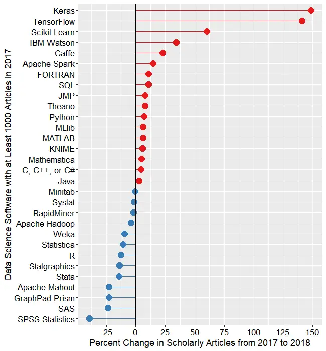
While Figures 2a and 2b are useful for studying market share as it stands now, they don’t show how things are changing. It would be ideal to have long-term growth trend graphs for each of the analytics packages, but collecting that much data annually is too time-consuming. What I’ve done instead is collect data only for the past two complete years, 2017 and 2018. This provides the data needed to study year-over-year changes.
Figure 2c shows the percent change across those years, with the growing “hot” packages shown in red (right side); the declining or “cooling” are shown in blue (left side). Since the number of articles tends to be in the thousands or tens of thousands, I have removed any software that had fewer than 1,000 articles in 2015. A package that grows from 1 article to 5 may demonstrate 500% growth but is still of little interest.
Figure 2c. Change in Google Scholar citation rate in the most recent complete two years, 2017 and 2018.
The recent changes in data science software can be summarized succinctly: AI/ML up; statistics down. The software that is growing contains none of the packages that are associated more with statistical analysis. The software in decline is dominated by the classic packages of statistics: SPSS Statistics, SAS, GraphPad Prism, Stata, Statgraphics, R, Statistica, Systat, and Minitab. JMP is the only traditional statistics package whose scholarly usage is growing. Of the machine learning software that’s declining in usage, there are rough equivalents that are growing (e.g. Mahout down, Spark up).
Of course another summary is: cheap (or free) up; expensive down. Of the growing packages, 13 out of 17 are available in open source. Of those in decline, only 5 out of 13 are open source.
Statistics software has been around much longer than AI/ML software, started back in the days before open source. Stat vendors have been adding AI/ML methods to their software, making them the more comprehensive solutions. The AI/ML vendors or projects are missing an opportunity to add more comprehensive statistics capabilities. Some, such as RapidMiner and KNIME, are indeed expanding in this direction, but very slowly indeed.
At the top of Figure 2c, we see that the deep learning packages Keras and TensorFlow are the fastest growing at nearly 150%. PyTorch is not shown here because it did not have enough usage in the previous year. However, its citation rate went from 616 to 4,670, a substantial 658% growth rate! There are other packages that are not shown here, including JASP with 223% growth, and jamovi with 720% growth. Despite such high growth, the latter still only has 108 citations in 2018. The rapid growth of JASP and jamovi lend credence to the perspective that the overall pattern of change shown in Figure 2c may be more of a result of free vs. expensive software. Neither of them offers any AI/ML features.
Scikit Learn, the Python machine learning library, was a fast grower with a 60% increase.
I was surprised to see IBM Watson growing a healthy 34% as much of the news about it has not been good. It’s awesome at Jeopardy though!
In the RapidMiner vs. KNIME contest, we saw previously that RapidMiner was ahead. From this plot, we that KNIME growing slightly (5.7%) while RapidMiner is declining slightly (1.8%).
The biggest losers in Figure 2c are SPSS, down 39%, and SAS, Prism, and Mahout, all down 24%. Even R is down 13%. Recall that Figure 2a shows that despite recent years of decline, SPSS is still extremely dominant for scholarly use, and R and SAS are still the #2 and #3 most widely used packages in this arena.
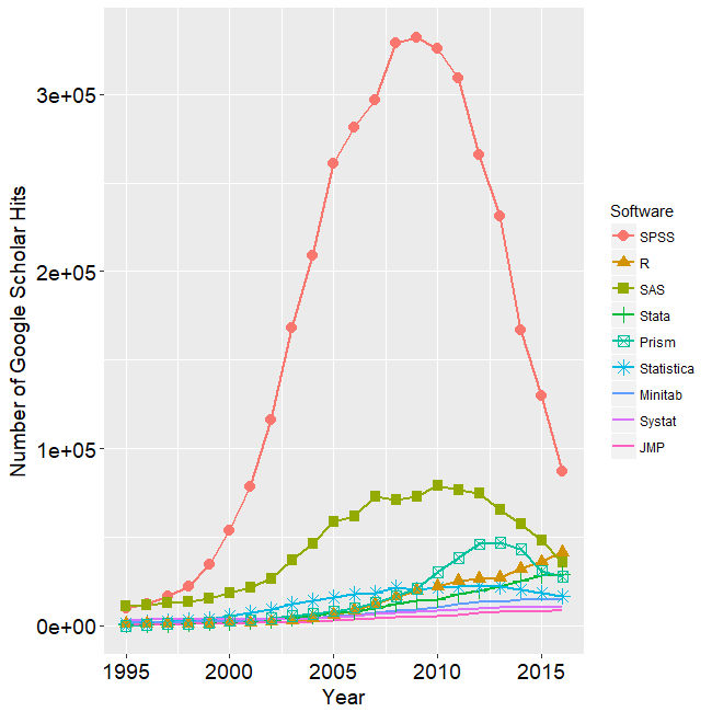
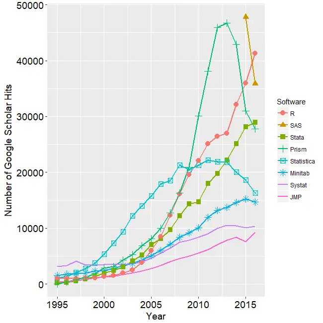
I’m particularly interested in the long-term trends of the classic statistics packages. So in Figure 2d I have plotted the same scholarly-use data for 1995 through 2016.
Figure 2d. The number of Google Scholar citations for each classic statistics package per year from 1995 through 2016.
SPSS has a clear lead overall, but now you can see that its dominance peaked in 2009 and its use is in sharp decline. SAS never came close to SPSS’ level of dominance, and its use peaked around 2010. GraphPAD Prism followed a similar pattern, though it peaked a bit later, around 2013.
In Figure 2d, the extreme dominance of SPSS makes it hard to see long-term trends in the other software. To address this problem, I have removed SPSS and all the data from SAS except for 2014 and 1015. The result is shown in Figure 2e.
Figure 2e. The number of Google Scholar citations for each classic statistics package from 1995 through 2016, this time with SPSS removed and SAS included only in 2014 and 2015. The removal of SPSS and SAS expanded scale makes it easier to see the rapid growth of the less popular packages.
Figure 2e makes it easy to see that most of the remaining packages grew steadily across the time period shown. R and Stata grew especially fast, as did Prism until 2012. Note that the decline in the number of articles that used SPSS, SAS, or Prism is not balanced by the increase in the other software shown in this particular graph. Even adding up all the other software shown in Figures 2a and 2b doesn’t account for the overall decline. However, I’m looking at only 58 out of over 100 data science tools.
While Figures 2d and 2e show the historical trend that ended in 2016, Figure 2f shows a fresh set of data collected in March, 2019. Since Google’s algorithm changes, preventing the new data from matching exactly with the old, this new data starts at 2015 so the two sets overlap. SPSS is not shown on this graph because its dominance would compress the y-axis, making trends in the others harder to see. However, keep in mind that despite SPSS’ 39% drop from 2017 to 2018, its use is still 66% higher than R’s in 2018! Apparently people are willing to pay for ease of use.
Figure 2f. The number of Google Scholar citations for each classic statistics package per year from 2015 through 2018.
In Figure 2f we can see that the downward trends of SAS, Prism, and Statistica are continuing. We also see that the long and rapid growth of R and Stata has come to an end. Growth that rapid can’t go on forever. It will be interesting to see next year to see if this is merely a flattening of usage or the beginning of a declining trend. As I pointed out in my book, R for Stata Users, there are many commonalities between R and Stata. As a result of this, and the fact that R is open source, I expect R use to stabilize at this level while use of Stata continues to slowly decline.
SPSS’ long-term rapid decline has to level out at some point. They have been chipped away at by many competitors. However, until recently these competitors have either been free and code-based such as R, or menu-based and proprietary, such as Prism. With the fairly recent arrival of JASP, jamovi, and BlueSky Statistics, SPSS now faces software that is both free and menu-based. Previous projects to add menus to R, such as the R Commander and Deducer, were also free and open source, but they required installing R separately and then using R code to activate the menus.
These results apply to scholarly articles in general. The results in specific fields or journals are very likely to be different.
To see many other ways to estimate the market share of this type of software, see my ongoing article, The Popularity of Data Science Software. My next post will update the job advertisements that list science software. You may also be interested in my in-depth reviews of point-and-click user interfaces to R. I invite you to subscribe to my blog or follow me on twitter where I announce new posts. Happy computing!
Update: an earlier version of this post included figures that I’ve removed at the request of Forrester, Inc.
In my previous post, I discussed Gartner’s reviews of data science software companies. In this post, I describe Forrester’s coverage and discuss how radically different it is. As usual, this post is already integrated into my regularly-updated article, The Popularity of Data Science Software.
Forrester Research, Inc. is a leading global research and advisory firm that reviews data science software vendors. Studying their reports and comparing them to Gartner’s can provide a deeper understanding of the software these vendors provide.
Historically, Forrester has conducted their analyses similarly to Gartner’s. That approach compares software that uses point-and-click style software like KNIME, to software that emphasizes coding, such as Anaconda. To make apples-to-apples comparisons, Forrester decided to spit the two types of software into separate reports.
The Forrester Wave: Multimodal Predictive Analytics and Machine Learning Solutions, Q3, 2018 covers software that is controllable by various means such as menus, workflows, wizards, or code (as of 23/22/2019 available free here). Forrester plans to cover tools for automated modeling in a separate report, due out in 2019. Given that automation is now a widely adopted feature of the several companies covered in this report, that seems like an odd approach.
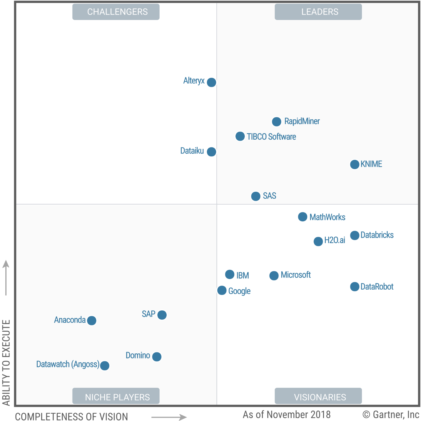
Forrester divides the vendors into four categories: Leaders, Strong Performers, Contenders, and Challengers.
In the Leaders category, they include IBM, while Gartner viewed them as a middle-of-the-pack Visionary. Forrester and Gartner both view SAS and RapidMiner as leaders.
The Strong Performers category includes KNIME, which Gartner considered a Leader. Datawatch and Tibco are tied in this segment while Gartner had them far apart, with Datawatch put in very last place by Gartner. Forrester has KNIME and SAP next to each other in this category, while Gartner had them far apart, with KNIME a Leader and SAP a Niche Player. Dataiku is here too, with a similar rating to Gartner.
The Contenders segment contains Microsoft and Mathworks, in positions similar to Gartner’s. Fico is here too; Gartner did not evaluate them.
Forrester’s Challengers segment includes World Programming, which sells SAS-compatible software, and Minitab, which purchased Salford Systems. Neither were considered by Gartner.
Forrester rates some of the notebook-based vendors very differently than Gartner. Here Domino Data Labs is a Leader while Gartner had them at the extreme other end of their plot, in the Niche Players quadrant. Oracle is also shown as a Leader, though its strength is this market is minimal.
In the Strong Performers category are Databricks and H2O.ai, in very similar positions compared to Gartner. Civis Analytics and OpenText are also in this category; neither were reviewed by Gartner. Cloudera is here as well; it too was left out by Gartner.
Forrester’s Condenders category contains Google, in a similar position compared to Gartner’s analysis. Anaconda is here too, in a position quite a bit higher than in Gartner’s plot.
The only two companies rated by Gartner but ignored by Forrester are Alteryx and DataRobot. The latter will no doubt be covered in Forrester’s report on automated modelers, due out this summer.
As with my coverage of Gartner’s report, my summary here barely scratches the surface of the two Forrester reports. Both provide insightful analyses of the vendors and the software they create. I recommend reading both (and learning more about open source software) before making any purchasing decisions.
To see many other ways to estimate the market share of this type of software, see my ongoing article, The Popularity of Data Science Software. My next post will update the scholarly use of data science software, a leading indicator. You may also be interested in my in-depth reviews of point-and-click user interfaces to R. I invite you to subscribe to my blog or follow me on twitter where I announce new posts. Happy computing!
I’ve just updated The Popularity of Data Science Software to reflect my take on Gartner’s 2019 report, Magic Quadrant for Data Science and Machine Learning Platforms. To save you the trouble of digging through all 40+ pages of my report, here’s just the updated section:
IT Research Firms
IT research firms study software products and corporate strategies. They survey customers regarding their satisfaction with the products and services and provide their analysis in reports that they sell to their clients. Each research firm has its own criteria for rating companies, so they don’t always agree. However, I find the detailed analysis that these reports contain extremely interesting reading. The reports exclude open source software that has no specific company backing, such as R, Python, or jamovi. Even open source projects that do have company backing, such as BlueSky Statistics, are excluded if they have yet to achieve sufficient market adoption. However, they do cover how company products integrate open source software into their proprietary ones.
While these reports are expensive, the companies that receive good ratings usually purchase copies to give away to potential customers. An Internet search of the report title will often reveal companies that are distributing them. On the date of this post, Datarobot is offering free copies.
Gartner, Inc. is one of the research firms that write such reports. Out of the roughly 100 companies selling data science software, Gartner selected 17 which offered “cohesive software.” That software performs a wide range of tasks including data importation, preparation, exploration, visualization, modeling, and deployment.
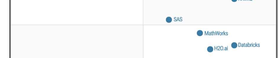
Gartner analysts rated the companies on their “completeness of vision” and their “ability to execute” that vision. Figure 3a shows the resulting “Magic Quadrant” plot for 2019, and 3b shows the plot for the previous year. Here I provide some commentary on their choices, briefly summarize their take, and compare this year’s report to last year’s. The main reports from both years contain far more detail than I cover here.
Figure 3a. Gartner Magic Quadrant for Data Science and Machine Learning Platforms from their 2019 report (plot done in November 2018, report released in 2019).
The Leaders quadrant is the place for companies whose vision is aligned with their customer’s needs and who have the resources to execute that vision. The further toward the upper-right corner of the plot, the better the combined score.
RapidMiner and KNIME reside in the best part of the Leaders quadrant this year and last. This year RapidMiner has the edge in ability to execute, while KNIME offers more vision. Both offer free and open source versions, but the companies differ quite a lot on how committed they are to the open source concept. KNIME’s desktop version is free and open source and the company says it will always be so. On the other hand, RapidMiner is limited by a cap on the amount of data that it can analyze (10,000 cases) and as they add new features, they usually come only via a commercial license with “difficult-to-navigate pricing conditions.” These two offer very similar workflow-style user interfaces and have the ability to integrate many open sources tools into their workflows, including R, Python, Spark, and H2O.
Tibco moved from the Challengers quadrant last year to the Leaders this year. This is due to a number of factors, including the successful integration of all the tools they’ve purchased over the years, including Jaspersoft, Spotfire, Alpine Data, Streambase Systems, and Statistica.
SAS declined from being solidly in the Leaders quadrant last year to barely being in it this year. This is due to a substantial decline in its ability to execute. Given SAS Institute’s billions in revenue, that certainly can’t be a financial limitation. It may be due to SAS’ more limited ability to integrate as wide a range of tools as other vendors have. The SAS language itself continues to be an important research tool among those doing complex mixed-effects linear models. Those models are among the very few that R often fails to solve.
The companies in the Visionaries Quadrant are those that have good future plans but which may not have the resources to execute that vision.
Mathworks moved forward substantially in this quadrant due to MATLAB’s ability to handle unconventional data sources such as images, video, and the Internet of Things (IoT). It has also opened up more to open source deep learning projects.
H2O.ai is also in the Visionaries quadrant. This is the company behind the open source H2O software, which is callable from many other packages or languages including R, Python, KNIME, and RapidMiner. While its own menu-based interface is primitive, its integration into KNIME and RapidMiner makes it easy to use for non-coders. H2O’s strength is in modeling but it is lacking in data access and preparation, as well as model management.
IBM dropped from the top of the Visionaries quadrant last year to the middle. The company has yet to fully integrate SPSS Statistics and SPSS Modeler into its Watson Studio. IBM has also had trouble getting Watson to deliver on its promises.
Databricks improved both its vision and its ability to execute, but not enough to move out of the Visionaries quadrant. It has done well with its integration of open-source tools into its Apache Spark-based system. However, it scored poorly in the predictability of costs.
Datarobot is new to the Gartner report this year. As its name indicates, its strength is in the automation of machine learning, which broadens its potential user base. The company’s policy of assigning a data scientist to each new client gets them up and running quickly.
Google’s position could be clarified by adding more dimensions to the plot. Its complex collection of a dozen products that work together is clearly aimed at software developers rather than data scientists or casual users. Simply figuring out what they all do and how they work together is a non-trivial task. In addition, the complete set runs only on Google’s cloud platform. Performance on big data is its forte, especially problems involving image or speech analysis/translation.
Microsoft offers several products, but only its cloud-only Azure Machine Learning (AML) was comprehensive enough to meet Gartner’s inclusion criteria. Gartner gives it high marks for ease-of-use, scalability, and strong partnerships. However, it is weak in automated modeling and AML’s relation to various other Microsoft components is overwhelming (same problem as Google’s toolset).
Figure 3b. Last year’s Gartner Magic Quadrant for Data Science and Machine Learning Platforms (January, 2018)
Those in the Challenger’s Quadrant have ample resources but less customer confidence in their future plans, or vision.
Alteryx dropped slightly in vision from last year, just enough to drop it out of the Leaders quadrant. Its workflow-based user interface is very similar to that of KNIME and RapidMiner, and it too gets top marks in ease-of-use. It also offers very strong data management capabilities, especially those that involve geographic data, spatial modeling, and mapping. It comes with geo-coded datasets, saving its customers from having to buy it elsewhere and figuring out how to import it. However, it has fallen behind in cutting edge modeling methods such as deep learning, auto-modeling, and the Internet of Things.
Dataiku strengthed its ability to execute significantly from last year. It added better scalability to its ease-of-use and teamwork collaboration. However, it is also perceived as expensive with a “cumbersome pricing structure.”
Members of the Niche Players quadrant offer tools that are not as broadly applicable. These include Anaconda, Datawatch (includes the former Angoss), Domino, and SAP.
Anaconda provides a useful distribution of Python and various data science libraries. They provide support and model management tools. The vast army of Python developers is its strength, but lack of stability in such a rapidly improving world can be frustrating to production-oriented organizations. This is a tool exclusively for experts in both programming and data science.
Datawatch offers the tools it acquired recently by purchasing Angoss, and its set of “Knowledge” tools continues to get high marks on ease-of-use and customer support. However, it’s weak in advanced methods and has yet to integrate the data management tools that Datawatch had before buying Angoss.
Domino Data Labs offers tools aimed only at expert programmers and data scientists. It gets high marks for openness and ability to integrate open source and proprietary tools, but low marks for data access and prep, integrating models into day-to-day operations, and customer support.
SAP’s machine learning tools integrate into its main SAP Enterprise Resource Planning system, but its fragmented toolset is weak, and its customer satisfaction ratings are low.
To see many other ways to rate this type of software, see my ongoing article, The Popularity of Data Science Software. You may also be interested in my in-depth reviews of point-and-click user interfaces to R. I invite you to subscribe to my blog or follow me on twitter where I announce new posts. Happy computing!
Last February I reviewed the jamovi menu-based front end to R. I’ve reviewed five more user interfaces since then, and have developed a more comprehensive template to make it easier to compare them all. Now I’m cycling back to jamovi, using that template to write a far more comprehensive review. I’ve added this review to the previous set, and I’m releasing it as a blog post so that it will be syndicated on R-Bloggers, StatsBlogs, et al.
Introduction
jamovi (spelled with a lower-case “j”) is a free and open source graphical user interface for the R software that targets beginners looking to point-and-click their way through analyses. It is available for Windows, Mac, Linux, and even ChromeOS. Versions are also planned for servers and tablets.
This post is one of a series of reviews which aim to help non-programmers choose the Graphical User Interface (GUI) for R that is best for them. Additionally, these reviews include cursory descriptions of the programming support that each GUI offers.
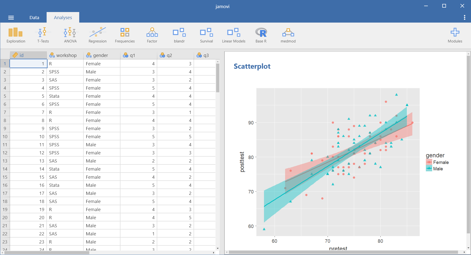
Figure 1. jamovi’s main screen.
Terminology
There are various definitions of user interface types, so here’s how I’ll be using these terms:
GUI = Graphical User Interface using menus and dialog boxes to avoid having to type programming code. I do not include any assistance for programming in this definition. So, GUI users are people who prefer using a GUI to perform their analyses. They don’t have the time or inclination to become good programmers.
IDE = Integrated Development Environment which helps programmers write code. I do not include point-and-click style menus and dialog boxes when using this term. IDE users are people who prefer to write R code to perform their analyses.
Installation
The various user interfaces available for R differ quite a lot in how they’re installed. Some, such as BlueSky Statistics or RKWard, install in a single step. Others install in multiple steps, such as R Commander (two steps), and Deducer (up to seven steps). Advanced computer users often don’t appreciate how lost beginners can become while attempting even a simple installation. The HelpDesks at most universities are flooded with such calls at the beginning of each semester!
jamovi’s single-step installation is extremely easy and includes its own copy of R. So if you already have a copy of R installed, you’ll have two after installing jamovi. That’s a good idea though, as it guarantees compatibility with the version of R that it uses, plus a standard R installation by itself is harder than jamovi’s. Python is also installed with jamovi, but it is used only for internal purposes. You can directly control only R through jamovi.
Plug-in Modules
When choosing a GUI, one of the most fundamental questions is: what can it do for you? What the initial software installation of each GUI gets you is covered in the Graphics, Analysis, and Modeling sections of this series of articles. Regardless of what comes built-in, it’s good to know how active the development community is. They contribute “plug-ins” which add new menus and dialog boxes to the GUI. This level of activity ranges from very low (RKWard, Deducer) to very high (R Commander).
For jamovi, plug-ins are called “modules” and they are found in the “jamovi library” rather than on the Comprehensive R Archive Network (CRAN) where R and most of its packages are found. This makes locating and installing jamovi modules especially easy.
Although jamovi is one of the most recent GUIs to appear on the R scene, it has already attracted a respectable number of developers. The list of modules at publication time is listed below. You can check on the latest ones on this web page.
Base R – converts jamovi analyses into standard R functions
blandr – Bland-Altman method comparison analysis, and is also available as an R package from CRAN
Death Watch – survival analysis
Distraction – quantiles and probabilities of continuous and discrete distributions
GAMLj – general linear model, linear mixed model, generalized linear models, etc.
jpower – power analysis for common research designs
MAJOR – meta-analysis based on R’s metafor package
medmod – basic mediation and moderation analysis
jAMM – advanced mediation analysis (similar to the popular Process Macro for SAS and SPSS)
R Data Sets
RJ – editor to run R code inside jamovi
scatr – scatter plots with marginal density or box plots
Statkat – helps you choose a statistical test.
TOSTER – tests of equivalence for t-tests and correlation
Walrus – robust descriptive stats & tests
jamovi Arcade – hangman & blackjack games
Startup
Some user interfaces for R, such as BlueSky and Rkward, start by double-clicking on a single icon, which is great for people who prefer to not write code. Others, such as R commander and JGR, have you start R, then load a package from your library, and then call a function to finally activate the GUI. That’s more appropriate for people looking to learn R, as those are among the first tasks they’ll have to learn anyway.
You start jamovi directly by double-clicking its icon from your desktop, or choosing it from your Start Menu (i.e. not from within R itself). It interacts with R in the background; you never need to be aware that R is running.
Data Editor
A data editor is a fundamental feature in data analysis software. It puts you in touch with your data and lets you get a feel for it, if only in a rough way. A data editor is such a simple concept that you might think there would be hardly any differences in how they work in different GUIs. While there are technical differences, to a beginner what matters the most are the differences in simplicity. Some GUIs, including BlueSky, let you create only what R calls a data frame. They use more common terminology and call it a data set: you create one, you save one, later you open one, then you use one. Others, such as RKWard trade this simplicity for the full R language perspective: a data set is stored in a workspace. So the process goes: you create a data set, you save a workspace, you open a workspace, and choose a dataset from within it.
jamovi’s data editor appears at start-up (Figure 1, left) and prompts you to enter data with an empty spreadsheet-style data editor. You can start entering data immediately, though at first, the variables are simply named A, B, C….
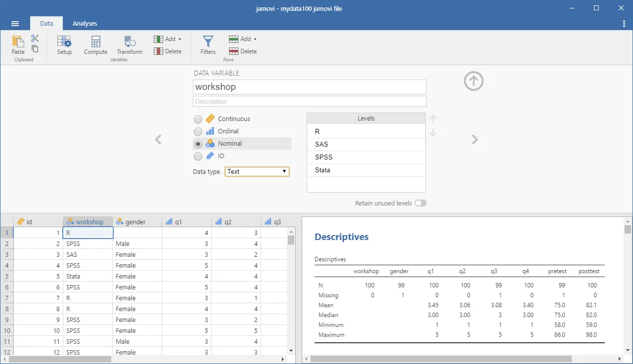
To change metadata, such as variable names, you double click on a name, and window (Figure 2) will slide open from the top with settings for variable name, description, measurement level (continuous, ordinal, nominal, or ID), data type (integer, decimal, text), variable levels (labels) and a “retain unused levels” switch. Currently, jamovi has no date format, which is a serious limitation if you deal with that popular data format.
Figure 2. The jamovi data editor with the variable attributes window open, allowing you to make changes.
When choosing variable terminology, R GUI designers have two choices: follow what most statistics books use, or instead use R jargon. The jamovi designers have opted for the statistics book terminology. For example, what jamovi calls categorical, decimal, or text are called factor, numeric, or character in R. Both sets of terms are fairly easy to learn, but given that some jamovi users may wish to learn R code, I find that choice puzzling. Changing variable settings can be done to many variables at once, which is an important time saver.
You can enter integer, decimal, or character data in the editor right after starting jamovi. It will recognize those types and set their metadata accordingly.
To enter nominal/factor data, you are free to enter numbers, such as 1/2 and later set levels to see Male/Female appear. Or you can set it up in advance and enter the numbers which will instantly turn into labels. That is a feature that saves time and helps assure accuracy. All data editors should offer that choice!
Adding variables or observations is as simple as scrolling beyond the set’s current limits and entering additional data. jamovi does not require “add more” buttons as some of its competitors (e.g. BlueSky) do. Adding variables or observations in between existing ones is also easy. Under the “Data” tab, there are two sets of “Add” and “Delete” buttons. The first set deals with variables and the second with cases. You can use the first set to insert, compute, transform variables or delete variables. The second inserts, appends, or deletes cases. These two sets of buttons are labeled “Variables” and “Rows”, but the font used is so small that I used jamovi for quite a while before noticing these labels.
Data Import
The ability to import data from a wide variety of formats is extremely important; you can’t analyze what you can’t access. Most of the GUIs evaluated in this series can open a wide range of file types and even pull data from relational databases. jamovi can’t read data from databases, but it can import the following file formats:
Comma Separated Values (.csv)
Plain text files (.txt)
SPSS (.sav, .zsav, .por)
SAS binary files (.sas7bdat, .xpt)
JASP (.jasp)
While jamovi doesn’t support true date/time variables, when you import a dataset that contains them, it will convert them to an integer value representing the number of days since 1970-01-01 and assign them labels in the YYYY-MM-DD format.
Data Export
The ability to export data to a wide range of file types helps when you have to use multiple tools to complete a task. Research is commonly a team effort, and in my experience, it’s rare to have all team members prefer to use the same tool. For these reasons, GUIs such as BlueSky and Deducer offer many export formats. Others, such as R Commander and RKward can create only delimited text files.
A fairly unique feature of jamovi is that it doesn’t save just a dataset, but instead it saves the combination of a dataset plus its associated analyses. To save just the dataset, you use the menu (a.k.a. hamburger) menu to select “Export” then “Data.” The export formats supported are the same as those provided for import, except for the more rarely-used ones such as SAS xpt and SPSS por and zsav:
Comma Separated Values (.csv)
Plain text files (.txt)
SPSS (.sav)
SAS binary files (.sas7bdat)
Data Management
It’s often said that 80% of data analysis time is spent preparing the data. Variables need to be transformed, recoded, or created; strings and dates need to be manipulated; missing values need to be handled; datasets need to be sorted, stacked, merged, aggregated, transposed, or reshaped (e.g. from “wide” format to “long” and back).
A critically important aspect of data management is the ability to transform many variables at once. For example, social scientists need to recode many survey items, biologists need to take the logarithms of many variables. Doing these types of tasks one variable at a time is tedious.
Some GUIs, such as BlueSky and R Commander can handle nearly all of these tasks. Others, such as RKWard handle only a few of these functions.
jamovi’s data management capabilities are minimal. You can transform or recode variables, and doing so across many variables is easy. The transformations are stored in the variable itself, making it easy to see what it was by double-clicking its name. However, the R code for the transformation is not available, even in with Syntax Mode turned on.
You can also filter cases to work on a subset of your data. However, jamovi can’t sort, stack, merge, aggregate, transpose, or reshape datasets. The lack of combining datasets may be a result of the fact that jamovi can only have one dataset open in a given session.
Menus & Dialog Boxes
The goal of pointing and clicking your way through an analysis is to save time by recognizing menu settings rather than performing the more difficult task of recalling programming commands. Some GUIs, such as BlueSky, make this easy by sticking to menu standards and using simpler dialog boxes; others, such as RKWard, use non-standard menus that are unique to it and hence require more learning.
jamovi uses standard menu choices for running steps listed on the Data and Analyses tabs. Dialog boxes appear and you select variables to place into their various roles. This is accomplished by either dragging the variable names or by selecting them and clicking an arrow located next to the particular role box. A unique feature of jamovi is that as soon as you fill in enough options to perform an analysis, its output appears instantly. There is no “OK” or “Run” button as the other GUIs reviewed here have. Thereafter, every option chosen adds to the output immediately; every option turned off is removed.
While nearly all GUIs keep your dialog box settings during your session, jamovi keeps those settings in its main “workspace” file. This allows you to return to a given analysis at a future date and try some model variations. You only need to click on the output of any analysis to have the dialog box appear to the right of it, complete with all settings intact.
Under the triple-dot menu on the upper right side of the screen, you can choose to run “Syntax Mode.” When you turn that on, the R syntax appears immediately, and when you turn it off, it vanishes just as quickly. Turning on syntax mode is the only way a jamovi user would be aware that R is doing the work in the background.
Output is saved by using the standard “Menu> Save” selection.
Documentation & Training
The jamovi User Guide covers the basics of using the software. The Resources by the Community web page provides links to a helpful array of documentation and tutorials in written and video form.
Help
R GUIs provide simple task-by-task dialog boxes which generate much more complex code. So for a particular task, you might want to get help on 1) the dialog box’s settings, 2) the custom functions it uses (if any), and 3) the R functions that the custom functions use. Nearly all R GUIs provide all three levels of help when needed. The notable exception that is the R Commander, which lacks help on the dialog boxes themselves.
jamovi doesn’t offer any integrated help files, only the documentation described in the Documentation & Training section above. The search for help can become very confusing. For example, after doing the scatterplot shown in the next section, I wondered if the scat() function offered a facet argument, normally this would be an easy question to answer. My initial attempt was to go to RStudio, load jamovi’s jmv package knowing that I routinely get help from it. However, the scat() function is not built into jamovi (or jmv); it comes in the scatr add-on module. So I had to return to jamovi and install Rj Editor module. That module lets you execute R code from within jamovi. However, running “help(scat)” yielded no result. After so much confusion, I never was able to find any help on that function. Hopefully, this situation will improve as jamovi matures.
Graphics
The various GUIs available for R handle graphics in several ways. Some, such as RKWard, focus on R’s built-in graphics. Others, such as BlueSky, focus on R’s popular ggplot graphics. GUIs also differ quite a lot in how they control the style of the graphs they generate. Ideally, you could set the style once, and then all graphs would follow it.
jamovi uses its own graphics functions to create plots. By default, they have the look of the popular ggplot2 package. jamovi is the only R GUI reviewed that lets you set the plot style in advance, and all future plots will use that style. It does this using four popular themes. jamovi also lets you choose color palettes in advance, from a set of eight.