BlueSky Statistics 5.40 GUI for R Update

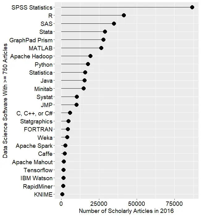
It has been just a few months since I reviewed five free and open-source point-and-click graphical user interfaces (GUIs) to the R language. I plan to keep those reviews up to date as new features are added. BlueSky’s interface would be immediately familiar to anyone who had used SPSS, as its developers model it on that popular software. The BlueSky developers’ goal is to help people use R without having to learn to write computer code.

While the previous version of BlueSky offered dozens of fairly advanced modeling methods such as generalized linear models, random forests, and support vector machines, it lacked some simpler features. Version 5.40 (correction: this was previously listed as version 6.04) adds a dialog for logistic regression, which is essentially its glm dialog simplified to do only logistic regression.

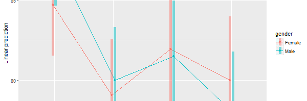
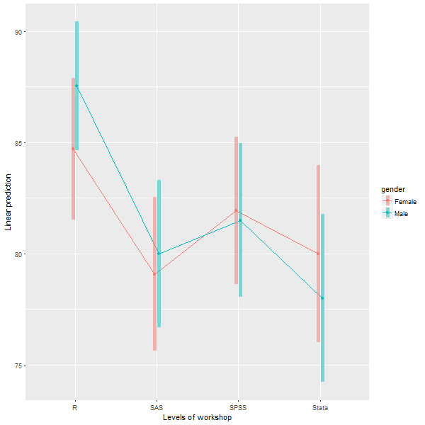
The Multi-Way ANOVA output has also been greatly enhanced, with the addition of a wide range of contrasts from the emmeans package, support for all three types of sums of squares, and plots for both post-hoc main-effects comparisons and interaction plots like this one:

BlueSky-Interaction-Plot

Users of RStudio will be pleased that the BlueSky’s program editor now submits lines of code like RStudio does so you can step your way through a program line-by-line, by clicking the Run button repeatedly.

The new version also has functions to do string-to-date vice versa, which led me to realize I had totally missed the string and date functions that it already had. In the “Data> Compute” dialog, the functions for Arithmetic, Logical, Math, and String(1) are visible. But if you click on the “>>” arrow on the right, you’ll also see String (2), Conversion, Statistical, Random Numbers, and four different menus of Date functions.

The complete set of new features and bug fixes is below. You can read my full review of BlueSky here, and you download the software for free here. I plan to write about new features in other R GUIs, so stay tuned to my blog or follow me on twitter where I announce new posts. Happy computing!

NEW FEATURES:
=============

1) Added support for weighted datasets. This option is available in Data -> Set Weights. Once you specify the weighting variable we create a new dataset with rows replicated as defined in the weights. This is similar to what SPSS does internally. When you run frequencies, independent sample t-tests, graphics commands, statistical tests etc on the new dataset (in BlueSky Statistics) with the rows replicated you will see results identical to those in SPSS.

2) Added the option to specify a weighting variable in Linear and Logistic Regression. This allows an optional vector of weights to be used during the fitting process (i.e. the weighted least-squares solution).

3) Added support for logistic regression under ‘Model Fitting’. Once the model is built, you can score the dataset, optionally obtain a confusion matrix, model statistics, and a ROC curve by selecting the model and clicking score. This is available on the top right-hand corner of the main application window.

4) We have updated the “Multi Way Anova” dialog with following capabilities:

  • display contrasts.
  • interaction plots.
  • support for type I, type II and type III tests.
  • pairwise comparison.

5) New reshape dialog with simplified R syntax has been added, using the tidyr package.

6) The “Multi variable one sample T-Test” and “Multi variable independent sample T-Test(with factor)” have been updated to allow you to specify the alternative hypothesis.

7) Added capabilities to support date manipulations.

  • The “String to date” dialog allows you to convert string to POSIXct date class.
  • The “Date to string” dialog allows you to convert the date (POSIXct and Date class) to string.

8) Simplified the syntax for frequencies and factor analysis.

9) If you launch a second instance of BlueSky Statistics the message that gets displayed has been improved. NOTE: You can only have one BlueSky Statistics instance running at a time.

10) We have improved the ability to browse the contents of the output window in BlueSky Statistics. This can be accessed from the menu (Layout > Show Navigation Tree).

11) Items in the output window can now be deleted. To delete an item from the output, just right click on the item(table/text/graphics) and choose the “Delete” option.

12) To make the output visually more appealing, we have introduced an option to hide the R syntax that gets displayed in the output window. This is controlled by an option in the configuration window ( Tools > Configuration Settings > Output tab ). By default we hide the R syntax in the output window.

13) When the option to show R syntax in the output is turned on ( Tools > Configuration Settings > Output tab ) and you resize the output window, we wrap the R syntax so that it is always visible.

14) To run any line of R syntax just place the cursor on that line and hit the RUN button, you don’t have to select the entire line.

15) If you want to run your R script line by line, place your cursor on the first line and hit RUN, the cursor will automatically move to the next line and you can hit the RUN button again.

This feature will work for simple R syntax which does not span multiple lines.

Example 1: 3 lines below work

a=10

b=20

c=a+b

Example 2: 4 lines below will not work

if(TRUE)

{

print(“Great”)

}

16)Added helpful hints to indicate you have reached the beginning and end of a dataset when scrolling wide datasets. This is available on the paging controls on the bottom right-hand corner of the screen.

17) Application launch is now faster.

18) In the BlueSky Statistics syntax editor, just like a comma, the pipe (%>%) can be used to break a long R code statement.

19) When the application launches, we open a new blank dataset this has been populated with zeros. You can right click on a row to delete a row or go into ‘Data -> Delete Variables’ to delete variables.

20) Clicking on a variable name in the data grid sorts in ascending order by that variable name. Clicking again sorts in descending order.

BUG FIXES:

=============

1) Fixed an issue with factor analysis when saving scores using the regression method.

2) Fixed an issue when re-editing factor levels that were previously changed in the variable grid. This would result in the dialog not functioning correctly and incorrect levels being added.

3) Fixed an issue when you closed the empty dataset that gets created when BlueSky Statistics is launched and then attempted to save open datasets- those datasets would not get saved correctly.

4) Fixed an issue that was limiting the number of variables that Factor Analysis can be run across.

5) Within block commands that use ‘local()’, cat(“\n”) can now be printed in the output to leave some extra spaces.

6) When you added a new factor variable and renamed the variable using the user interface and then tried to add new levels – this did not work and has been fixed.

7) Add new factor variable. Click in the cell where the new variable name is shown. Cell goes in edit mode. Now add new factor levels to this new variable. Switch to the data grid and select a different level. Switch back to ‘Variables’ tab and the application crashes. This has been fixed.

8) When any existing factor level name is modified using the user interface, a blank level automatically gets added. If you try to modify the level, it does not take effect. This has been addressed.

9) Disable data grid navigation buttons (on the lower right-hand side of the data grid) if there are less than 16 columns in the dataset.

10) Changing factor levels was not working because one or more levels had a single quote in the level name.

11) Aggregate control fixed: Text above the drop-down (that contains mean, median etc.) was getting chopped off. Similar issue with the label text above a textbox (which was almost at the bottom of the dialog).

12) Fixed significance codes for:

  • One Sample T Test and Independent Sample T Test
  • Multivariable one sample t-test and Multivariable Independent one sample t-test (with factor)

13) Fixed a defect: Select some syntax and hit RUN. After execution, the cursor goes to the top of the script. Now it moves to the next line.

14) Data grid navigation buttons are disabled if either end of the datagrid is reached. If there are no more columns on the right, the right navigation button is disabled. If there are no more columns on the left then left navigation button is disabled.

15) Left navigation tree in the output window is fixed for look and feel. It now has a cleaner look. To access left navigation, go to Layout -> Show navigation tree

16) In the R syntax editor, we now ignore square, curly and round brackets that appear inside single or double quotes. See example below:

grepl(“[“, “a[b”, fixed = TRUE)


A Comparative Review of the BlueSky Statistics GUI for R

Introduction

BlueSky Statistics’ desktop version is a free and open source graphical user interface for the R software that focuses on beginners looking to point-and-click their way through analyses.  A commercial version is also available which includes technical support and a version for Windows Terminal Servers such as Remote Desktop, or Citrix. Mac, Linux, or tablet users could run it via a terminal server.

This post is one of a series of reviews which aim to help non-programmers choose the Graphical User Interface (GUI) that is best for them. Additionally, these reviews include a cursory description of the programming support that each GUI offers.


Terminology

There are various definitions of user interface types, so here’s how I’ll be using these terms:

GUI = Graphical User Interface using menus and dialog boxes to avoid having to type programming code. I do not include any assistance for programming in this definition. So, GUI users are people who prefer using a GUI to perform their analyses. They don’t have the time or inclination to become good programmers.

IDE = Integrated Development Environment which helps programmers write code. I do not include point-and-click style menus and dialog boxes when using this term. IDE usersare people who prefer to write R code to perform their analyses.


Installation

The various user interfaces available for R differ quite a lot in how they’re installed. Some, such as jamovi or RKWard, install in a single step. Others install in multiple steps, such as the R Commander (two steps) and Deducer (up to seven steps). Advanced computer users often don’t appreciate how lost beginners can become while attempting even a simple installation. The HelpDesks at most universities are flooded with such calls at the beginning of each semester!

The main BlueSky installation is easily performed in a single step. The installer provides its own embedded copy of R, simplifying the installation and ensuring complete compatibility between BlueSky and the version of R it’s using. However, it also means if you already have R installed, you’ll end up with a second copy. You can have BlueSky control any version of R you choose, but if the version differs too much, you may run into occasional problems.


Plug-in Modules

When choosing a GUI, one of the most fundamental questions is: what can it do for you? What the initial software installation of each GUI gets you is covered in the Graphics, Analysis, and Modeling sections of this series of articles. Regardless of what comes built-in, it’s good to know how active the development community is. They contribute “plug-ins” which add new menus and dialog boxes to the GUI. This level of activity ranges from very low (RKWard, Deducer) through moderate (jamovi) to very active (R Commander).

BlueSky is a fairly new open source project, and at the moment all the add-on modules are provided by the company. However, BlueSky’s capabilities approaches the comprehensiveness of R Commander, which currently has the most add-ons available. The BlueSky developers are working to create an Internet repository for module distribution.


Startup

Some user interfaces for R, such as jamovi, start by double-clicking on a single icon, which is great for people who prefer to not write code. Others, such as R commander and JGR, have you start R, then load a package from your library, and call a function. That’s better for people looking to learn R, as those are among the first tasks they’ll have to learn anyway.

You start BlueSky directly by double-clicking its icon from your desktop, or choosing it from your Start Menu (i.e. not from within R itself). It interacts with R in the background; you never need to be aware that R is running.


Data Editor

A data editor is a fundamental feature in data analysis software. It puts you in touch with your data and lets you get a feel for it, if only in a rough way. A data editor is such a simple concept that you might think there would be hardly any differences in how they work in different GUIs. While there are technical differences, to a beginner what matters the most are the differences in simplicity. Some GUIs, including jamovi, let you create only what R calls a data frame. They use more common terminology and call it a data set: you create one, you save one, later you open one, then you use one. Others, such as RKWard trade this simplicity for the full R language perspective: a data set is stored in a workspace. So the process goes: you create a data set, you save a workspace, you open a workspace, and choose a data set from within it.

BlueSky starts up by showing you its main Application screen (Figure 1) and prompts you to enter data with an empty spreadsheet-style data editor. You can start entering data immediately, though at first, the variables are simply named var1, var2…. You might think you can rename them by clicking on their names, but such changes are done in a different manner, one that will be very familiar to SPSS users. There are two tabs at the bottom left of the data editor screen, which are labeled “Data” and “Variables.” The “Data” tab is shown by default, but clicking on the “Variables” tab takes you to a screen (Figure 2) which displays the metadata: variable names, labels, types, classes, values, and measurement scale.

Figure 1. The main BlueSky Application screen.

The big advantage that SPSS offers is that you can change the settings of many variables at once. So if you had, say, 20 variables for which you needed to set the same factor labels (e.g. 1=strongly disagree…5=Strongly Agree) you could do it once and then paste them into the other 19 with just a click or two. Unfortunately, that’s not yet fully implemented in BlueSky. Some of the metadata fields can be edited directly. For the rest, you must instead follow the directions at the top of that screen and right click on each variable, one at a time, to make the changes. Complete copy and paste of metadata is planned for a future version.

Figure 2. The Variables screen in the data editor. The “Variables” tab in the lower left is selected, letting us see the metadata for the same variables as shown in Figure 1.

You can enter numeric or character data in the editor right after starting BlueSky. The first time you enter character data, it will offer to convert the variable from numeric to character and wait for you to approve the change. This is very helpful as it’s all too easy to type the letter “O” when meaning to type a zero “0”, or the letter “I” instead of number one “1”.

To add rows, the Data tab is clearly labeled, “Click here to add a new row”. It would be much faster if the Enter key did that automatically.

To add variables you have to go to the Variables tab and right-click on the row of any variable (variable names are in rows on that screen), then choose “Insert new variable at end.”

To enter factor data, it’s best to leave it numeric such as 1 or 2, for male and female, then set the labels (which are called values using SPSS terminology) afterwards. The reason for this is that once labels are set, you must enter them from drop-down menus. While that ensures no invalid values are entered, it slows down data entry. The developer’s future plans includes automatic display of labels upon entry of numeric values.

If you instead decide to make the variable a factor before entering numeric data, it’s best to enter the numbers as labels as well. It’s an oddity of R that factors are numeric inside, while displaying labels that may or may not be the same as the numbers they represent.

To enter dates, enter them as character data and use the “Data> Compute” menu to convert the character data to a date. When I reported this problem to the developers, they said they would add this to the “Variables” metadata tab so you could set it to be a date variable before entering the data.

If you have another data set to enter, you can start the process again by clicking “File> New”, and a new editor window will appear in a new tab. You can change data sets simply by clicking on its tab and its window will pop to the front for you to see. When doing analyses, or saving data, the data set that’s displayed in the editor is the one that will be used. That approach feels very natural; what you see is what you get.

Saving the data is done with the standard “File > Save As” menu. You must save each one to its own file. While R allows multiple data sets (and other objects such as models) to be saved to a single file, BlueSky does not. Its developers chose to simplify what their users have to learn by limiting each file to a single data set. That is a useful simplification for GUI users. If a more advanced R user sends a compound file containing many objects, BlueSky will detect it and offer to open one data set (data frame) at a time.

Figure 3. Output window showing standard journal-style tables. Syntax editor has been opened and is shown on right side.


Data Import

The open source version of BlueSky supports the following file formats, all located under “File> Open”:

  • Comma Separated Values (.csv)
  • Plain text files (.txt)
  • Excel (old and new xls file types)
  • Dbase’s DBF
  • SPSS (.sav)
  • SAS binary files (sas7bdat)
  • Standard R workspace files (RData) with individual data frame selection

The SQL database formats are found under the “File> Import Data” menu. The supported formats include:

  • Microsoft Access
  • Microsoft SQL Server
  • MySQL
  • PostgreSQL
  • SQLite


Data Management

It’s often said that 80% of data analysis time is spent preparing the data. Variables need to be transformed, recoded, or created; strings and dates need to be manipulated; missing values need to be handled; datasets need to be stacked or merged, aggregated, transposed, or reshaped (e.g. from wide to long and back). A critically important aspect of data management is the ability to transform many variables at once. For example, social scientists need to recode many survey items, biologists need to take the logarithms of many variables. Doing these types of tasks one variable at a time can be tedious. Some GUIs, such as jamovi and RKWard handle only a few of these functions. Others, such as the R Commander, can handle many, but not all, of them.

BlueSky offers one of the most comprehensive sets of data management tools of any R GUI. The “Data” menu offers the following set of tools. Not shown is an extensive set of character and date/time functions which appear under “Compute.”

  1. Missing Values
  2. Compute
  3. Bin Numeric Variables
  4. Recode (able to recode many at once)
  5. Make Factor Variable (able to covert many at once)
  6. Transpose
  7. Transform (able to transform many at once)
  8. Sample Dataset
  9. Delete Variables
  10. Standardize Variables (able to standardize many at once)
  11. Aggregate (outputs results to a new dataset)
  12. Aggregate (outputs results to a printed table)
  13. Subset (outputs to a new data et)
  14. Subset (outputs results to a printed table)
  15. Merge Datasets
  16. Sort (outputs results to a new dataset)
  17. Sort (outputs results to a printed table)
  18. Reload Dataset from File
  19. Refresh Grid
  20. Concatenate Multiple Variables (handling missing values)
  21. Legacy (does same things but using base R code)
  22. Reshape (long to wide)
  23. Reshape (wide to long)

Continued here…

Gartner’s 2018 Take on Data Science Tools

I’ve just updated The Popularity of Data Science Software to reflect my take on Gartner’s 2018 report, Magic Quadrant for Data Science and Machine Learning Platforms. To save you the trouble of digging though all 40+ pages of my report, here’s just the new section:

IT Research Firms

IT research firms study software products and corporate strategies, they survey customers regarding their satisfaction with the products and services, and then provide their analysis on each in reports they sell to their clients. Each research firm has its own criteria for rating companies, so they don’t always agree. However, I find the detailed analysis that these reports contain extremely interesting reading. While these reports focus on companies, they often also describe how their commercial tools integrate open source tools such as R, Python, H2O, TensoFlow, and others.

While these reports are expensive, the companies that receive good ratings usually purchase copies to give away to potential customers. An Internet search of the report title will often reveal the companies that are distributing such free copies.

Gartner, Inc. is one of the companies that provides such reports.  Out of the roughly 100 companies selling data science software, Gartner selected 16 which had either high revenue, or lower revenue combined with high growth (see full report for details). After extensive input from both customers and company representatives, Gartner analysts rated the companies on their “completeness of vision” and their “ability to execute” that vision. Hereafter, I refer to these as simply vision and ability. Figure 3a shows the resulting “Magic Quadrant” plot for 2018, and 3b shows the plot for the previous year.

The Leader’s Quadrant is the place for companies who have a future direction in line with their customer’s needs and the resources to execute that vision. The further to the upper-right corner, the better the combined score. KNIME is in the prime position, with H2O.ai showing greater vision but lower ability to execute. This year KNIME gained the ability to run H2O.ai algorithms, so these two may be viewed as complementary tools rather than outright competitors.

Alteryx and SAS have nearly the same combined scores, but note that Gartner studied only SAS Enterprise Miner and SAS Visual Analytics. The latter includes Visual Statistics, and Visual Data Mining and Machine Learning. Excluded was the SAS System itself since Gartner focuses on tools that are integrated. This lack of integration may explain SAS’ decline in vision from last year.

KNIME and RapidMiner are quite similar tools as they are both driven by an easy to use and reproducible workflow interface. Both offer free and open source versions, but the companies differ quite a lot on how committed they are to the open source concept. KNIME’s desktop version is free and open source and the company says it will always be so. On the other hand, RapidMiner is limited by a cap on the amount of data that it can analyze (10,000 cases) and as they add new features, they usually come only via a commercial license. In the previous year’s Magic Quadrant, RapidMiner was slightly ahead, but now KNIME is in the lead.

Figure 3a. Gartner Magic Quadrant for Data Science and Machine Learning Platforms
Figure 3b. Gartner Magic Quadrant for Data Science Platforms 2017.

The companies in the Visionaries Quadrant are those that have a good future plans but which may not have the resources to execute that vision. Of these, IBM took a big hit by landing here after being in the Leader’s Quadrant for several years. Now they’re in a near-tie with Microsoft and Domino. Domino shot up from the bottom of that quadrant to towards the top. They integrate many different open source and commercial software (e.g. SAS, MATLAB) into their Domino Data Science Platform. Databricks and Dataiku offer cloud-based analytics similar to Domino, though lacking in access to commercial tools.

Those in the Challenger’s Quadrant have ample resources but less customer confidence on their future plans, or vision. Mathworks, the makers of MATLAB, continues to “stay the course” with its proprietary tools while most of the competition offers much better integration into the ever-expanding universe of open source tools.  Tibco replaces Quest in this quadrant due to their purchase of Statistica. Whatever will become of the red-headed stepchild of data science? Statistica has been owned by four companies in four years! (Statsoft, Dell, Quest, Tibco) Users of the software have got to be considering other options. Tibco also purchased Alpine Data in 2017, accounting for its disappearance from Figure 3b to 3a.

Members of the Niche Players quadrant offer tools that are not as broadly applicable. Anaconda is new to Gartner coverage this year. It offers in-depth support for Python. SAP has a toolchain that Gartner calls “fragmented and ambiguous.”  Angoss was recently purchased by Datawatch. Gartner points out that after 20 years in business, Angoss has only 300 loyal customers. With competition fierce in the data science arena, one can’t help but wonder how long they’ll be around. Speaking of deathwatches, once the king of Big Data, Teradata has been hammered by competition from open source tools such as Hadoop and Spark. Teradata’s net income was higher in 2008 than it is today.

As of 2/26/2018, RapidMiner is giving away copies of the Gartner report here.

Data Science Tool Market Share Leading Indicator: Scholarly Articles

Below is the latest update to The Popularity of Data Science Software. It contains an analysis of the tools used in the most recent complete year of scholarly articles. The section is also integrated into the main paper itself.

New software covered includes: Amazon Machine Learning, Apache Mahout, Apache MXNet, Caffe, Dataiku, DataRobot, Domino Data Labs, GraphPad Prism, IBM Watson, Pentaho, and Google’s TensorFlow.

Software dropped includes: Infocentricity (acquired by FICO), SAP KXEN (tiny usage), Tableau, and Tibco. The latter two didn’t fit in with the others due to their limited selection of advanced analytic methods.

Scholarly Articles

Scholarly articles provide a rich source of information about data science tools. Their creation requires significant amounts of effort, much more than is required to respond to a survey of tool usage. The more popular a software package is, the more likely it will appear in scholarly publications as an analysis tool, or even an object of study.

Since graduate students do the great majority of analysis in such articles, the software used can be a leading indicator of where things are headed. Google Scholar offers a way to measure such activity. However, no search of this magnitude is perfect; each will include some irrelevant articles and reject some relevant ones. Searching through concise job requirements (see previous section) is easier than searching through scholarly articles; however only software that has advanced analytical capabilities can be studied using this approach. The details of the search terms I used are complex enough to move to a companion article, How to Search For Data Science Articles.  Since Google regularly improves its search algorithm, each year I re-collect the data for the previous years.

Figure 2a shows the number of articles found for the more popular software packages (those with at least 750 articles) in the most recent complete year, 2016. To allow ample time for publication, insertion into online databases, and indexing, the was data collected on 6/8/2017.

SPSS is by far the most dominant package, as it has been for over 15 years. This may be due to its balance between power and ease-of-use. R is in second place with around half as many articles. SAS is in third place, still maintaining a substantial lead over Stata, MATLAB, and GraphPad Prism, which are nearly tied. This is the first year that I’ve tracked Prism, a package that emphasizes graphics but also includes statistical analysis capabilities. It is particularly popular in the medical research community where it is appreciated for its ease of use. However, it offers far fewer analytic methods than the other software at this level of popularity.

Note that the general-purpose languages: C, C++, C#, FORTRAN, MATLAB, Java, and Python are included only when found in combination with data science terms, so view those counts as more of an approximation than the rest.

Figure 2a. Number of scholarly articles found in the most recent complete year (2016) for the more popular data science software. To be included, software must be used in at least 750 scholarly articles.

The next group of packages goes from Apache Hadoop through Python, Statistica, Java, and Minitab, slowly declining as they go.

Both Systat and JMP are packages that have been on the market for many years, but which have never made it into the “big leagues.”

From C through KNIME, the counts appear to be near zero, but keep in mind that each are used in at least 750 journal articles. However, compared to the 86,500 that used SPSS, they’re a drop in the bucket.

Toward the bottom of Fig. 2a are two similar packages, the open source Caffe and Google’s Tensorflow. These two focus on “deep learning” algorithms, an area that is fairly new (at least the term is) and growing rapidly.

The last two packages in Fig 2a are RapidMiner and KNIME. It has been quite interesting to watch the competition between them unfold for the past several years. They are both workflow-driven tools with very similar capabilities. The IT advisory firms Gartner and Forester rate them as tools able to hold their own against the commercial titans, SPSS and SAS. Given that SPSS has roughly 75 times the usage in academia, that seems like quite a stretch. However, as we will soon see, usage of these newcomers are growing, while use of the older packages is shrinking quite rapidly. This plot shows RapidMiner with nearly twice the usage of KNIME, despite the fact that KNIME has a much more open source model.

Figure 2b shows the results for software used in fewer than 750 articles in 2016. This change in scale allows room for the “bars” to spread out, letting us make comparisons more effectively. This plot contains some fairly new software whose use is low but growing rapidly, such as Alteryx, Azure Machine Learning, H2O, Apache MXNet, Amazon Machine Learning, Scala, and Julia. It also contains some software that is either has either declined from one-time greatness, such as BMDP, or which is stagnating at the bottom, such as Lavastorm, Megaputer, NCSS, SAS Enterprise Miner, and SPSS Modeler.

Figure 2b. The number of scholarly articles for the less popular data science (those used by fewer than 750 scholarly articles in 2016.

While Figures 2a and 2b are useful for studying market share as it stands now, they don’t show how things are changing. It would be ideal to have long-term growth trend graphs for each of the analytics packages, but collecting that much data annually is too time consuming. What I’ve done instead is collect data only for the past two complete years, 2015 and 2016. This provides the data needed to study year-over-year changes.

Figure 2c shows the percent change across those years, with the “hot” packages whose use is growing shown in red (right side); those whose use is declining or “cooling” are shown in blue (left side). Since the number of articles tends to be in the thousands or tens of thousands, I have removed any software that had fewer than 500 articles in 2015. A package that grows from 1 article to 5 may demonstrate 500% growth, but is still of little interest.


Figure 2c. Change in the number of scholarly articles using each software in the most recent two complete years (2015 to 2016). Packages shown in red are “hot” and growing, while those shown in blue are “cooling down” or declining.

Caffe is the data science tool with the fastest growth, at just over 150%. This reflects the rapid growth in the use of deep learning models in the past few years. The similar products Apache MXNet and H2O also grew rapidly, but they were starting from a mere 12 and 31 articles respectively, and so are not shown.

IBM Watson grew 91%, which came as a surprise to me as I’m not quite sure what it does or how it does it, despite having read several of IBM’s descriptions about it. It’s awesome at Jeopardy though!

While R’s growth was a “mere” 14.7%, it was already so widely used that the percent translates into a very substantial count of 5,300 additional articles.

In the RapidMiner vs. KNIME contest, we saw previously that RapidMiner was ahead. From this plot we also see that it’s continuing to pull away from KNIME with quicker growth.

From Minitab on down, the software is losing market share, at least in academia. The variants of C and Java are probably losing out a bit to competition from several different types of software at once.

In just the past few years, Statistica was sold by Statsoft to Dell, then Quest Software, then Francisco Partners, then Tibco! Did its declining usage drive those sales? Did the game of musical chairs scare off potential users? If you’ve got an opinion, please comment below or send me an email.

The biggest losers are SPSS and SAS, both of which declined in use by 25% or more. Recall that Fig. 2a shows that despite recent years of decline, SPSS is still extremely dominant for scholarly use.

I’m particularly interested in the long-term trends of the classic statistics packages. So in Figure 2d I have plotted the same scholarly-use data for 1995 through 2016.

Figure 2d. The number of scholarly articles found in each year by Google Scholar. Only the top six “classic” statistics packages are shown.

As in Figure 2a, SPSS has a clear lead overall, but now you can see that its dominance peaked in 2009 and its use is in sharp decline. SAS never came close to SPSS’ level of dominance, and its use peaked around 2010. GraphPAD Prism followed a similar pattern, though it peaked a bit later, around 2013.

Note that the decline in the number of articles that used SPSS, SAS, or Prism is not balanced by the increase in the other software shown in this particular graph. Even adding up all the other software shown in Figures 2a and 2b doesn’t account for the overall decline. However, I’m looking at only 46 out of over 100 data science tools. SQL and Microsoft Excel could be taking up some of the slack, but it is extremely difficult to focus Google Scholar’s search on articles that used either of those two specifically for data analysis.

Since SAS and SPSS dominate the vertical space in Figure 2d by such a wide margin, I removed those two curves, leaving only two points of SAS usage in 2015 and 2016. The result is shown in Figure 2e.


Figure 2e. The number of scholarly articles found in each year by Google Scholar for classic statistics packages after the curves for SPSS and SAS have been removed.

Freeing up so much space in the plot allows us to see that the growth in the use of R is quite rapid and is pulling away from the pack. If the current trends continue, R will overtake SPSS to become the #1 software for scholarly data science use by the end of 2018. Note however, that due to changes in Google’s search algorithm, the trend lines have shifted before as discussed here. Luckily, the overall trends on this plot have stayed fairly constant for many years.

The rapid growth in Stata use seems to be finally slowing down.  Minitab’s growth has also seemed to stall in 2016, as has Systat’s. JMP appears to have had a bit of a dip in 2015, from which it is recovering.

The discussion above has covered but one of many views of software popularity or market share. You can read my analysis of several other perspectives here.

Keeping Up with Your Data Science Options

The field of data science is changing so rapidly that it’s quite hard to keep up with it all. When I first started tracking The Popularity of Data Science Software in 2010, I followed only ten packages, all of them classic statistics software. The term data science hadn’t caught on yet, data mining was still a new thing. One of my recent blog posts covered 53 packages, and choosing them from a list of around 100 was a tough decision!

To keep up with the rapidly changing field, you can read the information on a package’s web site, see what people are saying on blog aggregators such as R-Bloggers.com or StatsBlogs.com, and if it sounds good, download a copy and try it out. What’s much harder to do is figure out how they all relate to one another. A helpful source of information on that front is the book Disruptive Analtyics, by Thomas Dinsmore.

I was lucky enough to be the technical reviewer for the book, during which time I ended up reading it twice. I still refer to it regularly as it covers quite a lot of material. In a mere 262 pages, Dinsmore manages to describe each of the following packages, how they relate to one another, and how they fit into the big picture of data science:

  • Alluxio
  • Alpine Data
  • Alteryx
  • APAMA
  • Apex
  • Arrow
  • Caffe
  • Cloudera
  • Deeplearning4J
  • Drill
  • Flink
  • Giraph
  • Hadoop
  • HAWQ
  • Hive
  • IBM SPSS Modeler
  • Ignite
  • Impala
  • Kafka
  • KNIME Analytics Platform
  • Kylin
  • MADLib
  • Mahout
  • MapR
  • Microsoft R Aerver
  • Phoenix
  • Pig
  • Python
  • R
  • RapidMiner
  • Samza
  • SAS
  • SINGA
  • Skytree Server
  • Spark
  • Storm
  • Tajo
  • Tensorflow
  • Tez
  • Theano
  • Trafodion

As you can tell from the title, a major theme of the book is how open source software is disrupting the data science marketplace. Dinsmore’s blog, ML/DL: Machine Learning, Deep Learning, extends the book’s coverage as data science software changes from week to week.

I highly recommend both the book and the blog. Have fun keeping up with the field!

Forrester’s 2017 Take on Tools for Data Science

In my ongoing quest to track The Popularity of Data Science Software, I’ve updated the discussion of the annual report from Forrester, which I repeat here to save you from having to read through the entire document. If your organization is looking for training in the R language, you might consider my books, R for SAS and SPSS Users or R for Stata Users, or my on-site workshops.

Forrester Research, Inc. is a company that provides reports which analyze the competitive position of tools for data science. The conclusions from their 2017 report, Forrester Wave: Predictive Analytics and Machine Learning Solutions, are summarized in Figure 3b. On the x-axis they list the strength of each company’s strategy, while the y-axis measures the strength of their current offering. The size and shading of the circles around each data point indicate the strength of each vendor in the marketplace (70% vendor size, 30% ISV and service partners).

As with Gartner 2017 report discussed above, IBM, SAS, KNIME, and RapidMiner are considered leaders. However, Forrester sees several more companies in this category: Angoss, FICO, and SAP. This is quite different from the Gartner analysis, which places Angoss and SAP in the middle of the pack, while FICO is considered a niche player.

Figure 3b. Forrester Wave plot of predictive analytics and machine learning software.

In their Strong Performers category, they have H2O.ai, Microsoft, Statistica, Alpine Data, Dataiku, and, just barely, Domino Data Labs. Gartner rates Dataiku quite a bit higher, but they generally agree on the others. The exception is that Gartner dropped coverage of Alpine Data in 2017. Finally, Salford Systems is in the Contenders section. Salford was recently purchased by Minitab, a company that has never been rated by either Gartner or Forrester before as they focused on being a statistics package rather than expanding into machine learning or artificial intelligence tools as most other statistics packages have (another notable exception: Stata). It will be interesting to see how they’re covered in future reports.

Compared to last year’s Forrester report, KNIME shot up from barely being a Strong Performer into the Leader’s segment. RapidMiner and FICO moved from the middle of the Strong Performers segment to join the Leaders. The only other major move was a lateral one for Statistica, whose score on Strategy went down while its score on Current Offering went up (last year Statistica belonged to Dell, this year it’s part of Quest Software.)

The size of the “market presence” circle for RapidMiner indicates that Forrester views its position in the marketplace to be as strong as that of IBM and SAS. I find that perspective quite a stretch indeed!

Alteryx, Oracle, and Predixion were all dropped from this year’s Forrester report. They mention Alteryx and Oracle as having “capabilities embedded in other tools” implying that that is not the focus of this report. No mention was made of why Predixion was dropped, but considering that Gartner also dropped coverage of then in 2017, it doesn’t bode well for the company.

For a much more detailed analysis, see Thomas Dinsmore’s  blog.

Jobs for “Data Science” Up 7-fold, for “Statistician” Down by Half

The Bureau of Labor Statistics projects that jobs for statisticians will grow by 34% between 2014 and 2024. However, according to the nation’s largest job web site, the number of companies looking for “statisticians” is actually in sharp decline. Those jobs are likely being replaced by postings for “data scientists.”

I regularly monitor the Popularity of Data Science Software, and as an offshoot of that project, I collected data that helps us understand how the term “data science” is defined. I began by finding jobs that required expertise in software used for data science such as R or SPSS. I then examined the tasks that the jobs entailed, such as “analyze data,” and looked up jobs based only on one task at a time. I switched back and forth between searching for software and for the terms used to describe the jobs, until I had a comprehensive list of both.  In the end, I had searched for over 50 software packages and over 40 descriptive terms or tasks. I had also skimmed thousands of job advertisements. (Additional details are here).


Search Terms 2/26/2017 2/17/2014 Ratio
Big Data 20,646            10,378 1.99
Data analytics 15,774              6,209 2.54
Machine learning 12,499              3,658 3.42
Statistical analysis 11,397              9,719 1.17
Data mining   9,757              7,776 1.25
Data Science 6,873                  973 7.06
Quantitative analysis 4,095              3,365 1.22
Business analytics  4,043              2,867 1.41
Advanced Analytics 3,479              1,497 2.32
Data Scientist 3,272                 974 3.36
Statistical software 2,835              2,102 1.35
Predictive analytics                 2,411              1,497 1.61
Artificial intelligence  2,404                 794 3.03
Predictive modeling 2,264              1,804 1.25
Statistical modeling 2,040              1,462 1.40
Quantitative research                 1,837              1,380 1.33
Research analyst                 1,756              1,722 1.02
Statistical tools                 1,414              1,121 1.26
Statistician 904              1,711 0.53
Statistical packages                    784                 559 1.40
Survey research 440                 559 0.79
Quantitative modeling                    352                  322 1.09
Statistical research 208                  174 1.20
Statistical computing                    153                  108 1.42
Research computing                    133                    97 1.37
Statistical analyst                    125                  141 0.89
Data miner 34                    19 1.79

Many terms were used outside the realm of data science. Other terms were used both in data science jobs and in jobs that require little analytic skill. Terms that could not be used to specifically find data science jobs were: analytics, data visualization, graphics, data graphics, statistics, statistical, survey, research associate, and business intelligence. One term, econometric(s), required deep analytical skills, but was too focused on one field.

The search terms that were well-focused on data science, but not overly focused in a single field are listed in the following table. The table is sorted by the number of jobs found on Indeed.com on February 26, 2017. While each column displays counts taken on a single day, the large size of Indeed.com’s database of jobs keeps its counts stable. The correlation between the logs of the two counts is quite strong, r=.95, p= 4.7e-14.

During this three-year period, the overall unemployment rate dropped from 6.7% to 4.7%, indicating a period of job growth for most fields. Three terms grew very rapidly indeed with “data science” growing 7-fold, and both “data scientist” and “artificial intelligence” tripling in size. The biggest surprise was that the use of the term “statistician” took a huge hit, dropping to only 53% of its former value.

That table covers a wide range of terms, but only on two dates. What does the long-term trend look like? Indeed.com has a trend-tracking page that lets us answer that question. The figure below shows solid the growth in the percentage of advertisements that used the term “data scientist” (blue, top right), while those using the term “statistician” (yellow, lower right) are steadily declining.

The plot on the company’s site is interactive (the one shown here is not) allowing me to see that the most recent data points were recorded on December 27, 2016. On that date, the percentage of jobs for data scientist were 474% of those for statistician.

As an accredited professional statistician, am I worried about this trend? Not at all. Statistical analysis software has broadened its scope to include many new capabilities including: machine learning, artificial intelligence, Structured Query Language, advanced visualization techniques, interfaces to Python, R, and Apache Spark. The software has changed because the job known as “statistician” has changed. Statisticians aren’t going away, their jobs are evolving into what we now know as data science. And that field is growing quite nicely!

Data Science Job Report 2017: R Passes SAS, But Python Leaves Them Both Behind

I’ve just updated another section of The Popularity of Data Science Software. It is reproduced below to save you the trouble of reading the entire article. If your organization is looking for training in the R language, you might consider my books, R for SAS and SPSS Users or R for Stata Users, or my on-site workshops.

Job Advertisements

One of the best ways to measure the popularity or market share of software for data science is to count the number of job advertisements for each. Job advertisements are rich in information and are backed by money so they are perhaps the best measure of how popular each software is now. Plots of job trends give us a good idea of what is likely to become more popular in the future.

Indeed.com is the biggest job site in the U.S., making its collection the best around. As their  co-founder and former CEO Paul Forster stated, Indeed.com includes “all the jobs from over 1,000 unique sources, comprising the major job boards – Monster, Careerbuilder, Hotjobs, Craigslist – as well as hundreds of newspapers, associations, and company websites.” Indeed.com also has superb search capabilities and it includes a tool for tracking long-term trends.

Searching for jobs using Indeed.com is easy, but searching for software in a way that ensures fair comparisons across packages is tricky. Some software is used only for data science (e.g. SPSS, Apache Spark) while others are used in data science jobs and more broadly in report-writing jobs (e.g. SAS, Tableau). General-purpose languages (e.g. C, Java) are heavily used in data science jobs, but the vast majority of jobs that use them have nothing to do with data science. To level the playing field I developed a protocol to focus the search for each software within only jobs for data scientists. The details of this protocol are described in a separate article, How to Search for Data Science Jobs. All of the graphs in this section use those procedures to make the required queries.

I collected the job counts discussed in this section on February 24, 2017. One might think that a sample of on a single day might not be very stable, but the large number of job sources makes the counts in Indeed.com’s collection of jobs quite consistent. The last time I collected this data was February 20, 2014, and those that were collected using the same protocol (the general purpose languages) yielded quite similar results. They grew between 7% and 11%, and correlated r=.94, p=.002.

Figure 1a shows that SQL is in the lead with nearly 18,000 jobs, followed by Python and Java in the 13,000’s. Hadoop comes next with just over 10,000 jobs, then R, the C variants, and SAS. (The C, C++, and C# are combined in a single search since job advertisements usually seek any of them). This is the first time this report has shown more jobs for R than SAS, but keep in mind these are jobs specific to data science. If you open up the search to include jobs for report writing, you’ll find twice as many SAS jobs.

Next comes Apache Spark, which was too new to be included in the 2014 report. It has come a long way in an incredibly short time. For a detailed analysis of Spark’s status, see Spark is the Future of Analytics, by Thomas Dinsmore.

Tableau follows, with around 5,000 jobs. The 2014 report excluded Tableau due to its jobs being dominated by report writing. Including report writing will quadruple the number of jobs for Tableau expertise to just over 2o,ooo.

Figure 1a. The number of data science jobs for the more popular software (those with 250 jobs or more, 2/2017).

Apache Hive is next, with around 3,900 jobs, then a very diverse set of software comes next, with Scala, SAP, MATLAB, and SPSS, each having just over 2,500 data science jobs. After those, we see a slow decline from Teradata on down.

Much of the software had fewer than 250 job listings. When displayed on the same graph as the industry leaders, their job counts appear to be zero; therefore I have plotted them separately in Figure 1b. Alteryx comes out the leader of this group with 240 jobs. Microsoft was a difficult search since it appears in data science ads that mention other Microsoft products such as Windows or SQL Server. To eliminate such over-counting, I treated Microsoft different from the rest by including product names such as Azure Machine Learning and Microsoft Cognitive Toolkit. So there’s a good chance I went from over-emphasizing Microsoft to under-emphasizing it with only 157 jobs.

Figure 1b. The number of analytics jobs for the less popular software (under 250 jobs, 2/2017).

Next comes the fascinating new high-performance language Julia. I added FORTRAN just for fun and was surprised to see it still hanging in there after all these years. Apache Flink is also in this grouping, which all have around 125 jobs.

H2O follows, with just over 100 jobs.

I find it fascinating that SAS Enterprise Miner, RapidMiner, and KNIME appear with a similar number of jobs (around 90). Those three share a similar workflow user interface that make them particularly easy to use. The companies advertise the software as not needing much training, so it may be possible that companies feel little need to hire expertise if their existing staff picks it up more easily. SPSS Modeler also uses that type of interface, but its job count is about half that of the others, at 50 jobs.

Bringing up the rear is Statistica, which was sold to Dell, then sold to Quest. Its 36 jobs trails far behind its similar competitor, SPSS, which has a staggering 74-fold job advantage.

The open source MXNet deep learning framework, shows up next with 34 jobs. Tensorflow is a similar project with a 12-fold job advantage, but these two are both young enough that I expect both will be growing rapidly in the future.

In the final batch that has few, if any, jobs, we see a few newcomers such as DataRobot and Domino Data Labs. Others have been around for years, leaving us to wonder how they manage to stay afloat given all the competition.

It’s important to note that the values shown in Figures 1a and 1b are single points in time. The number of jobs for the more popular software do not change much from day to day. Therefore the relative rankings of the software shown in Figure 1a is unlikely to change much over the coming year. The less popular packages shown in Figure 1b have such low job counts that their ranking is more likely to shift from month to month, though their position relative to the major packages should remain more stable.

Each software has an overall trend that shows how the demand for jobs changes across the years. You can plot these trends using Indeed.com’s Job Trends tool. However, as before, focusing just on analytics jobs requires carefully constructed queries, and when comparing two trends at a time, they both have to fit in the same query limit. Those details are described here.

I’m particularly interested in trends involving R so let’s see how it compares to SAS. In Figure 1c we see that the number of data science jobs for SAS has remained relatively flat from 2012 until February 28, 2017 when I made this plot. During that same period, jobs for R grew steadily and finally surpassed jobs for SAS in early 2016. As noted in a blog post (and elsewhere in this report), use of R in scholarly publications surpassed those for SAS in 2015.

Figure 1c. Data science job trends for R (blue) and SAS (orange).

A long-standing debate has been taking place on the Internet regarding the relative place of Python and R. Ironically, this debate about data science software has involved very little actual data. However, it is possible now to at least study the job trends. Figure 1a showed us that Python is well out in front of R, at least on that single day the searches were run. What has the data looked like over time? The answer is shown in Figure 1d.

Figure 1d. Jobs trends for R (blue & lower) and Python (orange & upper).

As we see, Python surpassed R in terms of data science jobs back in 2013. These are, of course, very different languages and a quick scan of job descriptions will show that the R jobs are much more focused on the use of existing methods of analysis, while the Python jobs have more of a custom-programming angle to them.


Gartner’s 2017 Take on Data Science Software

In my ongoing quest to track The Popularity of Data Analysis Software, I’ve finally decided to change the title to use the newer term “data science”. The 2017 version of Gartner’s Magic Quadrant for Data Science Platforms was just published, so I have updated my IT Research Firms section, which I repeat here to save you from having to dig through the entire 40+ page tome. If your organization is looking for training in the R language, you might consider my books, R for SAS and SPSS Users or R for Stata Users, or my on-site workshops.

IT Research Firms

IT research firms study software products and corporate strategies, they survey customers regarding their satisfaction with the products and services,  and then provide their analysis on each in reports they sell to their clients. Each company has its own criteria for rating companies, so they don’t always agree. However, I find the reports extremely interesting reading. While these reports are expensive, the companies that receive good ratings often purchase copies to give away to potential customers. An Internet search of the report title will often reveal the companies that are distributing such copies.

Gartner, Inc. is one of the companies that provides such reports.  Out of the roughly 100 companies selling data science software, Gartner selected 16 which had either high revenue or lower revenue but high growth (see full report for details). After extensive input from both customers and company representatives, Gartner analysts rated the companies on their “completeness of vision” and their “ability to execute” that vision. Figure 3 shows the resulting plot. Note that purely open source software is not rated by Gartner, but nearly all the software in Figure 3 includes the ability to interact with R and Python.

The Leader’s Quadrant is the place for companies who have a future direction in line with their customer’s needs and the resources to execute that vision. The four companies in the Leaders quadrant have remained the same for the last three reports: IBM, KNIME, RapidMiner, and SAS. Of these, they rate IBM as having slightly greater “completeness of vision” due to the extensive integration they offer to open source software compared to SAS Institute. KNIME and RapidMiner are quite similar as the are driven by an easy to use workflow interface. Both offer free and open source versions, but RapidMiner’s is limited by a cap on the amount of data that it can analyze. IBM and SAS are market leaders based on revenue and, as we have seen, KNIME and RapidMiner are the ones with high growth.

Figure 3a. Gartner Magic Quadrant for Data Science Platforms

The companies in the Visionaries quadrant are those that have a good future plans but which may not have the resources to execute that vision. Of these, Microsoft increased its ability to execute compared to the 2016 report, and Alpine, one of the smallest companies, declined sharply in their ability to execute. The remaining three companies in this quadrant have just been added: H2O.ai, Dataiku, and Domino Data Lab.

Those in the Challenger’s quadrant have ample resources but less customer confidence on their future plans. Mathworks, the makers of MATLAB, is new to the report. Quest purchased Statistica from Dell, and it appears in roughly the same position as Dell did last year.

The Niche Players quadrant offer tools that are not as broadly applicable.

In 2017 Gartner dropped coverage of Accenture, Lavastorm, Megaputer, Predixion Software, and Prognoz.

Knoxville, TN: R for Text Analysis Workshop

The Knoxville R Users Group is presenting a workshop on text analysis using R by Bob Muenchen. The workshop is free and open to the public. You can join the group at https://www.meetup.com/Knoxville-R-Users-Group. A description of the workshop follows.

Seeking Cloud

R for Text Analysis

When analyzing text using R, it’s hard to know where to begin. There are 37 packages available and there is quite a lot of overlap in what they can do. This workshop will demonstrate how to do three popular approaches: dictionary-based content analysis, latent semantic analysis, and latent Dirichlet allocation. We will spend much of the time on the data preparation steps that are important to all text analysis methods including data acquisition, word stemming/lemmatization, removal of punctuation and other special characters, phrase discovery, tokenization, and so on. While the examples will focus on the automated extraction of topics in the text files, we will also briefly cover the analysis of sentiment (e.g. how positive is customer feedback?) and style (who wrote this? are they telling the truth?)

The results of each text analysis approach will be the topics found, and a numerical measure of each topic in each document. We will then merge that with numeric data and do analyses combining both types of data.

The R packages used include quanteda, lsa, topicmodels, tidytext and wordcloud; with brief coverage of tm and SnowballC. While the workshop will not be hands-on due to time constraints, the programs and data files will be available afterwards.

Where: University of Tennessee Humanities and Social Sciences Building, room 201. If the group gets too large, the location may move and a notice will be sent to everyone who RSVPs on Meetup.com or who registers at the UT workshop site below. You can also verify the location the day before via email with Bob at muenchen@utk.edu.

When: 9:05-12:05 Friday 1/27/17

Prerequisite: R language basics

Members of UT Community register at: http://workshop.utk.edu under Researcher Focused

Members of other groups please RSVP on your respective sites so I can bring enough handouts.