At the useR! 2022 Conference, the world-renowned Mayo Clinic announced that after 20 years of using SAS Institute’s JMP software, they have migrated to the BlueSky Statistics user interface for R. Ross Dierkhising, a principal biostatistician with the Clinic, described the process. They reviewed 16 commercial statistical software packages and none met their needs as well as JMP. Then they investigated three graphical user interface for the powerful R language: BlueSky Statistics, jamovi, and JASP.
They found BlueSky meet their needs as well as JMP, for significantly less cost. Then Mayo’s staff added over 40 new dialogs to BlueSky, including things that JMP did not offer. Dierkhising said, “I have nothing but the highest respect [for] the BlueSky development team and how they worked with us.” Among others, the Mayo’s additions to BlueSky include:
Kaplan-Meier, one group and compare groups
Competing risks, one group, and compare groups
Cox models, single model, and advanced single model
Stratified cox model
Fine-Gray Cox model
Cox model, with binary time-dependent covariate
Large-scale data/model summaries via the arsenal package
Frequency table in list format
Compare datasets like SAS’ compare procedure
Single tables of multiple model fits
Bland-Altman plots
Cohen’s and Fleiss’ kappa
Concordance correlation coefficients
Intraclass correlation coefficients
Diagnostic testing with a gold standard
Although Dierkhising said BlueSky included a “ton” of data wrangling methods, the Mayo team added a dozen more. The result was “gigantic” cost savings, and a tool that, in the end, did things that JMP could not do.
Anyone can download a free and open source copy of BlueSky statistics from the company website. You can read my detailed review of BlueSky here, and see how it compares to other graphical user interfaces to R here. The BlueSky User Guide is online here.
You can watch Ross Dierkhising’s entire 17 minute presentation here:
I have just updated my detailed reviews of Graphical User Interfaces (GUIs) for R, so let’s compare them again. It’s not too difficult to rank them based on the number of features they offer, so let’s start there. I’m basing the counts on the number of dialog boxes in each category of four categories:
Ease of Use
General Usability
Graphics
Analytics
This is trickier data to collect than you might think. Some software has fewer menu choices, depending instead on more detailed dialog boxes. Studying every menu and dialog box is very time-consuming, but that is what I’ve tried to do. I’m putting the details of each measure in the appendix so you can adjust the figures and create your own categories. If you decide to make your own graphs, I’d love to hear from you in the comments below.
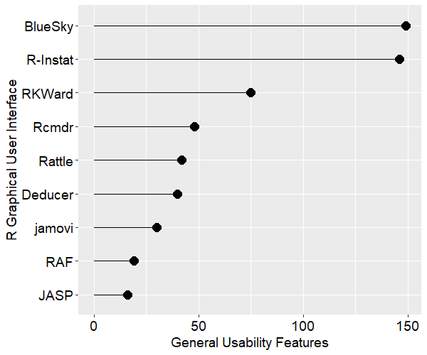
Figure 1 shows how the various GUIs compare on the average rank of the four categories. R Commander is abbreviated Rcmdr, and R AnalyticFlow is abbreviated RAF. We see that BlueSky is in the lead with R-Instat close behind. As my detailed reviews of those two point out, they are extremely different pieces of software! Rather than spend more time on this summary plot, let’s examine the four categories separately.
Figure 1. Mean of each R GUI’s ranking of the four categories. To make this plot consistent with the others below, the larger the rank, the better.
For the category of ease-of-use, I’ve defined it mostly by how well each GUI does what GUI users are looking for: avoiding code. They get one point each for being able to install, start, and use the GUI to its maximum effect, including publication-quality output, without knowing anything about the R language itself. Figure two shows the result. JASP comes out on top here, with jamovi and BlueSky right behind.
Figure 2. The number of ease-of-use features that each GUI has.
Figure 3 shows the general usability features each GUI offers. This category is dominated by data-wrangling capabilities, where data scientists and statisticians spend most of their time. This category also includes various types of data input and output. BlueSky and R-Instat come out on top not just due to their excellent selection of data wrangling features but also due to their use of the rio package for importing and exporting files. The rio package combines the import/export capabilities of many other packages, and it is easy to use. I expect the other GUIs will eventually adopt it, raising their scores by around 40 points. JASP shows up at the bottom of this plot due to its philosophy of encouraging users to prepare the data elsewhere before importing it into JASP.
Figure 3. Number of general usability features for each GUI.
Figure 4 shows the number of graphics features offered by each GUI. R-Instat has a solid lead in this category. In fact, this underestimates R-Instat’s ability if you…
I have recently updated my detailed reviews of Graphical User Interfaces (GUIs) for R, so it’s time for another comparison post. It’s not too difficult to rank them based on the number of features they offer, so let’s start there. I’m basing the counts on the number of dialog boxes in each category of four categories:
Ease of Use
General Usability
Graphics
Analytics
This is trickier data to collect than you might think. Some software has fewer menu choices, depending instead on more detailed dialog boxes. Studying every menu and dialog box is very time-consuming, but that is what I’ve tried to do. I’m putting the details of each measure in the appendix so you can adjust the figures and create your own categories. If you decide to make your own graphs, I’d love to hear from you in the comments below.
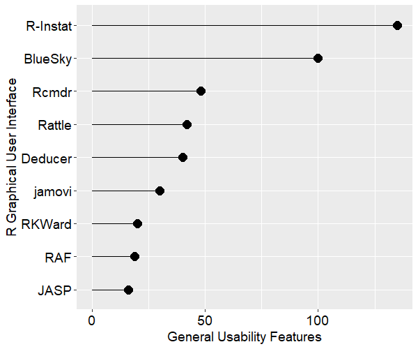
Figure 1 shows how the various GUIs compare on the average rank of the four categories. R Commander is abbreviated Rcmdr, and R AnalyticFlow is abbreviated RAF. We see that BlueSky (User Guide online here) and R-Instat are nearly tied for the lead. As my detailed reviews of those two point out, they are extremely different pieces of software! Rather than spend more time on this summary plot, let’s examine the four categories separately.
Figure 1. Mean of each R GUI’s ranking of the four categories. To make this plot consistent with the others below, the larger the rank, the better.
For the category of ease-of-use, I’ve defined it mostly by how well each GUI does what GUI users are looking for: avoiding code. They get one point each for being able to install, start, and use the GUI to its maximum effect, including publication-quality output without having to know anything about the R language itself. Figure two shows the result. JASP comes out on top here, with jamovi and BlueSky right behind.
Figure 2. The number of ease-of-use features that each GUI has.
Figure 3 shows the general usability features each GUI offers. This category is dominated by data-wrangling capabilities, where data scientists and statisticians spend the majority of their time. This category also includes various types of data input and output. R-Instat comes out on top not just due to its excellent selection of data wrangling features, but also due to its use of the rio package for importing and exporting files. The rio package combines the import/export capabilities of many other packages and it is easy to use. I expect the other GUIs will eventually adopt it, raising their scores by around 40 points. JASP shows up at the bottom on this plot due to its philosophy of encouraging users to prepare the data elsewhere before importing it into JASP.
Figure 3. Number of general usability features for each GUI.
Figure 4 shows the number of graphics features offered by each GUI. R-Instat has a solid lead in this category. In fact, this is actually an underestimate of R-Instat’s ability if you include its options to layer any “geom” on top of any graph. However, that requires knowing what the geoms are and how to use them. That’s knowledge of R code, of course.
When studying these graphs, it’s important to consider the difference between the relative and absolute performance. For example, relatively speaking, JASP and R Commander are not doing well here, but they do offer over 25 types of plots! That absolute figure might be fine for your needs.
Figure 4. Number of graphics features offered by each GUI.
Finally, we get to what is, for many people, the main reason for using this type of software: analytics. Figure 5 shows how the GUIs compare on the number of statistics, machine learning, and artificial intelligence methods. Here R Commander shows, well, a “commanding” lead! This GUI has been around the longest, and so has had more time for people to contribute to its capabilities. If you read an earlier version of this article, R Commander was not as dominant. That was due to the fact that I had not yet taken the time necessary to load and study every one of its 42 add-ons. That required a substantial amount of time, and these updated figures reflect a more complete view of its capabilities.
Again, it’s worth considering the absolute values on the x-axis. JASP and jamovi are in the middle of the pack, but they both have nearly 200 methods. If that is sufficient for your needs, you can then focus on the other categories.
Many important details are buried in these simple counts. For example, I enjoy using jamovi for statistical analyses, but it currently lacks machine learning and artificial intelligence. I like BlueSky too, but it doesn’t yet do any Bayesian statistics (jamovi and JASP do). Rattle comes out near the bottom due to its focus on machine learning, but it does an excellent job of introducing students to that area.
Figure 5. Number of analytics features offered by each GUI.
Overview of Each R GUI
The above plots help show us overall feature sets, but each package offers methods that the others lack. Let’s look at a brief overview of each. Remember that each of these has a detailed review that follows my standard template. I present them in alphabetical order.
BlueSky Statistics – This software was created by former SPSS employees and it shares many of SPSS’ features. BlueSky is only a few years old, and it converted from commercial to open source mid-way through 2018. Its developers have been adding features at a rapid rate. When using BlueSky, it’s not initially apparent that R is involved at all. Unless you click the code button “</>” included in every dialog box, you’ll never see the R code. If you’re wanting to learn R code, seeing what BlueSky uses for each step can help. BlueSky saves the dialog settings for every step, providing GUI-based reproducibility. For R code, it uses the popular, but controversial, tidyverse style while most of the other GUIs use base R functions. BlueSky’s output is in publication-quality tables which follow the popular style of the American Psychological Association. It’s stronger than most of the others at AI/ML and psychometrics. It is now available for Windows and Mac (previous versions were Windows-only).
Deducer – This has a very nice-looking interface, and it’s probably the first R GUI to offer output in true APA-style word processing tables. Being able to just cut and paste a table into your word processor saves a lot of time and it’s a feature that has been copied by several others. Deducer was released in 2008, and when I first saw it, I thought it would quickly gain developers. It got a few, but development seems to have halted. Deducer’s installation is quite complex, and it depends on the troublesome Java software. It also uses JGR, which never became as popular as the similar RStudio. The main developer, Ian Fellows, has moved on to another interesting GUI project called Vivid. I ran this most recently in February, 2022, and the output had many odd characters in it, perhaps due to a lack of support for Unicode.
jamovi– The developers who form the core of the jamovi project used to be part of the JASP team. Despite the fact that they started a couple of years later, they’re ahead of JASP in several ways at the moment. Its developers decided that the R code it used should be visible and any R code should be executable, features that differentiated it from JASP. jamovi has an extremely interactive interface that shows you the result of every selection in each dialog box (JASP does too). It also saves the settings in every dialog box, and lets you re-use every step on a new dataset by saving a “template.” That’s extremely useful since GUI users often prefer to avoid learning R code. jamovi’s biggest weakness is its dearth of data management featues, though there are plans to address that. The most recent version of jamovi borrowed the Bayesian analysis methods from JASP, making those two tied as the leaders in that approach. jamovi can help you learn R code by showing what it does at each step, though it uses its own functions from the jmv package. While those functions are not standard R, they do combine the capability of many R functions in each one.
JASP– The biggest advantage JASP offers is its emphasis on Bayesian analysis. If that’s your preference, this might be the one for you. Another strength is JASP’s Machine Learning module. At the moment JASP is very different from all the other GUIs reviewed here because it can’t show you the R code it’s writing. The development team plans to address that issue, but it has been planned for a couple of years now, so it must not be an easy thing to add.
R AnalyticFlow – This is unique among R GUIs as it is the only one that lets you organize your analyses using flowchart-like workflow diagrams. That approach makes it easy to visualize what a complex analysis is doing and to rerun it. It writes very clean base R code and provides easy access to the powerful lattice graphics package. It also supports the ggplot2 graphics package, but only through its more limited quickplot function. R AnalyticFlow also lets you extend its capability making it easier for R power users to interact with non-programmers. However, it has some serious limitations. Its set of analytic and graphical methods is quite sparse. It also lacks the important advantage that most workflow-based tools have: the ability to re-use the workflow on a new dataset by changing only the data input nodes. Since each node requires the name of the dataset used, you must change it in each location.
Rattle– If your work involves ML/AI (a.k.a. data mining) instead of standard statistical methods, Rattle may be the GUI for you. It’s focused on ML/AI, and its tabbed-based interface makes quick work of it. However, it’s the weakest of them all when it comes to statistical analysis. It also lacks many standard data management features.
R Commander – This is the oldest GUI, having been around since at least 2005. There are an impressive 42 add-ons developed for it. It is currently one of only three R GUIs that saves R Markdown files (the others being BlueSky and RKWard), but it does not create word processing tables by default, as some of the others do. The R code it writes is classic, rarely using the newer tidyverse functions. It works as a partner to R; you install R separately, then use it to install and start R Commander. R Commander makes it easy to blend menu-based analysis with coding. If your goal is to learn to code using base R, this is an excellent choice. The software’s main developer, John Fox, told me in January 2022 that he has no future development plans for R Commander. However, others can still extend its feature set by writing add-ons.
R-Instat – This offers one of the most extensive collections of data wrangling, graphics, and statistical analysis methods of any R GUI. At a basic level, its graphics dialogs are easy to use, and it offers powerful multi-layer support for people who are familiar with the ggplot2 package’s geom functions. To use its full modeling capabilities, you need to know what R’s packages (e.g. MASS) are and what each one’s functions (e.g. rlm) do. For an R programmer, recognizing a known package::function combination is much easier than recalling it without assistance. Such a user would find R-Instat’s GUI extremely helpful.
RKWard– This GUI blends a nice point-and-click interface with an integrated development environment (IDE) that is the most advanced of all the other GUIs reviewed here. It’s easy to install and start, and it saves all your dialog box settings, allowing you to rerun them. However, that’s done step-by-step, not all at once as jamovi’s templates allow. The code RKWard creates is classic R, with no tidyverse at all. RKWard is one of only three R GUIs that supports R Markdown.
Conclusion
I hope this brief comparison will help you choose the R GUI that is right for you. Each offers unique features that can make life easier for non-programmers. Instructors of introductory classes in statistics or ML/AI should find these enable their students to focus on the material rather than on learning the R language. If one catches your eye, don’t forget to read the full review of it here.
Acknowledgements
Writing this set of reviews has been a monumental undertaking. It would not have been possible without the assistance of Bruno Boutin, Anil Dabral, Ian Fellows, John Fox, Thomas Friedrichsmeier, Rachel Ladd, Jonathan Love, Ruben Ortiz, Danny Parsons, Christina Peterson, Josh Price, David Stern, Roger Stern, and Eric-Jan Wagenmakers, and Graham Williams.
Appendix: Guide to Scoring
The four categories are defined by the following. The yes/no items get scored 1 for yes, and 0 for no. The “how many” items consist of simple unweighted counts of the number of features, e.g., the number of file types a package can import without relying on R code. I used to plot the total number of features, but that is now dominated by the large values for analytics features, making that total fairly redundant.
Category
Feature
BlueSky
Deducer
Jasp
jamovi
RAF
Rattle
Rcmdr
R-Instat
RKWard
Ease_of_Use
Installs without the use of R
1.00
0.00
1.00
1.00
0.00
0.00
0.00
1.00
1.00
Ease_of_Use
Starts without the use of R
1.00
1.00
1.00
1.00
1.00
0.00
0.00
1.00
1.00
Ease_of_Use
Remembers recent files
0.00
1.00
1.00
1.00
1.00
0.00
0.00
1.00
1.00
Ease_of_Use
Hides R code by default
1.00
1.00
1.00
1.00
0.00
0.00
0.00
0.00
1.00
Ease_of_Use
Use its full capability without using R
1.00
1.00
1.00
1.00
0.00
1.00
1.00
0.00
1.00
Ease_of_Use
Data Editor
1.00
1.00
0.00
1.00
1.00
0.00
1.00
1.00
1.00
Ease_of_Use
Reuse the entire workflow without using R
1.00
0.00
1.00
1.00
0.00
0.00
0.00
0.00
1.00
Ease_of_Use
Pub-quality tables w/out R code steps
1.00
1.00
1.00
1.00
0.00
0.00
0.00
0.00
0.00
Ease_of_Use
Hides field-specific menus initially
0.00
1.00
1.00
1.00
0.00
0.00
1.00
0.00
0.00
Ease_of_Use
Table of Contents to ease navigation
0.00
0.00
1.00
0.00
0.00
0.00
0.00
0.00
1.00
Ease_of_Use
Easy to move blocks of output
1.00
0.00
1.00
0.00
0.00
0.00
0.00
0.00
0.00
Ease_of_Use
Easy to repeat any step by groups
1.00
0.00
0.00
0.00
0.00
0.00
0.00
0.00
0.00
General_Features
Operating Systems (how many)
2.00
3.00
4.00
4.00
3.00
3.00
3.00
1.00
3.00
General_Features
Import Data File Types (how many)
7.00
15.00
6.00
6.00
1.00
9.00
7.00
31.00
5.00
General_Features
Import Database (how many)
5.00
0.00
0.00
0.00
0.00
1.00
0.00
1.00
0.00
General_Features
Export Data File Types (how many)
5.00
7.00
1.00
5.00
1.00
1.00
3.00
20.00
3.00
General_Features
Multiple Data Files Open at Once
1.00
1.00
0.00
0.00
0.00
0.00
0.00
1.00
0.00
General_Features
Multiple Output Windows
1.00
0.00
0.00
0.00
0.00
0.00
0.00
0.00
0.00
General_Features
Multiple Code Windows
0.00
0.00
0.00
0.00
0.00
0.00
0.00
0.00
0.00
General_Features
Variable Metadata View
1.00
1.00
0.00
1.00
0.00
0.00
0.00
1.00
1.00
General_Features
Variable Search in Dialogs
0.00
1.00
0.00
1.00
0.00
0.00
0.00
0.00
0.00
General_Features
Variable Filtering (limit vars shown in data and dialogs)
R-Instat is a free and open source graphical user interface for the R software that focuses on people who want to point-and-click their way through data science analyses. Written in Visual Basic, it is currently only available for Microsoft Windows. However, a Linux version is in development using the cross-platform Mono implementation of the .NET framework.This post is one of a series of reviews that aim to help non-programmers choose the Graphical User Interface (GUI) that is best for them. Although I wrote the BlueSky User’s Guide, I hope to remain objective in these reviews. There is no one perfect user interface for everyone; each GUI for R has features that appeal to a different set of people.
Terminology
There are various definitions of user interface types, so here’s how I’ll be using these terms:GUI = Graphical User Interface using menus and dialog boxes to avoid having to type programming code. I do not include any assistance for programming in this definition. So, GUI users are people who prefer using a GUI to perform their analyses. They don’t have the time or inclination to become good programmers.
IDE = Integrated Development Environment which helps programmers write code. I do not include point-and-click style menus and dialog boxes when using this term. IDE users are people who prefer to write R code to perform their analyses.
Installation
The various user interfaces available for R differ quite a lot in how they’re installed. Some, such as jamovi or RKWard, install in a single step. Others, such as Deducer, install in multiple steps (up to seven steps, depending on your needs). Advanced computer users often don’t appreciate how lost beginners can become while attempting even a simple installation. The HelpDesks at most universities are flooded with such calls at the beginning of each semester!
R-Instat is easy to install, requiring only a single step. It provides its own embedded copy of R. This simplifies the installation and ensures complete compatibility between R-Instat and the version of R it’s using. However, it also means if you already have R installed, you’ll end up with a second copy. You can have R-Instat control any version of R you choose, but if the version differs too much, you may run into occasional problems.
Plug-in Modules
When choosing a GUI, one of the most fundamental questions is: what can it do for you? What the initial software installation of each GUI gets you is covered in the Graphics, Analysis, and Modeling sections of this series of articles. Regardless of what comes built-in, it’s good to know how active the development community is. They contribute “plug-ins” that add new menus and dialog boxes to the GUI. This level of activity ranges from very low (RKWard, Rattle, Deducer) through medium (JASP 15) to high (jamovi 43, R Commander 43).
While the R-Instat project welcomes contributions from anyone, there are not any modules to add at this time. All of its capabilities are included in its initial installation.
Startup
Some user interfaces for R, such as jamovi or JASP, start by double-clicking on a single icon, which is great for people who prefer to not write code. Others, such as R commander and JGR, have you start R, then load a package from your library, and then finally call a function. That’s better for people looking to learn R, as those are among the first tasks they’ll have to learn anyway.
You start R-Instat directly by double-clicking its icon from your desktop or choosing it from your Start Menu (i.e., not from within R).
Data Editor
A data editor is a fundamental feature in data analysis software. It puts you in touch with your data and lets you get a feel for it, if only in a rough way. A data editor is such a simple concept that you might think there would be hardly any differences in how they work in different GUIs. While there are technical differences, to a beginner what matters the most are the differences in simplicity. Some GUIs, including jamovi, let you create only what R calls a data frame. They use more common terminology and call it a data set: you create one, you save one, later you open one, then you use one. Others, such as RKWard trade this simplicity for the full R language perspective: a data set is stored in a workspace. So the process goes: you create a data set, you save a workspace, you open a workspace, and choose a data set from within it.
R-Instat starts up by showing its screen (Fig. 1). Under Start, I chose “New Data Frame” and it showed me the rather perplexing dialog shown in Fig. 2.
Figure 1. The R-Instat startup screen.
As an R user, I know what expressions are, but what did the R-Instat designers mean by the term?
Figure 2. The New Dataframe dialog.
Clicking the “Construct Examples” button brought up the suggestions shown in Fig. 3. These are standard R expressions, which came as quite a surprise! It seems that the R-Instat designers are wanting to get people to start using R programming code immediately.
Figure 3. Examples R-Instat provides for expression you can use to create a dataset.
Clicking the Help button brings up the advice, “the simplest option is Empty” (the developers say this will become the default in a future version). Clicking that button brings up a simple prompt for the number of rows and columns you would like to create. After that, you’re looking at a basic spreadsheet (Fig. 4) that easily lets you enter data. As you enter data, it determines if it is numeric or character. Scientific notation is accepted, but dates are saved as character variables. Logical values (TRUE, FALSE) are recognized as such and are stored appropriately.
Right-clicking on any column allows you to convert variables to be a factor, ordered factor, numeric, logical, or character. These changes are recorded as function calls to a custom “convert_column_to_type” function for reproducibility. Such interactive changes are not usually recorded by other R GUIs. Date/time conversion is not available on that menu, as that process is trickier. Those conversions are on the “Prepare> Column Date” menu item. Other things you can do from the right-click menu are: rename, duplicate, reorder, set levels/labels, sort, and filter/remove filter.
The class of each variable is indicated by a character code that follows each variable name in parenthesis: (C) for character, (F) for factor, (O.F) for ordered factor, (D) for date, (L) for logical. When no code follows a variable name, it is numeric.
Figure 4. The R-Instat Data View (left) and Output Window (right).
The name of the dataset appears on a tab at the bottom of the Data View window. This lets you easily manage multiple datasets, an ability that is popular among professionals, but which is rarely offered in R GUIs (BlueSky and R Commander are the only others that offer it).
Once the dataset is saved, to add rows or columns you choose, “Prepare > Data Frame > Insert rows/columns” to add new rows or columns at any position in the data frame. New columns can be added with a specified default value, which can be a big time-saver when entering blocks of related data.
There is a quicker method that works for inserting new rows. You right-click the row numbers and a pop-up menu will allow you to insert rows above or below, and the number of rows selected is the number of rows added – like in Excel.
When editing data, R-Instat lets you type new values on top of the old. As soon as you press the Enter key, it generates R code to execute the change. For example, in a language variable, when changing the value “English” to “Spanish,” it wrote,
Replace Value in Data
data_book$replace_value_in_data(data_name="wakefield", col_name="Language", rows="78", new_value="Spanish")
This is important for reproducibility, but R-Instat is the only GUI reviewed here that tracks such important manual changes. In fact, even among expensive proprietary software, Stata is the only one that I’m aware of that keeps track of such changes using code.
If you have another data set to enter, you can restart the process by choosing “File> New Data…” again. You can change data sets simply by clicking on its tab, and its window will pop to the front for you to see. When doing analyses, or saving data, the data set that is displayed in the editor does not influence what appears in dialog boxes. That means that you can be looking at one dataset while analyzing another! Since each dialog allows you to choose the dataset to use, that is technically not a problem, but if you have several datasets that contain the same variable names, remember that what you see may not be what you get! That’s the opposite of BlueSky Statistics, which automatically analyzes the dataset you see. R-Instat’s ability to work with multiple datasets in a single instance of the software is not a feature found in all R GUIs. For example, jamovi and JASP can only work with a single dataset at a time.
Saving the data is done with a fairly standard “File> Save As> Save Dataset As” menu. By default it will save all open datasets, filters, graphs, and models to a single file called a “data book.” That makes working with complex projects much easier to open and close.
Data Import
R-Instat supports the following file formats, most of which are automatically opened using “File> Import from File”. The ODK and NetCDF file formats have their own Import menus. R-Instat’s ability to open many formats related to climate science hints at what the software excels at. For details, see the Analysis Methods section below.
Comma Separated Values (.csv)
Plain text files (.txt)
Excel (old and new xls file types)
xBASE database files (dBase, etc.)
SPSS (.sav)
SAS binary files (sas7bdat and *.xpt)
Standard R workspace files (RData, but it just opens one dataframe of its choosing)
BlueSky Statistics is an easy-to-use menu system that uses the R language to do all its work. My detailed review of BlueSky is available here, and a brief comparison of the various menu systems for R is here. I’ve just released the BlueSky Statistics 7.1 User Guide in printed form on the world’s largest independent bookstore, Lulu.com. A description and detailed table of contents are available here.
Cover design by Kiran Rafiq.
I’ve also released the BlueSky Statistics 7.1 Intro Guide. It is a complete subset of the User Guide, and you can download it for free here (if you have trouble downloading it, your company may have security blocking Microsoft OneDrive; try it at home). Its description and table of contents are here, and soon you will also be able to purchase a printed copy of it from Lulu.com.
Cover design by Kiran Rafiq.
I’m enthusiastic about getting feedback on these books. If you have comments or suggestions, please send them to me at muenchen.bob at gmail dot com.
Publishing with Lulu.com has been a very pleasant experience. They put the author in complete control, making one responsible for every detail of the contents, obtaining reviewers, creating a cover file that includes the front, back, and spine of the book to match the dimensions of the book (e.g. more pages means wider spine, etc.) Advertising is left up to the writer as well, hence this blog post! If you are thinking about writing a book, I highly recommend both Lulu.com and getting a cover design from 99designs.com. The latter let me run a contest in which a dozen artists submitted several ideas each. Their built-in survey system let me ask many colleagues for their opinions to help me decide. Altogether, it was a very interesting experience.
To follow the progress of these and other R related books, subscribe to my blog, or follow me on Twitter.
The BlueSky Statistics graphical user interface (GUI) for the R language has added quite a few new features (described below). I’m also working on a BlueSky User Guide, a draft of which you can read about and download here. [Update: don’t download that, get the full Intro Guide download instead.] Although I’m spending a lot of time on BlueSky, I still plan to be as obsessive as ever about reviewing all (or nearly all) of the R GUIs, which is summarized here.
The new data management features in BlueSky are:
Date Order Check — this lets you quickly check across the dates stored in many variables, and it reports if it finds any rows whose dates are not always increasing from left to right.
Find Duplicates – generates a report of duplicates and saves a copy of the data set from which the duplicates are removed. Duplicates can be based on all variables, or a set of just ID variables.
Select First/Last Observation per Group – finding the first or last observation in a group can create new datasets from the “best” or “worst” case in each group, find the most current record, and so on.
Model Fitting / Tuning
One of the more interesting features in BlueSky is its offering of what they call Model Fitting and Model Tuning. Model Fitting gives you direct control over the R function that does the work. That provides precise control over every setting, and it can teach you the code that the menus create, but it also means that model tuning is up to you to do. However, it does standardize scoring so that you do not have to keep up with the wide range of parameters that each of those functions need for scoring. Model Tuning controls models through the caret package, which lets you do things like K-fold cross-validation and model tuning. However, it does not allow control over every model setting.
New Model Fitting menu items are:
Cox Proportional Hazards Model: Cox Single Model
Cox Multiple Models
Cox with Formula
Cox Stratified Model
Extreme Gradient Boosting
KNN
Mixed Models
Neural Nets: Multi-layer Perceptron
NeuralNets (i.e. the package of that name)
Quantile Regression
There are so many Model Tuning entries that it’s easier to just paste in the list I updated on the main BlueSkly review that I updated earlier this morning:
Model Tuning: Adaboost Classification Trees
Model Tuning: Bagged Logic Regression
Model Tuning: Bayesian Ridge Regression
Model Tuning: Boosted trees: gbm
Model Tuning: Boosted trees: xgbtree
Model Tuning: Boosted trees: C5.0
Model Tuning: Bootstrap Resample
Model Tuning: Decision trees: C5.0tree
Model Tuning: Decision trees: ctree
Model Tuning: Decision trees: rpart (CART)
Model Tuning: K-fold Cross-Validation
Model Tuning: K Nearest Neighbors
Model Tuning: Leave One Out Cross-Validation
Model Tuning: Linear Regression: lm
Model Tuning: Linear Regression: lmStepAIC
Model Tuning: Logistic Regression: glm
Model Tuning: Logistic Regression: glmnet
Model Tuning: Multi-variate Adaptive Regression Splines (MARS via earth package)
Model Tuning: Naive Bayes
Model Tuning: Neural Network: nnet
Model Tuning: Neural Network: neuralnet
Model Tuning: Neural Network: dnn (Deep Neural Net)
Model Tuning: Neural Network: rbf
Model Tuning: Neural Network: mlp
Model Tuning: Random Forest: rf
Model Tuning: Random Forest: cforest (uses ctree algorithm)
Graphical User Interfaces (GUIs) for the R language help beginners get started learning R, help non-programmers get their work done, and help teams of programmers and non-programmers work together by turning code into menus and dialog boxes. There has been quite a lot of progress on R GUIs since my last post on this topic. Below I describe some of the features added to several R GUIs.
BlueSky Statistics
BlueSky Statistics has added mixed-effects linear models. Its dialog shows an improved model builder that will be rolled out to the other modeling dialogs in future releases. Other new statistical methods include quantile regression, survival analysis using both Kaplan-Meier and Cox Proportional Hazards models, Bland-Altman plots, Cohen’s Kappa, Intraclass Correlation, odds ratios and relative risk for M by 2 tables, and sixteen diagnostic measures such as sensitivity, specificity, PPV, NPV, Youden’s Index, and the like. The ability to create complex tables of statistics was added via the powerful arsenal package. Some examples of the types of tables you can create with it are shown here.
Several new dialogs have been added to the Data menu. The Compute Dummy Variables dialog creates dummy (aka indicator) variables from factors for use in modeling. That approach offers greater control over how the dummies are created than you would have when including factors directly in models.
A new Factor Levels menu item leads to many of the functions from the forcats package. They allow you to reorder factor levels by count, by occurrence in the dataset, by functions of another variable, allow you to lump low-frequency levels into a single “Other” category, and so on. These are all helpful in setting the order and nature of, for example, bars in a plot or entries in a table.
The BlueSky Data Grid now has icons that show the type of variable i.e. factor, ordered factor, string, numeric, date or logical. The Output Viewer adds icons to let you add notes to the output (not full R Markdown yet), and a trash can icon lets you delete blocks of output.
A comprehensive list of the changes to this release is located here and my updated review of it is here.
jamovi
New modules expand jamovi’s capabilities to include time-based survival analysis, Bland-Altman analysis & plots, behavioral change analysis, advanced mediation analysis, differential item analysis, and quantiles & probabilities from various continuous distributions.
jamovi’s new Flexplot module greatly expands the types of graphs it can create, letting you take a single graph type and repeat it in rows and/or columns making it easy to visualize how the data is changing across groups (called facet, panel, or lattice plots).
You can read more about Flexplot here, and my recently-updated review of jamovi is here.
JASP
The JASP package has added two major modules, machine learning, and network analysis. The machine learning module includes boosting, K-nearest neighbors, and random forests for both regression and classification problems. For regression, it also adds regularized linear regression. For clustering, it covers hierarchical, K-means, random forest, density-based, and fuzzy C-means methods. It can generate models and add predictions to your dataset, but it still cannot save models for future use. The main method it is missing is a single decision tree model. While less accurate predictors, a simple tree model can often provide insight that is lacking from other methods.
Another major addition to JASP is Network Analysis. It helps you to study the strengths of interactions among people, cell phones, etc. With so many people working from home during the Coronavirus pandemic, it would be interesting to see what this would reveal about how our patterns of working together have changed.
A really useful feature in JASP is its Data Library. It greatly speeds your ability to try out a new feature by offering a completely worked-out example including data. When trying out the network analysis feature, all I had to do was open the prepared example to see what type of data it would use. With most other data science software, you’re left to dig about in a collection of datasets looking for a good one to test a particular analysis. Nicely done!
I’ve updated my full review of JASP, which you can read here.
RKWard
The main improvement to the RKWard GUI for R is adding support for R Markdown. That makes it the second GUI to support R Markdown after R Commander. Both the jamovi and BlueSky teams are headed that way. RKWard’s new live preview feature lets you see text, graphics, and markdown as you work. A comprehensive list of new features is available here, and my full review of it is here.
Conclusion
R GUIs are gaining features at a rapid pace, quickly closing in on the capabilities of commercial data science packages such as SAS, SPSS, and Stata. I encourage R GUI users to contribute their own additions to the menus and dialog boxes of their favorite(s). The development teams are always happy to help with such contributions. To follow the progress of these and other R GUIs, subscribe to my blog, or follow me on twitter.
Data science is being used in many ways to improve healthcare and reduce costs. We have written a textbook, Introduction to Biomedical Data Science, to help healthcare professionals understand the topic and to work more effectively with data scientists. The textbook content and data exercises do not require programming skills or higher math. We introduce open source tools such as R and Python, as well as easy-to-use interfaces to them such as BlueSky Statistics, jamovi, R Commander, and Orange. Chapter exercises are based on healthcare data, and supplemental YouTube videos are available in most chapters.
For instructors, we provide PowerPoint slides for each chapter, exercises, quiz questions, and solutions. Instructors can download an electronic copy of the book, the Instructor Manual, and PowerPoints after first registering on the instructor page.
The book is available in print
and various electronic formats. Because it is self-published, we plan to update it more rapidly than would be
possible through traditional publishers.
Below you will find a detailed table of contents and a list
of the textbook authors.
Table of Contents
OVERVIEW OF BIOMEDICAL DATA SCIENCE
Introduction
Background and history
Conflicting perspectives
the statistician’s perspective
the machine learner’s perspective
the database administrator’s perspective
the data visualizer’s perspective
Data analytical processes
raw data
data pre-processing
exploratory data analysis (EDA)
predictive modeling approaches
types of models
types of software
Major types of analytics
descriptive analytics
diagnostic analytics
predictive analytics (modeling)
prescriptive analytics
putting it all together
Biomedical data science tools
Biomedical data science education
Biomedical data science careers
Importance of soft skills in data science
Biomedical data science resources
Biomedical data science challenges
Future trends
Conclusion
References
SPREADSHEET TOOLS AND TIPS
Introduction
basic spreadsheet functions
download the sample spreadsheet
Navigating the worksheet
Clinical application of spreadsheets
formulas and functions
filter
sorting data
freezing panes
conditional formatting
pivot tables
visualization
data analysis
Tips and tricks
Microsoft Excel shortcuts – windows users
Google sheets tips and tricks
Conclusions
Exercises
References
BIOSTATISTICS PRIMER
Introduction
Measures of central tendency & dispersion
the normal and log-normal distributions
Descriptive and inferential statistics
Categorical data analysis
Diagnostic tests
Bayes’ theorem
Types of research studies
observational studies
interventional studies
meta-analysis
orrelation
Linear regression
Comparing two groups
the independent-samples t-test
the wilcoxon-mann-whitney test
Comparing more than two groups
Other types of tests
generalized tests
exact or permutation tests
bootstrap or resampling tests
Stats packages and online calculators
commercial packages
non-commercial or open source packages
online calculators
Challenges
Future trends
Conclusion
Exercises
References
DATA VISUALIZATION
Introduction
historical data visualizations
visualization frameworks
Visualization basics
Data visualization software
Microsoft Excel
Google sheets
Tableau
R programming language
other visualization programs
Visualization options
visualizing categorical data
visualizing continuous data
Dashboards
Geographic maps
Challenges
Conclusion
Exercises
References
INTRODUCTION TO DATABASES
Introduction
Definitions
A brief history of database models
hierarchical model
network model
relational model
Relational database structure
Clinical data warehouses (CDWs)
Structured query language (SQL)
Learning SQL
Conclusion
Exercises
References
BIG DATA
Introduction
The seven v’s of big data related to health care data
Technical background
Application
Challenges
technical
organizational
legal
translational
Future trends
Conclusion
References
BIOINFORMATICS and PRECISION MEDICINE
Introduction
History
Definitions
Biological data analysis – from data to discovery
Biological data types
genomics
transcriptomics
proteomics
bioinformatics data in public repositories
biomedical cancer data portals
Tools for analyzing bioinformatics data
command line tools
web-based tools
Genomic data analysis
Genomic data analysis workflow
variant calling pipeline for whole exome sequencing data
quality check
alignment
variant calling
variant filtering and annotation
downstream analysis
reporting and visualization
Precision medicine – from big data to patient care
Examples of precision medicine
Challenges
Future trends
Useful resources
Conclusion
Exercises
References
PROGRAMMING LANGUAGES FOR DATA ANALYSIS
Introduction
History
R language
installing R & rstudio
an example R program
getting help in R
user interfaces for R
R’s default user interface: rgui
Rstudio
menu & dialog guis
some popular R guis
R graphical user interface comparison
R resources
Python language
installing Python
an example Python program
getting help in Python
user interfaces for Python
reproducibility
R vs. Python
Future trends
Conclusion
Exercises
References
MACHINE LEARNING
Brief history
Introduction
data refresher
training vs test data
bias and variance
supervised and unsupervised learning
Common machine learning algorithms
Supervised learning
Unsupervised learning
dimensionality reduction
reinforcement learning
semi-supervised learning
Evaluation of predictive analytical performance
classification model evaluation
regression model evaluation
Machine learning software
Weka
Orange
Rapidminer studio
KNIME
Google TensorFlow
honorable mention
summary
Programming languages and machine learning
Machine learning challenges
Machine learning examples
example 1 classification
example 2 regression
example 3 clustering
example 4 association rules
Conclusion
Exercises
References
ARTIFICIAL INTELLIGENCE
Introduction
definitions
History
Ai architectures
Deep learning
Image analysis (computer vision)
Radiology
Ophthalmology
Dermatology
Pathology
Cardiology
Neurology
Wearable devices
Image libraries and packages
Natural language processing
NLP libraries and packages
Text mining and medicine
Speech recognition
Electronic health record data and AI
Genomic analysis
AI platforms
deep learning platforms and programs
Artificial intelligence challenges
General
Data issues
Technical
Socio economic and legal
Regulatory
Adverse unintended consequences
Need for more ML and AI education
Future trends
Conclusion
Exercises
References
Authors
Brenda Griffith Technical Writer Data.World Austin, TX
Robert Hoyt MD, FACP, ABPM-CI, FAMIA Associate Clinical Professor Department of Internal Medicine Virginia Commonwealth University Richmond, VA
David Hurwitz MD, FACP, ABPM-CI Associate CMIO Allscripts Healthcare Solutions Chicago, IL
Madhurima Kaushal MS Bioinformatics Washington University at St. Louis, School of Medicine St. Louis, MO
Robert Leviton MD, MPH, FACEP, ABPM-CI, FAMIA Assistant Professor New York Medical College Department of Emergency Medicine Valhalla, NY
Karen A. Monsen PhD, RN, FAMIA, FAAN Professor School of Nursing University of Minnesota Minneapolis, MN
Robert Muenchen MS, PSTAT Manager, Research Computing Support University of Tennessee Knoxville, TN
Dallas Snider PhD Chair, Department of Information Technology University of West Florida Pensacola, FL
A special thanks to Ann Yoshihashi MD for her help with the publication of this textbook.
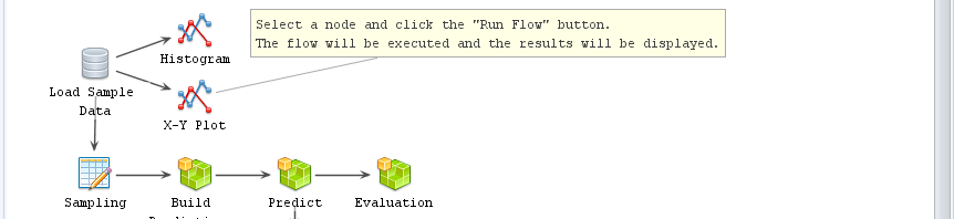
R AnalyticFlow (RAF) is a free and open source graphical user interface (GUI) for the R language that focuses on beginners looking to point-and-click their way through analyses. What sets it apart from the other half-dozen GUIs for R is that it uses a flowchart-like workflow diagram to control the analysis instead of only menus. In my first programming class back in the Pleistocene Era, my professor told us to never begin a program without doing a flowchart of what you were trying to accomplish. With workflow tools, you get the benefit of the diagram outlining the big picture, while the dialog box settings in each node control what happens at each step. In Figure 1 you can get a good idea of what is happening without any further information.
Another advantage you get with most workflow tools is the ability to reuse workflows very easily because the dataset is read in only once at the beginning. Unfortunately, most of that advantage is missing from R AnalyticFlow (hereafter, “RAF”) since you must specify which dataset is used in every node. The downside to workflow tools is that they’re slightly harder to learn than menu-based systems. This involves learning how to draw a diagram, what flows through it (e.g. datasets, models), and how to generate a single comprehensive reports for the entire analysis.
This post is one of a series of comparative reviews which aim to help non-programmers choose the GUI that is best for them. The reviews all follow a standard template to make comparisons across products easier. These reviews also include a cursory description of the programming support that each GUI offers.
Figure 1. An example workflow from R AnalyticFlow.
Terminology
There are various definitions of user interface types, so here’s how I’ll be using these terms:
GUI = Graphical User Interface using menus and dialog boxes to avoid having to type programming code. I do not include any assistance for programming in this definition. So, GUI users are people who prefer using a GUI to perform their analyses. They don’t have the time or inclination to become good programmers.
IDE = Integrated Development Environment which helps programmers write code. I do not include point-and-click style menus and dialog boxes when using this term. IDE users are people who prefer to write R code to perform their analyses.
Installation
The various user interfaces available for R differ quite a lot in how they’re installed. Some, such as BlueSky Statistics, jamovi, and RKWard, install in a single step. Others, such as Deducer, install in multiple steps (up to seven steps, depending on your needs). Advanced computer users often don’t appreciate how lost beginners can become while attempting even a simple installation. The Help Desks at most universities are flooded with such calls at the beginning of each semester!
RAF is available for Mac, and Linux. Its installation takes four steps:
Install Java, if you don’t already have it installed. This can be tricky as you must match the type of Java to the type of R you use. Most computers these days have 64-bit operating systems. Whether 32-bit or 64-bit, you must use the same “bitness” on all of these steps, or it will not work.
Next, install R if you haven’t already (available here).
Install RAF itself after downloading it from here.
Start RAF. It will prompt you to install some R packages, notably rJava. This step requires Internet access. To install if you don’t have such access, see the RAF website’s About R Packages section for important details on how to proceed (from another machine that does have Internet access, of course).
Plug-in Modules
When choosing a GUI, one of the most fundamental questions is: what can it do for you? What the initial software installation of each GUI gets you is covered in the Graphics, Analysis, and Modeling sections of this series of articles. Regardless of what comes built-in, it’s good to know how active the development community is. They contribute “plug-ins” which add new menus and dialog boxes to the GUI. This level of activity ranges from very low (RKWard, Deducer) through moderate (jamovi) to very active (R Commander).
RAF does not offer any plug-in modules, though its developers do provide instruction on how you can create your own.
Startup
Some user interfaces for R, such as BlueSky and jamovi, start by double-clicking on a single icon, which is great for people who prefer to not write code. Others, such as R Commander and JGR, have you start R, then load a package from your library, and then call a function. That’s better for people looking to learn R, as those are among the first tasks they’ll have to learn anyway.
You start RAF directly by double-clicking its icon from your desktop or choosing it from your Start Menu (i.e. not from within R itself). On my system, I had to right-click the icon and choose, “Run as Administrator” or I would get the message, “Failed to Launch R. Confirm Settings?” If I responded “Yes”, it showed the path to my installation of R, which was already correct. I tried a second computer and it did start, but when it tried to install the JavaGD and rJava packages, it said, “Warning in install.packages (c(“JavaGD”,”rJava”)) : ‘lib = “C:/Program Files/R/R-3.6.1/library” ‘ is not writable. Would you like to use a personal library instead?”
Upon startup, it displays its startup screen, shown in Figure 2. Quick Start puts you into the software with a new Flow window open. New Project starts a new workflow, and Bookmarks give you quick access to existing workflows.
Figure 2. R AnalyticFlow’s Startup Screen.
Data Editor
A data editor is a fundamental feature in data analysis software. It puts you in touch with your data and lets you get a feel for it, if only in a rough way. A data editor is such a simple concept that you might think there would be hardly any differences in how they work in different GUIs. While there are technical differences, to a beginner what matters the most are the differences in simplicity. Some GUIs, including jamovi, let you create only what R calls a data frame. They use more common terminology and call it a data set: you create one, you save one, later you open one, then you use one. Others, such as RKWard trade this simplicity for the full R language perspective: a data set is stored in a workspace. So the process goes: you create a data set, you save a workspace, you open a workspace, and choose a data set from within it.
To start entering data, choose “Input> Enter Data” and drag the selection onto the workflow editor window. An empty spreadsheet will appear (Figure 3). You can enter variable names on the first line if you check the “Header: Use 1st Row” box at the bottom of the window. This is the first hint you’ll see that RAF leans on R terminology that can be somewhat esoteric. RAF’s developers could have labeled this choice as “Column Names” but went with the R terminology of “Header” instead. This approach may be confusing for beginners, but if their goal is to learn R, it will help in the long run.
To enter factors (R’s categorical variables), choose the “Options” tab and check, “Convert Characters to Factors”, then RAF will convert the character string variables you enter to factors. Otherwise, it will leave them as characters. Dates remain stored as characters; you have to use “Processing> Set Data Type” node to change them, and they must be entered in the form yyyy-mm-dd.
Figure 3. R Analytic Flow’s data entry screen.
There is no limit to the number of rows and columns you can enter initially. However, once you choose “Run”, the data frame is created and can no longer be edited!
Saving the workflow is done with the standard “File > Save As” menu. You must save each one to its own file. To save the flow and the various objects that it uses such as data frames and models, use “Project > Export”. When receiving a project from a colleague, use “Project> Import” to begin using it.
Data Import
To analyze data, you must first read it. While many R GUIs can import a wide range of data formats such as files created by other statistics programs and databases, RAF can import only text and R objects.
RAF’s text import feature is well done. Once you select an Input File, it quickly scans the file and figures out if variable names are present, the delimiters it uses to separate the columns, and so on. It then displays a “preview” (Figure 4, bottom). It does this quickly since its preview is only on the first 100 rows of data. If the preview displays errors, you then manually change the settings and check the preview until it’s correct. When the preview looks good, you click, “Run”, it will then read all the data.
Figure 4. The Read Text File window.
Data Export
The ability to export data to a wide range of file types helps when you, or other members of your research team, have to use multiple tools to complete a task. Unfortunately, this is a very weak area for R GUIs. Deducer offers no data export at all, and R Commander, and rattle can export only delimited text files (an earlier version of this listed jamovi as having very limited data export; that has now been expanded). Only BlueSky offers a fairly comprehensive set of export options. Unfortunately, RAF falls into the former group, being able only to export data in text and R object files.
Data Management
It’s often said that 80% of data analysis time is spent preparing the data. Variables need to be transformed, recoded, or created; strings and dates need to be manipulated; missing values need to be handled; datasets need to be stacked or merged, aggregated, transposed, or reshaped (e.g. from wide to long and back). A critically important aspect of data management is the ability to transform many variables at once. For example, social scientists need to recode many survey items, biologists need to take the logarithms of many variables. Doing these types of tasks one variable at a time can be tedious. Some GUIs, such as jamovi and RKWard handle only a few of these functions. Others, such as BlueSky and the R Commander, can handle many, but not all, of them.
RAF handles a fairly basic set of data management tools:
Add/Edit Columns
Rename – Variables in a data frame)
Set Data Type
Select Rows
Select Columns
Missing Values – Sets values as missing, no imputation)
Sort
Sampling
Aggregate
Merge – Various joins
Merge – Adds rows
Manage Objects (copies, deletes, renames)
Workflows, Menus & Dialog Boxes
The goal of pointing & clicking your way through an analysis is to save time by recognizing dialog box settings rather than performing the more difficult task of recalling programming commands. Some GUIs, such as BlueSky and jamovi, make this easy by sticking to menu standards and using simpler dialog boxes; others, such as RKWard, use non-standard menus that are unique to it and hence require more learning.
RAF uses a unique interface. There are two ways to add build a workflow that guides your analysis. First, you can click on a toolbar icon, which drops down a menu. Click on a selection, and – without releasing the mouse button – drag your selection onto the flow window. In that case, the dialog box with its options opens below the flow area (Figure 3, bottom right).
The second way to use it is to click on a toolbar icon, drop down its menu, click on a selection and immediately release the mouse button. This causes the dialog box to appear floating in the middle of the screen (not shown). When you finish choosing your settings, there is a “Drag to Add” button at the top of the dialog. Clicking that button causes the dialog box to collapse into an icon which you can then drag onto the workflow surface.
Regardless of which method you choose, if you drop the new icon onto the top of one that is already in the workflow, it will move the new icon to the right and draw an arrow (called an “edge”) connecting the older one to the new. If you don’t drop it onto an icon that’s already in your workflow, you can add a connecting arrow later by clicking on the first icon, then choose “Draw Edge” and an arrow will appear aimed to the right (workflows go mostly left to right). The arrow will float around as you move your mouse, until you click on the second icon. A third way to connect the nodes in a flow is to click one icon, hold the Alt key down, then drag to the second icon.
Figure 3 shows the entire RAF window. On the top right is the workflow. Here are the steps I followed to create it:
I chose “Input> Read Text File” and dragged it onto the workflow. The icon’s settings appeared in the bottom right window.
I filled in the dialog box’s settings, then clicked “Run”. It named the icon after the file mydata.csv and a spreadsheet appeared in the upper-right.
I chose “Statistics> Cross Tabulation”, and dragged its icon onto the data icon.
I clicked the downward-facing arrow in the “Group By” box, and chose the variables. The first one I chose (workshop) formed the rows and the second (gender) formed the columns. Unlike most GUIs, there’s no indication of row and column roles.
I clicked “Run Node” at the top of the cross tabulation dialog box. The cross tabulation output appeared in the upper left window (right half). The code that RAF wrote to perform the task appears in the R Console window in the lower left.
You can run an entire flow by clicking “Run Flow” at the top left of the Flow window. While describing the process of building a workflow is tedious, learning to build one is quite easy to learn.
Figure 3. The entire R Analytic Flow window, with Cross Tabulation highlighted. In the top row are the viewer window (left) and flow window (right). In the bottom row are the R console (left) and the dialog box for the chosen icon (right). The Cross Tabulation icon is selected, so its dialog box is shown.
The goal of using a GUI is to make analysis easy, so GUI dialog boxes are usually quite simple to use and include everything that’s relevant within a single box. I looked at all the options in this dialog but could not find one to do a very common test for such a cross-tabulation table: the chi-squared test. RAF uses an aspect of R objects that ends up essentially creating two different types of dialog boxes in separate parts of its interface. R objects contain multiple bits of output. You can display them using generic R functions such as summary() and print(). The output window has radio buttons for those functions (Figure 3, right above the cross-tabulation table). Clicking the “summary” button will call R’s summary() function to display the chi-squared results where the table is currently shown. To study the pattern in the table and the chi-squared results requires clicking back and forth on Table and summary; you can’t get them to both appear on your screen at the same time.
Correlations provide another example. The statistics are shown, but their p-values are not shown until you click on the “summary” button. This approach is confusing for beginners, but good for people wishing to learn R.
A common data analysis task is repeating the same analysis across many variables. For example, you might want to repeat the above cross tabulation (or t-tests, etc.) on many variables at once. This is usually quite easy to accomplish in most GUIs, but not in RAF. Since R’s functions may not offer that ability without using R’s “apply” family of functions (or loops), and RAF does not support such functions, such simple tasks become quite a lot of work when using RAF. You need to add an node to your flow for each and every variable!
Each dialog box has an “Advanced” tab which allows you to enter the name of any R argument(s) in one column, and any value(s) you would like to pass to that argument in another. That’s a nice way to offer graphical control over common tasks, while assuring that every task a function is capable of is still available.
In a complex analysis, workflows can become quite complex and hard to read. A solution to this problem is the concept of a “metanode”. Metanodes allow you t take an entire section of your workflow and collapse it into what appears to be a single node. For example, you might commonly use eight nodes to prepare a dataset for analysis. You could combine all eight into a new node you call “Data Prep”, greatly simplifying the workflow. Unfortunately, RAF does not offer metanodes, as do other workflow-driven data science tools such as KNIME and RapidMiner.
One of the most surprising aspects of RAF’s workflow style is that every node specifies its input and output objects. That means that you can run any analysis with no connecting arrows in your diagram! Rather than be a required feature as with many workflow-based tools, in RAF they offer only the convenience of re-running an entire flow at once.
During GUI-driven analysis, the fact that R is doing the work is quite obvious as the code and any resulting messages appear in the Console window.
Documentation & Training
The only written documentation for RAF is the brief, but easy to follow, R AnalyticFlow 3 Starter Guide. Kamala Valarie has also done a 15-minute video on YouTube showing how to use RAF.
Help
R GUIs provide simple task-by-task dialog boxes that generate much more complex code. So for a particular task, you might want to get help on 1) the dialog box’s settings, 2) the custom functions it uses (if any), and 3) the R functions that the custom functions use. Nearly all R GUIs provide all three levels of help when needed. The notable exception is the R Commander, which lacks help on the dialog boxes themselves.
The level of help that RAF offers is only the built-in R help file for the particular function you’re using. However, I had problems with the help getting stuck and showing me the help file from previous tasks rather than the one I was currently using.
Graphics
The various GUIs available for R handle graphics in several ways. Some, such as R Commander and RKWard, focus on R’s built-in graphics. Others, such as BlueSky Statistics use the popular ggplot2 package. Still others, such as jamovi, use their own functions and integrate them into analysis steps.
GUIs also differ quite a lot in how they control the style of the graphs they generate. Ideally, you could set the style once, and then all graphs would follow it. That’s how BlueSky and jamovi work.
RAF uses the very flexible lattice package for all of its graphics. That makes it particularly easy to display “small multiples” of the same plot repeated by levels of another variable or two. There does not appear to be any way to control the style of the plots.
One of us (Muenchen) has been tracking The Popularity of Data Science Software using a variety of different approaches. One approach is to use Google Scholar to count the number of scholarly articles found each year for each software. He chose Google Scholar since it searches “across many disciplines and sources: articles, theses, books, abstracts, and court opinions, from academic publishers, professional societies, online repositories, universities, and other web sites.” Figure 1 shows the results from 1995 through 2016. Data collected in 2018 showed that while SPSS use dropped 39% drop from 2017 to 2018, its use was still 66% higher than R in 2018.
Figure 1. Number of citations per year for each statistics package, found by Google Scholar, from 1995 to 2016.
We see in the plot that SPSS was extremely dominant for most of that time period. Even after its precipitous decline, it still beats the rest by more than a 2 to 1 margin. Over the years, several people questioned the accuracy of Figure 1. In a time when scholarly publications are proliferating, how could SPSS use be in such decline?
One hypothesis that has often been suggested revolves around one of the most bizarre product name changes in the history of marketing. As a result of a legal battle for control of the name “SPSS”, the SPSS company changed the name of the product to “PASW”, an acronym for Predictive Analytics Software. The change made about as much sense as Coke people renaming Coke to “BSW”, for Bubbly Sugar Water. The battle was settled and in 2011 and the product name reverted back to SPSS.
Could that name change account for the apparent
decline in its use? A search on Google Scholar from 2009 to 2012 on the string:
“PASW” -“SPSS”
-“Amos”
yielded 12,000 hits. That sounds like quite a few, but when “SPSS” was substituted for “PASW” in that search, we found 701,000 references. At first glance, it seems that the scholarly use of SPSS was undercounted by 1.7%. However, when searching a vast volume of documents, each string may have problems with over-counting. For example, PASW stands for “Plant Available Soil Water” which accounts for 138 of those 12,000 articles. There may be many other such abbreviations. That’s the type of analysis Muenchen did several years ago, before concluding that PASW was more trouble than it was worth (details are here). In 2018 that search yields only 361 hits, and the title of the very first article begins with, “Projections Analysis of Surface Waves (PASW)…”
Muenchen’s hypothesis regarding the apparent decline of SPSS is that it was caused by competition. Back in 2002, SPSS shared the statistical software market with SAS and a couple of others. Its momentum carried it upward for a few more years, then the competition started chipping away at it. GraphPad Prism improved significantly with the release of its version 5 in 2007 and medical users of SPSS found an alternative that was as easy to use while focusing more on their needs. R added enough useful packages around the same time to become competitive. By now there are probably hundreds of packages that people can use to analyze data, only a few of which are shown in Figure 1.
Mackinnon remained skeptical of this hypothesis because the overall graph appears to show decreases in statistical software citation over time. This would seem to contradict evidence that the number of journal articles published has been increasing at about 3% per year over the last 3 centuries, and about 3.9% per year in the past decade (2018 STM Report, pg. 25). Thus, the total number of citations to statistical software as a collective group should be increasing concurrently with this overall increase.
Mackinnon gathered data from a different source: Scopus. According to Wikipedia, “Scopus covers nearly 36,377 titles from approximately 11,678 publishers, of which 34,346 are peer-reviewed journals in top-level subject fields: life sciences, social sciences, physical sciences, and health sciences.” Mackinnon limited the search to reference lists, reasoning that such citations are likely an indicator of using the software in the paper. Two search strings were used:
REF(“the R software” OR “the R
project” OR “r-project.org” OR “R development core”)
REF(SPSS)
These searches are being a bit generous to SPSS by including Modeler and AMOS, and very conservative for R by not including citations to common packages (e.g., ggplot2). The resulting data are plotted in Figure 2.
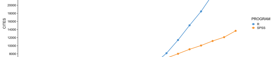
Figure 2. Number of citations per year for each statistics package, found by Scopus, from 2000 to 2018.
Above
we see that the citations of R in scholarly journals exceeded that of SPSS back
in 2012. However, the scale of Figure 2 tops out at 30,000 while Figure 1’s
scale peaks at 300,000. Google is finding a lot more documents! So, which of
these software packages is used the most in scholarly work? Good question! We would like to hear your comments below,
especially from readers who collect data from other sources.