See BlueSky Statistics GUI for R at JSM 2023

Are attending this year’s Joint Statistical Meetings in Toronto? If so, stop by booth 404 to see the latest features of BlueSky Statistics. A menu-based graphical user interface for the R language, BlueSky lets people access the power of R without having to learn to program. Programmers can easily add code to BlueSky’s menus, sharing their expertise with non-programmers. My detailed review of BlueSky is here, a brief comparison to other R GUIs is here, and the BlueSky User Guide is here. I hope to see you in Toronto!

Update to Data Science Software Popularity

I’ve updated The Popularity of Data Science Software‘s market share estimates based on scholarly articles. I posted it below, so you don’t have to sift through the main article to read the new section.

Scholarly Articles

Scholarly articles provide a rich source of information about data science tools. Because publishing requires significant effort, analyzing the type of data science tools used in scholarly articles provides a better picture of their popularity than a simple survey of tool usage. The more popular a software package is, the more likely it will appear in scholarly publications as an analysis tool or even as an object of study.

Since scholarly articles tend to use cutting-edge methods, the software used in them can be a leading indicator of where the overall market of data science software is headed. Google Scholar offers a way to measure such activity. However, no search of this magnitude is perfect; each will include some irrelevant articles and reject some relevant ones. The details of the search terms I used are complex enough to move to a companion article, How to Search For Data Science Articles.  

Figure 2a shows the number of articles found for the more popular software packages and languages (those with at least 4,500 articles) in the most recent complete year, 2022.

Figure 2a. The number of scholarly articles found on Google Scholar for data science software. Only those with more than 4,500 citations are shown.

SPSS is the most popular package, as it has been for over 20 years. This may be due to its balance between power and its graphical user interface’s (GUI) ease of use. R is in second place with around two-thirds as many articles. It offers extreme power, but as with all languages, it requires memorizing and typing code. GraphPad Prism, another GUI-driven package, is in third place. The packages from MATLAB through TensorFlow are roughly at the same level. Next comes Python and Scikit Learn. The latter is a library for Python, so there is likely much overlap between those two. Note that the general-purpose languages: C, C++, C#, FORTRAN, Java, MATLAB, and Python are included only when found in combination with data science terms, so view those counts as more of an approximation than the rest. Old stalwart FORTRAN appears last in this plot. While its count seems close to zero, that’s due to the wide range of this scale, and its count is just over the 4,500-article cutoff for this plot.

Continuing on this scale would make the remaining packages appear too close to the y-axis to read, so Figure 2b shows the remaining software on a much smaller scale, with the y-axis going to only 4,500 rather than the 110,000 used in Figure 2a. I chose that cutoff value because it allows us to see two related sets of tools on the same plot: workflow tools and GUIs for the R language that make it work much like SPSS.

Figure 2b. Number of scholarly articles using each data science software found using Google Scholar. Only those with fewer than 4,500 citations are shown.

JASP and jamovi are both front-ends to the R language and are way out front in this category. The next R GUI is R Commander, with half as many citations. Still, that’s far more than the rest of the R GUIs: BlueSky Statistics, Rattle, RKWard, R-Instat, and R AnalyticFlow. While many of these have low counts, we’ll soon see that the use of nearly all is rapidly growing.

Workflow tools are controlled by drawing 2-dimensional flowcharts that direct the flow of data and models through the analysis process. That approach is slightly more complex to learn than SPSS’ simple menus and dialog boxes, but it gets closer to the complete flexibility of code. In order of citation count, these include RapidMiner, KNIME, Orange Data Mining, IBM SPSS Modeler, SAS Enterprise Miner, Alteryx, and R AnalyticFlow. From RapidMiner to KNIME, to SPSS Modeler, the citation rate approximately cuts in half each time. Orange Data Mining comes next, at around 30% less. KNIME, Orange, and R Analytic Flow are all free and open-source.

While Figures 2a and 2b help study market share now, they don’t show how things are changing. It would be ideal to have long-term growth trend graphs for each software, but collecting that much data is too time-consuming. Instead, I’ve collected data only for the years 2019 and 2022. This provides the data needed to study growth over that period.

Figure 2c shows the percent change across those years, with the growing “hot” packages shown in red (right side) and the declining or “cooling” ones shown in blue (left side).

Figure 2c. Change in Google Scholar citation rate from 2019 to the most recent complete year, 2022. BlueSky (2,960%) and jamovi (452%) growth figures were shrunk to make the plot more legible.

Seven of the 14 fastest-growing packages are GUI front-ends that make R easy to use. BlueSky’s actual percent growth was 2,960%, which I recoded as 220% as the original value made the rest of the plot unreadable. In 2022 the company released a Mac version, and the Mayo Clinic announced its migration from JMP to BlueSky; both likely had an impact. Similarly, jamovi’s actual growth was 452%, which I recoded to 200. One of the reasons the R GUIs were able to obtain such high percentages of change is that they were all starting from low numbers compared to most of the other software. So be sure to look at the raw counts in Figure 2b to see the raw counts for all the R GUIs.

The most impressive point on this plot is the one for PyTorch. Back on 2a we see that PyTorch was the fifth most popular tool for data science. Here we see it’s also the third fastest growing. Being big and growing fast is quite an achievement!

Of the workflow-based tools, Orange Data Mining is growing the fastest. There is a good chance that the next time I collect this data Orange will surpass SPSS Modeler.

The big losers in Figure 2c are the expensive proprietary tools: SPSS, GraphPad Prism, SAS, BMDP, Stata, Statistica, and Systat. However, open-source R is also declining, perhaps a victim of Python’s rising popularity.

I’m particularly interested in the long-term trends of the classic statistics packages. So in Figure 2d, I have plotted the same scholarly-use data for 1995 through 2016.

Figure 2d. The number of Google Scholar citations for each classic statistics package per year from 1995 through 2016.

SPSS has a clear lead overall, but now you can see that its dominance peaked in 2009, and its use is in sharp decline. SAS never came close to SPSS’s level of dominance, and its usage peaked around 2010. GraphPad Prism followed a similar pattern, though it peaked a bit later, around 2013.

In Figure 2d, the extreme dominance of SPSS makes it hard to see long-term trends in the other software. To address this problem, I have removed SPSS and all the data from SAS except for 2014 and 2015. The result is shown in Figure 2e.

Figure 2e. The number of Google Scholar citations for each classic statistics package from 1995 through 2016, with SPSS removed and SAS included only in 2014 and 2015. The removal of SPSS and SAS expanded scale makes it easier to see the rapid growth of the less popular packages.

Figure 2e shows that most of the remaining packages grew steadily across the time period shown. R and Stata grew especially fast, as did Prism until 2012. The decline in the number of articles that used SPSS, SAS, or Prism is not balanced by the increase in the other software shown in this graph.

These results apply to scholarly articles in general. The results in specific fields or journals are likely to differ.

You can read the entire Popularity of Data Science Software here; the above discussion is just one section.

Updated Comparison of R Graphical User Interfaces

I have just updated my detailed reviews of Graphical User Interfaces (GUIs) for R, so let’s compare them again. It’s not too difficult to rank them based on the number of features they offer, so let’s start there. I’m basing the counts on the number of dialog boxes in each category of four categories:

  • Ease of Use
  • General Usability
  • Graphics
  • Analytics

This is trickier data to collect than you might think. Some software has fewer menu choices, depending instead on more detailed dialog boxes. Studying every menu and dialog box is very time-consuming, but that is what I’ve tried to do. I’m putting the details of each measure in the appendix so you can adjust the figures and create your own categories. If you decide to make your own graphs, I’d love to hear from you in the comments below.

Figure 1 shows how the various GUIs compare on the average rank of the four categories. R Commander is abbreviated Rcmdr, and R AnalyticFlow is abbreviated RAF. We see that BlueSky is in the lead with R-Instat close behind. As my detailed reviews of those two point out, they are extremely different pieces of software! Rather than spend more time on this summary plot, let’s examine the four categories separately.

Figure 1. Mean of each R GUI’s ranking of the four categories. To make this plot consistent with the others below, the larger the rank, the better.

For the category of ease-of-use, I’ve defined it mostly by how well each GUI does what GUI users are looking for: avoiding code. They get one point each for being able to install, start, and use the GUI to its maximum effect, including publication-quality output, without knowing anything about the R language itself. Figure two shows the result. JASP comes out on top here, with jamovi and BlueSky right behind.

Figure 2. The number of ease-of-use features that each GUI has.

Figure 3 shows the general usability features each GUI offers. This category is dominated by data-wrangling capabilities, where data scientists and statisticians spend most of their time. This category also includes various types of data input and output. BlueSky and R-Instat come out on top not just due to their excellent selection of data wrangling features but also due to their use of the rio package for importing and exporting files. The rio package combines the import/export capabilities of many other packages, and it is easy to use. I expect the other GUIs will eventually adopt it, raising their scores by around 40 points. JASP shows up at the bottom of this plot due to its philosophy of encouraging users to prepare the data elsewhere before importing it into JASP.

Figure 3. Number of general usability features for each GUI.

Figure 4 shows the number of graphics features offered by each GUI. R-Instat has a solid lead in this category. In fact, this underestimates R-Instat’s ability if you…

Continued…

Gartner’s 2019 Take on Data Science Software

I’ve just updated The Popularity of Data Science Software to reflect my take on Gartner’s 2019 report, Magic Quadrant for Data Science and Machine Learning Platforms. To save you the trouble of digging through all 40+ pages of my report, here’s just the updated section:

IT Research Firms

IT research firms study software products and corporate strategies. They survey customers regarding their satisfaction with the products and services and provide their analysis in reports that they sell to their clients. Each research firm has its own criteria for rating companies, so they don’t always agree. However, I find the detailed analysis that these reports contain extremely interesting reading. The reports exclude open source software that has no specific company backing, such as R, Python, or jamovi. Even open source projects that do have company backing, such as BlueSky Statistics, are excluded if they have yet to achieve sufficient market adoption. However, they do cover how company products integrate open source software into their proprietary ones.

While these reports are expensive, the companies that receive good ratings usually purchase copies to give away to potential customers. An Internet search of the report title will often reveal companies that are distributing them. On the date of this post, Datarobot is offering free copies.

Gartner, Inc. is one of the research firms that write such reports.  Out of the roughly 100 companies selling data science software, Gartner selected 17 which offered “cohesive software.” That software performs a wide range of tasks including data importation, preparation, exploration, visualization, modeling, and deployment.

Gartner analysts rated the companies on their “completeness of vision” and their “ability to execute” that vision. Figure 3a shows the resulting “Magic Quadrant” plot for 2019, and 3b shows the plot for the previous year. Here I provide some commentary on their choices, briefly summarize their take, and compare this year’s report to last year’s. The main reports from both years contain far more detail than I cover here.

Gartner-2019

Figure 3a. Gartner Magic Quadrant for Data Science and Machine Learning Platforms from their 2019 report (plot done in November 2018, report released in 2019).

The Leaders quadrant is the place for companies whose vision is aligned with their customer’s needs and who have the resources to execute that vision. The further toward the upper-right corner of the plot, the better the combined score.

  • RapidMiner and KNIME reside in the best part of the Leaders quadrant this year and last. This year RapidMiner has the edge in ability to execute, while KNIME offers more vision. Both offer free and open source versions, but the companies differ quite a lot on how committed they are to the open source concept. KNIME’s desktop version is free and open source and the company says it will always be so. On the other hand, RapidMiner is limited by a cap on the amount of data that it can analyze (10,000 cases) and as they add new features, they usually come only via a commercial license with “difficult-to-navigate pricing conditions.” These two offer very similar workflow-style user interfaces and have the ability to integrate many open sources tools into their workflows, including R, Python, Spark, and H2O.
  • Tibco moved from the Challengers quadrant last year to the Leaders this year. This is due to a number of factors, including the successful integration of all the tools they’ve purchased over the years, including Jaspersoft, Spotfire, Alpine Data, Streambase Systems, and Statistica.
  • SAS declined from being solidly in the Leaders quadrant last year to barely being in it this year. This is due to a substantial decline in its ability to execute. Given SAS Institute’s billions in revenue, that certainly can’t be a financial limitation. It may be due to SAS’ more limited ability to integrate as wide a range of tools as other vendors have. The SAS language itself continues to be an important research tool among those doing complex mixed-effects linear models. Those models are among the very few that R often fails to solve.

The companies in the Visionaries Quadrant are those that have good future plans but which may not have the resources to execute that vision.

  • Mathworks moved forward substantially in this quadrant due to MATLAB’s ability to handle unconventional data sources such as images, video, and the Internet of Things (IoT). It has also opened up more to open source deep learning projects.
  • H2O.ai is also in the Visionaries quadrant. This is the company behind the open source  H2O software, which is callable from many other packages or languages including R, Python, KNIME, and RapidMiner. While its own menu-based interface is primitive, its integration into KNIME and RapidMiner makes it easy to use for non-coders. H2O’s strength is in modeling but it is lacking in data access and preparation, as well as model management.
  • IBM dropped from the top of the Visionaries quadrant last year to the middle. The company has yet to fully integrate SPSS Statistics and SPSS Modeler into its Watson Studio. IBM has also had trouble getting Watson to deliver on its promises.
  • Databricks improved both its vision and its ability to execute, but not enough to move out of the Visionaries quadrant. It has done well with its integration of open-source tools into its Apache Spark-based system. However, it scored poorly in the predictability of costs.
  • Datarobot is new to the Gartner report this year. As its name indicates, its strength is in the automation of machine learning, which broadens its potential user base. The company’s policy of assigning a data scientist to each new client gets them up and running quickly.
  • Google’s position could be clarified by adding more dimensions to the plot. Its complex collection of a dozen products that work together is clearly aimed at software developers rather than data scientists or casual users. Simply figuring out what they all do and how they work together is a non-trivial task. In addition, the complete set runs only on Google’s cloud platform. Performance on big data is its forte, especially problems involving image or speech analysis/translation.
  • Microsoft offers several products, but only its cloud-only Azure Machine Learning (AML) was comprehensive enough to meet Gartner’s inclusion criteria. Gartner gives it high marks for ease-of-use, scalability, and strong partnerships. However, it is weak in automated modeling and AML’s relation to various other Microsoft components is overwhelming (same problem as Google’s toolset).

Figure 3b. Last year’s Gartner Magic Quadrant for Data Science and Machine Learning Platforms (January, 2018)

Those in the Challenger’s Quadrant have ample resources but less customer confidence in their future plans, or vision.

  • Alteryx dropped slightly in vision from last year, just enough to drop it out of the Leaders quadrant. Its workflow-based user interface is very similar to that of KNIME and RapidMiner, and it too gets top marks in ease-of-use. It also offers very strong data management capabilities, especially those that involve geographic data, spatial modeling, and mapping. It comes with geo-coded datasets, saving its customers from having to buy it elsewhere and figuring out how to import it. However, it has fallen behind in cutting edge modeling methods such as deep learning, auto-modeling, and the Internet of Things.
  • Dataiku strengthed its ability to execute significantly from last year. It added better scalability to its ease-of-use and teamwork collaboration. However, it is also perceived as expensive with a “cumbersome pricing structure.”

Members of the Niche Players quadrant offer tools that are not as broadly applicable. These include Anaconda, Datawatch (includes the former Angoss), Domino, and SAP.

  • Anaconda provides a useful distribution of Python and various data science libraries. They provide support and model management tools. The vast army of Python developers is its strength, but lack of stability in such a rapidly improving world can be frustrating to production-oriented organizations. This is a tool exclusively for experts in both programming and data science.
  • Datawatch offers the tools it acquired recently by purchasing Angoss, and its set of “Knowledge” tools continues to get high marks on ease-of-use and customer support. However, it’s weak in advanced methods and has yet to integrate the data management tools that Datawatch had before buying Angoss.
  • Domino Data Labs offers tools aimed only at expert programmers and data scientists. It gets high marks for openness and ability to integrate open source and proprietary tools, but low marks for data access and prep, integrating models into day-to-day operations, and customer support.
  • SAP’s machine learning tools integrate into its main SAP Enterprise Resource Planning system, but its fragmented toolset is weak, and its customer satisfaction ratings are low.

To see many other ways to rate this type of software, see my ongoing article, The Popularity of Data Science Software. You may also be interested in my in-depth reviews of point-and-click user interfaces to R. I invite you to subscribe to my blog or follow me on twitter where I announce new posts. Happy computing!

Forecast Update: Will 2014 be the Beginning of the End for SAS and SPSS?

[Since this was originally published in 2013, I’ve collected new data that renders this article obsolete. You can always see the most recent data here. -Bob Muenchen]

I recently updated my plots of the data analysis tools used in academia in my ongoing article, The Popularity of Data Analysis Software. I repeat those here and update my previous forecast of data analysis software usage.

Learning to use a data analysis tool well takes significant effort, so people tend to continue using the tool they learned in college for much of their careers. As a result, the software used by professors and their students is likely to predict what the next generation of analysts will use for years to come. As you can see in Fig. 1, the use of most analytic software is growing rapidly in academia. The only one growing slowly, very slowly, is Statistica.

Fig_7b_ScholarlyImpactLittle6
Figure 1. The growth of data analysis packages with SAS and SPSS removed.

While they remain dominant, the use of SAS and SPSS has been declining rapidly in recent years. Figure 2 plots the same data, adding SAS and SPSS and dropping JMP and Statistica (and changing all colors and symbols!)

Fig_7a_ScholarlyImpactBig6
Figure 2. Scholarly use of data analysis software with SAS and SPSS added, JMP and Statistica removed.

Since Google changes its search algorithm, I recollect all the data every year. Last year’s plot (below, Fig. 3) ended with the data from 2011 and contained some notable differences. For SPSS, the 2003 data value is quite a bit lower than the value collected in the current year. If the data were not collected by a computer program, I would suspect a data entry error. In addition, the old 2011 data value in Fig. 3 for SPSS showed a marked slowing in the rate of usage decline. In the 2012 plot (above, Fig. 2), not only does the decline not slow in 2011, but both the 2011 and 2012 points continue the sharp decline of the previous few years.

Figure 3. Scholarly use of data analysis software, collected in 2011. Note how different the SPSS value for 2011 is compared to that in Fig. 2.

Let’s take a more detailed look at what the future may hold for R, SAS and SPSS Statistics.

Here is the data from Google Scholar:

         R   SAS SPSS   Stata
1995     7  9120 7310      24
1996     4  9130 8560      92
1997     9 10600 11400    214
1998    16 11400 17900    333
1999    25 13100 29000    512
2000    51 17300 50500    785
2001   155 20900 78300    969
2002   286 26400 66200   1260
2003   639 36300 43500   1720
2004  1220 45700 156000  2350
2005  2210 55100 171000  2980
2006  3420 60400 169000  3940
2007  5070 61900 167000  4900
2008  7000 63100 155000  6150
2009  9320 60400 136000  7530
2010 11500 52000 109000  8890
2011 13600 44800  74900 10900
2012 17000 33500  49400 14700

ARIMA Forecasting

I forecast the use of R, SAS, SPSS and Stata five years into the future using Rob Hyndman’s forecast package and the default settings of its auto.arima function. The dip in SPSS use in 2002-2003 drove the function a bit crazy as it tried to see a repetitive up-down cycle, so I modeled the SPSS data only from its 2005 peak onward.  Figure 4 shows the resulting predictions.

Forecast
Figure 4. Forecast of scholarly use of the top four data analysis software packages, 2013 through 2017.

The forecast shows R and Stata surpassing SPSS and SAS this year (2013), with Stata coming out on top. It also shows all scholarly use of SPSS and SAS stopping in 2014 and 2015, respectively. Any forecasting book will warn you of the dangers of looking too far beyond the data and above forecast does just that.

Guestimate Forecasting

So what will happen? Each reader probably has his or her own opinion, here’s mine. The growth in R’s use in scholarly work will continue for three more years at which point it will level off at around 25,000 articles in 2015. This growth will be driven by:

  • The continued rapid growth in add-on packages
  • The attraction of R’s powerful language
  • The near monopoly R has on the latest analytic methods
  • Its free price
  • The freedom to teach with real-world examples from outside organizations, which is forbidden to academics by SAS and SPSS licenses (IBM is loosening up on this a bit)

What will slow R’s growth is its lack of a graphical user interface that:

  • Is powerful
  • Is easy to use
  • Provides direct cut/paste access to journal style output in word processor format
  • Is standard, i.e. widely accepted as The One to Use
  • Is open source

While programming has important advantages over GUI use, many people will not take the time needed to learn to program. Therefore they rarely come to fully understand those advantages. Conversely, programmers seldom take the time to fully master a GUI and so often underestimate its full range of capabilities and its speed of use. Regardless of which is best, GUI users far outnumber programmers and, until resolved, this will limit R’s long term growth. There are GUIs for R, but with so many to choose from that none becomes the clear leader (Deducer, R Commander, Rattle, at least two from commercial companies and still more here.) If from this “GUI chaos” a clear leader were to emerge, then R could continue its rapid growth and end up as the most used software.

The use of SAS for scholarly work will continue to decline until it matches R at the 25,000 level. This is caused by competition from R and other packages (notably Stata) but also by SAS Instute’s self-inflicted GUI chaos.  For years they have offered too many GUIs such as SAS/Assist, SAS/Insight, IML/Studio, the Analyst application, Enterprise Guide, Enterprise Miner and  even JMP (which runs SAS nicely in recent versions). Professors looking to meet student demand for greater ease of use are not sure which GUI to teach, so they continue teaching SAS as a programming language. Even now that Enterprise Guide has evolved into a respectable GUI, many SAS users do not know what it is. If SAS Institute were to completely replace their default Display Manager System with Enterprise Guide, they could bend the curve and end up at a higher level of perhaps 27,000.

The use of SPSS for scholarly work will decline less sharply in 2013 and will level off in in 2015 at around 27,000 articles because:

  • Many of the people who needed advanced methods and were not happy calling R functions from within SPSS have already switched to R or Stata
  • Many of the people who like to program and want a more flexible language than SPSS offers have already switched to R or Stata
  • Many of the people who needed more interactive visualization have already switched to JMP

The GUI users will stick with SPSS until a GUI as good (or close to as good) comes to R and becomes widely accepted. At The University of Tennessee where I work, that’s the great majority of SPSS users.

Although Stata is currently the fastest growing package, it’s growth will slow in 2013 and level off by 2015 at around 23,000 articles, leaving it in fourth place. The main cause of this will be inertia of users of the established leaders, SPSS and SAS, as well as the competition from all the other packages, most notably R. R and Stata share many strengths and with one being free, I doubt Stata will be able to beat R in the long run.

The other packages shown in Fig. 1 will also level off around 2015, roughly maintaining their current place in the rankings. A possible exception is JMP, whose interface is radically superior to the the others for exploratory analysis. Its use could continue to grow, perhaps even replacing Stata for fourth place.

The future of SAS Enterprise Miner and IBM SPSS Modeler are tied to the success of each company’s more mainstream products, SAS and SPSS Statistics respectively. Use of those products is generally limited to one university class in data mining, while the other software discussed here is widely used in many classes. Both companies could significantly shift their future by combining their two main GUIs. Imagine a menu & dialog-box system that draws a simple flowchart as you do things. It would be easy to learn and users would quickly get the idea that you could manipulate the flowchart directly, increasing its window size to make more room. The flowchart GUI lets you see the big picture at a glance and lets you re-use the analysis without switching from GUI to programming, as all other GUI methods require. Such a merger could give SAS and SPSS a game-changing edge in this competitive marketplace.

So there you have it: the future of analytics revealed. No doubt each reader has found a wide range of things to disagree with, so I encourage you to do your own forecasts and add links to them in the comment section below. You can use my data or follow the detailed blog at Librestats to collect your own. One thing is certain: the coming decade in the field of analytics will be interesting indeed!

Why R is Hard to Learn

[An updated version of this article is here]

The open source R software for analytics has a reputation for being hard to learn. It certainly can be, especially for people who are already familiar with similar packages such as SAS, SPSS or Stata. Training and documentation that leverages their existing knowledge and points out where their previous knowledge is likely to mislead them can save much of frustration. This is the approach used in my books, R for SAS and SPSS Users and R for Stata Users as well as the workshops that are based on them.

Here is a list of complaints about R that I commonly hear from people learning it. In the comments section below, I’d like to hear about things that drive you crazy about R.

Misleading Function or Parameter Names (data=, sort, if)

The most difficult time people have learning R is when functions don’t do the “obvious” thing. For example when sorting data, SAS, SPSS and Stata users all use commands appropriately named “sort.” Turning to R they look for such a command and, sure enough, there’s one named exactly that. However, it does not sort data sets! Instead it sorts individual variables, which is often a very dangerous thing to do. In R, the “order” function sorts data sets and it does so in a somewhat convoluted way. However there are add-on packages that have sorting functions that work just as SAS/SPSS/Stata users would expect.

Perhaps the biggest shock comes when the new R user discovers that sorting is often not even needed by R. When other packages require sorting before they can do three common tasks:

  1. Summarizing / aggregating data
  2. Repeating an analysis for each group (“by” or “split file” processing)
  3. Merging files by key variables

R does not need to sort files before any of these tasks! So while sorting is a very helpful thing to be able to do for other reasons, R does not require it for these common situations.

Nonstandard Output

R’s output is often quite sparse. For example, when doing crosstabulation, other packages routinely provide counts, cell percents, row/column percents and even marginal counts and percents. R’s built-in table function (e.g. table(a,b)) provides only counts. The reason for this is that such sparse output can be readily used as input to further analysis. Getting a bar plot of a crosstabulation is as simple as barplot( table(a,b) ). This piecemeal approach is what allows R to dispense with separate output management systems such as SAS’ ODS or SPSS’ OMS. However there are add-on packages that provide more comprehensive output that is essentially identical to that provided by other packages.

Too Many Commands

Other statistics packages have relatively few analysis commands but each of them have many options to control their output. R’s approach is quite the opposite which takes some getting used to. For example, when doing a linear regression in SAS or SPSS you usually specify everything in advance and then see all the output at once: equation coefficients, ANOVA table, and so on. However, when you create a model in R, one command (summary) will provide the parameter estimates while another (anova) provides the ANOVA table. There is even a command “coefficients” that gets only that part of the model. So there are more commands to learn but fewer options are needed for each.

R’s commands are also consistent, working across all the modeling types that they might apply to. For example the “predict” function works the same way for all types of models that might make predictions.

Sloppy Control of Variables

When I learned R, it came as quite a shock that in a single analysis you can include variables from multiple data sets. That usually requires that the observations be in identical order in each data set. Over the years I have had countless clients come in to merge data sets that they thought had observations in the same order, but were not! It’s always safer to merge by key variables (like ID) if possible. So by enabling such analyses R seems to be asking for disaster. I still recommend merging files when possible by key variables before doing an analysis.

So why does R allow this “sloppiness”? It does so because it provides very useful flexibility. For example, might plot regression lines of variable X against variable Y for each of three groups on the same plot. Then you can add group labels directly onto the graph. This lets you avoid a legend that makes your readers look back and forth between the legend and lines. The label data would contain only three variables: the group labels and the coordinates at which you wish them to appear. That’s a data set of only 3 observations so merging that with the main data set makes little sense.

Loop-a-phobia

R has loops to control program flow, but people (especially beginners) are told to avoid them. Since loops are so critical to applying the same function to multiple variables, this seems strange. R instead uses the “apply” family of functions. You tell R to apply the function to either rows or columns. It’s a mental adjustment to make, but the result is the same.

Functions That Act Like Procedures

Many other packages, including SAS, SPSS and Stata have procedures or commands that do typical data analyses which go “down” through all the observations. They also have functions that usually do a single calculation across rows, such as taking the mean of some scores for each observation in the data set. But R has only functions and those functions can do both. How does it get away with that? Functions may have a preference to go down rows or across columns but for many functions you can use the “apply” family of functions to force then to go in either direction. So it’s true that in R, functions act like procedures and functions. Coming from other software, that’s a wild new idea.

Naming and Renaming Variables is Way Too Complicated

Often when people learn how R names and renames its variables they, well, freak out. There are many ways to name and rename variables because R stores the names as a character variable. Think of all the ways you know how to fiddle with character variables and you’ll realize that if you could use them all to name or rename variables, you have way more flexibility than the other data analysis packages. However, how long did it take you to learn all those tricks? Probably quite a while! So until someone needs that much flexibility, I recommend simply using R to read variable names from the same source as you read the data. When you need to rename them, use an add-on package that will let you do so in a style that is similar to SAS, SPSS or Stata. An example is here. You can convert to R’s built-in approach when you need more flexibility.

Inability to Analyze Multiple Variables

One of the first functions beginners typically learn is mean(X). As you might guess, it gets the mean of the X variable’s values. That’s simple enough. It also seems likely that to get the mean of two variables, you would just enter mean(X, Y). However that’s wrong because functions in R typically accept only single objects. The solution is to put those two variables into a single object such as a data frame: mean( data.frame(x,y) ). So the generalization you need to make isn’t from one variable to multiple variables, but rather from one object (a variable) to another (a data set). Since other software packages are not object oriented, this is a mental adjustment people have to make when coming to R from other packages. (Note to R gurus: I could have used colMeans but it does not make this example as clear.)

Poor Ability to Select Variable Sets

Most data analysis packages allow you to select variables that are next to one another in the data set (e.g. A–Z or A TO Z). R generally lacks this useful ability. It does have a “subset” function that allows the form A:Z, but that form works only in that function. There are many various work-arounds for this problem but most do seem rather convoluted compared to other software. Nothing’s perfect!

Too Much Complexity

People complain that R has too much complexity overall compared to other software. This comes from the fact that you can start learning software like SAS and SPSS with relatively few commands: the basic ones to read and analyze data. However when you start to become more productive you then have to learn whole new languages! To help reduce repitition in your programs you’ll need to learn the macro language. To use the output from one procedure in another, you’ll need to learn an output management system like SAS ODS or SPSS OMS. To add new capabilities you need to learn a matrix language like SAS IML, SPSS Matrix or Stata Mata. Each of these languages has its own commands and rules. There are also steps for tranferring data or parameters from one language to another. R has no need for that added complexity because it integrates all these capabilities into R itself. So it’s true that beginners have to see more complexity in R. Howevever, as they learn more about R, they begin to realize that there is actually less complexity and more power in R!

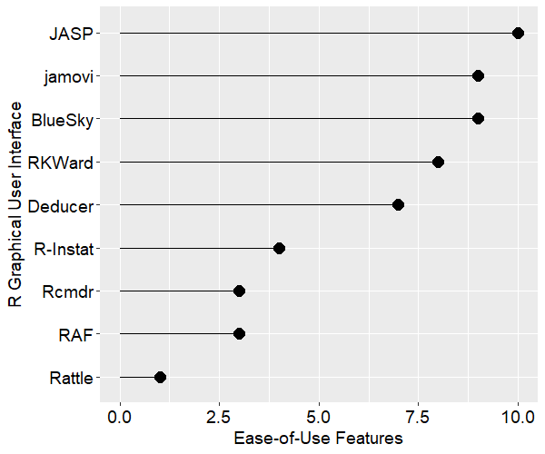
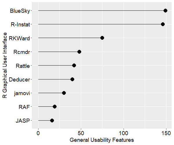
Lack of Graphical User Interface (GUI)

Like most other packages R’s full power is only accessible through programming. However unlike the others, it does not offer a standard GUI to help non-programmers do analyses. The two which are most like SAS, SPSS and Stata are R Commander and Deducer. While they offer enough analytic methods to make it through an undergraduate degree in statistics, they lack control when compared to a powerful GUI such as those used by SPSS or JMP. Worse, beginners must initially see a programming environment and then figure out how to find, install, and activate either GUI. Given that GUIs are aimed at people with fewer computer skills, this is a problem.

Conclusion

Most of the issues described above are misunderstandings caused by expecting R to work like other software that the person already knows. What examples like this have you come across?

Acknowledgements

Thanks to Patrick Burns and Tal Galili for their suggestions that improved this post.

Will 2015 be the Beginning of the End for SAS and SPSS?

[Since this was originally published in 2012, I’ve collected new data that renders this article obsolete. You can always see the most recent data here. -Bob Muenchen]

Learning to use a data analysis tool well takes significant effort, so people tend to continue using the tool they learned in college for much of their careers. As a result, the software used by professors and their students is likely to predict what the next generation of analysts will use for years to come. I track this trend, and many others, in my article The Popularity of Data Analysis Software. In the latest update (4/13/2012) I forecast that, if current trends continued, the use of the R software would exceed that of SAS for scholarly applications in 2015. That was based on the data shown in Figure 7a, which I repeat here:

Let’s take a more detailed look at what the future may hold for R, SAS and SPSS Statistics.

Here is the data from Google Scholar:

         R   SAS   SPSS
1995     8  8620   6450
1996     2  8670   7600
1997     6 10100   9930
1998    13 10900  14300
1999    26 12500  24300
2000    51 16800  42300
2001   133 22700  68400
2002   286 28100  88400
2003   627 40300  78600
2004  1180 51400 137000
2005  2180 58500 147000
2006  3430 64400 142000
2007  5060 62700 131000
2008  6960 59800 116000
2009  9220 52800  61400
2010 11300 43000  44500
2011 14600 32100  32000

ARIMA Forecasting

We can forecast the use of R using Rob Hyndman’s handy auto.arima function to forecast five years into the future:

> library("forecast")

> R_fit <- auto.arima(R)

> R_forecast <- forecast(R_fit, h=5)

> R_forecast

   Point Forecast Lo 80 Hi 80 Lo 95 Hi 95
18          18258 17840 18676 17618 18898
19          22259 21245 23273 20709 23809
20          26589 24768 28409 23805 29373
21          31233 28393 34074 26889 35578
22          36180 32102 40258 29943 42417

We see that even if the use of SAS and SPSS were to remain at their current levels, R use would surpass their use in 2016 (Point Forecast column where 18-22 represent years 2012 -2016).

If we follow the same steps for SAS we get:

> SAS_fit <- auto.arima(SAS)

> SAS_forecast <- forecast(SAS_fit, h=5)

> SAS_forecast

   Point Forecast     Lo 80   Hi 80    Lo 95 Hi 95
18          21200  16975.53 25424.5  14739.2 27661
19          10300    853.79 19746.2  -4146.7 24747
20           -600 -16406.54 15206.5 -24774.0 23574
21         -11500 -34638.40 11638.4 -46887.1 23887
22         -22400 -53729.54  8929.5 -70314.4 25514

It appears that if the use of SAS continues to decline at its precipitous rate, all scholarly use of it will stop in 2014 (the number of articles published can’t be less than zero, so view the negatives as zero). I would bet Mitt Romney $10,000 that that is not going to happen!

I find the SPSS prediction the most interesting:

> SPSS_fit <- auto.arima(SPSS)

> SPSS_forecast <- forecast(SPSS_fit, h=5)

> SPSS_forecast

   Point Forecast   Lo 80 Hi 80   Lo 95  Hi 95
18        13653.2  -16301 43607  -32157  59463
19        -4693.6  -57399 48011  -85299  75912
20       -23040.4 -100510 54429 -141520  95439
21       -41387.2 -145925 63151 -201264 118490
22       -59734.0 -193590 74122 -264449 144981

The forecast has taken a logical approach of focusing on the steeper decline from 2005 through 2010 and predicting that this year (2012) is the last time SPSS will see use in scholarly publications. However the part of the graph that I find most interesting is the shift from 2010 to 2011, which shows SPSS use still declining but at a much slower rate.

Any forecasting book will warn you of the dangers of looking too far beyond the data and I think these forecasts do just that. The 2015 figure in the Popularity paper and in the title of this blog post came from an exponential smoothing approach that did not match the rate of acceleration as well as the ARIMA approach does.

Colbert Forecasting

While ARIMA forecasting has an impressive mathematical foundation it’s always fun to follow Stephen Colbert’s approach: go from the gut. So now I’ll present the future of analytics software that must be true, because it feels so right to me personally. This analysis has Colbert’s most important attribute: truthiness.

The growth in R’s use in scholarly work will continue for two more years at which point it will level off at around 25,000 articles in 2014.This growth will be driven by:

  • The continued rapid growth in add-on packages (Figure 10)
  • The attraction of R’s powerful language
  • The near monopoly R has on the latest analytic methods
  • Its free price
  • The freedom to teach with real-world examples from outside organizations, which is forbidden to academics by SAS and SPSS licenses (it benefits those organizations, so the vendors say they should have their own software license).

What will slow R’s growth is its lack of a graphical user interface that:

  • Is powerful
  • Is easy to use
  • Provides journal style output in word processor format
  • Is standard, i.e. widely accepted as The One to Use
  • Is open source

While programming has important advantages over GUI use, many people will not take the time needed to learn to program. Therefore they rarely come to fully understand those advantages. Conversely, programmers seldom take the time to fully master a GUI and so often underestimate its capabilities. Regardless of which is best, GUI users far outnumber programmers and, until resolved, this will limit R’s long term growth. There are GUIs for R, but so many to choose from that none becomes the clear leader (Deducer, R Commander, Rattle, Red-R, at least two from commercial companies and still more here.) If from this “GUI chaos” a clear leader were to emerge, then R could continue its rapid growth and end up as the most used package.

The use of SAS for scholarly work will continue to decline until it matches R at the 25,000 level. This is caused by competition from R and other packages (notably Stata) but also by SAS Instute’s self-inflicted GUI chaos.  For years they have offered too many GUIs such as SAS/Assist, SAS/Insight, IML/Studio, the Analyst application, Enterprise Guide, Enterprise Miner and  even JMP (which runs SAS nicely in recent versions). Professors looking to meet student demand for greater ease of use could not decide what to teach so they continued teaching SAS as a programming language. Even now that Enterprise Guide has evolved into a good GUI, many SAS users do not know what it is. If SAS Institute were to completely replace their default Display Manager System with Enterprise Guide, they could bend the curve and end up at a higher level of perhaps 27,000.

The use of SPSS for scholarly work will decline only slightly this year and will level off in 2013 because:

  • The people who needed advanced methods and were not happy calling R functions from within SPSS have already switched to R or Stata
  • The people who like to program and want a more flexible language than SPSS offers have already switched to R or Stata
  • The people who needed a more advanced GUI have already switched to JMP

The GUI users will stick with SPSS until a GUI as good (or close to as good) comes to R and becomes widely accepted. At The University of Tennessee where I work, that’s the great majority of SPSS users.

Stata’s growth will level off in 2013 at level that will leave it in fourth place. The other packages shown in Figure 7b will also level off around the same time, roughly maintaining their current place in the rankings. A possible exception is JMP, whose interface is radically superior to the the others for exploratory analysis. Its use could continue to grow, perhaps even replacing Stata for fourth place.

The future of Enterprise Miner and SPSS Modeler are tied to the success of each company’s more mainstream products, SAS and SPSS Statistics respectively. Use of those products is generally limited to one university class in data mining, while the other software discussed here is widely used in many classes.

So there you have it: the future of analytics revealed. No doubt each reader has found a wide range of things to disagree with, so I encourage you to follow the detailed blog at Librestats to collect your own data from Google Scholar and do your own set of forecasts. Or simply go from the gut!