Way back in 2012 I published a forecast that showed that the use of R for scholarly publications would likely pass the use of SAS in 2015. But I didn’t believe the forecast since I expected the sharp decline in SAS and SPSS use to level off. In 2013, the trend accelerated and I expected R to pass SAS in the middle of 2014. As luck would have it, Google changed their algorithm, somehow finding vast additional quantities of SAS and SPSS articles. I just collected data on the most recent complete year of scholarly publications, and it turns out that 2015 was indeed the year that R passed SAS to garner the #2 position. Once again, models do better than “expert” opinion! I’ve updated The Popularity of Data Analysis Software to reflect this new data and include it here to save you the trouble of reading the whole 45 pages of it.
If you’re interested in learning R, you might consider reading my books R for SAS and SPSS Users, or R for Stata Users. I also teach workshops on R, but I’m currently booked through mid October, so please plan ahead.
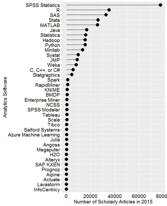
Scholarly Articles
Scholarly articles are also rich in information and backed by significant amounts of effort. The more popular a software package is, the more likely it will appear in scholarly publications as an analysis tool or even an object of study. The software that is used in scholarly articles is what the next generation of analysts will graduate knowing, so it’s a leading indicator of where things are headed. Google Scholar offers a way to measure such activity. However, no search of this magnitude is perfect; each will include some irrelevant articles and reject some relevant ones. The details of the search terms I used are complex enough to move to a companion article, How to Search For Data Science Articles. Since Google regularly improves its search algorithm, each year I re-collect the data for all years.
Figure 2a shows the number of articles found for each software package for the most recent complete year, 2015. SPSS is by far the most dominant package, as it has been for over 15 years. This may be due to its balance between power and ease-of-use. For the first time ever, R is in second place with around half as many articles. Although now in third place, SAS is nearly tied with R. Stata and MATLAB are essentially tied for fourth and fifth place. Starting with Java, usage slowly tapers off. Note that the general-purpose software C, C++, C#, MATLAB, Java, and Python are included only when found in combination with data science terms, so view those as much rougher counts than the rest. Since Scala and Julia have a heavy data science angle to them, I cut them some slack by not adding any data science terms to the search, not that it helped them much!
From Spark on down, the counts appear to be zero. That’s not the case, the counts are just very low compared to the more popular packages, used in tens of thousands articles. Figure 2b shows the software only for those packages that have fewer than 1,200 articles (i.e. the bottom part of Fig. 2a), so we can see how they compare. Spark and RapidMiner top out the list of these packages, followed by KNIME and BMDP. There’s a slow decline in the group that goes from Enterprise Miner to Salford Systems. Then comes a group of mostly relative new arrivals beginning with Microsoft’s Azure Machine Learning. A package that’s not a new arrival is from Megaputer, whose Polyanalyst software has been around for many years now, with little progress to show for it. Dead last is Lavastorm, which to my knowledge is the only commercial package that includes Tibco’s internally written version of R, TERR.

Figures 2a and 2b are useful for studying market share as it is now, but they don’t show how things are changing. It would be ideal to have long-term growth trend graphs for each of the analytics packages, but collecting such data is too time consuming since it must be re-collected every year (since Google’s search algorithms change). What I’ve done instead is collect data only for the past two complete years, 2014 and 2015. Figure 2c shows the percent change across those years, with the “hot” packages whose use is growing shown in red. Those whose use is declining or “cooling” are shown in blue. Since the number of articles tends to be in the thousands or tens of thousands, I have removed any software that had fewer than 500 articles in 2014.

Python is the fastest growing. Note that the Python figures are strictly for data science use as defined here. The open-source KNIME and RapidMiner are the second and third fastest growing, respectively. Both use the easy yet powerful workflow approach to data science. Figure 2b showed that RapidMiner has almost twice the marketshare of KNIME, but here we see use of KNIME is growing faster. That may be due to KNIME’s greater customer satisfaction, as shown in the Rexer Analytics Data Science Survey. The companies are two of only four chosen by IT advisory firm Gartner, Inc. as having both a complete vision of the future and the ability to execute that vision (Fig. 3a).
R is in fourth place in growth, and given its second place in overall marketshare, it is in an enviable position.
At the other end of the scale are SPSS and SAS, both of which declined in use by 25% or more. Recall that Fig. 2a shows that despite recent years of decline, SPSS is still extremely dominant for scholarly use. Hadoop use declined slightly, perhaps as people turned to alternatives Spark and H2O.
I’m particularly interested in the long-term trends of the classic statistics packages. So in Figure 2d I’ve plotted the same scholarly-use data for 1995 through 2015, the last complete year of data when this graph was made. As in Figure 2a, SPSS has a clear lead, but now you can see that its dominance peaked in 2008 and its use is in sharp decline. SAS never came close to SPSS’ level of dominance, and it also peaked around 2008. Note that the decline in the number of articles that used SPSS or SAS is not balanced by the increase in the other software shown in this particular graph. However, if you add up all the other software shown in Figure 2a, you come close. There still seems to be a slight decline in people reporting the particular software tool they used.

Since SAS and SPSS dominate the vertical space in Figure 2d by such a wide margin, I removed those two curves, leaving only a single point of SAS usage in 2015. The the result is shown in Figure 2e. Freeing up so much space in the plot now allows us to see that the growth in the use of R is quite rapid and is pulling away from the pack (recall that the curve for SAS has a steep downward slope). If the current trends continue, R will cross SPSS to become the #1 software for scholarly data science use by the end of 2017. Stata use is also growing more quickly than the rest. Note that trends have shifted before as discussed here. The use of Statistica, Minitab, Systat and JMP are next in popularity, respectively, with their growth roughly parallel to one another.

Using a logarithmic y-axis scales down the more popular packages, allowing us to see the full picture in a single image (Figure 2f.) This view makes it more clear that R use has passed that of SAS, and that Stata use is closing in on it. However, even when one studies the y-axis values carefully, it can be hard to grasp how much the logarithmic transformation has changed the values. For example, in 2015 value for SPSS is well over twice the value for R. The original scale shown in Figure 2d makes that quite clear.


