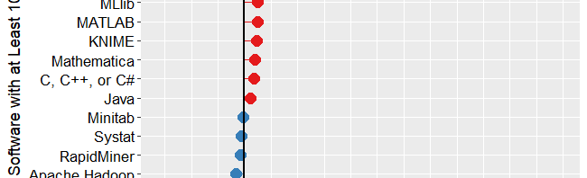
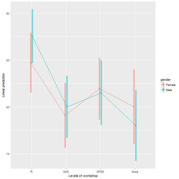
Gartner’s 2019 Take on Data Science Software

I’ve just updated The Popularity of Data Science Software to reflect my take on Gartner’s 2019 report, Magic Quadrant for Data Science and Machine Learning Platforms. To save you the trouble of digging through all 40+ pages of my report, here’s just the updated section:

IT Research Firms

IT research firms study software products and corporate strategies. They survey customers regarding their satisfaction with the products and services and provide their analysis in reports that they sell to their clients. Each research firm has its own criteria for rating companies, so they don’t always agree. However, I find the detailed analysis that these reports contain extremely interesting reading. The reports exclude open source software that has no specific company backing, such as R, Python, or jamovi. Even open source projects that do have company backing, such as BlueSky Statistics, are excluded if they have yet to achieve sufficient market adoption. However, they do cover how company products integrate open source software into their proprietary ones.

While these reports are expensive, the companies that receive good ratings usually purchase copies to give away to potential customers. An Internet search of the report title will often reveal companies that are distributing them. On the date of this post, Datarobot is offering free copies.

Gartner, Inc. is one of the research firms that write such reports.  Out of the roughly 100 companies selling data science software, Gartner selected 17 which offered “cohesive software.” That software performs a wide range of tasks including data importation, preparation, exploration, visualization, modeling, and deployment.

Gartner analysts rated the companies on their “completeness of vision” and their “ability to execute” that vision. Figure 3a shows the resulting “Magic Quadrant” plot for 2019, and 3b shows the plot for the previous year. Here I provide some commentary on their choices, briefly summarize their take, and compare this year’s report to last year’s. The main reports from both years contain far more detail than I cover here.

Gartner-2019

Figure 3a. Gartner Magic Quadrant for Data Science and Machine Learning Platforms from their 2019 report (plot done in November 2018, report released in 2019).

The Leaders quadrant is the place for companies whose vision is aligned with their customer’s needs and who have the resources to execute that vision. The further toward the upper-right corner of the plot, the better the combined score.

  • RapidMiner and KNIME reside in the best part of the Leaders quadrant this year and last. This year RapidMiner has the edge in ability to execute, while KNIME offers more vision. Both offer free and open source versions, but the companies differ quite a lot on how committed they are to the open source concept. KNIME’s desktop version is free and open source and the company says it will always be so. On the other hand, RapidMiner is limited by a cap on the amount of data that it can analyze (10,000 cases) and as they add new features, they usually come only via a commercial license with “difficult-to-navigate pricing conditions.” These two offer very similar workflow-style user interfaces and have the ability to integrate many open sources tools into their workflows, including R, Python, Spark, and H2O.
  • Tibco moved from the Challengers quadrant last year to the Leaders this year. This is due to a number of factors, including the successful integration of all the tools they’ve purchased over the years, including Jaspersoft, Spotfire, Alpine Data, Streambase Systems, and Statistica.
  • SAS declined from being solidly in the Leaders quadrant last year to barely being in it this year. This is due to a substantial decline in its ability to execute. Given SAS Institute’s billions in revenue, that certainly can’t be a financial limitation. It may be due to SAS’ more limited ability to integrate as wide a range of tools as other vendors have. The SAS language itself continues to be an important research tool among those doing complex mixed-effects linear models. Those models are among the very few that R often fails to solve.

The companies in the Visionaries Quadrant are those that have good future plans but which may not have the resources to execute that vision.

  • Mathworks moved forward substantially in this quadrant due to MATLAB’s ability to handle unconventional data sources such as images, video, and the Internet of Things (IoT). It has also opened up more to open source deep learning projects.
  • H2O.ai is also in the Visionaries quadrant. This is the company behind the open source  H2O software, which is callable from many other packages or languages including R, Python, KNIME, and RapidMiner. While its own menu-based interface is primitive, its integration into KNIME and RapidMiner makes it easy to use for non-coders. H2O’s strength is in modeling but it is lacking in data access and preparation, as well as model management.
  • IBM dropped from the top of the Visionaries quadrant last year to the middle. The company has yet to fully integrate SPSS Statistics and SPSS Modeler into its Watson Studio. IBM has also had trouble getting Watson to deliver on its promises.
  • Databricks improved both its vision and its ability to execute, but not enough to move out of the Visionaries quadrant. It has done well with its integration of open-source tools into its Apache Spark-based system. However, it scored poorly in the predictability of costs.
  • Datarobot is new to the Gartner report this year. As its name indicates, its strength is in the automation of machine learning, which broadens its potential user base. The company’s policy of assigning a data scientist to each new client gets them up and running quickly.
  • Google’s position could be clarified by adding more dimensions to the plot. Its complex collection of a dozen products that work together is clearly aimed at software developers rather than data scientists or casual users. Simply figuring out what they all do and how they work together is a non-trivial task. In addition, the complete set runs only on Google’s cloud platform. Performance on big data is its forte, especially problems involving image or speech analysis/translation.
  • Microsoft offers several products, but only its cloud-only Azure Machine Learning (AML) was comprehensive enough to meet Gartner’s inclusion criteria. Gartner gives it high marks for ease-of-use, scalability, and strong partnerships. However, it is weak in automated modeling and AML’s relation to various other Microsoft components is overwhelming (same problem as Google’s toolset).

Figure 3b. Last year’s Gartner Magic Quadrant for Data Science and Machine Learning Platforms (January, 2018)

Those in the Challenger’s Quadrant have ample resources but less customer confidence in their future plans, or vision.

  • Alteryx dropped slightly in vision from last year, just enough to drop it out of the Leaders quadrant. Its workflow-based user interface is very similar to that of KNIME and RapidMiner, and it too gets top marks in ease-of-use. It also offers very strong data management capabilities, especially those that involve geographic data, spatial modeling, and mapping. It comes with geo-coded datasets, saving its customers from having to buy it elsewhere and figuring out how to import it. However, it has fallen behind in cutting edge modeling methods such as deep learning, auto-modeling, and the Internet of Things.
  • Dataiku strengthed its ability to execute significantly from last year. It added better scalability to its ease-of-use and teamwork collaboration. However, it is also perceived as expensive with a “cumbersome pricing structure.”

Members of the Niche Players quadrant offer tools that are not as broadly applicable. These include Anaconda, Datawatch (includes the former Angoss), Domino, and SAP.

  • Anaconda provides a useful distribution of Python and various data science libraries. They provide support and model management tools. The vast army of Python developers is its strength, but lack of stability in such a rapidly improving world can be frustrating to production-oriented organizations. This is a tool exclusively for experts in both programming and data science.
  • Datawatch offers the tools it acquired recently by purchasing Angoss, and its set of “Knowledge” tools continues to get high marks on ease-of-use and customer support. However, it’s weak in advanced methods and has yet to integrate the data management tools that Datawatch had before buying Angoss.
  • Domino Data Labs offers tools aimed only at expert programmers and data scientists. It gets high marks for openness and ability to integrate open source and proprietary tools, but low marks for data access and prep, integrating models into day-to-day operations, and customer support.
  • SAP’s machine learning tools integrate into its main SAP Enterprise Resource Planning system, but its fragmented toolset is weak, and its customer satisfaction ratings are low.

To see many other ways to rate this type of software, see my ongoing article, The Popularity of Data Science Software. You may also be interested in my in-depth reviews of point-and-click user interfaces to R. I invite you to subscribe to my blog or follow me on twitter where I announce new posts. Happy computing!

Updated Review: jamovi User Interface to R

Last February I reviewed the jamovi menu-based front end to R.  I’ve reviewed five more user interfaces since then, and have developed a more comprehensive template to make it easier to compare them all. Now I’m cycling back to jamovi, using that template to write a far more comprehensive review. I’ve added this review to the previous set, and I’m releasing it as a blog post so that it will be syndicated on R-Bloggers, StatsBlogs, et al.

Introduction

jamovi (spelled with a lower-case “j”) is a free and open source graphical user interface for the R software that targets beginners looking to point-and-click their way through analyses. It is available for Windows, Mac, Linux, and even ChromeOS. Versions are also planned for servers and tablets.

This post is one of a series of reviews which aim to help non-programmers choose the Graphical User Interface (GUI) for R that is best for them. Additionally, these reviews include cursory descriptions of the programming support that each GUI offers.

Figure 1. jamovi’s main screen.


Terminology

There are various definitions of user interface types, so here’s how I’ll be using these terms:

GUI = Graphical User Interface using menus and dialog boxes to avoid having to type programming code. I do not include any assistance for programming in this definition. So, GUI users are people who prefer using a GUI to perform their analyses. They don’t have the time or inclination to become good programmers.

IDE = Integrated Development Environment which helps programmers write code. I do not include point-and-click style menus and dialog boxes when using this term. IDE users are people who prefer to write R code to perform their analyses.


Installation

The various user interfaces available for R differ quite a lot in how they’re installed. Some, such as BlueSky Statistics or RKWard, install in a single step. Others install in multiple steps, such as R Commander (two steps), and Deducer (up to seven steps). Advanced computer users often don’t appreciate how lost beginners can become while attempting even a simple installation. The HelpDesks at most universities are flooded with such calls at the beginning of each semester!

jamovi’s single-step installation is extremely easy and includes its own copy of R. So if you already have a copy of R installed, you’ll have two after installing jamovi. That’s a good idea though, as it guarantees compatibility with the version of R that it uses, plus a standard R installation by itself is harder than jamovi’s. Python is also installed with jamovi, but it is used only for internal purposes. You can directly control only R through jamovi.


Plug-in Modules

When choosing a GUI, one of the most fundamental questions is: what can it do for you? What the initial software installation of each GUI gets you is covered in the Graphics, Analysis, and Modeling sections of this series of articles. Regardless of what comes built-in, it’s good to know how active the development community is. They contribute “plug-ins” which add new menus and dialog boxes to the GUI. This level of activity ranges from very low (RKWard, Deducer) to very high (R Commander).

For jamovi, plug-ins are called “modules” and they are found in the “jamovi library” rather than on the Comprehensive R Archive Network (CRAN) where R and most of its packages are found. This makes locating and installing jamovi modules especially easy.

Although jamovi is one of the most recent GUIs to appear on the R scene, it has already attracted a respectable number of developers. The list of modules at publication time is listed below. You can check on the latest ones on this web page.

  1. Base R – converts jamovi analyses into standard R functions
  2. blandr – Bland-Altman method comparison analysis, and is also available as an R package from CRAN
  3. Death Watch – survival analysis
  4. Distraction – quantiles and probabilities of continuous and discrete distributions
  5. GAMLj –  general linear model, linear mixed model, generalized linear models, etc.
  6. jpower – power analysis for common research designs
  7. Learning Statistics with jamovi – example data sets to accompany the book learning statistics with jamovi
  8. MAJOR – meta-analysis based on R’s metafor package
  9. medmod – basic mediation and moderation analysis
  10. jAMM – advanced mediation analysis (similar to the popular Process Macro for SAS and SPSS)
  11. R Data Sets
  12. RJ – editor to run R code inside jamovi
  13. scatr – scatter plots with marginal density or box plots
  14. Statkat – helps you choose a statistical test.
  15. TOSTER – tests of equivalence for t-tests and correlation
  16. Walrus – robust descriptive stats & tests
  17. jamovi Arcade – hangman & blackjack games
 

Startup

Some user interfaces for R, such as BlueSky and Rkward, start by double-clicking on a single icon, which is great for people who prefer to not write code. Others, such as R commander and JGR, have you start R, then load a package from your library, and then call a function to finally activate the GUI. That’s more appropriate for people looking to learn R, as those are among the first tasks they’ll have to learn anyway.

You start jamovi directly by double-clicking its icon from your desktop, or choosing it from your Start Menu (i.e. not from within R itself). It interacts with R in the background; you never need to be aware that R is running.


Data Editor

A data editor is a fundamental feature in data analysis software. It puts you in touch with your data and lets you get a feel for it, if only in a rough way. A data editor is such a simple concept that you might think there would be hardly any differences in how they work in different GUIs. While there are technical differences, to a beginner what matters the most are the differences in simplicity. Some GUIs, including BlueSky, let you create only what R calls a data frame. They use more common terminology and call it a data set: you create one, you save one, later you open one, then you use one. Others, such as RKWard trade this simplicity for the full R language perspective: a data set is stored in a workspace. So the process goes: you create a data set, you save a workspace, you open a workspace, and choose a dataset from within it.

jamovi’s data editor appears at start-up (Figure 1, left) and prompts you to enter data with an empty spreadsheet-style data editor. You can start entering data immediately, though at first, the variables are simply named A, B, C….

To change metadata, such as variable names, you double click on a name, and window (Figure 2) will slide open from the top with settings for variable name, description, measurement level (continuous, ordinal, nominal, or ID), data type (integer, decimal, text), variable levels (labels) and a “retain unused levels” switch. Currently, jamovi has no date format, which is a serious limitation if you deal with that popular data format.

jamovi data editor settings
Figure 2. The jamovi data editor with the variable attributes window open, allowing you to make changes.

When choosing variable terminology, R GUI designers have two choices: follow what most statistics books use, or instead use R jargon. The jamovi designers have opted for the statistics book terminology. For example, what jamovi calls categorical, decimal, or text are called factor, numeric, or character in R. Both sets of terms are fairly easy to learn, but given that some jamovi users may wish to learn R code, I find that choice puzzling. Changing variable settings can be done to many variables at once, which is an important time saver.

You can enter integer, decimal, or character data in the editor right after starting jamovi. It will recognize those types and set their metadata accordingly.

To enter nominal/factor data, you are free to enter numbers, such as 1/2 and later set levels to see Male/Female appear. Or you can set it up in advance and enter the numbers which will instantly turn into labels. That is a feature that saves time and helps assure accuracy. All data editors should offer that choice!

Adding variables or observations is as simple as scrolling beyond the set’s current limits and entering additional data. jamovi does not require “add more” buttons as some of its competitors (e.g. BlueSky) do. Adding variables or observations in between existing ones is also easy. Under the “Data” tab, there are two sets of “Add” and “Delete” buttons. The first set deals with variables and the second with cases. You can use the first set to insert, compute, transform variables or delete variables. The second inserts, appends, or deletes cases. These two sets of buttons are labeled “Variables” and “Rows”, but the font used is so small that I used jamovi for quite a while before noticing these labels.


Data Import

The ability to import data from a wide variety of formats is extremely important; you can’t analyze what you can’t access. Most of the GUIs evaluated in this series can open a wide range of file types and even pull data from relational databases. jamovi can’t read data from databases, but it can import the following file formats:

  • Comma Separated Values (.csv)
  • Plain text files (.txt)
  • SPSS (.sav, .zsav, .por)
  • SAS binary files (.sas7bdat, .xpt)
  • JASP (.jasp)

While jamovi doesn’t support true date/time variables, when you import a dataset that contains them, it will convert them to an integer value representing the number of days since 1970-01-01 and assign them labels in the YYYY-MM-DD format.


Data Export

The ability to export data to a wide range of file types helps when you have to use multiple tools to complete a task. Research is commonly a team effort, and in my experience, it’s rare to have all team members prefer to use the same tool. For these reasons, GUIs such as BlueSky and Deducer offer many export formats. Others, such as R Commander and RKward can create only delimited text files.

A fairly unique feature of jamovi is that it doesn’t save just a dataset, but instead it saves the combination of a dataset plus its associated analyses. To save just the dataset, you use the menu (a.k.a. hamburger) menu to select “Export” then “Data.”  The export formats supported are the same as those provided for import, except for the more rarely-used ones such as SAS xpt and SPSS por and zsav:

  • Comma Separated Values (.csv)
  • Plain text files (.txt)
  • SPSS (.sav)
  • SAS binary files (.sas7bdat)


Data Management

It’s often said that 80% of data analysis time is spent preparing the data. Variables need to be transformed, recoded, or created; strings and dates need to be manipulated; missing values need to be handled; datasets need to be sorted, stacked, merged, aggregated, transposed, or reshaped (e.g. from “wide” format to “long” and back).

A critically important aspect of data management is the ability to transform many variables at once. For example, social scientists need to recode many survey items, biologists need to take the logarithms of many variables. Doing these types of tasks one variable at a time is tedious.

Some GUIs, such as BlueSky and R Commander can handle nearly all of these tasks. Others, such as RKWard handle only a few of these functions.

jamovi’s data management capabilities are minimal. You can transform or recode variables, and doing so across many variables is easy. The transformations are stored in the variable itself, making it easy to see what it was by double-clicking its name. However, the R code for the transformation is not available, even in with Syntax Mode turned on.

You can also filter cases to work on a subset of your data. However, jamovi can’t sort, stack, merge, aggregate, transpose, or reshape datasets. The lack of combining datasets may be a result of the fact that jamovi can only have one dataset open in a given session.


Menus & Dialog Boxes

The goal of pointing and clicking your way through an analysis is to save time by recognizing menu settings rather than performing the more difficult task of recalling programming commands. Some GUIs, such as BlueSky, make this easy by sticking to menu standards and using simpler dialog boxes; others, such as RKWard, use non-standard menus that are unique to it and hence require more learning.

jamovi uses standard menu choices for running steps listed on the Data and Analyses tabs. Dialog boxes appear and you select variables to place into their various roles. This is accomplished by either dragging the variable names or by selecting them and clicking an arrow located next to the particular role box. A unique feature of jamovi is that as soon as you fill in enough options to perform an analysis, its output appears instantly. There is no “OK” or “Run” button as the other GUIs reviewed here have. Thereafter, every option chosen adds to the output immediately; every option turned off is removed.

While nearly all GUIs keep your dialog box settings during your session, jamovi keeps those settings in its main “workspace” file. This allows you to return to a given analysis at a future date and try some model variations. You only need to click on the output of any analysis to have the dialog box appear to the right of it, complete with all settings intact.

Under the triple-dot menu on the upper right side of the screen, you can choose to run “Syntax Mode.” When you turn that on, the R syntax appears immediately, and when you turn it off, it vanishes just as quickly. Turning on syntax mode is the only way a jamovi user would be aware that R is doing the work in the background.

Output is saved by using the standard “Menu> Save” selection.


Documentation & Training

The jamovi User Guide covers the basics of using the software. The Resources by the Community web page provides links to a helpful array of documentation and tutorials in written and video form.


Help

R GUIs provide simple task-by-task dialog boxes which generate much more complex code. So for a particular task, you might want to get help on 1) the dialog box’s settings, 2) the custom functions it uses (if any), and 3) the R functions that the custom functions use. Nearly all R GUIs provide all three levels of help when needed. The notable exception that is the R Commander, which lacks help on the dialog boxes themselves.

jamovi doesn’t offer any integrated help files, only the documentation described in the Documentation & Training section above. The search for help can become very confusing. For example, after doing the scatterplot shown in the next section, I wondered if the scat() function offered a facet argument, normally this would be an easy question to answer. My initial attempt was to go to RStudio, load jamovi’s jmv package knowing that I routinely get help from it. However, the scat() function is not built into jamovi (or jmv); it comes in the scatr add-on module. So I had to return to jamovi and install Rj Editor module. That module lets you execute R code from within jamovi. However, running “help(scat)” yielded no result. After so much confusion, I never was able to find any help on that function. Hopefully, this situation will improve as jamovi matures.


Graphics

The various GUIs available for R handle graphics in several ways. Some, such as RKWard, focus on R’s built-in graphics. Others, such as BlueSky, focus on R’s popular ggplot graphics. GUIs also differ quite a lot in how they control the style of the graphs they generate. Ideally, you could set the style once, and then all graphs would follow it.

jamovi uses its own graphics functions to create plots. By default, they have the look of the popular ggplot2 package. jamovi is the only R GUI reviewed that lets you set the plot style in advance, and all future plots will use that style. It does this using four popular themes. jamovi also lets you choose color palettes in advance, from a set of eight.

[Continued…]

BlueSky Statistics 5.40 GUI for R Update

It has been just a few months since I reviewed five free and open-source point-and-click graphical user interfaces (GUIs) to the R language. I plan to keep those reviews up to date as new features are added. BlueSky’s interface would be immediately familiar to anyone who had used SPSS, as its developers model it on that popular software. The BlueSky developers’ goal is to help people use R without having to learn to write computer code.

While the previous version of BlueSky offered dozens of fairly advanced modeling methods such as generalized linear models, random forests, and support vector machines, it lacked some simpler features. Version 5.40 (correction: this was previously listed as version 6.04) adds a dialog for logistic regression, which is essentially its glm dialog simplified to do only logistic regression.

The Multi-Way ANOVA output has also been greatly enhanced, with the addition of a wide range of contrasts from the emmeans package, support for all three types of sums of squares, and plots for both post-hoc main-effects comparisons and interaction plots like this one:

BlueSky-Interaction-Plot

Users of RStudio will be pleased that the BlueSky’s program editor now submits lines of code like RStudio does so you can step your way through a program line-by-line, by clicking the Run button repeatedly.

The new version also has functions to do string-to-date vice versa, which led me to realize I had totally missed the string and date functions that it already had. In the “Data> Compute” dialog, the functions for Arithmetic, Logical, Math, and String(1) are visible. But if you click on the “>>” arrow on the right, you’ll also see String (2), Conversion, Statistical, Random Numbers, and four different menus of Date functions.

The complete set of new features and bug fixes is below. You can read my full review of BlueSky here, and you download the software for free here. I plan to write about new features in other R GUIs, so stay tuned to my blog or follow me on twitter where I announce new posts. Happy computing!

NEW FEATURES:
=============

1) Added support for weighted datasets. This option is available in Data -> Set Weights. Once you specify the weighting variable we create a new dataset with rows replicated as defined in the weights. This is similar to what SPSS does internally. When you run frequencies, independent sample t-tests, graphics commands, statistical tests etc on the new dataset (in BlueSky Statistics) with the rows replicated you will see results identical to those in SPSS.

2) Added the option to specify a weighting variable in Linear and Logistic Regression. This allows an optional vector of weights to be used during the fitting process (i.e. the weighted least-squares solution).

3) Added support for logistic regression under ‘Model Fitting’. Once the model is built, you can score the dataset, optionally obtain a confusion matrix, model statistics, and a ROC curve by selecting the model and clicking score. This is available on the top right-hand corner of the main application window.

4) We have updated the “Multi Way Anova” dialog with following capabilities:

  • display contrasts.
  • interaction plots.
  • support for type I, type II and type III tests.
  • pairwise comparison.

5) New reshape dialog with simplified R syntax has been added, using the tidyr package.

6) The “Multi variable one sample T-Test” and “Multi variable independent sample T-Test(with factor)” have been updated to allow you to specify the alternative hypothesis.

7) Added capabilities to support date manipulations.

  • The “String to date” dialog allows you to convert string to POSIXct date class.
  • The “Date to string” dialog allows you to convert the date (POSIXct and Date class) to string.

8) Simplified the syntax for frequencies and factor analysis.

9) If you launch a second instance of BlueSky Statistics the message that gets displayed has been improved. NOTE: You can only have one BlueSky Statistics instance running at a time.

10) We have improved the ability to browse the contents of the output window in BlueSky Statistics. This can be accessed from the menu (Layout > Show Navigation Tree).

11) Items in the output window can now be deleted. To delete an item from the output, just right click on the item(table/text/graphics) and choose the “Delete” option.

12) To make the output visually more appealing, we have introduced an option to hide the R syntax that gets displayed in the output window. This is controlled by an option in the configuration window ( Tools > Configuration Settings > Output tab ). By default we hide the R syntax in the output window.

13) When the option to show R syntax in the output is turned on ( Tools > Configuration Settings > Output tab ) and you resize the output window, we wrap the R syntax so that it is always visible.

14) To run any line of R syntax just place the cursor on that line and hit the RUN button, you don’t have to select the entire line.

15) If you want to run your R script line by line, place your cursor on the first line and hit RUN, the cursor will automatically move to the next line and you can hit the RUN button again.

This feature will work for simple R syntax which does not span multiple lines.

Example 1: 3 lines below work

a=10

b=20

c=a+b

Example 2: 4 lines below will not work

if(TRUE)

{

print(“Great”)

}

16)Added helpful hints to indicate you have reached the beginning and end of a dataset when scrolling wide datasets. This is available on the paging controls on the bottom right-hand corner of the screen.

17) Application launch is now faster.

18) In the BlueSky Statistics syntax editor, just like a comma, the pipe (%>%) can be used to break a long R code statement.

19) When the application launches, we open a new blank dataset this has been populated with zeros. You can right click on a row to delete a row or go into ‘Data -> Delete Variables’ to delete variables.

20) Clicking on a variable name in the data grid sorts in ascending order by that variable name. Clicking again sorts in descending order.

BUG FIXES:

=============

1) Fixed an issue with factor analysis when saving scores using the regression method.

2) Fixed an issue when re-editing factor levels that were previously changed in the variable grid. This would result in the dialog not functioning correctly and incorrect levels being added.

3) Fixed an issue when you closed the empty dataset that gets created when BlueSky Statistics is launched and then attempted to save open datasets- those datasets would not get saved correctly.

4) Fixed an issue that was limiting the number of variables that Factor Analysis can be run across.

5) Within block commands that use ‘local()’, cat(“\n”) can now be printed in the output to leave some extra spaces.

6) When you added a new factor variable and renamed the variable using the user interface and then tried to add new levels – this did not work and has been fixed.

7) Add new factor variable. Click in the cell where the new variable name is shown. Cell goes in edit mode. Now add new factor levels to this new variable. Switch to the data grid and select a different level. Switch back to ‘Variables’ tab and the application crashes. This has been fixed.

8) When any existing factor level name is modified using the user interface, a blank level automatically gets added. If you try to modify the level, it does not take effect. This has been addressed.

9) Disable data grid navigation buttons (on the lower right-hand side of the data grid) if there are less than 16 columns in the dataset.

10) Changing factor levels was not working because one or more levels had a single quote in the level name.

11) Aggregate control fixed: Text above the drop-down (that contains mean, median etc.) was getting chopped off. Similar issue with the label text above a textbox (which was almost at the bottom of the dialog).

12) Fixed significance codes for:

  • One Sample T Test and Independent Sample T Test
  • Multivariable one sample t-test and Multivariable Independent one sample t-test (with factor)

13) Fixed a defect: Select some syntax and hit RUN. After execution, the cursor goes to the top of the script. Now it moves to the next line.

14) Data grid navigation buttons are disabled if either end of the datagrid is reached. If there are no more columns on the right, the right navigation button is disabled. If there are no more columns on the left then left navigation button is disabled.

15) Left navigation tree in the output window is fixed for look and feel. It now has a cleaner look. To access left navigation, go to Layout -> Show navigation tree

16) In the R syntax editor, we now ignore square, curly and round brackets that appear inside single or double quotes. See example below:

grepl(“[“, “a[b”, fixed = TRUE)


A Comparative Review of the Rattle GUI for R

Introduction

Rattle is a popular free and open source Graphical User Interface (GUI) for the R software, one that focuses on beginners looking to point-and-click their way through data mining tasks. Such tasks are also referred to as machine learning or predictive analytics.  Rattle’s name is an acronym for “R Analytical Tool To Learn Easily.” Rattle is available on Windows, Mac, and Linux systems.

This post is one of a series of reviews which aim to help non-programmers choose the GUI that is best for them. Additionally, these reviews include a cursory description of the programming support that each GUI offers.

Figure 1. The Rattle interface with the “Data” tab chosen, showing which file I’m reading, and the roles of the variables will play in analyses. The role assigned to each variable is critically important. Note the all-important “Execute” button in the upper left of the screen. Nothing happens until it’s clicked.


Terminology

There are various definitions of user interface types, so here’s how I’ll be using these terms:

GUI = Graphical User Interface using menus and dialog boxes to avoid having to type programming code. I do not include any assistance for programming in this definition. So, GUI users are people who prefer using a GUI to perform their analyses. They don’t have the time or inclination to become good programmers.

IDE = Integrated Development Environment which helps programmers write code. I do not include point-and-click style menus and dialog boxes when using this term. IDE usersare people who prefer to write R code to perform their analyses.


Installation

The various user interfaces available for R differ quite a lot in how they’re installed. Some, such as jamovi or RKWard, install in a single step. Others install in multiple steps, such as R Commander (two steps) and Deducer (up to seven steps). Advanced computer users often don’t appreciate how lost beginners can become while attempting even a simple installation. The Help Desks at most universities are flooded with such calls at the beginning of each semester!

The steps to install Rattle are:

  1. Install R
  2. In R, install the toolkit that Rattle is written in by executing the command: install.packages(“RGtk2”)
  3. Also in R, install Rattle itself by executing the command:
    install.packages(“rattle”, dependencies=TRUE)
    The very  latest development version is available here.
    Note that while Rattle’s name is capitalized, the name of the rattle package is spelled in all lower-case letters!
  4. If you wish to take advantage of interactive visualization (highly recommended) then install the GGobi software from: http://www.ggobi.org/downloads/.


Plug-in Modules

When choosing a GUI, one of the most fundamental questions is: what can it do for you? What the initial software installation of each GUI gets you is covered in the Graphics, Analysis, and Modeling sections of this series of articles. Regardless of what comes built-in, it’s good to know how active the development community is. They contribute “plug-ins” which add new menus and dialog boxes to the GUI. This level of activity ranges from very low (RKWard, Deducer) through moderate (jamovi) to very active (R Commander).

Rattle’s complete capability was designed and programmed by Graham Williams of Togaware. As a result, it doesn’t have plug-ins, but it does include a comprehensive set of data mining tools.


Startup

Some user interfaces for R, such as jamovi, start by double-clicking on a single icon, which is great for people who prefer to not write code. Others, such as R commander and JGR, have you start R, then load a package from your library, and call a function. That’s better for people looking to learn R, as those are among the first tasks they’ll have to learn anyway.

Rattle is run as a part of R itself, so the steps to start it begin with starting R:

  1. Start R.
  2. Load Rattle from your library by executing the command: library(“rattle”)
  3. Start Rattle by executing the command: rattle()


Data Editor

A data editor is a fundamental feature in data analysis software. It puts you in touch with your data and lets you get a feel for it, if only in a rough way. A data editor is such a simple concept that you might think there would be hardly any differences in how they work in different GUIs. While there are technical differences, to a beginner what matters the most are the differences in simplicity. Some GUIs, including jamovi, let you create only what R calls a data frame. They use more common terminology and call it a data set: you create one, you save one, later you open one, then you use one. Others, such as RKWard trade this simplicity for the full R language perspective: a data set is stored in a workspace. So the process goes: you create a data set, you save a workspace, you open a workspace, and choose a data set from within it.

Rattle’s data editor is unique for a GUI in that it does not offer a way to create a data set. It lets you edit any data set you open using R’s built-in edit function, but that function offers very few features. Clicking on a variable name will cause a dialog to open, offering to change the variable’s name or type as numeric or character (see Figure 2). Rattle automatically converts variables that have fewer than 10 values into “categorical” ones. R would call these factors. You can always recode variables from numeric to categorical (or vice versa) in the “Transform” tab (see Data Management section).

Figure 2. Rattle uses R’s built-in edit function as its data editor. Here I clicked on the name of the variable “Rainfall” to show how you might rename it or change its data type.


Data Import

Since R GUIs are using R to do the work behind the scenes, they often include the ability to read a wide range of files, including SAS, SPSS, and Stata. Some, like BlueSky Statistics, also include the ability to read directly from SQL databases. Of course you can always use R code to import data from any source and then continue to analyze it using any GUI, but the point of GUIs is to avoid programming.

Rattle skips many common statistical data formats, but it includes a couple exclusive ones, such as the Attribute-Relation File Format used by other data mining tools. It also includes “corpus” which reads in text documents, and it then it performs the popular tf-idfcalculation to prepare them for analysis using the other numerically-based analysis methods.

On its “Data” tab, Rattle offers several formats:

  1. File: CSV
  2. File: TXT
  3. File: Excel
  4. Attribute-Relation File Format (ARFF)
  5. Open Database Connectivity (ODBC)
  6. R Dataset
  7. RData File
  8. Library
  9. Corpus (for text analysis)
  10. Script


Data Management

It’s often said that 80% of data analysis time is spent preparing the data. Variables need to be transformed, recoded, or created; strings and dates need to be manipulated; missing values need to be handled; datasets need to be stacked or merged, aggregated, transposed, or reshaped (e.g. from wide to long and back). A critically important aspect of data management is the ability to transform many variables at once. For example, social scientists need to recode many survey items, biologists need to take the logarithms of many variables. Doing these types of tasks one variable at a time can be tedious. Some GUIs, such as jamovi and RKWard handle only a few of these functions. Others, such as  BlueSky Statistics or the R Commander can handle all, or nearly all, of these tasks.

Rattle provides minimal data management tools. Its designer chose to focus on reading a single data set, and making transformations that are common in data mining projects quick and easy. More complex  data management tasks are left to other tools such as SQL in a database before the data set is read in, or using R programming.

Rattle’s “Transform” tab cycles through various data management “types.”  The way it works is quite unique. As you can see in Figure X, I have selected the Transform tab by clicking on it. I then held the CTRL key down to select several variables that are highlighted in blue. If the variables had been next to one another, I could have clicked on the first one, then shift-clicked on the last to select them all. Next I chose my transformation, by choosing “Recode” and then “Recenter.” Finally, I clicked the “Execute” button (or F2) to complete the process by adding three new recoded variables to the data set. Original variables are never changed, and you never have the ability to choose the name of the new variable(s). A prefix is appended to the variable name(s) automatically to speed the process. In this case, my Rainfall variable was transformed into “RRC_Rainfall”. The RRC prefix stands for “Recoded, Re-Centered.”

Whenever a variable is transformed, its status in the “Data” tab switches from “Input” to “Ignore”, while the transformed version of variable enters the data with an “Input” role.

Figure 3. Rattle’s “Transform” tab with three variables selected. The “Recode” sub-tab is also selected and the “Recenter” transformation is chosen. When the “Explore” button is clicked, the newly tranformed variables will be appended to the data set with a prefix indicating the type of transformation performed.


As easy as some transformations are, other transformations are impossible. For example, if you had a formula to calculate recommended daily allowances of vitamins, there’s no way to do it. Conditional transformations, those which have different formulas for different subsets of the observations (e.g. daily allowances of vitamins calculated differently for men and women) are also not possible. Here are the available transformations:

Transform> Rescale> Normalize

  • Recenter (Z-score)
  • Scale 0 to 1
  • (Var – Median)/Mean Absolute Deviation (MAD)
  • Natural Log
  • Log 10
  • Matrix (divide all by a constant)

Transform> Impute

  • Replace missing with zeros (e.g. requesting nothing gets you nothing)
  • Mean
  • Median
  • Mode
  • Constant

Transform> Recode

  • Binning> Quantiles
  • Binning> KMeans clusters
  • Binning> Equal width intervals
  • Binning> N Equally spaced intervals
  • Indicator variables
  • Join Categorics
  • As Categoric
  • As Numeric

Continued here…

A Comparative Review of the BlueSky Statistics GUI for R

Introduction

BlueSky Statistics’ desktop version is a free and open source graphical user interface for the R software that focuses on beginners looking to point-and-click their way through analyses.  A commercial version is also available which includes technical support and a version for Windows Terminal Servers such as Remote Desktop, or Citrix. Mac, Linux, or tablet users could run it via a terminal server.

This post is one of a series of reviews which aim to help non-programmers choose the Graphical User Interface (GUI) that is best for them. Additionally, these reviews include a cursory description of the programming support that each GUI offers.


Terminology

There are various definitions of user interface types, so here’s how I’ll be using these terms:

GUI = Graphical User Interface using menus and dialog boxes to avoid having to type programming code. I do not include any assistance for programming in this definition. So, GUI users are people who prefer using a GUI to perform their analyses. They don’t have the time or inclination to become good programmers.

IDE = Integrated Development Environment which helps programmers write code. I do not include point-and-click style menus and dialog boxes when using this term. IDE usersare people who prefer to write R code to perform their analyses.


Installation

The various user interfaces available for R differ quite a lot in how they’re installed. Some, such as jamovi or RKWard, install in a single step. Others install in multiple steps, such as the R Commander (two steps) and Deducer (up to seven steps). Advanced computer users often don’t appreciate how lost beginners can become while attempting even a simple installation. The HelpDesks at most universities are flooded with such calls at the beginning of each semester!

The main BlueSky installation is easily performed in a single step. The installer provides its own embedded copy of R, simplifying the installation and ensuring complete compatibility between BlueSky and the version of R it’s using. However, it also means if you already have R installed, you’ll end up with a second copy. You can have BlueSky control any version of R you choose, but if the version differs too much, you may run into occasional problems.


Plug-in Modules

When choosing a GUI, one of the most fundamental questions is: what can it do for you? What the initial software installation of each GUI gets you is covered in the Graphics, Analysis, and Modeling sections of this series of articles. Regardless of what comes built-in, it’s good to know how active the development community is. They contribute “plug-ins” which add new menus and dialog boxes to the GUI. This level of activity ranges from very low (RKWard, Deducer) through moderate (jamovi) to very active (R Commander).

BlueSky is a fairly new open source project, and at the moment all the add-on modules are provided by the company. However, BlueSky’s capabilities approaches the comprehensiveness of R Commander, which currently has the most add-ons available. The BlueSky developers are working to create an Internet repository for module distribution.


Startup

Some user interfaces for R, such as jamovi, start by double-clicking on a single icon, which is great for people who prefer to not write code. Others, such as R commander and JGR, have you start R, then load a package from your library, and call a function. That’s better for people looking to learn R, as those are among the first tasks they’ll have to learn anyway.

You start BlueSky directly by double-clicking its icon from your desktop, or choosing it from your Start Menu (i.e. not from within R itself). It interacts with R in the background; you never need to be aware that R is running.


Data Editor

A data editor is a fundamental feature in data analysis software. It puts you in touch with your data and lets you get a feel for it, if only in a rough way. A data editor is such a simple concept that you might think there would be hardly any differences in how they work in different GUIs. While there are technical differences, to a beginner what matters the most are the differences in simplicity. Some GUIs, including jamovi, let you create only what R calls a data frame. They use more common terminology and call it a data set: you create one, you save one, later you open one, then you use one. Others, such as RKWard trade this simplicity for the full R language perspective: a data set is stored in a workspace. So the process goes: you create a data set, you save a workspace, you open a workspace, and choose a data set from within it.

BlueSky starts up by showing you its main Application screen (Figure 1) and prompts you to enter data with an empty spreadsheet-style data editor. You can start entering data immediately, though at first, the variables are simply named var1, var2…. You might think you can rename them by clicking on their names, but such changes are done in a different manner, one that will be very familiar to SPSS users. There are two tabs at the bottom left of the data editor screen, which are labeled “Data” and “Variables.” The “Data” tab is shown by default, but clicking on the “Variables” tab takes you to a screen (Figure 2) which displays the metadata: variable names, labels, types, classes, values, and measurement scale.

Figure 1. The main BlueSky Application screen.

The big advantage that SPSS offers is that you can change the settings of many variables at once. So if you had, say, 20 variables for which you needed to set the same factor labels (e.g. 1=strongly disagree…5=Strongly Agree) you could do it once and then paste them into the other 19 with just a click or two. Unfortunately, that’s not yet fully implemented in BlueSky. Some of the metadata fields can be edited directly. For the rest, you must instead follow the directions at the top of that screen and right click on each variable, one at a time, to make the changes. Complete copy and paste of metadata is planned for a future version.

Figure 2. The Variables screen in the data editor. The “Variables” tab in the lower left is selected, letting us see the metadata for the same variables as shown in Figure 1.

You can enter numeric or character data in the editor right after starting BlueSky. The first time you enter character data, it will offer to convert the variable from numeric to character and wait for you to approve the change. This is very helpful as it’s all too easy to type the letter “O” when meaning to type a zero “0”, or the letter “I” instead of number one “1”.

To add rows, the Data tab is clearly labeled, “Click here to add a new row”. It would be much faster if the Enter key did that automatically.

To add variables you have to go to the Variables tab and right-click on the row of any variable (variable names are in rows on that screen), then choose “Insert new variable at end.”

To enter factor data, it’s best to leave it numeric such as 1 or 2, for male and female, then set the labels (which are called values using SPSS terminology) afterwards. The reason for this is that once labels are set, you must enter them from drop-down menus. While that ensures no invalid values are entered, it slows down data entry. The developer’s future plans includes automatic display of labels upon entry of numeric values.

If you instead decide to make the variable a factor before entering numeric data, it’s best to enter the numbers as labels as well. It’s an oddity of R that factors are numeric inside, while displaying labels that may or may not be the same as the numbers they represent.

To enter dates, enter them as character data and use the “Data> Compute” menu to convert the character data to a date. When I reported this problem to the developers, they said they would add this to the “Variables” metadata tab so you could set it to be a date variable before entering the data.

If you have another data set to enter, you can start the process again by clicking “File> New”, and a new editor window will appear in a new tab. You can change data sets simply by clicking on its tab and its window will pop to the front for you to see. When doing analyses, or saving data, the data set that’s displayed in the editor is the one that will be used. That approach feels very natural; what you see is what you get.

Saving the data is done with the standard “File > Save As” menu. You must save each one to its own file. While R allows multiple data sets (and other objects such as models) to be saved to a single file, BlueSky does not. Its developers chose to simplify what their users have to learn by limiting each file to a single data set. That is a useful simplification for GUI users. If a more advanced R user sends a compound file containing many objects, BlueSky will detect it and offer to open one data set (data frame) at a time.

Figure 3. Output window showing standard journal-style tables. Syntax editor has been opened and is shown on right side.


Data Import

The open source version of BlueSky supports the following file formats, all located under “File> Open”:

  • Comma Separated Values (.csv)
  • Plain text files (.txt)
  • Excel (old and new xls file types)
  • Dbase’s DBF
  • SPSS (.sav)
  • SAS binary files (sas7bdat)
  • Standard R workspace files (RData) with individual data frame selection

The SQL database formats are found under the “File> Import Data” menu. The supported formats include:

  • Microsoft Access
  • Microsoft SQL Server
  • MySQL
  • PostgreSQL
  • SQLite


Data Management

It’s often said that 80% of data analysis time is spent preparing the data. Variables need to be transformed, recoded, or created; strings and dates need to be manipulated; missing values need to be handled; datasets need to be stacked or merged, aggregated, transposed, or reshaped (e.g. from wide to long and back). A critically important aspect of data management is the ability to transform many variables at once. For example, social scientists need to recode many survey items, biologists need to take the logarithms of many variables. Doing these types of tasks one variable at a time can be tedious. Some GUIs, such as jamovi and RKWard handle only a few of these functions. Others, such as the R Commander, can handle many, but not all, of them.

BlueSky offers one of the most comprehensive sets of data management tools of any R GUI. The “Data” menu offers the following set of tools. Not shown is an extensive set of character and date/time functions which appear under “Compute.”

  1. Missing Values
  2. Compute
  3. Bin Numeric Variables
  4. Recode (able to recode many at once)
  5. Make Factor Variable (able to covert many at once)
  6. Transpose
  7. Transform (able to transform many at once)
  8. Sample Dataset
  9. Delete Variables
  10. Standardize Variables (able to standardize many at once)
  11. Aggregate (outputs results to a new dataset)
  12. Aggregate (outputs results to a printed table)
  13. Subset (outputs to a new data et)
  14. Subset (outputs results to a printed table)
  15. Merge Datasets
  16. Sort (outputs results to a new dataset)
  17. Sort (outputs results to a printed table)
  18. Reload Dataset from File
  19. Refresh Grid
  20. Concatenate Multiple Variables (handling missing values)
  21. Legacy (does same things but using base R code)
  22. Reshape (long to wide)
  23. Reshape (wide to long)

Continued here…

A Comparative Review of the Deducer GUI for R

Introduction

Deducer is a free and open source Graphical User Interface for the R software, one that provides beginners a way to point-and-click their way through analyses. It also integrates into an environment designed to help programmers be more productive. Deducer is available on Windows, Mac, and Linux; there is no server version.

This post one of a series of reviews which aim to help non-programmers choose the Graphical User Interface (GUI) that is best for them. However, the reviews will include a cursory description of the programming support that each GUI offers.

Figure 1. JGR console with Deducer menus (left) and Deducer data viewer (right).


Terminology

There are various definitions of user interface types, so here’s how I’ll be using these terms:

GUI = Graphical User Interface specifically using menus and dialog boxes to avoid having to type programming code. I do not include any assistance for programming in this definition. So GUI users are people who prefer using a GUI to perform their analyses. They don’t have the time or inclination to become good programmers.

IDE = Integrated Development Environment which helps programmers write code. I do not include point-and-click style menus and dialog boxes when using this term. IDE users are people who prefer to write R code to perform their analyses.


Installation

The various user interfaces available for R differ quite a lot in how they’re installed. Some, such as jamovi, BlueSky, or RKWard, install in a single step. Others, such as the R Commander and Rattle, install in multiple steps. Advanced computer users often don’t appreciate how lost beginners can become while attempting even a simple installation. The HelpDesks at most are flooded with such calls at the beginning of each semester!

Deducer’s installation is quite complex:

  1. If you haven’t already done so, install the Java JRE. If you’re on Windows, I recommend the Windows x64 64-bit version.
  2. Download and install R. You should only need to keep the 64-bit version there too.
  3. Start R as an administrator, and from within it install Deducer and its companion IDE, the Java GUI for R (JGR, pronounced “jaguar”) using:
    packages(c(“JGR”,”Deducer”,”DeducerExtras”))
  4. Start JGR by submitting the commands:
    library(“JGR”)
    JGR()
  5. Within the JGR Console, start Deducer by choosing “Packages & Data> Package Manager” and clicking the checkboxes labeled “loaded” and “default” in front of both “Deducer” and “Deducer Extras”, then close the box.
  6. If you wish to get publication-quality output, download and install DeducerRichOutput from here.
  7. Finally, if you wish to start Deducer by clicking an icon (instead of typing two R commands) download the JGR launcher from here. If you have problems with this working start over while paying particular attention to where the instructions say, “as administrator.”

If your goal is to point-and-click your way through analyses, you probably won’t care for that much complexity. However, if your goal is to learn how to program in R, following those steps will help you on your way. Some of those steps are tasks you must learn when programming R.


Plug-in Modules

When choosing a GUI, one of the most fundamental questions is: what can it do for you? What the initial software installation of each GUI gets you is covered in the Graphics, Analysis, and Modeling sections of this series of articles. Regardless of what comes built-in, it’s good to know how active the development community is. They contribute “plug-ins” which add new menus and dialog boxes to the GUI. This level of activity ranges from very low (e.g. RKWard) through moderate (e.g. jamovi) to very active (e.g. R Commander).

Deducer has been in existence since 2009, and during that time nine plug-ins have been developed. Unfortunately there is no single place to go to find them. On the GUI’s “Packages & Data> GUI Add-ons” menu you’ll find four of them. Others are available here. The complete list of plug-ins that I could find is here:

  1. DeducerExtras: An add-on package containing a variety of additional analysis dialogs. These include: Distribution quantiles, single/multiple sample proportion tests, paired t-test, Wilcoxon signed rank test, Levene’s test, Bartlett’s test, k-means clustering, Hierarchical clustering, factor analysis, and multi-dimensional scaling
  2. DeducerPlugInScaling: Reliability and factor analysis
  3. DeducerMMR: Moderated multiple regression and simple slopes analysis
  4. DeducerRichOutput: writes results into true word processing tables with fonts and formatting
  5. DeducerSpatial: A GUI for Spatial Data Analysis and Visualization
  6. RDSAnalyst: Respondent Driven Sampling
  7. gMCP: (Experimental) A graphical approach to sequentially rejective multiple test procedures
  8. RGG: (Experimental) A GUI Generator
  9. DeducerText: (Experimental) Text Mining
  10. DeducerHansel: (Experimental) An add-on package which covers many methods common in econometrics, including binary logit, binary probit, and tobit estimates, and various time-series, panel, and spatial data methods. The time-series methods include cointegration analysis.

Startup

Some user interfaces for R, such as jamovi, start by double-clicking on a single icon, which is great for people who prefer to not write code. Others, such as R commander and Rattle, have you start R, then load a package from your library, then call a function. That’s better for people looking to learn R, as those are among the first tasks they’ll have to learn anyway.

On Deducer’s main web site, it recommends the following steps:

  1. Start R.
  2. Load the JGR package from your library by executing the command: “library(“JGR”)”.
  3. Start JGR by executing the command: “JGR()” and, if you followed the installation instructions above, JGR will start Deducer automatically. Both of the screens shown in Figure 1 will appear.

However, if you make it successfully through all seven installation steps described above, you can also start Deducer by double-clicking on the JGR Launcher icon.


Data Editor / Viewer

A data editor is a fundamental feature in data analysis software. It puts you in touch with your data and lets you get a feel for it, if only in a rough way. A data editor is such a simple concept that you might think there would be hardly any differences in how they work in different GUIs. While there are technical differences, to a beginner what matters the most are the differences in simplicity. Some GUIs, including jamovi, let you create only what R calls a data frame. They use more common terminology and call it a data set: you create one, you save one, later you open one, then you use one. Others, such as RKWard trade this simplicity for the full R language perspective: a data set is stored in a workspace. So the process goes: you create a data set, you save a workspace, you open a workspace, and choose a data set from within it.

Deducer’s data editor is named Data Viewer. That can be confusing since many well-known software packages – including RStudio, the R Commander, and SAS Studio – use the term “viewer” for tools that let you see but not edit the data. The first time I used Deducer, I spent an embarrassing amount of time trying to find the “data editor” when it was right under my nose!

Figure 2. Deducer’s Data Viewer with the “Data View” tab selected (upper left). I have right-clicked on the variable name of “q2” and it displayed a menu of tasks to perform.

You can start Deducer’s Data Viewer by choosing “File> New Data”. You then provide a name, and click OK. You’ll see it execute a command like, “mydata <- data.frame()” but the Data Viewer may not show you an empty spreadsheet. It tends to lock onto your last data set, but you can choose the drop-down menu labeled “Data Set” to get to the name of the one you just started to create. An empty version of the screen shown in Figure 2 will appear.

You can start entering data immediately, though the variables will be named V1, V2,… at first. Numeric and character data will be fine, but don’t enter any other type of variables yet, such as dates. Before you go very far, it’s important to click on the “Variable View” tab and fill in your metadata, such as variable names, Type and Factor Level (see Figure 3). When the metadata are filled in, the data editor may wipe out any existing data! For example, if you enter some dates like “8/31/2018” it will be stored as character. If you then switch to the Variable View, and click on Type for that variable, and choose “Date” from the drop-down menu, the editor will delete the exiting dates.

This combination of Data View/Variable View is a common one which was made popular by SPSS. In that software it offers great power by letting you copy metadata from one variable to dozens of others. So you might have survey data where, 1=”Strongly Disagree”, 2=”Disagree”,…”5=”Strongly Agree”. SPSS would allow you to define this for one variable, the copy it and paste it into many others. Deducer’s Variable View does not allow that. You must work one variable at a time, which gets quite tedious.

To open an existing data set, choose “File> Open Data”. If it doesn’t appear in the Data Viewer window, choose it from the Data Set drop-down menu.

Figure 3. Deducer’s Data Viewer with the “Variable View” tab selected (upper left). This displays and lets us edit the metadata for the same data as shown in Figure 2.

Saving the data is done with the standard “File> Save As” menu. You must save each one to its own file. While R allows multiple data sets (and other objects such as models) to be saved to a single file, Deducer does not. Its developers chose to simplify what their users have to learn by limiting each file to a single data set. However, you can also save or load multiple data sets by using JGR’s workspace save and open menu items. This strikes a good balance as beginners will relate to the simplicity of one-data-set-per-file, while advanced users will like the option to deal with more complex multi-object workspaces.

[Continued here…]

The Popularity of Point-and-Click GUIs for R


Point-and-click graphical user interfaces (GUIs) for R allow people to analyze data using the R software, without having to learn how to program in the R language. This is a brief look at how popular each one is. Knowing that a GUI is popular doesn’t mean it will meet your needs, but it does mean that it’s meeting the needs of many others. This may be helpful information when selecting the appropriate GUI for you, if programming is not your primary interest. For detailed information regarding what each GUI can do for you, and how it works, see my series of comparative reviews, which is currently in progress.

There are many ways to estimate the popularity of data science software, but one of the most accurate is by counting the number of downloads (see appendix for details). Figure 1 shows the monthly downloads of four of the six R GUIs that I’m reviewing (i.e. all that exist as far as I know).  We can see that the R Commander (Rcmdr) is the most popular GUI, and it has had steady growth since its introduction. Next comes Rattle, which is more oriented towards machine learning tasks. It too, has shown high popularity and steady growth.

The three lines at the bottom could use more “breathing room” so let’s look at them in their own plot.

Figure 1. Number of times each software was downloaded by month.


Figure 2 shows the same data as Figure 1, but with the two most popular GUIs removed to make room to study the remaining data. From it we can see that Deducer has been around for many more years than the other two. Downloads for Deducer grew steadily for a couple of years, then they leveled off. Its downloads appear to be declining slightly in recent years. jamovi (its name is not capitalized) has only been around for a brief period, and its growth has been very rapid. As you can see from my recent review, jamovi has many useful features.

Figure 2. Number of times the less popular GUIs were downloaded. (Same as Fig. 1, with the R Commander and rattle removed).

The lowest (blue) line shows downloads for the jmv package, that contains all the functions used by the jamovi GUI. It allows programmers to write code instead of using the jamovi GUI. People who point-and-click their way through an analysis in jamovi can send their code to any R user, who would then use the jmv package to run it. Since most jamovi users would prefer to point-and-click their way through analyses, it makes sense that the jmv package has been downloaded many fewer times than jamovi itself.

Two GUIs are missing from this plot: RKWard and BlueSky Statistics. Neither of those are downloaded from CRAN, and I was unable to obtain data from the developers of those GUIs. However, knowing that RKWard has a similar number of point-and-click features as Deducer, one can deduce (heh!) that it might have a similar level of popularity. The BlueSky software has only recently appeared on the scene, especially with its current level of features, so I expect it too will be towards the bottom, but growing rapidly.

I’m nearly done with all my reviews, so stay tuned to see what the other GUIs offer.

Acknowledgements

Thanks to Guangchuang Yu for making the dlstats package which allowed me to collect data so easily. Thanks also to Jonathon Love, who provided the download data for jamovi, and to Josh Price for his helpful editorial advice.

Appendix: Where the Data Came From

I used R’s dlstats package, which makes quick work of gathering counts of monthly downloads of R packages from the Comprehensive R Archive Network (CRAN). CRAN consists of sites around the world called “mirrors” from which people can download R packages. When starting the download process, R asks you to choose a mirror that is close to your location. In the popular RStudio development environment for R, the default mirror is set to their own server, which is actually a worldwide network of mirrors. Since it’s the default download location in a very popular tool for R, its download data will give us a good idea of the relative popularity of each GUI. The absolute popularity will be greater, but to get that data I would have to gather data from all the other servers around the world. If you have time to do that, please send me the results!

A Comparative Review of the RKWard GUI for R

Introduction

RKWard is a free and open source Graphical User Interface for the R software, one that supports beginners looking to point-and-click their way through analyses, as well as advanced programmers. You can think of it as a blend of the menus and dialog boxes that R Commander offers combined with the programming support that RStudio provides. RKWard is available on Windows, Mac, and Linux.

This review is one of a series which aims to help non-programmers choose the Graphical User Interface (GUI) that is best for them. However, I do include a cursory overview of how RKWard helps you work with code. In most sections, I’ll begin with a brief description of the topic’s functionality and how GUIs differ in implementing it. Then I’ll cover how RKWard does it.

Figure 1. RKWard’s main control screen containing an open data editor window (big one), an open dialog box (right) and its output window (lower left).


Terminology

There are various definitions of user interface types, so here’s how I’ll be using these terms:

GUI = Graphical User Interface specifically using menus and dialog boxes to avoid having to type programming code. I do not include any assistance for programming in this definition. So GUI users are people who prefer using a GUI to perform their analyses. They often don’t have the time required to become good programmers.

IDE = Integrated Development Environment which helps programmers write code. I do not include point-and-click style menus and dialog boxes when using this term. IDE users are people who prefer to write R code to perform their analyses.


Installation

The various user interfaces available for R differ quite a lot in how they’re installed. Some, such as jamovi or BlueSky Statistics, install in a single step. Others install in multiple steps, such as R Commander and Deducer. Advanced computer users often don’t appreciate how lost beginners can become while attempting even a single-step installation. I work at the University of Tennessee, and our HelpDesk is flooded with such calls at the beginning of each semester!

Installing RKWard on Windows is done in a single step since its installation file contains both R and RKWard. However, Mac and Linux users have a two-step process, installing R first, then download RKWard which links up to the most recent version of R that it finds. Regardless of their operating system, RKWard users never need to learn how to start R, then execute the install.packages function, and then load a library.  Installers for all three operating systems are available here.

The RKWard installer obtains the appropriate version of R, simplifying the installation and ensuring complete compatibility. However, if you already had a copy of R installed, depending on its version, you could end up with a second copy.

RKWard minimizes the size of its download by waiting to install some R packages until you actually try to use them for the first time. Then it prompts you, offering default settings that will get the package you need.

On Windows, the installation file is 136 megabytes in size.


Plug-ins

When choosing a GUI, one of the most fundamental questions is: what can it do for you? What the initial software installation of each GUI gets you is covered in the Graphics, Analysis, and Modeling section of this series of articles. Regardless of what comes built-in, it’s good to know how active the development community is. They contribute “plug-ins” which add new menus and dialog boxes to the GUI. This level of activity ranges from very low (RKWard, BlueSky, Deducer) through moderate (jamovi) to very active (R Commander).

Currently all plug-ins are included with the initial installation.  You can see them using the menu selection Settings> Configure Packages> Manage RKWard Plugins. There are only brief descriptions of what they do, but once installed, you can access the help files with a single click.

RKWard add-on modules are part of standard R packages and are distributed on CRAN. Their package descriptions include a field labeled, “enhances: rkward”. You can sort packages by that field in RKWard’s package installation dialog where they are displayed with the RKWard icon.

Continued here…

A Review of Qualtrics, QuestionPro, REDCap, SurveyGizmo, & SurveyMonkey

 Introduction

Web-based surveys offer a quick and effective way to collect data. Several companies sell software-as-a-service which makes the construction of surveys quite easy using only a web browser. At the University of Tennessee, we currently have a system-wide site license for Qualtrics.  Initial discussions suggested an intent from Qualtrics to more than double its price from the previous year. This article describes the process we followed to evaluate and select an alternative, in the interest of providing similar functionality at a reasonable cost.

In choosing the options to review, our first step was to search for online software reviews of tools that we knew were already in use by various groups across all UT campuses and institutes. If one of those provided similar features at a lower price, we could minimize our training and migration expenses. A summary of the reviews’ overall ratings is shown in Table 1.

Source Qualtrics Question Pro REDcap Survey Gizmo Survey Monkey
Captera 5 4.5 5 4.5
Comparisons 4.4 4.45 4.55 4.6
G2Crowd 4.4 4 4.5 4.5
GetApp 5 4.56 5 4.5
SMB Guru 4.25 4.5 3.75
TopTen Reviews   4.965 4.735
Mean Score 4.61 4.5 4 4.75 4.43

Table 1. Summary of web survey ratings from online review sites. Some scores are rescaled to range from 1 through 5. While most scores are available directly from the Source link, to get a score on the Comparisons site you must first choose a comparison of two products, then click on one of them to get its full review.


The tools were all highly rated, but we wondered if the raters needed as many features as we use for academic research. A search using Google Scholar confirmed that these were the five survey tools most widely used in scholarly research.

We read all we could find regarding the financial state of each company, read about what  employees said about them on Glassdoor.com, and searched for complaints of any sort regarding the companies or their products. We found no significant problems in any of those areas. The companies all seem to be growing quite rapidly.

We also considered using open source software. However, the most popular open source web survey tool is LimeSurvey, and our previous experience with it was not positive. We investigated reviews of LimeSurvey to see if it had improved since we used it last, but there were very few of them compared to the others.

Selection Process

We formed a committee of ten university faculty and staff, all with substantial survey design expertise. The committee compiled a list of 141 web survey features that we considered important. We then surveyed the university research community, including our current survey tool users, asking them to rate the importance of each feature on a 5-point Likert scale. The detailed table of features and importance ratings appears in the appendix.

We used the features list to write the specifications for a Request for Qualified Suppliers (RFQ-S), a type of Request for Proposal. We specified a 5-year contract including separate pricing for: individuals, groups (e.g. departments, colleges, or institutes), single campus, and multi-campuses; as well as internal use, external use with not-for-profit clients, and external use with for-profit clients.

External use is important because the University of Tennessee is a Carnegie Engaged University, which means one of its prime goals is to perform collaborative research with external organizations. The for-profit category was included because students like to solve the types of problems that companies provide. Our Institute for Public Service also occasionally does surveys for companies in Tennessee. Such use is often prohibited from academic software licenses.

The RFQ-S was sent to the five vendors shown in Table 1. To keep things comparable, REDcap Cloud was chosen as the vendor for REDcap. They offer the same type of software-as-a-service as the other venders, though REDcap is also available for on-premises installations for free.

The bids we received covered an extremely wide range, with the highest price more than ten times larger than the lowest. Each of the responding vendors specified which of the 141 features they offered. Only one vendor, Qualtrics, stated that it was not acceptable to use their software for the benefit of any type of external organizations. Qualtrics requires an expensive commercial license when third parties are involved.

We then tested each feature, verifying the companies’ claims. We considered rating each for ease-of-use and effectiveness, but found that if the feature was implemented at all, it was generally both easy to use and effective.

We then created a composite score which weighted each feature according to the ratings from the feature importance survey. Our purchasing department prefers 1,000-point scales, so we adjusted the scores accordingly. A perfect score of 1,000 would indicate software that offered every feature that a demanding person would describe as Very Important. The resulting scores are shown in Table 2. Readers can use the data in the appendix to develop their own scores. Since REDcap Cloud did not respond to our bid, we did not evaluate or score it. However, does offer an extensive feature set including some very advanced features for database use and clinical trials. We are already using the free on-site version for projects that require those features, but it’s not as easy to use as the other products.

Qualtrics QuestionPro SurveyGizmo SurveyMonkey
Total number
of features
(out of 141)
134 132 130 111
Raw Score 541 529 524 456
Scaled score
(x 1.418)
767 750 744 647

Table 2. Feature counts and scores weighted by feature importance. Each feature is listed in the appendix. See vendors for pricing.


QuestionPro and SurveyGizmo offered nearly identical feature sets to Qualtrics, with equivalent ease-of-use, at significantly lower prices. SurveyMonkey offered a smaller set of features, at a price that was much lower than Qualtrics, but still much higher than the others.

We called the three references that QuestionPro and SurveyGizmo had each provided. They all reported that the software worked well, had close to zero downtime, had technical support that was quick and competent, and they all reported planning to continue using their chosen vendor well into the future.

QuestionPro not only scored the highest on the 141 attributes we initially focused on, but it also currently offers advanced features that we had not even considered. The company’s future features roadmap is substantially more advanced than any other product currently on the market, and anything we heard regarding the other vendors’ future plans. As a result, we decided to go with QuestionPro.

Migration Issues

We have changed web survey tools twice before, so we are well aware of the challenges involved. When moving to a new software platform, the software cost is important, but so are migration costs. For example, if we were to attempt a migration from SAS to R in one year’s time, the cost to train people and convert tens of thousands of programs would far outweigh the savings (at least at educational prices). However, survey software is relatively easy to learn, taking an hour to learn how to set up a typical survey. We estimate that a typical survey could be migrated in well under an hour. Complex ones might take much longer, especially those that must migrate longitudinal data along with the survey.

The Qualtrics administrative dashboard allows us to download extensive details about how our people have used the software over the last five years. The total number of accounts is intimidating, at just over  11,000. However, thousands of accounts contain only a single survey with a single response, indicating that the person was simply trying the software out. Thousands more accounts have not been logged into in years. We learned that 80% of surveys each year are created by new users who are starting from scratch and thus have no work to migrate.

We have developed preliminary estimates of migration effort from current usage, and they range between a total of 1,000 and 4,000 hours. Our support staff will be available to help users migrate their projects. We are developing a survey to get more details from current users to better assess migration needs. This will allow us to determine the number of projects that entail additional complexity such as multi-institutional collaboration or longitudinal studies that must maintain long-term data compatibility. We will also be recording the time it takes to move surveys and data to the new system. As we collect such data, we will be able to forecast how long the migration will take.

Conclusion

Our work resulted in the selection of a software package, QuestionPro, which is comparable to Qualtrics at a much lower price. Comparing our final expenditure to the initial price increase that our Qualtrics sales rep requested, the savings over the 5-year life of the contract is over $900,000. In addition, we now have a product that members of the university community can use to solve problems for companies, helping to engage UT more fully into the economy of Tennessee.

If you found this post useful, I invite you to check out many more on my website or follow me on Twitter.


Appendix: Web survey tool features and their importance ratings

The importance of each feature (1=very low importance…5= very important) was determined by current users of web survey tools at the University of Tennessee. A rating of zero indicates that the software lacks that feature. This information was current as of 12/1/2017; the vendors all regularly add new features so check their web sites for their latest information.

Feature Qualtrics QuestionPro SurveyGizmo SurveyMonkey
Display Text (e.g. instructions) 4.46 4.46 4.46 4.46
Skip Logic 4.65 4.65 4.65 4.65
Display Logic 4.65 4.65 4.65 4.65
Required Questions / Required Answers 4.64 4.64 4.64 4.64
Redirect Browser at end of survey 3.83 3.83 3.83 3.83
Anonymous Responses (separate survey data from distribution/contact information) 4.51 4.51 4.51 4.51
Embedded Data/Hidden Values/Custom Values 3.85 3.85 3.85 3.85
Survey Collaboration 4.51 4.51 4.51 4.51
Single Response 4.68 4.68 4.68 4.68
Multiple Response 4.70 4.70 4.70 4.70
Likert Grid/Matrix 4.60 4.60 4.60 4.60
Open-ended text 4.60 4.60 4.60 4.60
Email distribution 4.72 4.72 4.72 4.72
Contact Management 4.50 4.50 4.50 4.50
Send Reminders 4.57 4.57 4.57 4.57
Export to CSV 4.69 4.69 4.69 4.69
Export to at least one statistics package (such as SAS, SPSS…) 4.51 4.51 4.51 4.51
SSO login 4.51 4.51 4.51 4.51
Phone Support (for users and admins) 4.51 4.51 4.51 4.51
Integrated Question Design Methodology Advice 0.00 0.00 0.00 3.96
Machine Learning to Improve Response Rate 0.00 3.84 0.00 3.84
Randomization of Questions 3.71 3.71 3.71 3.71
Randomization of Responses 3.57 3.57 3.57 3.57
A/B Test Questions (Split respondents between scenarios) 3.82 3.82 3.82 3.82
Multi-Lingual Surveys 3.68 3.68 3.68 3.68
Quiz Development 3.74 3.74 3.74 3.74
Score Survey 3.89 3.89 3.89 3.89
Custom Survey Templates 4.23 4.23 4.23 4.23
Branch Logic 4.62 4.62 4.62 4.62
Preview Survey for Standard Screen Size 4.58 4.58 4.58 4.58
Preview Survey for Phone Screen Size 4.58 4.58 4.58 4.58
Easy to Create Interface 3.95 3.95 3.95 3.95
Recode Values/Set Reporting Values (i.e. set Yes to 1 and No to 0  or recode on an unsual scale such as 0,1,3,5) 4.16 4.16 4.16 4.16
Custom Javascript Support 3.59 3.59 3.59 0.00
Loop&Merge / Page Piping (loop through the same set of questions a given number of times) 3.94 3.94 3.94 3.94
Insert Piped Text from question or custom value into question text 4.02 4.02 4.02 4.02
Insert Piped Text from question or custom value into question response 3.95 3.95 3.95 3.95
Carry Forward selected answers to populate future questions 4.11 4.11 4.11 4.11
Carry Forward response choices to populate responses on future questions 4.10 4.10 4.10 0.00
Soft-Require Question (request response) 4.41 4.41 4.41 0.00
Optional Progress Bar 4.21 4.21 4.21 4.21
API Integration 3.89 3.89 3.89 3.89
GoogleForm Integration 0.00 3.82 0.00 3.82
Email Triggers/Action Alerts (trigger emails automatically to be sent based on survey responses) 4.17 4.17 4.17 4.17
Contact List Triggers (add people to contact list automatically based on how they answer a survey) 3.98 3.98 0.00 0.00
Edit Next, Submit and Close Button Text 4.23 4.23 4.23 4.23
Hide Next, Submit or Close buttons 4.03 4.03 4.03 0.00
File Library 4.08 4.08 4.08 4.08
Import Surveys Questions from Word 0.00 4.28 4.28 4.28
Export Survey Questions to Word 4.39 4.39 4.39 0.00
Import/Export Survey file (to create a copy that can be exported/imported) 4.61 4.61 4.61 4.61
Copy Survey within survey tool 4.64 4.64 4.64 4.64
Revert to previous versions 4.16 4.16 4.16 0.00
Password/contact list  authentication within a survey (respondent must authenticate with credentials saved within the contact list to continue) 3.90 3.90 3.90 3.90
SSO authentication within a survey (respondent must authenticate with SSO credentials to continue) 3.78 3.78 3.78 3.78
Connect to Web Services (such as random number generator) 3.79 3.79 3.79 0.00
Survey Collaboration within the university/license/brand 4.30 4.30 4.30 4.30
Survey Collaboration outside of the university/license/brand 3.81 0.00 3.81 3.81
Numeric Entry 4.41 4.41 4.41 4.41
Constant Sum 3.56 3.56 3.56 0.00
Slider 3.63 3.63 3.63 3.63
Ranking 4.19 4.19 4.19 4.19
Descriptive Text/Graphic 4.46 4.46 4.46 4.46
Side by Side 3.99 3.99 3.99 3.99
Captcha 3.01 3.01 3.01 0.00
Signature 3.25 3.25 3.25 0.00
Closed Card Sort Questions 3.08 3.08 3.08 0.00
Image Heatmap Questions 2.88 2.88 2.88 0.00
Open Card Sort Questions 0.00 3.08 3.08 0.00
Semantic Differential Questions 3.28 3.28 3.28 3.28
Text Highlighter Questions 3.53 3.53 3.53 0.00
Choice Based Conjoint 3.35 3.35 3.35 0.00
Max Differential (Max Diff) Questions 3.39 3.39 3.39 0.00
Track Time Respondent Stays on a Question or  Page 3.55 3.55 3.55 0.00
Audio/Video Sentiment Questions (slider recording response while video/audio plays) 0.00 3.45 3.45 0.00
File Upload 4.07 4.07 4.07 4.07
Geo-Targeting/Tracking 3.20 3.20 3.20 3.20
Embed External Audio and Video Files 3.81 3.81 3.81 3.81
Real-time Responses 4.13 4.13 4.13 4.13
Filter Responses 4.39 4.39 4.39 4.39
Printed Reports 4.37 4.37 4.37 4.37
Cross-Tabulation Reporting 4.31 4.31 4.31 4.31
Variable Creation 4.20 4.20 0.00 0.00
Response Editing 4.05 4.05 4.05 4.05
View Reports Online 4.67 4.67 4.67 4.67
Export report from within offline report (pdf or other format) 4.51 4.51 4.51 4.51
Import response data from Excel or other format 4.26 4.26 4.26 0.00
Manually enter response data collected externally 4.16 4.16 4.16 4.16
Export reports (Please attach list formats) 4.67 4.67 4.67 4.67
Export Individual Charts 4.39 4.39 4.39 4.39
Create reports from multiple data sources 4.35 4.35 4.35 4.35
Share Contact Lists 4.19 4.19 4.19 4.19
Group organization 4.33 4.33 4.33 4.33
Social Media Distribution 3.88 3.88 3.88 3.88
SMS Distribution 3.60 3.60 0.00 0.00
Template Library of Messages 4.06 4.06 0.00 4.06
Embed First Question in Email Invite 3.29 3.29 3.29 3.29
Mobile First UX 3.95 3.95 3.95 3.95
Response Panels 2.86 2.86 2.86 2.86
URL Shortener 3.91 3.91 3.91 3.91
Survey Quotas 3.43 3.43 3.43 3.43
Schedule email invites and reminders 4.41 4.41 4.41 4.41
Schedule survey to close 4.53 4.53 4.53 4.53
Resend Link after completion 3.31 3.31 3.31 3.31
Send email to Contact List without survey link 3.32 0.00 3.32 3.32
Optional opt out link in emails 4.07 4.07 4.07 4.07
Stand alone Mobile App 4.17 4.17 0.00 4.17
Offline Mode 3.65 3.65 3.65 0.00
SPSS 4.32 4.32 4.32 4.32
PDF 4.31 4.31 4.31 4.31
PowerPoint 3.93 3.93 3.93 3.93
Change variable labels and/or response values before export 4.19 0.00 4.19 4.19
Select if data are exported as Response Text or Response Value 4.37 4.37 4.37 4.37
Export subset of data 4.43 4.43 4.43 4.43
Word Cloud 3.48 3.48 3.48 3.48
Tag Text Themes Manually 3.60 3.60 3.60 3.60
Sentiment Analysis 3.61 3.61 0.00 0.00
Nvivo Integration 3.77 0.00 3.77 3.77
Automatic Tagging 3.56 0.00 3.56 0.00
Admin Dashboard 3.95 3.95 3.95 3.95
Ability to log into user account through Admin account 3.95 0.00 3.95 0.00
Encryption at Rest 3.95 3.95 3.95 3.95
Email Support (for users and admins) 3.95 3.95 3.95 3.95
Chat Support (for users and admins) 3.95 3.95 3.95 0.00
Set up User Groups (for shared access) 3.95 3.95 3.95 3.95
Dedicated Account Manager 3.95 3.95 3.95 3.95
Migrate Survey and Respondent Data 4.25 4.25 4.25 4.25
Account Management 3.95 3.95 3.95 3.95
Ability to set email limits per account 3.95 0.00 3.95 0.00
Ability to set access to different question types 3.95 0.00 0.00 0.00
Multiple Admin Accounts 3.95 3.95 3.95 3.95
Auto creation of accounts (via SSO) 3.95 3.95 3.95 3.95
HIPPA Compliant 3.95 3.95 3.95 3.95
FERPA Compliant 3.95 3.95 3.95 3.95
ADA Compliance (Fully Accessible/508 Compliant) 3.95 3.95 3.95 3.95
SAS no. 70
PCI DSS 0.00 3.95 3.95 3.95
ISO 27001 3.95 3.95 0.00 3.95
OWASP 3.95 0.00 3.95 0.00
Data Encryption in transit 3.95 3.95 3.95 3.95
Data Encryption at rest 3.95 3.95 3.95 3.95
Data Encryption on all backups 3.95 3.95 3.95 3.95

Gartner’s 2018 Take on Data Science Tools

I’ve just updated The Popularity of Data Science Software to reflect my take on Gartner’s 2018 report, Magic Quadrant for Data Science and Machine Learning Platforms. To save you the trouble of digging though all 40+ pages of my report, here’s just the new section:

IT Research Firms

IT research firms study software products and corporate strategies, they survey customers regarding their satisfaction with the products and services, and then provide their analysis on each in reports they sell to their clients. Each research firm has its own criteria for rating companies, so they don’t always agree. However, I find the detailed analysis that these reports contain extremely interesting reading. While these reports focus on companies, they often also describe how their commercial tools integrate open source tools such as R, Python, H2O, TensoFlow, and others.

While these reports are expensive, the companies that receive good ratings usually purchase copies to give away to potential customers. An Internet search of the report title will often reveal the companies that are distributing such free copies.

Gartner, Inc. is one of the companies that provides such reports.  Out of the roughly 100 companies selling data science software, Gartner selected 16 which had either high revenue, or lower revenue combined with high growth (see full report for details). After extensive input from both customers and company representatives, Gartner analysts rated the companies on their “completeness of vision” and their “ability to execute” that vision. Hereafter, I refer to these as simply vision and ability. Figure 3a shows the resulting “Magic Quadrant” plot for 2018, and 3b shows the plot for the previous year.

The Leader’s Quadrant is the place for companies who have a future direction in line with their customer’s needs and the resources to execute that vision. The further to the upper-right corner, the better the combined score. KNIME is in the prime position, with H2O.ai showing greater vision but lower ability to execute. This year KNIME gained the ability to run H2O.ai algorithms, so these two may be viewed as complementary tools rather than outright competitors.

Alteryx and SAS have nearly the same combined scores, but note that Gartner studied only SAS Enterprise Miner and SAS Visual Analytics. The latter includes Visual Statistics, and Visual Data Mining and Machine Learning. Excluded was the SAS System itself since Gartner focuses on tools that are integrated. This lack of integration may explain SAS’ decline in vision from last year.

KNIME and RapidMiner are quite similar tools as they are both driven by an easy to use and reproducible workflow interface. Both offer free and open source versions, but the companies differ quite a lot on how committed they are to the open source concept. KNIME’s desktop version is free and open source and the company says it will always be so. On the other hand, RapidMiner is limited by a cap on the amount of data that it can analyze (10,000 cases) and as they add new features, they usually come only via a commercial license. In the previous year’s Magic Quadrant, RapidMiner was slightly ahead, but now KNIME is in the lead.

Figure 3a. Gartner Magic Quadrant for Data Science and Machine Learning Platforms

Figure 3b. Gartner Magic Quadrant for Data Science Platforms 2017.

The companies in the Visionaries Quadrant are those that have a good future plans but which may not have the resources to execute that vision. Of these, IBM took a big hit by landing here after being in the Leader’s Quadrant for several years. Now they’re in a near-tie with Microsoft and Domino. Domino shot up from the bottom of that quadrant to towards the top. They integrate many different open source and commercial software (e.g. SAS, MATLAB) into their Domino Data Science Platform. Databricks and Dataiku offer cloud-based analytics similar to Domino, though lacking in access to commercial tools.

Those in the Challenger’s Quadrant have ample resources but less customer confidence on their future plans, or vision. Mathworks, the makers of MATLAB, continues to “stay the course” with its proprietary tools while most of the competition offers much better integration into the ever-expanding universe of open source tools.  Tibco replaces Quest in this quadrant due to their purchase of Statistica. Whatever will become of the red-headed stepchild of data science? Statistica has been owned by four companies in four years! (Statsoft, Dell, Quest, Tibco) Users of the software have got to be considering other options. Tibco also purchased Alpine Data in 2017, accounting for its disappearance from Figure 3b to 3a.

Members of the Niche Players quadrant offer tools that are not as broadly applicable. Anaconda is new to Gartner coverage this year. It offers in-depth support for Python. SAP has a toolchain that Gartner calls “fragmented and ambiguous.”  Angoss was recently purchased by Datawatch. Gartner points out that after 20 years in business, Angoss has only 300 loyal customers. With competition fierce in the data science arena, one can’t help but wonder how long they’ll be around. Speaking of deathwatches, once the king of Big Data, Teradata has been hammered by competition from open source tools such as Hadoop and Spark. Teradata’s net income was higher in 2008 than it is today.

As of 2/26/2018, RapidMiner is giving away copies of the Gartner report here.