Below are examples of graphs made using the powerful ggplot2 package. An easy way to study how ggplot2 works is to use the point-and-click user interface to R called BlueSky Statistics. Graphs are quick to create that way, and it will write the ggplot2 code for you. The User Guide for that free software is here.
While R’s traditional graphics offers a nice set of plots, some of them require a lot of work. Viewing the same plot for different groups in your data is particularly difficult. The ggplot2 package is extremely flexible, and repeating plots for groups is quite easy. The “gg” in ggplot2 stands for the Grammar of Graphics, a comprehensive theory of graphics by Leland Wilkinson, which he described in his book by the same name. In his book, The Grammar of Graphics, Wilkinson showed how you could describe plots, not as discrete types like bar plots or pie charts, but using a “grammar” that would work not only for plots we commonly use but for almost any conceivable graphic. From this perspective, a pie chart is just a bar chart with a circular (polar) coordinate system replacing the rectangular Cartesian coordinate system. Wilkinson’s book is perhaps the most important one on graphics ever written. However, it is not a light read, and it presents an abstract graphical syntax that is meant to clarify his concepts. It is not a language you can use to recreate his graphs!
The ggplot2 package is a simplified implementation of the grammar of graphics written by Hadley Wickham for R. It is simplified only in that he uses R for data transformation and restructuring, rather than implementing that in his syntax. Wickham’s book, ggplot2: Elegant Graphics for Data Analysis, provides a detailed presentation of the ggplot2 package. Here I will review the basic examples presented in my books. The practice data set is shown here. The programs and the data they use are also available for download here.
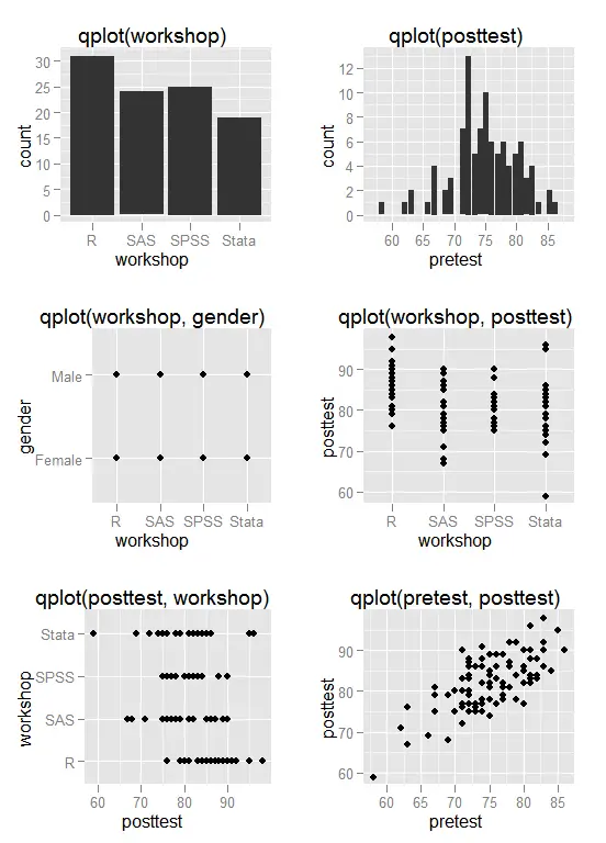
To make it easy to get started, the ggplot2 package offers two main functions: quickplot() and ggplot(). The quickplot() function – also known as qplot() – mimics R’s traditional plot() function in many ways. It is particularly easy to use for simple plots. Below is an example of the default plots that qplot() makes. The command that created each plot is shown in the title of each graph. Most of them are useful except for middle one in the left column of qplot(workshop, gender). A plot like that of two factors simply shows the combinations of the factors that exist which is certainly not worth doing a graph to discover.
While qplot() is easy to use for simple graphs, it does not use the powerful grammar of graphics. The ggplot() function does that. To understand ggplot, you need to ask yourself, what are the fundamental parts of every data graph? They are:
- Aesthetics – these are the roles that the variables play in each graph. A variable may control where points appear, the color or shape of a point, the height of a bar and so on.
- Geoms – these are the geometric objects. Do you need bars, points, lines?
- Statistics – these are the functions like linear regression you might need to draw a line.
- Scales – these are legends that show things like circular symbols represent females while circles represent males.
- Facets – these are the groups in your data. Faceting by gender would cause the graph to repeat for the two genders.
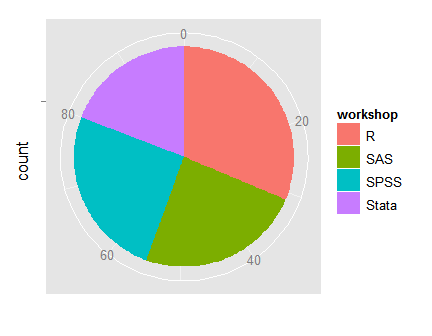
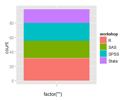
In R for SAS and SPSS Users and R for Stata Users, I showed how to create almost all the graphs using both qplot() and ggplot(). For the remainder of this page, I will use only ggplot() because it is the more flexible function, and by focusing on it, I hope to make it easier to learn. Let us start our use of the ggplot() function with a single stacked bar plot. It is not a very popular plot, but it helps demonstrate how different the grammar of graphics perspective is. On the x-axis, there really is no variable, so I plugged in a call to the factor() function that creates an empty one on the fly. I then fill the single bar in using the fill argument. There is only one type of geometric object on the plot, which I add with geom_bar. The colors are a bit garish, but they are chosen so that colorblind people (10% of males) can still read them.
ggplot(mydata100, aes(x = factor(""), fill = workshop) ) +geom_bar()

The x-axis comes out labeled as “factor(“”)” but we can over-write that with a title for the x-axis. What is particularly interesting is that this can become a pie chart simply by changing its coordinate system to polar. The final line of code changes the label on the discrete x-axis to blank with “ ”.
ggplot(mydata100, aes(x = factor(""), fill = workshop) ) +
geom_bar() +
coord_polar(theta = "y") +
scale_x_discrete("")
Bar Plots
The upper left corner of the plot of the first plot above shows a bar plot of workshop created with qplot(). From the grammar of graphics approach, that graph has only one type of geometric object: bars. The ggplot() function itself only needs to specify the data set to use. Note the unusual use of the plus sign “+” to add the effect of of geom_bar() to ggplot(). Only one variable plays an “aesthetic” role: workshop. The aes() function sets that role. So here is one way to write the code:
ggplot(mydata100) + geom_bar( aes(workshop) )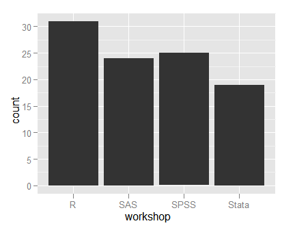
In our case, it’s just as easy either way, but I like the first approach since it ties the aesthetic role clearly to the bars. However, as our graphs become more complex, it can be a big time-saver to set as many aesthetic roles in the ggplot() function call and let it pass them through to various other functions that we will add on to build a more complex plot.
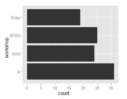
The grammar of graphics way of creating plots looks quite odd at first, especially when you consider that qplot(workshop) also does the above plot! However, as graphs get more complex, ggplot() can handle it using the same ideas while qplot() cannot. Flipping from vertical to horizontal bars is easy by adding the coord_flip() function.
ggplot(mydata100, aes(workshop) ) +geom_bar() + coord_flip()
If you want to fill the bars with color, you can do that using the “fill” argument.
ggplot(mydata100,aes(workshop, fill = workshop ) ) +geom_bar()

The use of color above was, well, colorful, but it did not add any useful information. However, when displaying bar plots of two factors, the fill argument becomes very useful. You can display it in several ways. Below I use fill to color the bars by workshop and set the “position” to stack.
ggplot(mydata100, aes(gender, fill = workshop) ) +
  geom_bar(position = "stack")
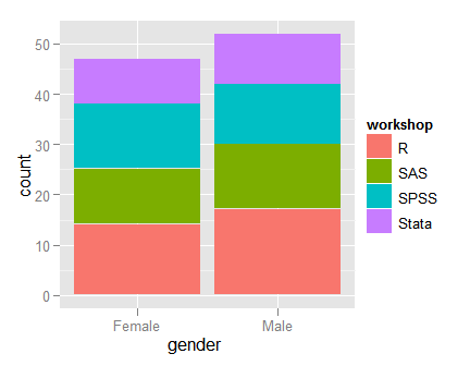
In the plot above, the height of the bars represents the total number of males and females. This is fine if you want to compare the total counts, but if you want to compare the proportions of each gender that took each class, you would have to make the bars equal heights. You can do that by simply changing the position to “fill.”
ggplot(mydata100, aes(gender, fill=workshop) ) +geom_bar(position="fill")
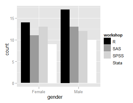
Here is the same plot changing only the bar position to be “dodge”.
ggplot(mydata100, aes(gender, fill=workshop ) ) +geom_bar(position="dodge")
You can change any of the above colored graphs to shades of grey by simply adding the scale_fill_grey() function. Here is the plot immediately above repeated in greyscale.
ggplot(mydata100, aes(gender, fill=workshop ) ) +geom_bar(position="dodge") +scale_fill_grey(start = 0, end = 1)
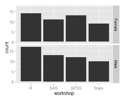
You can get the same information that is in the above plot by making small separate plots for one of the groups. You can accomplish that with the facet_grid() function. It accepts a formula in the form “rows ~ columns”, so using “gender ~ .” asks for two rows for the genders (three if we had not removed missing values) and no columns.
ggplot(mydata100, aes(workshop) ) +geom_bar() +facet_grid(gender ~ .)
Pre-summarized Data
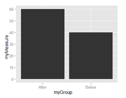
The ggplot2 package summarizes your data for you. If it is already summarized, you can create a small data frame of the results to plot.
myTemp <- data.frame(myGroup = factor( c("Before","After") ),myMeasure=c(40, 60) )ggplot(data=myTemp, aes(myGroup, myMeasure) ) +geom_bar(stat = "identity")
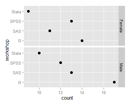
Dot Charts
Dot charts are similar to bar charts, but since they plot points on both an x- and y-axis, they require a special variable called “..count..”. That calculates the counts and lets you plot them on the y-axis. The points use the “bin” statistic. Since dot charts are usually shown “sideways” I am adding the coord_flip() function.
ggplot(mydata100, aes(workshop, ..count.. ) ) +geom_point(stat = "count", size = 4) +coord_flip() +facet_grid( gender ~ . )
Adding Titles and Labels
To add a title, use the labs() function and its title and x or y arguments. The character sequence “\n” tells R to go to a new line in all R packages. In this example, I use it to put the word “Workshops” onto a new line. That’s optional, of course.
ggplot(mydata100, aes(workshop, ..count..)) +geom_bar() +labs(title = "Workshop Attendance",x = "Statistics Package \nWorkshops")
Histograms
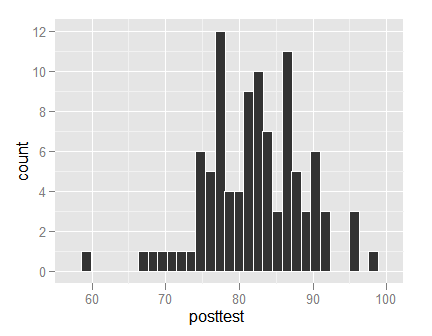
Recall from our first example that you can use qplot to get a quick histogram: qplot(posttest). However, as things get more complicated, ggplot() is easier to control. The geom_histogram function is all you need. I have set the color of the bar edges to white. Without that, the bars all run together in the same shade of grey.
ggplot(mydata100, aes(posttest) ) +geom_histogram(color = "white")
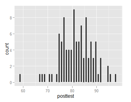
You can change the number of bars used using the binwidth argument. Since this many bars do not touch, I did not bother setting the edge color to white.
ggplot(mydata100, aes(posttest) ) +geom_histogram(binwidth = 0.5)
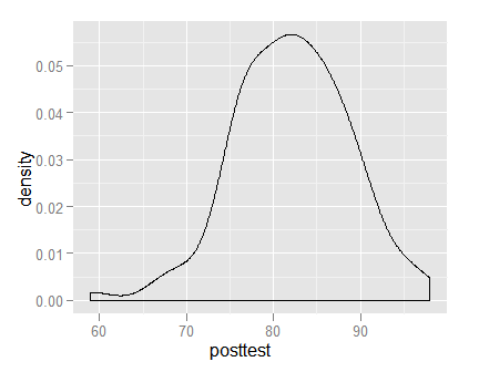
If you prefer a density plot, that is easy too.
ggplot(mydata100, aes(posttest)) +geom_density()
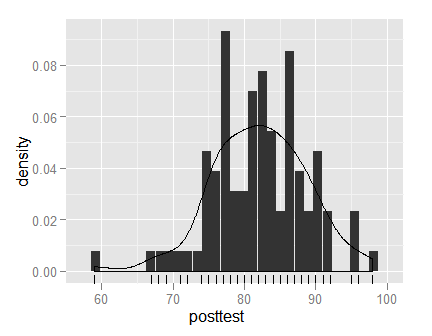
It is easy to layer many different geometric objects onto your plots. In this case, to get the same axis on the histogram as the density used, I used a special ggplot2 variable named “..density..” on the y-axis. I also added a “rug” of carpet-like tick marks on the x-axis using geom_rug.
ggplot(data=mydata100) +geom_histogram( aes(posttest, ..density..) ) +geom_density( aes(posttest, ..density..) ) +geom_rug( aes(posttest) )
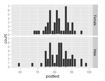
Comparing group histograms is easy when you facet them.
ggplot(mydata100, aes(posttest) ) +geom_histogram(color = "white") +facet_grid(gender ~ .)
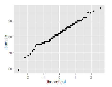
Normal QQ Plots
Normal QQ plots are done in ggplot with the stat_qq() function and the sample aesthetic.
ggplot(mydata100, aes(sample = posttest) ) +stat_qq()
Strip Plots
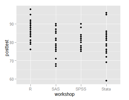
With fairly small data sets, you can do strip plots using the point geom.
ggplot(mydata100, aes(workshop, posttest) ) +
  geom_point()
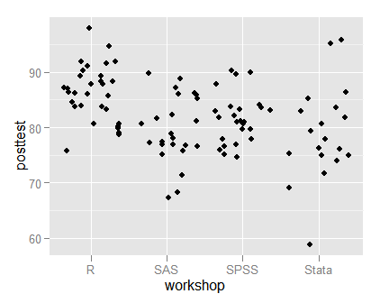
With large data sets, you can use the jitter geom instead. Our data is so small that the default amount of jitter makes it hard even to notice where each group ends. See the books for details on controlling the amount of jitter.
ggplot(mydata100, aes(workshop, posttest) ) +
  geom_jitter()
Scatter and Line Plots
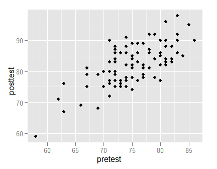
Various types of scatter and line plots can be done using different geoms, as shown below. You can, of course, add multiple geoms to a plot. For example, you might want both points and lines, in which case you would simply add both geoms.
ggplot(mydata100, aes(pretest, posttest)) +
  geom_point()
When you add a line geom, the ggplot sorts the data along the x-axis automatically. If you had time-series data that were not sorted by date, it would do so.
ggplot(mydata100, aes(pretest, posttest) ) +
  geom_line()
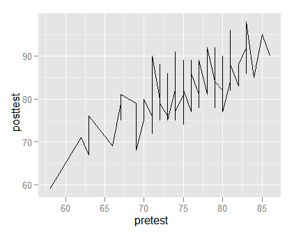
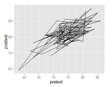
The path geom leaves the order of the data as it is; it does not sort it before connecting the points. This would make more sense if we had geographic mapping data. See the books for more examples.
ggplot(mydata100, aes(pretest, posttest) ) +
  geom_path()
Scatterplots for Large Datasets
Large data sets provide a challenge since other points obscure so many points. Eventually, the entire set of scatter forms a single large blob. To examine ways to alleviate this problem, let us create a data set with 5,000 points.
pretest2  <- round( rnorm( n=5000, mean=80, sd=5) )
posttest2 <- round( pretest2 + rnorm( n=5000, mean=3, sd=3) )
pretest2[  pretest2 > 100] <- 100
posttest2[posttest2 > 100] <- 100
temp <- data.frame(pretest2,posttest2)
Now I will plot the data using small-sized points, jittering their positions and coloring them with some transparency (called “alpha” in computer-speak).
ggplot(temp, aes(pretest2, posttest2), size=2,
  position = position_jitter(x = 2, y = 2) ) +
  geom_jitter(colour=alpha("black",0.15) )
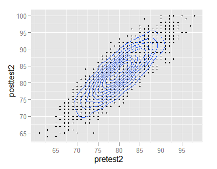
Next I will use very small sized points and lay a set of 2D density contours on top of them. To help see the contours more clearly, I will not jitter the points.
ggplot(temp, aes( x=pretest2, y=posttest2) ) +
  geom_point( size=1 ) +
  geom_density2d()
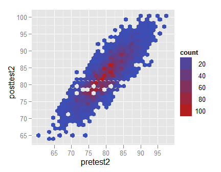
Finally, I will create a hexbin plot, that replaces bunches of points with a larger hexagonal symbol.
ggplot(temp, aes(pretest2, posttest2)) +
  geom_hex( bins=30 )
Scatter Plots with Fit Lines
The ggplot() function makes it particularly easy to add fit lines to scatter plots. Simply adding the geom_smooth() function does the trick.
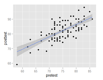
ggplot(mydata100, aes(pretest, posttest) ) +
  geom_point() +
  geom_smooth()
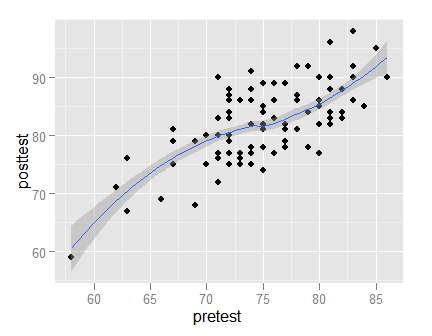
Adding a linear regression fit requires only the addition of “method = lm” argument.
ggplot(mydata100, aes(pretest, posttest) ) +
  geom_point() +
  geom_smooth(method=lm)
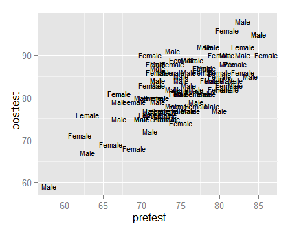
To plot labels instead of point characters, add the label aesthetic. I placed “size = 3” in the geom_text function to clarify its role. I could have put it in the aes() function call within the ggplot() call, but then it would have added a useless legend indicating what 3 represented when it is merely a size.
ggplot(mydata100, aes(pretest, posttest,
  label = as.character(gender) )) +
  geom_text(size = 3)
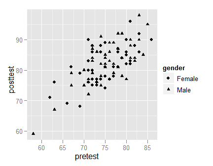
To use point shapes to represent the value of a third variable, simply set the shape aesthetic.
ggplot(mydata100, aes(pretest, posttest) ) +
  geom_point( aes(shape = gender ) )
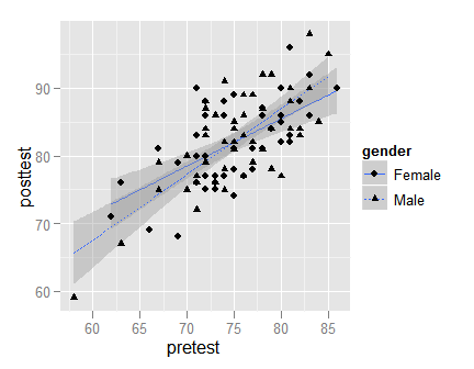
Scatter Plots with Linear Fits by Group
One way to use a different fit for each group is to do them on the same plot. This involves setting aesthetics for both linetype and point shape. You can place these in the main ggplot() function call, but since linetype applies only to geom_smooth and shape applies only to geom_point, I prefer to place them in those function calls. I tend to think of lines being added to the scattered points, but in this case I placed the geom_point() call last so that the shading from the gray confidence intervals would not shade the points themselves.
ggplot(mydata100, aes(pretest, posttest) ) +
  geom_smooth( aes(linetype = gender), method = "lm") +
  geom_point(  aes(shape    = gender) )
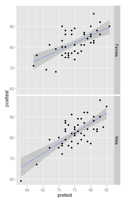
Another way to display linear fits per group is to facet the plot.
ggplot(mydata100, aes(pretest, posttest ) ) +
  geom_smooth(method = "lm") +
  geom_point() +
  facet_grid(gender ~ .)
Box Plots
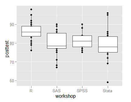
The ggplot package offers considerable control over how you can do box plots. Here I plot the raw points and then the boxes on top of them. This hides the points that are actually in the middle 50% of the data. They are usually dense and of less interest than the points that are further out. If you have a lot of data, you might consider using geom_jitter() to spread the points around, preventing over-plotting.
ggplot(mydata100, aes(workshop, posttest )) +
  geom_point() +
  geom_boxplot()
The ggplot2 package offers a nearly endless array of combinations to visualize your data. I hope you have found these examples useful. Advanced users will find much more detail in our books. In particular, the BlueSky Statistics User Guide contains the point-and-click equivalents for most of these graphs, and it will show you the ggplot code that it writes. Enjoy!
Not too familiar with that. You’ll have to deicde whether the overhead of computing an elevation matrix is worse than writing your own function.Here’s a different question: can you plot a three-dimensional curve, i. e. a mapping from some interval into R3? persp() won’t help with that. One would think that curve() could accept a vector function as its first parameter. But I don’t think it does. Any ideas?
Here’s some info about plotting 3D surfaces:
http://stackoverflow.com/questions/1896419/plotting-a-3d-surface-plot-with-contour-map-overlay-using-r
Cheers,
Bob
Its there a way to add a main title to the plot? I’m trying to add it but I can’t… 🙁
Hi Juan,
Here’s an example.
Cheers,
Bob
ggplot(mydata100,
aes(pretest,posttest)) +
geom_point() +
labs(title = “Plot of Test Scores”,
x = “Before Workshop”,
y = “After Workshop”) +
theme(plot.title =
element_text(size = rel(2.5))
)
Hello Mr. Muenchen.
Thank you very much! I made what you told me and works very good!
Here is the code I used if it helps for someone else.
graf <- ggplot(data.name)
graf + geom_density2d(aes(CAPARACHO.ANCHO,CAPARACHO.LARGO, colour=SEXO)) + geom_point(aes(CAPARACHO.ANCHO, y=CAPARACHO.LARGO, colour=SEXO)) + labs(title="Estimacion de densidad ancho-largo del caparacho", x="Ancho del Caparacho", y="Largo del Caparacho")+ theme(plot.title=element_text(size=rel(1.5)))
I just change the size relation for 1.5 because 2.5 was too big.
Take care & thank you!
Juan.
Dear Mr Muenchen,
Thank you for these very helpful examples. I just wondered how you could display percentages (instead of counts) on the y-axis in the bar charts. The practice dataset (mydata100) has 100 cases, so it won’t make a difference here, but in other datasets it will. Thanks in advance.
Hi LKK,
Here’s a link that shows how to do it:
http://stackoverflow.com/questions/3695497/ggplot-showing-instead-of-counts-in-charts-of-categorical-variables
Cheers, Bob
Thanks for sharing this link. Actually, I wanted to create a grouped bar chart, displaying % within gender (my grouping variable). This turned out to be a bit more complicated than expected. After consulting this page for further reference, I managed to get a solution: http://stackoverflow.com/questions/17368223/ggplot2-multi-group-histogram-with-in-group-proportions-rather-than-frequency
I can provide more details if necessary, but I don’t know if this is the right venue to do so.
Dear Bob,
The link to R Cheat Sheets on the blogroll seems to be outdated. I think this is the new link: https://www.rstudio.com/resources/cheatsheets/
Hi LKK,
Thanks for letting me know. It’s fixed now.
Cheers,
Bob
Very useful..!
When using facet plot, how can we change the label of each fact?
e.g. change ‘female’ label here to ‘women’; and ‘male’ to ‘men’
Hi Sawsan,
When you create a factor, use this form:
gender <- factor(gender, levels=c(1,2), labels=c("Women","Men)) or if they were coded "f" and "m" use this: gender <- factor(gender, levels=c("f","m"), labels=c("Women","Men)) Cheers, Bob
Hi Bob, very interesting topic and well explained.
Hi Bob
Thank you for this awesome post . I have been using what I have learned from your post for my data. However, I have some difficulty with graphing and I hope you can give me some guidance. Here is my problem. I’m trying to create axis breaks similar to this in ggplot2. So far I can not find anything to help me with this. I hope you can show me the way. Thank you so much for your time.
http://www.r-bloggers.com/wp-content/uploads/2010/08/bar-chart-natural-axis-split1.png
Hi Lew,
I’m pretty sure ggplot2 doesn’t have axis splits built into it yet, but here’s a clever work-around that looks pretty good:
https://joergsteinkamp.wordpress.com/2016/01/22/broken-axis-with-ggplot2/
Cheers,
Bob
Hi,
if I want to draw a boxplot with this form:
ggplot(mydata100, aes(workshop, posttest )) + geom_boxplot()
the ggplot2 draws me some kind of point plot and i cant figure it out where is the problem.
Thank you for the answer!
Hi Aknela,
That code worked fine when I ran it. If anyone has a problem with that plot, just download a new copy of the data and make sure that the ggplot2 package is installed and loaded.
Cheers,
Bob
Thanks. Great Tutorial.
if i have two group in svm classificaion example male,female how i can draw the male shape different from the female
Hi Ahmed,
There’s an example of that above showing:
ggplot(mydata100, aes(pretest, posttest) ) +
geom_point( aes(shape=gender ) )
Cheers,
Bob
I have a dataset and I want to run clustered bar graph with error bars in stata.
Hi Ismail,
Here’s the place to go for help with Stata:
https://www.statalist.org/forums/help
Cheers,
Bob