R offers three main graphics packages: traditional (or base), lattice and ggplot2. Traditional graphics are built into R, create nice looking graphs, and are very flexible. However, they require a lot of work when repeating a graph for different groups in your data. Lattice graphics excel at repeating graphs for various groups. The ggplot2 package also deals with groups well and is quite a bit more flexible than lattice graphics. This section deals just with traditional R graphics functions. Our books devote 130 pages to describing the relationship among these packages and explaining how to create each type of plot. However, if you look at the examples below, you will often be able to plug your variables into the code to create the graph you need. The practice data set is shown here. The programs and the data they use are also available for download here.
R for SAS and SPSS Users and R for Stata Users contain examples for advanced users. Paul Murrell’s book R Graphics (right) also offers excellent coverage of traditional graphics in great detail.
Bar Plots
Bar Plots of Counts
If you have pre-summarized data, it is easy to get a bar plot of it.
barplot( c(40, 60) )

This bar plot summarizes the variable q4. If the data is a factor (q4 is not) then plot() will do it automatically since it is a generic function. You can also use barplot() if the data is summarized with table() first.
plot( as.factor(q4) )
barplot( table(q4) )
This plots a factor, gender. The plot() function recognizes that it is a factor, and so it summarizes it before plotting it. Alternatively, you can use barplot() on the frequencies obtained by table().
plot(gender) # or...
barplot( table(gender) )

Using traditional graphics functions, you can turn a graph on its side by adding the argument, horiz = TRUE. As before, plot() will do frequencies automatically and barplot() requires some sort of summarization, in this case table().
plot(workshop, horiz = TRUE)  # or...
barplot(table(workshop), horiz = TRUE)

A stacked bar plot is like a rectangular pie chart. You can make one by converting the output from table() into a matrix. Note that it drops the value labels so we would have to add them to make this useful. More on that later.
barplot( as.matrix( table(workshop) ), beside = FALSE)

You can visualize frequencies on two factors by using plot(). It will label the x- and y-axes so I have suppressed that using the arguments xlab=”” and ylab=””. The barplot() function can also do this plot if you first summarize the data with another function, table() in this case. However, it does not label the genders on the y-axis, making it a bit more work.
plot(workshop, gender, xlab = "", ylab = "")

You can also do this plot using the mosaicplot() function. It uses table() to get frequencies. It would display “table(workshop, gender)” in the main title if I had not suppressed it with the argument main=””.
mosaicplot( table(workshop, gender), main = "" )

The mosaicplot() function can also handle more than two factors. Our practice data set only has two, so we will use the Titanic survivor data that comes with R. The plot below is much larger than the others because displaying the third variable takes up quite a bit more space.
mosaicplot(~ Sex + Age + Survived, data = Titanic, color = TRUE)

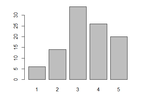
Bar Plots of Means
So far, we have been plotting frequencies. An advantage barplot() has over plot() is that you can get the height of bars to represent any measure you like. Below I use tapply() to get the means of q1 by gender, store it in myMeans and then plot those means.
myMeans <- tapply(q1, gender, mean, na.rm = TRUE)
barplot(myMeans)

We can get means broken down by both gender and workshop by including both of them on the tapply() call. To include more than one factor in tapply(), you must supply the factors in a list (or a data frame, which is a type of a list). Note that we do not labels for the workshops. You could add them with the legend() function (see next example) but this is a good example of something the ggplot() function would do automatically. I never use the barplot function for more than one factor.
myMeans <- tapply(q1, list(workshop, gender), mean, na.rm = TRUE)
barplot(myMeans, beside = TRUE)

Adding Titles, Labels, Colors, and Legends
All the traditional graphics functions calls can be embellished with a variety of arguments: col for color, xlab/ylab for x- and y-axis labels, main and sub for main and subtitles. The legend function provides an extreme level of control over legends or scales. However, the functions in the ggplot2 package will do very nice legends automatically.
Graphics Parameters and Multiple Plots on a Page
Graphics parameters control R’s traditional plot functions. You can get a list of them by running simply “par()”. One of the parameters is mfrow. It sets up multi-frame plots in rows. Once you have set how many rows (first value) and columns (second) then all the plots that follow will fill the rows as we read: left to right, top to bottom. Here is an example.
par(mfrow = c(2,2))  # 2 rows, 2 columns.
barplot( table(gender, workshop) )
barplot( table(workshop, gender) )
barplot( table(gender, workshop), beside = TRUE )
barplot( table(workshop, gender), beside = TRUE )
par(mfrow = c(1, 1))  # 1 row, 1 column (back to the default).

Pie Charts
A pie chart is easy to do using pie() but the slices are empty by default. The col argument can fill in shades of gray or colors.
pie( table(workshop),
     col = c("white", "gray90", "gray60", "black") )

Dot Charts
The dotchart() function works just like barplot() in that you either provide it values directly or use other summarization functions to get those values. Below I use table() to get frequencies. By default dotchart() uses open circles as its plot character. The argument pch = 19 changes that to be a solid circle, and the cex argument makes the character bigger through character expansion.
dotchart( table(workshop, gender), pch = 19, cex = 1.5)

Histograms
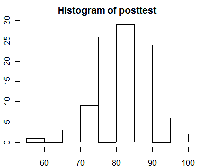
A basic histogram is very easy to get. Note that it adds its own main title to the plot. You can suppress that by adding: main = “”.
hist(posttest)
You can change the number of bars in the histogram with the breaks argument. The lines() function can add a density curve to the plot, and the rug() function adds shag carpet-like tick marks to the x-axis where each data point appears.
[sourcecode language="r"]
hist(posttest, breaks = 20, probability = TRUE)
lines( density(posttest) )
rug(posttest)
[/sourcecode]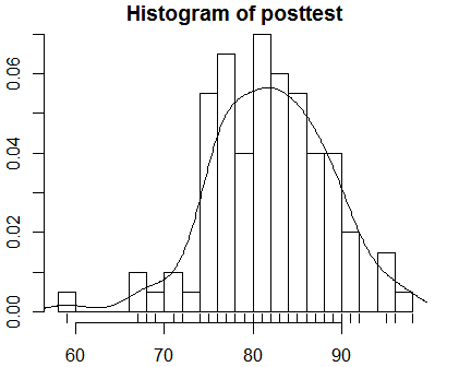
You can select subsets of your data to plot by using logical selections as in any R function call. Here I have selected the males. It displays the logical selection as the label on the x-axis. You can suppress that with: xlab = “”. I have also used the col argument to change the color of the bars to gray.
[sourcecode language="r"]
hist( posttest[gender == "Male"],
 col = "gray60",
      main = "Histogram for Males Only")
[/sourcecode]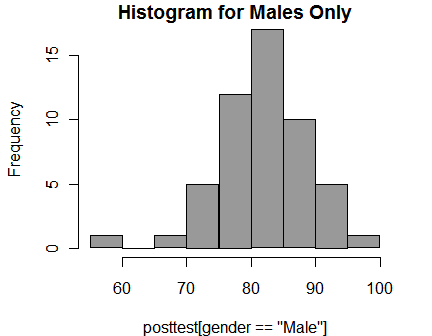
Normal QQ Plots
A normal QQ plot displays a fairly straight line when the data are normally distributed. R has a qqnorm() function that is built in, but I prefer the qq.plot() function in the car (Companion to Applied Regression) package since it includes a 95% confidence interval.
library("car")
qq.plot(posttest,
  labels = row.names(mydata100),
  col = "black")

Strip Charts
Strip charts are scatter plots of single variables. To prevent points from obscuring one another, they can either be moved around a bit at random (jittered) or stacked upon one another. The multi-frame plot below shows both approaches.
par(mfrow = c(2,1))  # 2 rows, 2 columns.

stripchart(posttest, method = "jitter",
main = "Stripchart with Jitter")

stripchart(posttest, method"stack",
main = "Stripchart with Stacking")

par( mfrow=c(1,1) )  # Back to 1 row, 1 column.

You can display either type of strip chart by group.
stripchart(posttest ~ workshop, method = "jitter")

Scatter Plots and Line Plots
Scatter plots are the default when you supply two numeric variables to the plot() function.
plot(pretest, posttest)

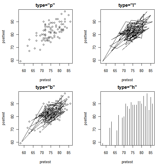
The type argument controls whether plot() displays points (“p”), lines (“l”), both (“b”), or histogram-like needles to each point (“h”). Displaying lines would make sense if our data were collected through time and displayed overall or seasonal trends. The order of the points in our data set mean nothing so we get a mess of zig-zagging lines. Note that “main” changes the title, not the display; that is controlled only by the type argument.
par( mfrow=c(2,2) )  # 2 rows, 2 columns.

plot( pretest, posttest, type = "p", main = 'type = "p")
plot( pretest, posttest, type = "l", main = 'type = "l")
plot( pretest, posttest, type = "b", main = 'type = "b")
plot( pretest, posttest, type = "h", main = 'type = "h")

par( mfrow=c(1,1) )  # Back to 1 row, 1 column.
If you have many points plotting on top of one another, as often happens with 1 to 5 Likert-scale data, you can add some jitter (random variation) to the points to get a better view of overall trends.
par( mfrow = c(1, 2) )

plot( q1, q4, main="Likert Scale Without Jitter")
plot( jitter(q1, 3), jitter(q4, 3),
  main="Likert Scale With Jitter")

par( mfrow = c(1, 1) )

Scatter Plots of Large Data Sets
The problem of overplotting becomes severe when you have thousands of points. In the next example I generate a new data set containing 5,000 observations. Then I plot them first using the default settings (left). Many of the points are obscured by other points. On the right side I plot the data using a much smaller point character and add some jitter so you can see many more of the points.
# Create two new variables with 5,000 values.
pretest2  <- round( rnorm( n=5000, mean=80, sd=5) )
posttest2 <- round( pretest2 + rnorm(n=5000, mean=3, sd=3) )

# Make sure 100 is the largest possible score.
 pretest2[pretest2  > 100] <- 100
posttest2[posttest2 > 100] <- 100

par(mfrow=c(1, 2) )  # 1 row, 2 columns.

plot( pretest2, posttest2,
  main="5,000 Points, Default Character \nNo Jitter")
plot( jitter(pretest2,4), jitter(posttest2,4), pch = "."
  main = "5,000 Points Using pch = '.' \nand Jitter")

Another way to do scatter plots of large data sets is to replace a set of points with a single large hexagonal point. The hexbin() function does just that. The plot below is shown larger than most because the values in the scale showing the number of counts in each hexagon overwrite one another in smaller sizes.
library("hexbin")
plot( hexbin(pretest2, posttest2) )

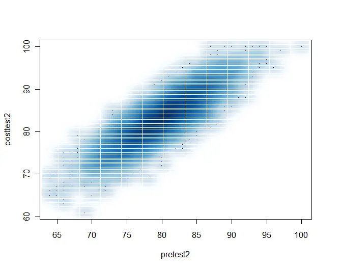
A final way to get a scatter plot for large numbers of observations is to use the smoothScatter() function shown below. The white lines that divide the scatter into rectangles look oddly spaced in this low-resolution image, but they look much better in a high-resolution version for publication.
smoothScatter(pretest2, posttest2)
To see what type of line might fit your data, the lowess() function is a good place to start. The lines() function adds the lowess() fit to the data.
[sourcecode language="r"]
plot(posttest ~ pretest)
lines( lowess(posttest ~ pretest) )
[/sourcecode]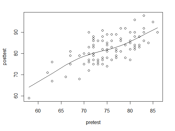
That looks like a fairly straight line, so we might want to fit that with a simple linear regression. The abline() function can add any straight line in the form y=ax+b where the a and b arguments provide the slope and y-intercept, respectively. Since the Im() function does linear models that supply the slope and intercept, abline() allows you to nest lm() within it.
[sourcecode language="r"]
plot(posttest ~ pretest)
abline( lm(posttest ~ pretest) )
[/sourcecode]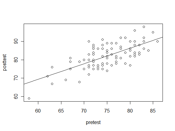
To use point characters to identify groups in your data, you can add the pch argument. It accepts numeric vectors, so to use a factor like gender, nest it within the as.numeric() function. By using logical selections on the variables, such as gender == “Male” you can easily get the abline() function to do separate lines for each group. You can also use which(gender “Male”) to select groups while eliminate missing values a bit more cleanly; see the books for obsessive details on that. The lty argument sets the line type for each group.
plot(posttest~pretest, pch = as.numeric(gender) )

abline( lm( posttest[gender == "Male"]
          ~ pretest[ gender == "Male"]),
       lty = 1 )

abline( lm(posttest[gender == "Female"]
          ~ pretest[ gender == "Female"]),
        lty = 2)

legend("topleft", c("Male", "Female"),
       lty = c(1, 2), pch = c(2, 1) )

Plotting Labels Instead of Points
A helpful way to display group membership on a scatter plot is to plot labels instead of other plot characters. If one character will suffice, the pch argument will do this. Since gender is a factor and I need character values for this plot, I enclose gender in the as.character() function. Below you can easily see the lowest scoring person on both pretest and posttest is male.
plot(pretest, posttest, pch = as.character(gender)

The pch argument will only display the first character. That’s often a good idea since it minimizes point overlap. However, you can use whole labels by suppressing all plot characters with pch = “n” and adding them with the text() function. Although this plot is quite a mess with our practice data set, it works quite well with small data sets.
plot(pretest, posttest, type = "n")
text(pretest, posttest, label = as.character(gender) )

Box Plots
Box plots are easy to do with the plot() function. R also has a boxplot() function that allows for additional control. See books for details.
plot(workshop, posttest)
