The field of data science is changing so rapidly that it’s quite hard to keep up with it all. When I first started tracking The Popularity of Data Science Software in 2010, I followed only ten packages, all of them classic statistics software. The term data science hadn’t caught on yet, data mining was still a new thing. One of my recent blog posts covered 53 packages, and choosing them from a list of around 100 was a tough decision!
To keep up with the rapidly changing field, you can read the information on a package’s web site, see what people are saying on blog aggregators such as R-Bloggers.com or StatsBlogs.com, and if it sounds good, download a copy and try it out. What’s much harder to do is figure out how they all relate to one another. A helpful source of information on that front is the book Disruptive Analtyics, by Thomas Dinsmore.
I was lucky enough to be the technical reviewer for the book, during which time I ended up reading it twice. I still refer to it regularly as it covers quite a lot of material. In a mere 262 pages, Dinsmore manages to describe each of the following packages, how they relate to one another, and how they fit into the big picture of data science:
Alluxio
Alpine Data
Alteryx
APAMA
Apex
Arrow
Caffe
Cloudera
Deeplearning4J
Drill
Flink
Giraph
Hadoop
HAWQ
Hive
IBM SPSS Modeler
Ignite
Impala
Kafka
KNIME Analytics Platform
Kylin
MADLib
Mahout
MapR
Microsoft R Aerver
Phoenix
Pig
Python
R
RapidMiner
Samza
SAS
SINGA
Skytree Server
Spark
Storm
Tajo
Tensorflow
Tez
Theano
Trafodion
As you can tell from the title, a major theme of the book is how open source software is disrupting the data science marketplace. Dinsmore’s blog, ML/DL: Machine Learning, Deep Learning, extends the book’s coverage as data science software changes from week to week.
I highly recommend both the book and the blog. Have fun keeping up with the field!
Kaggle.com is a web site that sponsors data science contests. People post problems there along the amount of money they are willing pay the person or team who solves their problem the best. Both money and the competitors’ reputations are on the line, so there’s strong motivation to use the best possible tools. Figure 9 compares the usage of the top two tools chosen by the data scientists working on the problems. From April 2015 through July 2016, we see the usage of both R and Python growing at a similar rate. At the most recent time point Python has pulled ahead slightly. Much more detail is available here.
Figure 9. Software used in data science competitions on Kaggle.com in 2015 and 2016.
I’ve just finished a major overhaul to my widely read article, Why R is Hard to Learn. It describes the main complaints I’ve heard from the participants to my workshops, and how those complaints can often be mitigated. Here’s the only new section:
The Tidyverse Curse
There’s a common theme in many of the sections above: a task that is hard to perform using base a R function is made much easier by a function in the dplyr package. That package, and its relatives, are collectively known as the tidyverse. Its functions help with many tasks, such as selecting, renaming, or transforming variables, filtering or sorting observations, combining data frames, and doing by-group analyses. dplyr is such a helpful package that Rdocumentation.org shows that it is the single most popular R package (as of 3/23/2017.) As much of a blessing as these commands are, they’re also a curse to beginners as they’re more to learn. The main packages of dplyr, tibble, tidyr, and purrr contain a few hundred functions, though I use “only” around 60 of them regularly. As people learn R, they often comment that base R functions and tidyverse ones feel like two separate languages. The tidyverse functions are often the easiest to use, but not always; its pipe operator is usually simpler to use, but not always; tibbles are usually accepted by non-tidyverse functions, but not always; grouped tibbles may help do what you want automatically, but not always (i.e. you may need to ungroup or group_by higher levels). Navigating the balance between base R and the tidyverse is a challenge to learn.
A demonstration of the mental overhead required to use tidyverse function involves the usually simple process of printing data. I mentioned this briefly in the Identity Crisis section above. Let’s look at an example using the built-in mtcars data set using R’s built-in print function:
We see the data, but the variable names actually ran off the top of my screen when viewing the entire data set, so I had to scroll backwards to see what they were. The dplyr package adds several nice new features to the print function. Below, I’m taking mtcars and sending it using the pipe operator “%>%” into dplyr’s as_data_frame function to convert it to a special type of tidyverse data frame called a “tibble” which prints better. From there I send it to the print function (that’s R’s default function, so I could have skipped that step). The output all fits on one screen since it stopped at a default of 10 observations. That allowed me to easily see the variable names that had scrolled off the screen using R’s default print method. It also notes helpfully that there are 22 more rows in the data that are not shown. Additional information includes the row and column counts at the top (32 x 11), and the fact that the variables are stored in double precision (<dbl>).
The new print format is helpful, but we also lost something important: the names of the cars! It turns out that row names get in the way of the data wrangling that dplyr is so good at, so tidyverse functions replace row names with 1, 2, 3…. However, the names are still available if you use the rownames_to_columns() function:
> library("dplyr")
> mtcars %>%
+   as_data_frame() %>%
+   rownames_to_column() %>%
+   print()
Error in function_list[[i]](value) :
 could not find function "rownames_to_column"
Oops, I got an error message; the function wasn’t found. I remembered the right command, and using the dplyr package did cause the car names to vanish, but the solution is in the tibble package that I “forgot” to load. So let’s load that too (dplyr is already loaded, but I’m listing it again here just to make each example stand alone.)
Another way I could have avoided that problem is by loading the package named tidyverse, which includes both dplyr and tibble, but that’s another detail to learn.
In the above output, the row names are back! What if we now decided to save the data for use with a function that would automatically display row names? It would not find them because now they’re now stored in a variable called rowname, not in the row names position! Therefore, we would need to use either the built-in names function or the tibble package’s column_to_rownames function to restore the names to their previous position.
Most other data science software requires row names to be stored in a standard variable e.g. rowname. You then supply its name to procedures with something like SAS’
“ID rowname;” statement. That’s less to learn.
This isn’t a defect of the tidyverse, it’s the result of an architectural decision on the part of the original language designers; it probably seemed like a good idea at the time. The tidyverse functions are just doing the best they can with the existing architecture.
Another example of the difference between base R and the tidyverse can be seen when dealing with long text strings. Here I have a data frame in tidyverse format (a tibble). I’m asking it to print the lyrics for the song American Pie. Tibbles normally print in a nicer format than standard R data frames, but for long strings, they only display what fits on a single line:
> songs_df %>%
+   filter(song == "american pie") %>%
+   select(lyrics) %>%
+   print()
# A tibble: 1 × 1
 lyrics
 <chr>
1 a long long time ago i can still remember how that music used
The whole song can be displayed by converting the tibble to a standard R data frame by routing it through the as.data.frame function:
> songs_df %>%
+   filter(song == "american pie") %>%
+   select(lyrics) %>%
+   as.data.frame() %>%
+   print()
 ... <truncated>
1 a long long time ago i can still remember how that music used
to make me smile and i knew if i had my chance that i could make
those people dance and maybe theyd be happy for a while but
february made me shiver with every paper id deliver bad news on
the doorstep i couldnt take one more step i cant remember if i cried
...
These examples demonstrate a small slice of the mental overhead you’ll need to deal with as you learn base R and the tidyverse packages, such as dplyr. Since this section has focused on what makes R hard to learn, it may make you wonder why dplyr is the most popular R package. You can get a feel for that by reading the Introduction to dplyr. Putting in the time to learn it is well worth the effort.
Forrester Research, Inc. is a company that provides reports which analyze the competitive position of tools for data science. The conclusions from their 2017 report, Forrester Wave: Predictive Analytics and Machine Learning Solutions, are summarized in Figure 3b. On the x-axis they list the strength of each company’s strategy, while the y-axis measures the strength of their current offering. The size and shading of the circles around each data point indicate the strength of each vendor in the marketplace (70% vendor size, 30% ISV and service partners).
As with Gartner 2017 report discussed above, IBM, SAS, KNIME, and RapidMiner are considered leaders. However, Forrester sees several more companies in this category: Angoss, FICO, and SAP. This is quite different from the Gartner analysis, which places Angoss and SAP in the middle of the pack, while FICO is considered a niche player.
Figure 3b. Forrester Wave plot of predictive analytics and machine learning software.
In their Strong Performers category, they have H2O.ai, Microsoft, Statistica, Alpine Data, Dataiku, and, just barely, Domino Data Labs. Gartner rates Dataiku quite a bit higher, but they generally agree on the others. The exception is that Gartner dropped coverage of Alpine Data in 2017. Finally, Salford Systems is in the Contenders section. Salford was recently purchased by Minitab, a company that has never been rated by either Gartner or Forrester before as they focused on being a statistics package rather than expanding into machine learning or artificial intelligence tools as most other statistics packages have (another notable exception: Stata). It will be interesting to see how they’re covered in future reports.
Compared to last year’s Forrester report, KNIME shot up from barely being a Strong Performer into the Leader’s segment. RapidMiner and FICO moved from the middle of the Strong Performers segment to join the Leaders. The only other major move was a lateral one for Statistica, whose score on Strategy went down while its score on Current Offering went up (last year Statistica belonged to Dell, this year it’s part of Quest Software.)
The size of the “market presence” circle for RapidMiner indicates that Forrester views its position in the marketplace to be as strong as that of IBM and SAS. I find that perspective quite a stretch indeed!
Alteryx, Oracle, and Predixion were all dropped from this year’s Forrester report. They mention Alteryx and Oracle as having “capabilities embedded in other tools” implying that that is not the focus of this report. No mention was made of why Predixion was dropped, but considering that Gartner also dropped coverage of then in 2017, it doesn’t bode well for the company.
For a much more detailed analysis, see Thomas Dinsmore’s blog.
The Bureau of Labor Statistics projects that jobs for statisticians will grow by 34% between 2014 and 2024. However, according to the nation’s largest job web site, the number of companies looking for “statisticians” is actually in sharp decline. Those jobs are likely being replaced by postings for “data scientists.”
I regularly monitor the Popularity of Data Science Software, and as an offshoot of that project, I collected data that helps us understand how the term “data science” is defined. I began by finding jobs that required expertise in software used for data science such as R or SPSS. I then examined the tasks that the jobs entailed, such as “analyze data,” and looked up jobs based only on one task at a time. I switched back and forth between searching for software and for the terms used to describe the jobs, until I had a comprehensive list of both. In the end, I had searched for over 50 software packages and over 40 descriptive terms or tasks. I had also skimmed thousands of job advertisements. (Additional details are here).
Search Terms
2/26/2017
2/17/2014
Ratio
Big Data
20,646
10,378
1.99
Data analytics
15,774
6,209
2.54
Machine learning
12,499
3,658
3.42
Statistical analysis
11,397
9,719
1.17
Data mining
9,757
7,776
1.25
Data Science
6,873
973
7.06
Quantitative analysis
4,095
3,365
1.22
Business analytics
4,043
2,867
1.41
Advanced Analytics
3,479
1,497
2.32
Data Scientist
3,272
974
3.36
Statistical software
2,835
2,102
1.35
Predictive analytics
2,411
1,497
1.61
Artificial intelligence
2,404
794
3.03
Predictive modeling
2,264
1,804
1.25
Statistical modeling
2,040
1,462
1.40
Quantitative research
1,837
1,380
1.33
Research analyst
1,756
1,722
1.02
Statistical tools
1,414
1,121
1.26
Statistician
904
1,711
0.53
Statistical packages
784
559
1.40
Survey research
440
559
0.79
Quantitative modeling
352
322
1.09
Statistical research
208
174
1.20
Statistical computing
153
108
1.42
Research computing
133
97
1.37
Statistical analyst
125
141
0.89
Data miner
34
19
1.79
Many terms were used outside the realm of data science. Other terms were used both in data science jobs and in jobs that require little analytic skill. Terms that could not be used to specifically find data science jobs were: analytics, data visualization, graphics, data graphics, statistics, statistical, survey, research associate, and business intelligence. One term, econometric(s), required deep analytical skills, but was too focused on one field.
The search terms that were well-focused on data science, but not overly focused in a single field are listed in the following table. The table is sorted by the number of jobs found on Indeed.com on February 26, 2017. While each column displays counts taken on a single day, the large size of Indeed.com’s database of jobs keeps its counts stable. The correlation between the logs of the two counts is quite strong, r=.95, p= 4.7e-14.
During this three-year period, the overall unemployment rate dropped from 6.7% to 4.7%, indicating a period of job growth for most fields. Three terms grew very rapidly indeed with “data science” growing 7-fold, and both “data scientist” and “artificial intelligence” tripling in size. The biggest surprise was that the use of the term “statistician” took a huge hit, dropping to only 53% of its former value.
That table covers a wide range of terms, but only on two dates. What does the long-term trend look like? Indeed.com has a trend-tracking page that lets us answer that question. The figure below shows solid the growth in the percentage of advertisements that used the term “data scientist” (blue, top right), while those using the term “statistician” (yellow, lower right) are steadily declining.
The plot on the company’s site is interactive (the one shown here is not) allowing me to see that the most recent data points were recorded on December 27, 2016. On that date, the percentage of jobs for data scientist were 474% of those for statistician.
As an accredited professional statistician, am I worried about this trend? Not at all. Statistical analysis software has broadened its scope to include many new capabilities including: machine learning, artificial intelligence, Structured Query Language, advanced visualization techniques, interfaces to Python, R, and Apache Spark. The software has changed because the job known as “statistician” has changed. Statisticians aren’t going away, their jobs are evolving into what we now know as data science. And that field is growing quite nicely!
One of the best ways to measure the popularity or market share of software for data science is to count the number of job advertisements for each. Job advertisements are rich in information and are backed by money so they are perhaps the best measure of how popular each software is now. Plots of job trends give us a good idea of what is likely to become more popular in the future.
Indeed.com is the biggest job site in the U.S., making its collection the best around. As their co-founder and former CEO Paul Forster stated, Indeed.com includes “all the jobs from over 1,000 unique sources, comprising the major job boards – Monster, Careerbuilder, Hotjobs, Craigslist – as well as hundreds of newspapers, associations, and company websites.” Indeed.com also has superb search capabilities and it includes a tool for tracking long-term trends.
Searching for jobs using Indeed.com is easy, but searching for software in a way that ensures fair comparisons across packages is tricky. Some software is used only for data science (e.g. SPSS, Apache Spark) while others are used in data science jobs and more broadly in report-writing jobs (e.g. SAS, Tableau). General-purpose languages (e.g. C, Java) are heavily used in data science jobs, but the vast majority of jobs that use them have nothing to do with data science. To level the playing field I developed a protocol to focus the search for each software within only jobs for data scientists. The details of this protocol are described in a separate article, How to Search for Data Science Jobs. All of the graphs in this section use those procedures to make the required queries.
I collected the job counts discussed in this section on February 24, 2017. One might think that a sample of on a single day might not be very stable, but the large number of job sources makes the counts in Indeed.com’s collection of jobs quite consistent. The last time I collected this data was February 20, 2014, and those that were collected using the same protocol (the general purpose languages) yielded quite similar results. They grew between 7% and 11%, and correlated r=.94, p=.002.
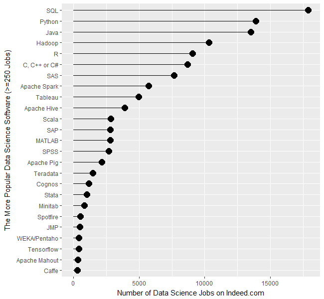
Figure 1a shows that SQL is in the lead with nearly 18,000 jobs, followed by Python and Java in the 13,000’s. Hadoop comes next with just over 10,000 jobs, then R, the C variants, and SAS. (The C, C++, and C# are combined in a single search since job advertisements usually seek any of them). This is the first time this report has shown more jobs for R than SAS, but keep in mind these are jobs specific to data science. If you open up the search to include jobs for report writing, you’ll find twice as many SAS jobs.
Next comes Apache Spark, which was too new to be included in the 2014 report. It has come a long way in an incredibly short time. For a detailed analysis of Spark’s status, see Spark is the Future of Analytics, by Thomas Dinsmore.
Tableau follows, with around 5,000 jobs. The 2014 report excluded Tableau due to its jobs being dominated by report writing. Including report writing will quadruple the number of jobs for Tableau expertise to just over 2o,ooo.
Figure 1a. The number of data science jobs for the more popular software (those with 250 jobs or more, 2/2017).
Apache Hive is next, with around 3,900 jobs, then a very diverse set of software comes next, with Scala, SAP, MATLAB, and SPSS, each having just over 2,500 data science jobs. After those, we see a slow decline from Teradata on down.
Much of the software had fewer than 250 job listings. When displayed on the same graph as the industry leaders, their job counts appear to be zero; therefore I have plotted them separately in Figure 1b. Alteryx comes out the leader of this group with 240 jobs. Microsoft was a difficult search since it appears in data science ads that mention other Microsoft products such as Windows or SQL Server. To eliminate such over-counting, I treated Microsoft different from the rest by including product names such as Azure Machine Learning and Microsoft Cognitive Toolkit. So there’s a good chance I went from over-emphasizing Microsoft to under-emphasizing it with only 157 jobs.
Figure 1b. The number of analytics jobs for the less popular software (under 250 jobs, 2/2017).
Next comes the fascinating new high-performance language Julia. I added FORTRAN just for fun and was surprised to see it still hanging in there after all these years. Apache Flink is also in this grouping, which all have around 125 jobs.
H2O follows, with just over 100 jobs.
I find it fascinating that SAS Enterprise Miner, RapidMiner, and KNIME appear with a similar number of jobs (around 90). Those three share a similar workflow user interface that make them particularly easy to use. The companies advertise the software as not needing much training, so it may be possible that companies feel little need to hire expertise if their existing staff picks it up more easily. SPSS Modeler also uses that type of interface, but its job count is about half that of the others, at 50 jobs.
Bringing up the rear is Statistica, which was sold to Dell, then sold to Quest. Its 36 jobs trails far behind its similar competitor, SPSS, which has a staggering 74-fold job advantage.
The open source MXNet deep learning framework, shows up next with 34 jobs. Tensorflow is a similar project with a 12-fold job advantage, but these two are both young enough that I expect both will be growing rapidly in the future.
In the final batch that has few, if any, jobs, we see a few newcomers such as DataRobot and Domino Data Labs. Others have been around for years, leaving us to wonder how they manage to stay afloat given all the competition.
It’s important to note that the values shown in Figures 1a and 1b are single points in time. The number of jobs for the more popular software do not change much from day to day. Therefore the relative rankings of the software shown in Figure 1a is unlikely to change much over the coming year. The less popular packages shown in Figure 1b have such low job counts that their ranking is more likely to shift from month to month, though their position relative to the major packages should remain more stable.
Each software has an overall trend that shows how the demand for jobs changes across the years. You can plot these trends using Indeed.com’s Job Trends tool. However, as before, focusing just on analytics jobs requires carefully constructed queries, and when comparing two trends at a time, they both have to fit in the same query limit. Those details are described here.
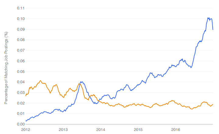
I’m particularly interested in trends involving R so let’s see how it compares to SAS. In Figure 1c we see that the number of data science jobs for SAS has remained relatively flat from 2012 until February 28, 2017 when I made this plot. During that same period, jobs for R grew steadily and finally surpassed jobs for SAS in early 2016. As noted in a blog post (and elsewhere in this report), use of R in scholarly publications surpassed those for SAS in 2015.
Figure 1c. Data science job trends for R (blue) and SAS (orange).
A long-standing debate has been taking place on the Internet regarding the relative place of Python and R. Ironically, this debate about data science software has involved very little actual data. However, it is possible now to at least study the job trends. Figure 1a showed us that Python is well out in front of R, at least on that single day the searches were run. What has the data looked like over time? The answer is shown in Figure 1d.
Figure 1d. Jobs trends for R (blue & lower) and Python (orange & upper).
As we see, Python surpassed R in terms of data science jobs back in 2013. These are, of course, very different languages and a quick scan of job descriptions will show that the R jobs are much more focused on the use of existing methods of analysis, while the Python jobs have more of a custom-programming angle to them.
In my ongoing quest to track The Popularity of Data Analysis Software, I’ve finally decided to change the title to use the newer term “data science”. The 2017 version of Gartner’s Magic Quadrant for Data Science Platforms was just published, so I have updated my IT Research Firms section, which I repeat here to save you from having to dig through the entire 40+ page tome. If your organization is looking for training in the R language, you might consider my books, R for SAS and SPSS Users or R for Stata Users, or my on-site workshops.
IT Research Firms
IT research firms study software products and corporate strategies, they survey customers regarding their satisfaction with the products and services, and then provide their analysis on each in reports they sell to their clients. Each company has its own criteria for rating companies, so they don’t always agree. However, I find the reports extremely interesting reading. While these reports are expensive, the companies that receive good ratings often purchase copies to give away to potential customers. An Internet search of the report title will often reveal the companies that are distributing such copies.
Gartner, Inc. is one of the companies that provides such reports. Out of the roughly 100 companies selling data science software, Gartner selected 16 which had either high revenue or lower revenue but high growth (see full report for details). After extensive input from both customers and company representatives, Gartner analysts rated the companies on their “completeness of vision” and their “ability to execute” that vision. Figure 3 shows the resulting plot. Note that purely open source software is not rated by Gartner, but nearly all the software in Figure 3 includes the ability to interact with R and Python.
The Leader’s Quadrant is the place for companies who have a future direction in line with their customer’s needs and the resources to execute that vision. The four companies in the Leaders quadrant have remained the same for the last three reports: IBM, KNIME, RapidMiner, and SAS. Of these, they rate IBM as having slightly greater “completeness of vision” due to the extensive integration they offer to open source software compared to SAS Institute. KNIME and RapidMiner are quite similar as the are driven by an easy to use workflow interface. Both offer free and open source versions, but RapidMiner’s is limited by a cap on the amount of data that it can analyze. IBM and SAS are market leaders based on revenue and, as we have seen, KNIME and RapidMiner are the ones with high growth.
Figure 3a. Gartner Magic Quadrant for Data Science Platforms
The companies in the Visionaries quadrant are those that have a good future plans but which may not have the resources to execute that vision. Of these, Microsoft increased its ability to execute compared to the 2016 report, and Alpine, one of the smallest companies, declined sharply in their ability to execute. The remaining three companies in this quadrant have just been added: H2O.ai, Dataiku, and Domino Data Lab.
Those in the Challenger’s quadrant have ample resources but less customer confidence on their future plans. Mathworks, the makers of MATLAB, is new to the report. Quest purchased Statistica from Dell, and it appears in roughly the same position as Dell did last year.
The Niche Players quadrant offer tools that are not as broadly applicable.
In 2017 Gartner dropped coverage of Accenture, Lavastorm, Megaputer, Predixion Software, and Prognoz.
The Knoxville R Users Group is presenting a workshop on text analysis using R by Bob Muenchen. The workshop is free and open to the public. You can join the group at https://www.meetup.com/Knoxville-R-Users-Group. A description of the workshop follows.
R for Text Analysis
When analyzing text using R, it’s hard to know where to begin. There are 37 packages available and there is quite a lot of overlap in what they can do. This workshop will demonstrate how to do three popular approaches: dictionary-based content analysis, latent semantic analysis, and latent Dirichlet allocation. We will spend much of the time on the data preparation steps that are important to all text analysis methods including data acquisition, word stemming/lemmatization, removal of punctuation and other special characters, phrase discovery, tokenization, and so on. While the examples will focus on the automated extraction of topics in the text files, we will also briefly cover the analysis of sentiment (e.g. how positive is customer feedback?) and style (who wrote this? are they telling the truth?)
The results of each text analysis approach will be the topics found, and a numerical measure of each topic in each document. We will then merge that with numeric data and do analyses combining both types of data.
The R packages used include quanteda, lsa, topicmodels, tidytext and wordcloud; with brief coverage of tm and SnowballC. While the workshop will not be hands-on due to time constraints, the programs and data files will be available afterwards.
Where: University of Tennessee Humanities and Social Sciences Building, room 201. If the group gets too large, the location may move and a notice will be sent to everyone who RSVPs on Meetup.com or who registers at the UT workshop site below. You can also verify the location the day before via email with Bob at muenchen@utk.edu.
Way back in 2012 I published a forecast that showed that the use of R for scholarly publications would likely pass the use of SAS in 2015. But I didn’t believe the forecast since I expected the sharp decline in SAS and SPSS use to level off. In 2013, the trend accelerated and I expected R to pass SAS in the middle of 2014. As luck would have it, Google changed their algorithm, somehow finding vast additional quantities of SAS and SPSS articles. I just collected data on the most recent complete year of scholarly publications, and it turns out that 2015 was indeed the year that R passed SAS to garner the #2 position. Once again, models do better than “expert” opinion! I’ve updated The Popularity of Data Analysis Software to reflect this new data and include it here to save you the trouble of reading the whole 45 pages of it.
If you’re interested in learning R, you might consider reading my books R for SAS and SPSS Users, or R for Stata Users. I also teach workshops on R, but I’m currently booked through mid October, so please plan ahead.
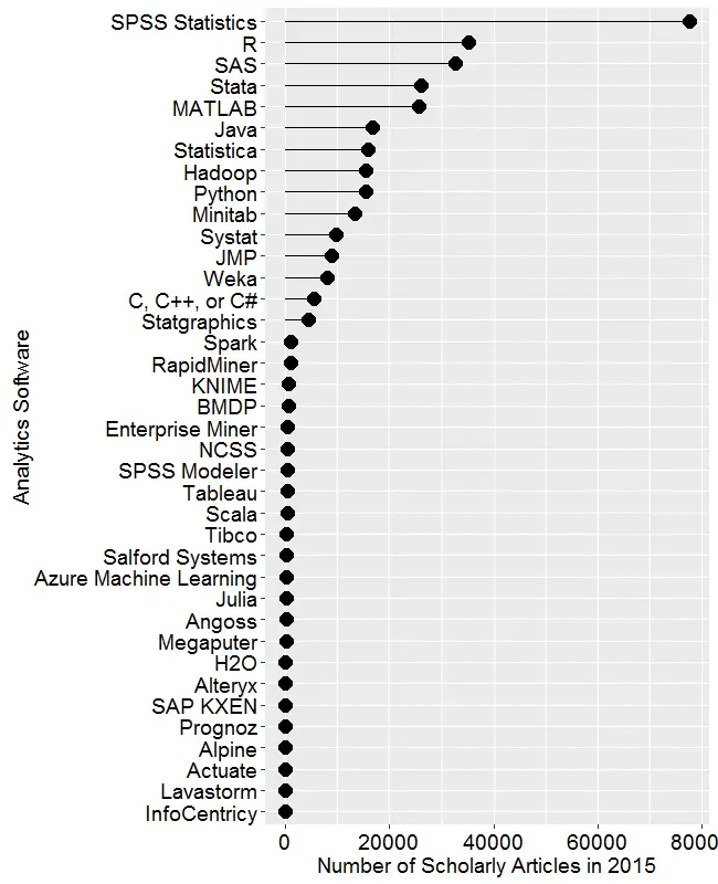
Figure 2a. Number of scholarly articles found in the most recent complete year (2015) for each software package.
Scholarly Articles
Scholarly articles are also rich in information and backed by significant amounts of effort. The more popular a software package is, the more likely it will appear in scholarly publications as an analysis tool or even an object of study. The software that is used in scholarly articles is what the next generation of analysts will graduate knowing, so it’s a leading indicator of where things are headed. Google Scholar offers a way to measure such activity. However, no search of this magnitude is perfect; each will include some irrelevant articles and reject some relevant ones. The details of the search terms I used are complex enough to move to a companion article, How to Search For Data Science Articles. Since Google regularly improves its search algorithm, each year I re-collect the data for all years.
Figure 2a shows the number of articles found for each software package for the most recent complete year, 2015. SPSS is by far the most dominant package, as it has been for over 15 years. This may be due to its balance between power and ease-of-use. For the first time ever, R is in second place with around half as many articles. Although now in third place, SAS is nearly tied with R. Stata and MATLAB are essentially tied for fourth and fifth place. Starting with Java, usage slowly tapers off. Note that the general-purpose software C, C++, C#, MATLAB, Java, and Python are included only when found in combination with data science terms, so view those as much rougher counts than the rest. Since Scala and Julia have a heavy data science angle to them, I cut them some slack by not adding any data science terms to the search, not that it helped them much!
From Spark on down, the counts appear to be zero. That’s not the case, the counts are just very low compared to the more popular packages, used in tens of thousands articles. Figure 2b shows the software only for those packages that have fewer than 1,200 articles (i.e. the bottom part of Fig. 2a), so we can see how they compare. Spark and RapidMiner top out the list of these packages, followed by KNIME and BMDP. There’s a slow decline in the group that goes from Enterprise Miner to Salford Systems. Then comes a group of mostly relative new arrivals beginning with Microsoft’s Azure Machine Learning. A package that’s not a new arrival is from Megaputer, whose Polyanalyst software has been around for many years now, with little progress to show for it. Dead last is Lavastorm, which to my knowledge is the only commercial package that includes Tibco’s internally written version of R, TERR.
Figure 2b. The number of scholarly articles for software that was used by fewer than 1,200 scholarly articles (i.e. the bottom part of Fig. 2a, rescaled.)
Figures 2a and 2b are useful for studying market share as it is now, but they don’t show how things are changing. It would be ideal to have long-term growth trend graphs for each of the analytics packages, but collecting such data is too time consuming since it must be re-collected every year (since Google’s search algorithms change). What I’ve done instead is collect data only for the past two complete years, 2014 and 2015. Figure 2c shows the percent change across those years, with the “hot” packages whose use is growing shown in red. Those whose use is declining or “cooling” are shown in blue. Since the number of articles tends to be in the thousands or tens of thousands, I have removed any software that had fewer than 500 articles in 2014.
Figure 2c. Change in the number of scholarly articles using each software in the most recent two complete years (2014 to 2015). Packages shown in red are “hot” and growing, while those shown in blue are “cooling down” or declining.
Python is the fastest growing. Note that the Python figures are strictly for data science use as defined here. The open-source KNIME and RapidMiner are the second and third fastest growing, respectively. Both use the easy yet powerful workflow approach to data science. Figure 2b showed that RapidMiner has almost twice the marketshare of KNIME, but here we see use of KNIME is growing faster. That may be due to KNIME’s greater customer satisfaction, as shown in the Rexer Analytics Data Science Survey. The companies are two of only four chosen by IT advisory firm Gartner, Inc. as having both a complete vision of the future and the ability to execute that vision (Fig. 3a).
R is in fourth place in growth, and given its second place in overall marketshare, it is in an enviable position.
At the other end of the scale are SPSS and SAS, both of which declined in use by 25% or more. Recall that Fig. 2a shows that despite recent years of decline, SPSS is still extremely dominant for scholarly use. Hadoop use declined slightly, perhaps as people turned to alternatives Spark and H2O.
I’m particularly interested in the long-term trends of the classic statistics packages. So in Figure 2d I’ve plotted the same scholarly-use data for 1995 through 2015, the last complete year of data when this graph was made. As in Figure 2a, SPSS has a clear lead, but now you can see that its dominance peaked in 2008 and its use is in sharp decline. SAS never came close to SPSS’ level of dominance, and it also peaked around 2008. Note that the decline in the number of articles that used SPSS or SAS is not balanced by the increase in the other software shown in this particular graph. However, if you add up all the other software shown in Figure 2a, you come close. There still seems to be a slight decline in people reporting the particular software tool they used.
Figure 2d. The number of scholarly articles found in each year by Google Scholar. Only the top six “classic” statistics packages are shown.
Since SAS and SPSS dominate the vertical space in Figure 2d by such a wide margin, I removed those two curves, leaving only a single point of SAS usage in 2015. The the result is shown in Figure 2e. Freeing up so much space in the plot now allows us to see that the growth in the use of R is quite rapid and is pulling away from the pack (recall that the curve for SAS has a steep downward slope). If the current trends continue, R will cross SPSS to become the #1 software for scholarly data science use by the end of 2017. Stata use is also growing more quickly than the rest. Note that trends have shifted before as discussed here. The use of Statistica, Minitab, Systat and JMP are next in popularity, respectively, with their growth roughly parallel to one another.
Figure 2e. The number of scholarly articles found in each year by Google Scholar for classic statistics packages after the curves for SPSS and SAS have been removed.
Using a logarithmic y-axis scales down the more popular packages, allowing us to see the full picture in a single image (Figure 2f.) This view makes it more clear that R use has passed that of SAS, and that Stata use is closing in on it. However, even when one studies the y-axis values carefully, it can be hard to grasp how much the logarithmic transformation has changed the values. For example, in 2015 value for SPSS is well over twice the value for R. The original scale shown in Figure 2d makes that quite clear.
Figure 2f. A logarithmic view of the number of scholarly articles found in each year by Google Scholar. This combines the previous two figures into one by compressing the y-axis with a base 10 logarithm.
I previously reported on the initial results of Rexer Analytics’ 2015 survey of data science tools here. More results are now available, and the comprehensive report should be released soon. One of the more interesting questions on the survey was, “Please rate your overall satisfaction with [your previously chosen software].” Most of the measures I report in my regularly-updated article, The Popularity of Data Analysis Software are raw measures of usage, so it’s nice to have data that goes beyond usage and into satisfaction. The results are show in the figure below for the more popular software (other software had very small sample sizes and so are not shown).
Results from the question, “Please rate your overall satisfaction with [your previously chosen software].” Only software with substantial number of responses shown.People reported being somewhat satisfied with their chosen tool, which doesn’t come a much of a surprise. If they weren’t at least somewhat satisfied, they would be likely to move on to another tool. What really differentiated the tools was the percent of people who reported being extremely satisfied. The free and open source KNIME program came out #1 with 69% of its users being extremely satisfied. (KNIME is also the 2nd fastest growing data science package among scholarly researchers). IBM SPSS Modeler came in second with 60%, followed closely by R with 57%.
Both of the top two packages use the workflow user interface which has many advantages that I’ve written about here and here. However, RapidMiner and SAS Enterprise Miner also use the workflow interface, and their percent of extremely satisfied customers were less than half at 32% and 29%, respectively. We might wonder if people are more satisfied with KNIME because they’re using the free desktop version, but RapidMiner also has a free version, so cost isn’t a factor on that comparison.
Although both R and SAS have menu-based interfaces, they are predominantly programming languages. R has almost triple the number of extremely satisfied users, which may be the result of its being generally viewed as the more powerful language, albeit somewhat harder to learn. The fact that R is free while SAS is not may also be a factor in that difference.