Introduction
Deducer is a free and open source Graphical User Interface for the R software, one that provides beginners a way to point-and-click their way through analyses. It also integrates into an environment designed to help programmers be more productive. Deducer is available on Windows, Mac, and Linux; there is no server version.
This post one of a series of reviews which aim to help non-programmers choose the Graphical User Interface (GUI) that is best for them. However, the reviews will include a cursory description of the programming support that each GUI offers.

Terminology
There are various definitions of user interface types, so here’s how I’ll be using these terms:
GUI = Graphical User Interface specifically using menus and dialog boxes to avoid having to type programming code. I do not include any assistance for programming in this definition. So GUI users are people who prefer using a GUI to perform their analyses. They don’t have the time or inclination to become good programmers.
IDE = Integrated Development Environment which helps programmers write code. I do not include point-and-click style menus and dialog boxes when using this term. IDE users are people who prefer to write R code to perform their analyses.
Installation
The various user interfaces available for R differ quite a lot in how they’re installed. Some, such as jamovi, BlueSky, or RKWard, install in a single step. Others, such as the R Commander and Rattle, install in multiple steps. Advanced computer users often don’t appreciate how lost beginners can become while attempting even a simple installation. The HelpDesks at most are flooded with such calls at the beginning of each semester!
Deducer’s installation is quite complex:
- If you haven’t already done so, install the Java JRE. If you’re on Windows, I recommend the Windows x64 64-bit version.
- Download and install R. You should only need to keep the 64-bit version there too.
- Start R as an administrator, and from within it install Deducer and its companion IDE, the Java GUI for R (JGR, pronounced “jaguar”) using:
packages(c(“JGR”,”Deducer”,”DeducerExtras”)) - Start JGR by submitting the commands:
library(“JGR”)
JGR() - Within the JGR Console, start Deducer by choosing “Packages & Data> Package Manager” and clicking the checkboxes labeled “loaded” and “default” in front of both “Deducer” and “Deducer Extras”, then close the box.
- If you wish to get publication-quality output, download and install DeducerRichOutput from here.
- Finally, if you wish to start Deducer by clicking an icon (instead of typing two R commands) download the JGR launcher from here. If you have problems with this working start over while paying particular attention to where the instructions say, “as administrator.”
If your goal is to point-and-click your way through analyses, you probably won’t care for that much complexity. However, if your goal is to learn how to program in R, following those steps will help you on your way. Some of those steps are tasks you must learn when programming R.
Plug-in Modules
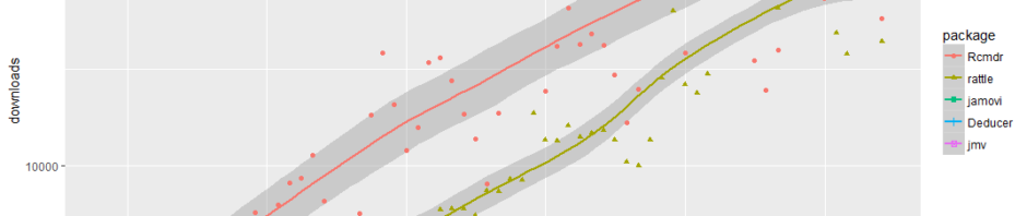
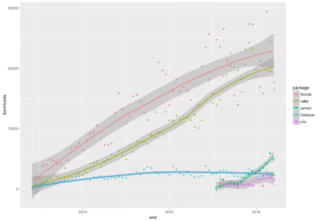
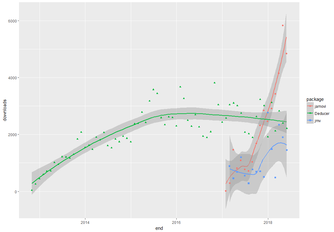
When choosing a GUI, one of the most fundamental questions is: what can it do for you? What the initial software installation of each GUI gets you is covered in the Graphics, Analysis, and Modeling sections of this series of articles. Regardless of what comes built-in, it’s good to know how active the development community is. They contribute “plug-ins” which add new menus and dialog boxes to the GUI. This level of activity ranges from very low (e.g. RKWard) through moderate (e.g. jamovi) to very active (e.g. R Commander).
Deducer has been in existence since 2009, and during that time nine plug-ins have been developed. Unfortunately there is no single place to go to find them. On the GUI’s “Packages & Data> GUI Add-ons” menu you’ll find four of them. Others are available here. The complete list of plug-ins that I could find is here:
- DeducerExtras: An add-on package containing a variety of additional analysis dialogs. These include: Distribution quantiles, single/multiple sample proportion tests, paired t-test, Wilcoxon signed rank test, Levene’s test, Bartlett’s test, k-means clustering, Hierarchical clustering, factor analysis, and multi-dimensional scaling
- DeducerPlugInScaling: Reliability and factor analysis
- DeducerMMR: Moderated multiple regression and simple slopes analysis
- DeducerRichOutput: writes results into true word processing tables with fonts and formatting
- DeducerSpatial: A GUI for Spatial Data Analysis and Visualization
- RDSAnalyst: Respondent Driven Sampling
- gMCP: (Experimental) A graphical approach to sequentially rejective multiple test procedures
- RGG: (Experimental) A GUI Generator
- DeducerText: (Experimental) Text Mining
- DeducerHansel: (Experimental) An add-on package which covers many methods common in econometrics, including binary logit, binary probit, and tobit estimates, and various time-series, panel, and spatial data methods. The time-series methods include cointegration analysis.
Startup
Some user interfaces for R, such as jamovi, start by double-clicking on a single icon, which is great for people who prefer to not write code. Others, such as R commander and Rattle, have you start R, then load a package from your library, then call a function. That’s better for people looking to learn R, as those are among the first tasks they’ll have to learn anyway.
On Deducer’s main web site, it recommends the following steps:
- Start R.
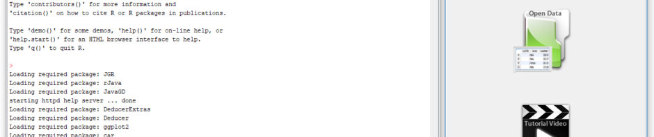
- Load the JGR package from your library by executing the command: “library(“JGR”)”.
- Start JGR by executing the command: “JGR()” and, if you followed the installation instructions above, JGR will start Deducer automatically. Both of the screens shown in Figure 1 will appear.
However, if you make it successfully through all seven installation steps described above, you can also start Deducer by double-clicking on the JGR Launcher icon.
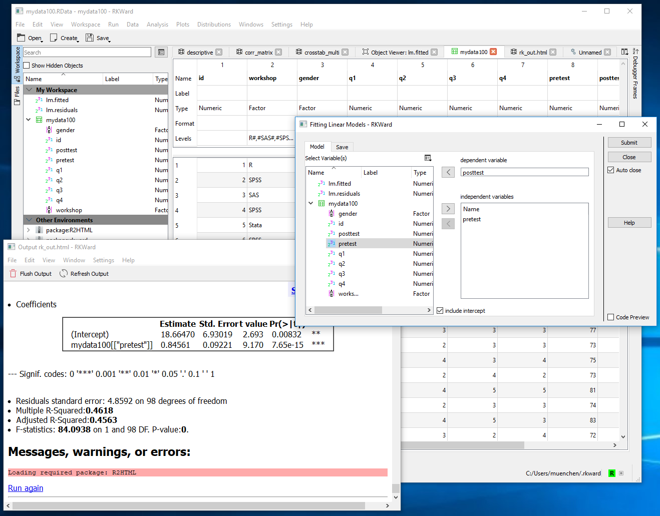
Data Editor / Viewer
A data editor is a fundamental feature in data analysis software. It puts you in touch with your data and lets you get a feel for it, if only in a rough way. A data editor is such a simple concept that you might think there would be hardly any differences in how they work in different GUIs. While there are technical differences, to a beginner what matters the most are the differences in simplicity. Some GUIs, including jamovi, let you create only what R calls a data frame. They use more common terminology and call it a data set: you create one, you save one, later you open one, then you use one. Others, such as RKWard trade this simplicity for the full R language perspective: a data set is stored in a workspace. So the process goes: you create a data set, you save a workspace, you open a workspace, and choose a data set from within it.
Deducer’s data editor is named Data Viewer. That can be confusing since many well-known software packages – including RStudio, the R Commander, and SAS Studio – use the term “viewer” for tools that let you see but not edit the data. The first time I used Deducer, I spent an embarrassing amount of time trying to find the “data editor” when it was right under my nose!

You can start Deducer’s Data Viewer by choosing “File> New Data”. You then provide a name, and click OK. You’ll see it execute a command like, “mydata <- data.frame()” but the Data Viewer may not show you an empty spreadsheet. It tends to lock onto your last data set, but you can choose the drop-down menu labeled “Data Set” to get to the name of the one you just started to create. An empty version of the screen shown in Figure 2 will appear.
You can start entering data immediately, though the variables will be named V1, V2,… at first. Numeric and character data will be fine, but don’t enter any other type of variables yet, such as dates. Before you go very far, it’s important to click on the “Variable View” tab and fill in your metadata, such as variable names, Type and Factor Level (see Figure 3). When the metadata are filled in, the data editor may wipe out any existing data! For example, if you enter some dates like “8/31/2018” it will be stored as character. If you then switch to the Variable View, and click on Type for that variable, and choose “Date” from the drop-down menu, the editor will delete the exiting dates.
This combination of Data View/Variable View is a common one which was made popular by SPSS. In that software it offers great power by letting you copy metadata from one variable to dozens of others. So you might have survey data where, 1=”Strongly Disagree”, 2=”Disagree”,…”5=”Strongly Agree”. SPSS would allow you to define this for one variable, the copy it and paste it into many others. Deducer’s Variable View does not allow that. You must work one variable at a time, which gets quite tedious.
To open an existing data set, choose “File> Open Data”. If it doesn’t appear in the Data Viewer window, choose it from the Data Set drop-down menu.

Saving the data is done with the standard “File> Save As” menu. You must save each one to its own file. While R allows multiple data sets (and other objects such as models) to be saved to a single file, Deducer does not. Its developers chose to simplify what their users have to learn by limiting each file to a single data set. However, you can also save or load multiple data sets by using JGR’s workspace save and open menu items. This strikes a good balance as beginners will relate to the simplicity of one-data-set-per-file, while advanced users will like the option to deal with more complex multi-object workspaces.
[Continued here…]