BlueSky Statistics is easy-to-use software for statistics and machine learning. Behind the scenes it does all its work using the powerful R language. It can show you the code it writes, which you can modify for finer control. It comes in a free Base version and a commercial Pro version. BlueSky Statistics LLC has greatly enhanced its quality control and Six Sigma capabilities, as described here. Many of the enhancements have come at the request of the manufacturers who have recently migrated to BlueSky Statistics from Minitab or JMP. These features will be demonstrated at Quality Show South, Nashville, Booth 418, April 16-17, and ASQ World Conference on Quality & Improvement, Denver, Booth 314, May 4-7.
I’ve updated The Popularity of Data Science Software‘s market share estimates based on scholarly articles. I posted it below, so you don’t have to sift through the main article to read the new section.
Scholarly Articles
Scholarly articles provide a rich source of information about data science tools. Because publishing requires significant effort, analyzing the type of data science tools used in scholarly articles provides a better picture of their popularity than a simple survey of tool usage. The more popular a software package is, the more likely it will appear in scholarly publications as an analysis tool or even as an object of study.
Since scholarly articles tend to use cutting-edge methods, the software used in them can be a leading indicator of where the overall market of data science software is headed. Google Scholar offers a way to measure such activity. However, no search of this magnitude is perfect; each will include some irrelevant articles and reject some relevant ones. The details of the search terms I used are complex enough to move to a companion article, How to Search For Data Science Articles.
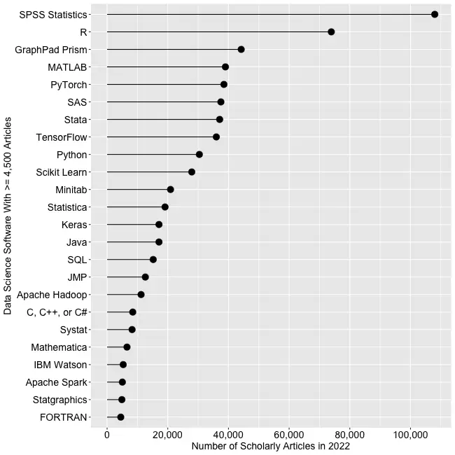
Figure 2a shows the number of articles found for the more popular software packages and languages (those with at least 4,500 articles) in the most recent complete year, 2022.
Figure 2a. The number of scholarly articles found on Google Scholar for data science software. Only those with more than 4,500 citations are shown.
SPSS is the most popular package, as it has been for over 20 years. This may be due to its balance between power and its graphical user interface’s (GUI) ease of use. R is in second place with around two-thirds as many articles. It offers extreme power, but as with all languages, it requires memorizing and typing code. GraphPad Prism, another GUI-driven package, is in third place. The packages from MATLAB through TensorFlow are roughly at the same level. Next comes Python and Scikit Learn. The latter is a library for Python, so there is likely much overlap between those two. Note that the general-purpose languages: C, C++, C#, FORTRAN, Java, MATLAB, and Python are included only when found in combination with data science terms, so view those counts as more of an approximation than the rest. Old stalwart FORTRAN appears last in this plot. While its count seems close to zero, that’s due to the wide range of this scale, and its count is just over the 4,500-article cutoff for this plot.
Continuing on this scale would make the remaining packages appear too close to the y-axis to read, so Figure 2b shows the remaining software on a much smaller scale, with the y-axis going to only 4,500 rather than the 110,000 used in Figure 2a. I chose that cutoff value because it allows us to see two related sets of tools on the same plot: workflow tools and GUIs for the R language that make it work much like SPSS.
Figure 2b. Number of scholarly articles using each data science software found using Google Scholar. Only those with fewer than 4,500 citations are shown.
JASP and jamovi are both front-ends to the R language and are way out front in this category. The next R GUI is R Commander, with half as many citations. Still, that’s far more than the rest of the R GUIs: BlueSky Statistics, Rattle, RKWard, R-Instat, and R AnalyticFlow. While many of these have low counts, we’ll soon see that the use of nearly all is rapidly growing.
Workflow tools are controlled by drawing 2-dimensional flowcharts that direct the flow of data and models through the analysis process. That approach is slightly more complex to learn than SPSS’ simple menus and dialog boxes, but it gets closer to the complete flexibility of code. In order of citation count, these include RapidMiner, KNIME, Orange Data Mining, IBM SPSS Modeler, SAS Enterprise Miner, Alteryx, and R AnalyticFlow. From RapidMiner to KNIME, to SPSS Modeler, the citation rate approximately cuts in half each time. Orange Data Mining comes next, at around 30% less. KNIME, Orange, and R Analytic Flow are all free and open-source.
While Figures 2a and 2b help study market share now, they don’t show how things are changing. It would be ideal to have long-term growth trend graphs for each software, but collecting that much data is too time-consuming. Instead, I’ve collected data only for the years 2019 and 2022. This provides the data needed to study growth over that period.
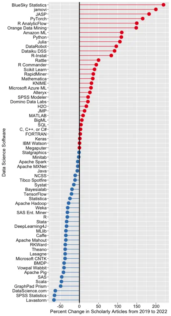
Figure 2c shows the percent change across those years, with the growing “hot” packages shown in red (right side) and the declining or “cooling” ones shown in blue (left side).
Figure 2c. Change in Google Scholar citation rate from 2019 to the most recent complete year, 2022. BlueSky (2,960%) and jamovi (452%) growth figures were shrunk to make the plot more legible.
Seven of the 14 fastest-growing packages are GUI front-ends that make R easy to use. BlueSky’s actual percent growth was 2,960%, which I recoded as 220% as the original value made the rest of the plot unreadable. In 2022 the company released a Mac version, and the Mayo Clinic announced its migration from JMP to BlueSky; both likely had an impact. Similarly, jamovi’s actual growth was 452%, which I recoded to 200. One of the reasons the R GUIs were able to obtain such high percentages of change is that they were all starting from low numbers compared to most of the other software. So be sure to look at the raw counts in Figure 2b to see the raw counts for all the R GUIs.
The most impressive point on this plot is the one for PyTorch. Back on 2a we see that PyTorch was the fifth most popular tool for data science. Here we see it’s also the third fastest growing. Being big and growing fast is quite an achievement!
Of the workflow-based tools, Orange Data Mining is growing the fastest. There is a good chance that the next time I collect this data Orange will surpass SPSS Modeler.
The big losers in Figure 2c are the expensive proprietary tools: SPSS, GraphPad Prism, SAS, BMDP, Stata, Statistica, and Systat. However, open-source R is also declining, perhaps a victim of Python’s rising popularity.
I’m particularly interested in the long-term trends of the classic statistics packages. So in Figure 2d, I have plotted the same scholarly-use data for 1995 through 2016.
Figure 2d. The number of Google Scholar citations for each classic statistics package per year from 1995 through 2016.
SPSS has a clear lead overall, but now you can see that its dominance peaked in 2009, and its use is in sharp decline. SAS never came close to SPSS’s level of dominance, and its usage peaked around 2010. GraphPad Prism followed a similar pattern, though it peaked a bit later, around 2013.
In Figure 2d, the extreme dominance of SPSS makes it hard to see long-term trends in the other software. To address this problem, I have removed SPSS and all the data from SAS except for 2014 and 2015. The result is shown in Figure 2e.
Figure 2e. The number of Google Scholar citations for each classic statistics package from 1995 through 2016, with SPSS removed and SAS included only in 2014 and 2015. The removal of SPSS and SAS expanded scale makes it easier to see the rapid growth of the less popular packages.
Figure 2e shows that most of the remaining packages grew steadily across the time period shown. R and Stata grew especially fast, as did Prism until 2012. The decline in the number of articles that used SPSS, SAS, or Prism is not balanced by the increase in the other software shown in this graph.
These results apply to scholarly articles in general. The results in specific fields or journals are likely to differ.
You can read the entire Popularity of Data Science Software here; the above discussion is just one section.
I have recently updated my extensive analysis of the popularity of data science software. This update covers perhaps the most important section, the one that measures popularity based on the number of job advertisements. I repeat it here as a blog post, so you don’t have to read the entire article.
Job Advertisements
One of the best ways to measure the popularity or market share of software for data science is to count the number of job advertisements that highlight knowledge of each as a requirement. Job ads are rich in information and are backed by money, so they are perhaps the best measure of how popular each software is now. Plots of change in job demand give us a good idea of what will become more popular in the future.
Indeed.com is the biggest job site in the U.S., making its collection of job ads the best around. As their co-founder and former CEO Paul Forster stated, Indeed.com includes “all the jobs from over 1,000 unique sources, comprising the major job boards – Monster, CareerBuilder, HotJobs, Craigslist – as well as hundreds of newspapers, associations, and company websites.” Indeed.com also has superb search capabilities.
Searching for jobs using Indeed.com is easy, but searching for software in a way that ensures fair comparisons across packages is challenging. Some software is used only for data science (e.g., scikit-learn, Apache Spark), while others are used in data science jobs and, more broadly, in report-writing jobs (e.g., SAS, Tableau). General-purpose languages (e.g., Python, C, Java) are heavily used in data science jobs, but the vast majority of jobs that require them have nothing to do with data science. To level the playing field, I developed a protocol to focus the search for each software within only jobs for data scientists. The details of this protocol are described in a separate article, How to Search for Data Science Jobs. All of the results in this section use those procedures to make the required queries.
I collected the job counts discussed in this section on October 5, 2022. To measure percent change, I compare that to data collected on May 27, 2019. One might think that a sample on a single day might not be very stable, but they are. Data collected in 2017 and 2014 using the same protocol correlated r=.94, p=.002. I occasionally double-check some counts a month or so later and always get similar figures.
The number of jobs covers a very wide range from zero to 164,996, with a mean of 11,653.9 and a median of 845.0. The distribution is so skewed that placing them all on the same graph makes reading values difficult. Therefore, I split the graph into three, each with a different scale. A single plot with a logarithmic scale would be an alternative, but when I asked some mathematically astute people how various packages compared on such a plot, they were so far off that I dropped that approach.
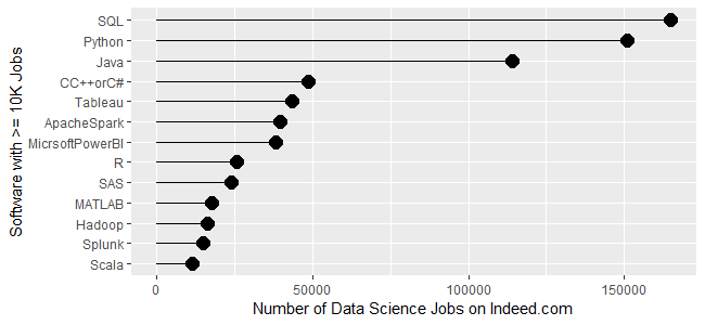
Figure 1a shows the most popular tools, those with at least 10,000 jobs. SQL is in the lead with 164,996 jobs, followed by Python with 150,992 and Java with 113,944. Next comes a set from C++/C# at 48,555, slowly declining to Microsoft’s Power BI at 38,125. Tableau, one of Power BI’s major competitors, is in that set. Next comes R and SAS, both around 24K jobs, with R slightly in the lead. Finally, we see a set slowly declining from MATLAB at 17,736 to Scala at 11,473.
Figure 1a. Number of data science jobs for the more popular software (>= 10,000 jobs).
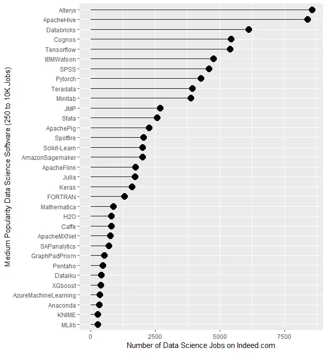
Figure 1b covers tools for which there are between 250 and 10,000 jobs. Alteryx and Apache Hive are at the top, both with around 8,400 jobs. There is quite a jump down to Databricks at 6,117 then much smaller drops from there to Minitab at 3,874. Then we see another big drop down to JMP at 2,693 after which things slowly decline until MLlib at 274.
Figure 1b. Number of jobs for less popular data science software tools, those with between 250 and 10,000 jobs.
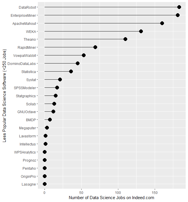
The least popular set of software, those with fewer than 250 jobs, are displayed in Figure 1c. It begins with DataRobot and SAS’ Enterprise Miner, both near 182. That’s followed by Apache Mahout with 160, WEKA with 131, and Theano at 110. From RapidMiner on down, there is a slow decline until we finally hit zero at WPS Analytics. The latter is a version of the SAS language, so advertisements are likely to always list SAS as the required skill.
Figure 1c. Number of jobs for software having fewer than 250 advertisements.
Several tools use the powerful yet easy workflow interface: Alteryx, KNIME, Enterprise Miner, RapidMiner, and SPSS Modeler. The scale of their counts is too broad to make a decent graph, so I have compiled those values in Table 1. There we see Alteryx is extremely dominant, with 30 times as many jobs as its closest competitor, KNIME. The latter is around 50% greater than Enterprise Miner, while RapidMiner and SPSS Modeler are tiny by comparison.
Software
Jobs
Alteryx
8,566
KNIME
281
Enterprise Miner
181
RapidMiner
69
SPSS Modeler
17
Table 1. Job counts for workflow tools.
Let’s take a similar look at packages whose traditional focus was on statistical analysis. They have all added machine learning and artificial intelligence methods, but their reputation still lies mainly in statistics. We saw previously that when we consider the entire range of data science jobs, R was slightly ahead of SAS. Table 2 shows jobs with only the term “statistician” in their description. There we see that SAS comes out on top, though with such a tiny margin over R that you might see the reverse depending on the day you gather new data. Both are over five times as popular as Stata or SPSS, and ten times as popular as JMP. Minitab seems to be the only remaining contender in this arena.
Software
Jobs only for “Statistician”
SAS
1040
R
1012
Stata
176
SPSS
146
JMP
93
Minitab
55
Statistica
2
BMDP
3
Systat
0
NCSS
0
Table 2. Number of jobs for the search term “statistician” and each software.
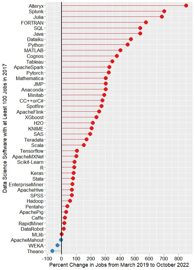
Next, let’s look at the change in jobs from the 2019 data to now (October 2022), focusing on software that had at least 50 job listings back in 2019. Without such a limitation, software that increased from 1 job in 2019 to 5 jobs in 2022 would have a 500% increase but still would be of little interest. Percent change ranged from -64.0% to 2,479.9%, with a mean of 306.3 and a median of 213.6. There were two extreme outliers, IBM Watson, with apparent job growth of 2,479.9%, and Databricks, at 1,323%. Those two were so much greater than the rest that I left them off of Figure 1d to keep them from compressing the remaining values beyond legibility. The rapid growth of Databricks has been noted elsewhere. However, I would take IBM Watson’s figure with a grain of salt as its growth in revenue seems nowhere near what the Indeed.com’s job figure seems to indicate.
The remaining software is shown in Figure 1d, where those whose job market is “heating up” or growing are shown in red, while those that are cooling down are shown in blue. The main takeaway from this figure is that nearly the entire data science software market has grown over the last 3.5 years. At the top, we see Alteryx, with a growth of 850.7%. Splunk (702.6%) and Julia (686.2%) follow. To my surprise, FORTRAN follows, having gone from 195 jobs to 1,318, yielding growth of 575.9%! My supercomputing colleagues assure me that FORTRAN is still important in their area, but HPC is certainly not growing at that rate. If any readers have ideas on why this could occur, please leave your thoughts in the comments section below.
Figure 1d. Percent change in job listings from March 2019 to October 2022. Only software that had at least 50 jobs in 2019 is shown. IBM (2,480%) and Databricks (1,323%) are excluded to maintain the legibility of the remaining values.
SQL and Java are both growing at around 537%. From Dataiku on down, the rate of growth slows steadily until we reach MLlib, which saw almost no change. Only two packages declined in job advertisements, with WEKA at -29.9%, Theano at -64.1%.
This wraps up my analysis of software popularity based on jobs. You can read my ten other approaches to this task at https://r4stats.com/articles/popularity/. Many of those are based on older data, but I plan to update them in the first quarter of 2023, when much of the needed data will become available. To receive notice of such updates, subscribe to this blog, or follow me on Twitter: https://twitter.com/BobMuenchen.
At the useR! 2022 Conference, the world-renowned Mayo Clinic announced that after 20 years of using SAS Institute’s JMP software, they have migrated to the BlueSky Statistics user interface for R. Ross Dierkhising, a principal biostatistician with the Clinic, described the process. They reviewed 16 commercial statistical software packages and none met their needs as well as JMP. Then they investigated three graphical user interface for the powerful R language: BlueSky Statistics, jamovi, and JASP.
They found BlueSky meet their needs as well as JMP, for significantly less cost. Then Mayo’s staff added over 40 new dialogs to BlueSky, including things that JMP did not offer. Dierkhising said, “I have nothing but the highest respect [for] the BlueSky development team and how they worked with us.” Among others, the Mayo’s additions to BlueSky include:
Kaplan-Meier, one group and compare groups
Competing risks, one group, and compare groups
Cox models, single model, and advanced single model
Stratified cox model
Fine-Gray Cox model
Cox model, with binary time-dependent covariate
Large-scale data/model summaries via the arsenal package
Frequency table in list format
Compare datasets like SAS’ compare procedure
Single tables of multiple model fits
Bland-Altman plots
Cohen’s and Fleiss’ kappa
Concordance correlation coefficients
Intraclass correlation coefficients
Diagnostic testing with a gold standard
Although Dierkhising said BlueSky included a “ton” of data wrangling methods, the Mayo team added a dozen more. The result was “gigantic” cost savings, and a tool that, in the end, did things that JMP could not do.
Anyone can download a free and open source copy of BlueSky statistics from the company website. You can read my detailed review of BlueSky here, and see how it compares to other graphical user interfaces to R here. The BlueSky User Guide is online here.
You can watch Ross Dierkhising’s entire 17 minute presentation here: