BlueSky Statistics is a graphical user interface for the powerful R language. On July 10, 2024, the BlueskyStatistics.com website said:
“…As the BlueSky Statistics version 10 product evolves, we will continue to work on orchestrating the necessary logistics to make the BlueSky Statistics version 10.x application available as an open-source project. This will be done in phases, as we did for the BlueSky Statistics 7.x version. We are currently rearchitecting its key components to allow the broader community to make effective contributions. When this work is complete, we will open-source the components for broader community participation…”
In the current statement (September 5, 2024), the sentence regarding version 10.x becoming open source is gone. This line was added:
“…Revenue from the commercial (Pro) version plays a vital role in funding the R&D needed to continue to develop and support the open-source (BlueSky Statistics 7.x) version and the free version (BlueSky Statistics 10.x Base Edition)…”
I have verified with the founders that they no longer plan to release version 10 with an open-source license. I’m disappointed by this change as I have advocated for and written about open source for many years.
There are many advantages of open-source licensing over proprietary. If the company decides to stop making version 10 free, current users will still have the right to run the currently installed version, but they will only be able to get the next version if they pay. If it were open source, its users could move the code to another repository and base new versions on that. That scenario has certainly happened before, most notably with OpenOffice. BlueSky LLC has announced no plans to charge for future versions of BlueSky Base Edition, but they could.
I have already updated the references on my website to reflect that BlueSky v10 is not open source. I wish I had been notified of this change before telling many people at the JSM 2024 conference that I was demonstrating open-source software. I apologize to them.
Are attending this year’s Joint Statistical Meetings in Toronto? If so, stop by booth 404 to see the latest features of BlueSky Statistics. A menu-based graphical user interface for the R language, BlueSky lets people access the power of R without having to learn to program. Programmers can easily add code to BlueSky’s menus, sharing their expertise with non-programmers. My detailed review of BlueSky is here, a brief comparison to other R GUIs is here, and the BlueSky User Guide is here. I hope to see you in Toronto! [Epilog: at the meeting, I did not know the company had decided to keep the latest version closed-source. Sorry to those I inadvertently misled at the conference.]
I’ve updated The Popularity of Data Science Software‘s market share estimates based on scholarly articles. I posted it below, so you don’t have to sift through the main article to read the new section.
Scholarly Articles
Scholarly articles provide a rich source of information about data science tools. Because publishing requires significant effort, analyzing the type of data science tools used in scholarly articles provides a better picture of their popularity than a simple survey of tool usage. The more popular a software package is, the more likely it will appear in scholarly publications as an analysis tool or even as an object of study.
Since scholarly articles tend to use cutting-edge methods, the software used in them can be a leading indicator of where the overall market of data science software is headed. Google Scholar offers a way to measure such activity. However, no search of this magnitude is perfect; each will include some irrelevant articles and reject some relevant ones. The details of the search terms I used are complex enough to move to a companion article, How to Search For Data Science Articles.
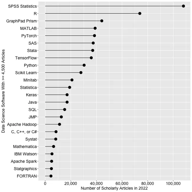
Figure 2a shows the number of articles found for the more popular software packages and languages (those with at least 4,500 articles) in the most recent complete year, 2022.
Figure 2a. The number of scholarly articles found on Google Scholar for data science software. Only those with more than 4,500 citations are shown.
SPSS is the most popular package, as it has been for over 20 years. This may be due to its balance between power and its graphical user interface’s (GUI) ease of use. R is in second place with around two-thirds as many articles. It offers extreme power, but as with all languages, it requires memorizing and typing code. GraphPad Prism, another GUI-driven package, is in third place. The packages from MATLAB through TensorFlow are roughly at the same level. Next comes Python and Scikit Learn. The latter is a library for Python, so there is likely much overlap between those two. Note that the general-purpose languages: C, C++, C#, FORTRAN, Java, MATLAB, and Python are included only when found in combination with data science terms, so view those counts as more of an approximation than the rest. Old stalwart FORTRAN appears last in this plot. While its count seems close to zero, that’s due to the wide range of this scale, and its count is just over the 4,500-article cutoff for this plot.
Continuing on this scale would make the remaining packages appear too close to the y-axis to read, so Figure 2b shows the remaining software on a much smaller scale, with the y-axis going to only 4,500 rather than the 110,000 used in Figure 2a. I chose that cutoff value because it allows us to see two related sets of tools on the same plot: workflow tools and GUIs for the R language that make it work much like SPSS.
Figure 2b. Number of scholarly articles using each data science software found using Google Scholar. Only those with fewer than 4,500 citations are shown.
JASP and jamovi are both front-ends to the R language and are way out front in this category. The next R GUI is R Commander, with half as many citations. Still, that’s far more than the rest of the R GUIs: BlueSky Statistics, Rattle, RKWard, R-Instat, and R AnalyticFlow. While many of these have low counts, we’ll soon see that the use of nearly all is rapidly growing.
Workflow tools are controlled by drawing 2-dimensional flowcharts that direct the flow of data and models through the analysis process. That approach is slightly more complex to learn than SPSS’ simple menus and dialog boxes, but it gets closer to the complete flexibility of code. In order of citation count, these include RapidMiner, KNIME, Orange Data Mining, IBM SPSS Modeler, SAS Enterprise Miner, Alteryx, and R AnalyticFlow. From RapidMiner to KNIME, to SPSS Modeler, the citation rate approximately cuts in half each time. Orange Data Mining comes next, at around 30% less. KNIME, Orange, and R Analytic Flow are all free and open-source.
While Figures 2a and 2b help study market share now, they don’t show how things are changing. It would be ideal to have long-term growth trend graphs for each software, but collecting that much data is too time-consuming. Instead, I’ve collected data only for the years 2019 and 2022. This provides the data needed to study growth over that period.
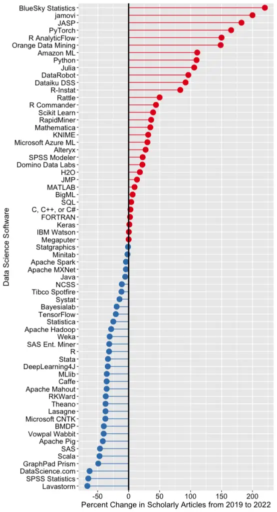
Figure 2c shows the percent change across those years, with the growing “hot” packages shown in red (right side) and the declining or “cooling” ones shown in blue (left side).
Figure 2c. Change in Google Scholar citation rate from 2019 to the most recent complete year, 2022. BlueSky (2,960%) and jamovi (452%) growth figures were shrunk to make the plot more legible.
Seven of the 14 fastest-growing packages are GUI front-ends that make R easy to use. BlueSky’s actual percent growth was 2,960%, which I recoded as 220% as the original value made the rest of the plot unreadable. In 2022 the company released a Mac version, and the Mayo Clinic announced its migration from JMP to BlueSky; both likely had an impact. Similarly, jamovi’s actual growth was 452%, which I recoded to 200. One of the reasons the R GUIs were able to obtain such high percentages of change is that they were all starting from low numbers compared to most of the other software. So be sure to look at the raw counts in Figure 2b to see the raw counts for all the R GUIs.
The most impressive point on this plot is the one for PyTorch. Back on 2a we see that PyTorch was the fifth most popular tool for data science. Here we see it’s also the third fastest growing. Being big and growing fast is quite an achievement!
Of the workflow-based tools, Orange Data Mining is growing the fastest. There is a good chance that the next time I collect this data Orange will surpass SPSS Modeler.
The big losers in Figure 2c are the expensive proprietary tools: SPSS, GraphPad Prism, SAS, BMDP, Stata, Statistica, and Systat. However, open-source R is also declining, perhaps a victim of Python’s rising popularity.
I’m particularly interested in the long-term trends of the classic statistics packages. So in Figure 2d, I have plotted the same scholarly-use data for 1995 through 2016.
Figure 2d. The number of Google Scholar citations for each classic statistics package per year from 1995 through 2016.
SPSS has a clear lead overall, but now you can see that its dominance peaked in 2009, and its use is in sharp decline. SAS never came close to SPSS’s level of dominance, and its usage peaked around 2010. GraphPad Prism followed a similar pattern, though it peaked a bit later, around 2013.
In Figure 2d, the extreme dominance of SPSS makes it hard to see long-term trends in the other software. To address this problem, I have removed SPSS and all the data from SAS except for 2014 and 2015. The result is shown in Figure 2e.
Figure 2e. The number of Google Scholar citations for each classic statistics package from 1995 through 2016, with SPSS removed and SAS included only in 2014 and 2015. The removal of SPSS and SAS expanded scale makes it easier to see the rapid growth of the less popular packages.
Figure 2e shows that most of the remaining packages grew steadily across the time period shown. R and Stata grew especially fast, as did Prism until 2012. The decline in the number of articles that used SPSS, SAS, or Prism is not balanced by the increase in the other software shown in this graph.
These results apply to scholarly articles in general. The results in specific fields or journals are likely to differ.
You can read the entire Popularity of Data Science Software here; the above discussion is just one section.
I have just updated my detailed reviews of Graphical User Interfaces (GUIs) for R, so let’s compare them again. It’s not too difficult to rank them based on the number of features they offer, so let’s start there. I’m basing the counts on the number of dialog boxes in each category of four categories:
Ease of Use
General Usability
Graphics
Analytics
This is trickier data to collect than you might think. Some software has fewer menu choices, depending instead on more detailed dialog boxes. Studying every menu and dialog box is very time-consuming, but that is what I’ve tried to do. I’m putting the details of each measure in the appendix so you can adjust the figures and create your own categories. If you decide to make your own graphs, I’d love to hear from you in the comments below.
Figure 1 shows how the various GUIs compare on the average rank of the four categories. R Commander is abbreviated Rcmdr, and R AnalyticFlow is abbreviated RAF. We see that BlueSky is in the lead with R-Instat close behind. As my detailed reviews of those two point out, they are extremely different pieces of software! Rather than spend more time on this summary plot, let’s examine the four categories separately.
Figure 1. Mean of each R GUI’s ranking of the four categories. To make this plot consistent with the others below, the larger the rank, the better.
For the category of ease-of-use, I’ve defined it mostly by how well each GUI does what GUI users are looking for: avoiding code. They get one point each for being able to install, start, and use the GUI to its maximum effect, including publication-quality output, without knowing anything about the R language itself. Figure two shows the result. JASP comes out on top here, with jamovi and BlueSky right behind.
Figure 2. The number of ease-of-use features that each GUI has.
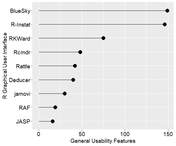
Figure 3 shows the general usability features each GUI offers. This category is dominated by data-wrangling capabilities, where data scientists and statisticians spend most of their time. This category also includes various types of data input and output. BlueSky and R-Instat come out on top not just due to their excellent selection of data wrangling features but also due to their use of the rio package for importing and exporting files. The rio package combines the import/export capabilities of many other packages, and it is easy to use. I expect the other GUIs will eventually adopt it, raising their scores by around 40 points. JASP shows up at the bottom of this plot due to its philosophy of encouraging users to prepare the data elsewhere before importing it into JASP.
Figure 3. Number of general usability features for each GUI.
Figure 4 shows the number of graphics features offered by each GUI. R-Instat has a solid lead in this category. In fact, this underestimates R-Instat’s ability if you…
[Since this was originally published in 2013, I’ve collected new data that renders this article obsolete. You can always see the most recent data here. -Bob Muenchen]
I recently updated my plots of the data analysis tools used in academia in my ongoing article, The Popularity of Data Analysis Software. I repeat those here and update my previous forecast of data analysis software usage.
Learning to use a data analysis tool well takes significant effort, so people tend to continue using the tool they learned in college for much of their careers. As a result, the software used by professors and their students is likely to predict what the next generation of analysts will use for years to come. As you can see in Fig. 1, the use of most analytic software is growing rapidly in academia. The only one growing slowly, very slowly, is Statistica.
Figure 1. The growth of data analysis packages with SAS and SPSS removed.
While they remain dominant, the use of SAS and SPSS has been declining rapidly in recent years. Figure 2 plots the same data, adding SAS and SPSS and dropping JMP and Statistica (and changing all colors and symbols!)
Figure 2. Scholarly use of data analysis software with SAS and SPSS added, JMP and Statistica removed.
Since Google changes its search algorithm, I recollect all the data every year. Last year’s plot (below, Fig. 3) ended with the data from 2011 and contained some notable differences. For SPSS, the 2003 data value is quite a bit lower than the value collected in the current year. If the data were not collected by a computer program, I would suspect a data entry error. In addition, the old 2011 data value in Fig. 3 for SPSS showed a marked slowing in the rate of usage decline. In the 2012 plot (above, Fig. 2), not only does the decline not slow in 2011, but both the 2011 and 2012 points continue the sharp decline of the previous few years.
Figure 3. Scholarly use of data analysis software, collected in 2011. Note how different the SPSS value for 2011 is compared to that in Fig. 2.
Let’s take a more detailed look at what the future may hold for R, SAS and SPSS Statistics.
I forecast the use of R, SAS, SPSS and Stata five years into the future using Rob Hyndman’s forecast package and the default settings of its auto.arima function. The dip in SPSS use in 2002-2003 drove the function a bit crazy as it tried to see a repetitive up-down cycle, so I modeled the SPSS data only from its 2005 peak onward. Figure 4 shows the resulting predictions.
Figure 4. Forecast of scholarly use of the top four data analysis software packages, 2013 through 2017.
The forecast shows R and Stata surpassing SPSS and SAS this year (2013), with Stata coming out on top. It also shows all scholarly use of SPSS and SAS stopping in 2014 and 2015, respectively. Any forecasting book will warn you of the dangers of looking too far beyond the data and above forecast does just that.
Guestimate Forecasting
So what will happen? Each reader probably has his or her own opinion, here’s mine. The growth in R’s use in scholarly work will continue for three more years at which point it will level off at around 25,000 articles in 2015. This growth will be driven by:
The continued rapid growth in add-on packages
The attraction of R’s powerful language
The near monopoly R has on the latest analytic methods
Its free price
The freedom to teach with real-world examples from outside organizations, which is forbidden to academics by SAS and SPSS licenses (IBM is loosening up on this a bit)
What will slow R’s growth is its lack of a graphical user interface that:
Is powerful
Is easy to use
Provides direct cut/paste access to journal style output in word processor format
Is standard, i.e. widely accepted as The One to Use
Is open source
While programming has important advantages over GUI use, many people will not take the time needed to learn to program. Therefore they rarely come to fully understand those advantages. Conversely, programmers seldom take the time to fully master a GUI and so often underestimate its full range of capabilities and its speed of use. Regardless of which is best, GUI users far outnumber programmers and, until resolved, this will limit R’s long term growth. There are GUIs for R, but with so many to choose from that none becomes the clear leader (Deducer, R Commander, Rattle, at least two from commercial companies and still more here.) If from this “GUI chaos” a clear leader were to emerge, then R could continue its rapid growth and end up as the most used software.
The use of SAS for scholarly work will continue to decline until it matches R at the 25,000 level. This is caused by competition from R and other packages (notably Stata) but also by SAS Instute’s self-inflicted GUI chaos. For years they have offered too many GUIs such as SAS/Assist, SAS/Insight, IML/Studio, the Analyst application, Enterprise Guide, Enterprise Miner and even JMP (which runs SAS nicely in recent versions). Professors looking to meet student demand for greater ease of use are not sure which GUI to teach, so they continue teaching SAS as a programming language. Even now that Enterprise Guide has evolved into a respectable GUI, many SAS users do not know what it is. If SAS Institute were to completely replace their default Display Manager System with Enterprise Guide, they could bend the curve and end up at a higher level of perhaps 27,000.
The use of SPSS for scholarly work will decline less sharply in 2013 and will level off in in 2015 at around 27,000 articles because:
Many of the people who like to program and want a more flexible language than SPSS offers have already switched to R or Stata
Many of the people who needed more interactive visualization have already switched to JMP
The GUI users will stick with SPSS until a GUI as good (or close to as good) comes to R and becomes widely accepted. At The University of Tennessee where I work, that’s the great majority of SPSS users.
Although Stata is currently the fastest growing package, it’s growth will slow in 2013 and level off by 2015 at around 23,000 articles, leaving it in fourth place. The main cause of this will be inertia of users of the established leaders, SPSS and SAS, as well as the competition from all the other packages, most notably R. R and Stata share many strengths and with one being free, I doubt Stata will be able to beat R in the long run.
The other packages shown in Fig. 1 will also level off around 2015, roughly maintaining their current place in the rankings. A possible exception is JMP, whose interface is radically superior to the the others for exploratory analysis. Its use could continue to grow, perhaps even replacing Stata for fourth place.
The future of SAS Enterprise Miner and IBM SPSS Modeler are tied to the success of each company’s more mainstream products, SAS and SPSS Statistics respectively. Use of those products is generally limited to one university class in data mining, while the other software discussed here is widely used in many classes. Both companies could significantly shift their future by combining their two main GUIs. Imagine a menu & dialog-box system that draws a simple flowchart as you do things. It would be easy to learn and users would quickly get the idea that you could manipulate the flowchart directly, increasing its window size to make more room. The flowchart GUI lets you see the big picture at a glance and lets you re-use the analysis without switching from GUI to programming, as all other GUI methods require. Such a merger could give SAS and SPSS a game-changing edge in this competitive marketplace.
So there you have it: the future of analytics revealed. No doubt each reader has found a wide range of things to disagree with, so I encourage you to do your own forecasts and add links to them in the comment section below. You can use my data or follow the detailed blog at Librestats to collect your own. One thing is certain: the coming decade in the field of analytics will be interesting indeed!
[Since this was originally published in 2012, I’ve collected new data that renders this article obsolete. You can always see the most recent data here. -Bob Muenchen]
Learning to use a data analysis tool well takes significant effort, so people tend to continue using the tool they learned in college for much of their careers. As a result, the software used by professors and their students is likely to predict what the next generation of analysts will use for years to come. I track this trend, and many others, in my article The Popularity of Data Analysis Software. In the latest update (4/13/2012) I forecast that, if current trends continued, the use of the R software would exceed that of SAS for scholarly applications in 2015. That was based on the data shown in Figure 7a, which I repeat here:
Let’s take a more detailed look at what the future may hold for R, SAS and SPSS Statistics.
We see that even if the use of SAS and SPSS were to remain at their current levels, R use would surpass their use in 2016 (Point Forecast column where 18-22 represent years 2012 -2016).
It appears that if the use of SAS continues to decline at its precipitous rate, all scholarly use of it will stop in 2014 (the number of articles published can’t be less than zero, so view the negatives as zero). I would bet Mitt Romney $10,000 that that is not going to happen!
The forecast has taken a logical approach of focusing on the steeper decline from 2005 through 2010 and predicting that this year (2012) is the last time SPSS will see use in scholarly publications. However the part of the graph that I find most interesting is the shift from 2010 to 2011, which shows SPSS use still declining but at a much slower rate.
Any forecasting book will warn you of the dangers of looking too far beyond the data and I think these forecasts do just that. The 2015 figure in the Popularity paper and in the title of this blog post came from an exponential smoothing approach that did not match the rate of acceleration as well as the ARIMA approach does.
Colbert Forecasting
While ARIMA forecasting has an impressive mathematical foundation it’s always fun to follow Stephen Colbert’s approach: go from the gut. So now I’ll present the future of analytics software that must be true, because it feels so right to me personally. This analysis has Colbert’s most important attribute: truthiness.
The growth in R’s use in scholarly work will continue for two more years at which point it will level off at around 25,000 articles in 2014.This growth will be driven by:
The continued rapid growth in add-on packages (Figure 10)
The attraction of R’s powerful language
The near monopoly R has on the latest analytic methods
Its free price
The freedom to teach with real-world examples from outside organizations, which is forbidden to academics by SAS and SPSS licenses (it benefits those organizations, so the vendors say they should have their own software license).
What will slow R’s growth is its lack of a graphical user interface that:
Is powerful
Is easy to use
Provides journal style output in word processor format
Is standard, i.e. widely accepted as The One to Use
Is open source
While programming has important advantages over GUI use, many people will not take the time needed to learn to program. Therefore they rarely come to fully understand those advantages. Conversely, programmers seldom take the time to fully master a GUI and so often underestimate its capabilities. Regardless of which is best, GUI users far outnumber programmers and, until resolved, this will limit R’s long term growth. There are GUIs for R, but so many to choose from that none becomes the clear leader (Deducer, R Commander, Rattle, Red-R, at least two from commercial companies and still more here.) If from this “GUI chaos” a clear leader were to emerge, then R could continue its rapid growth and end up as the most used package.
The use of SAS for scholarly work will continue to decline until it matches R at the 25,000 level. This is caused by competition from R and other packages (notably Stata) but also by SAS Instute’s self-inflicted GUI chaos. For years they have offered too many GUIs such as SAS/Assist, SAS/Insight, IML/Studio, the Analyst application, Enterprise Guide, Enterprise Miner and even JMP (which runs SAS nicely in recent versions). Professors looking to meet student demand for greater ease of use could not decide what to teach so they continued teaching SAS as a programming language. Even now that Enterprise Guide has evolved into a good GUI, many SAS users do not know what it is. If SAS Institute were to completely replace their default Display Manager System with Enterprise Guide, they could bend the curve and end up at a higher level of perhaps 27,000.
The use of SPSS for scholarly work will decline only slightly this year and will level off in 2013 because:
The people who like to program and want a more flexible language than SPSS offers have already switched to R or Stata
The people who needed a more advanced GUI have already switched to JMP
The GUI users will stick with SPSS until a GUI as good (or close to as good) comes to R and becomes widely accepted. At The University of Tennessee where I work, that’s the great majority of SPSS users.
Stata’s growth will level off in 2013 at level that will leave it in fourth place. The other packages shown in Figure 7b will also level off around the same time, roughly maintaining their current place in the rankings. A possible exception is JMP, whose interface is radically superior to the the others for exploratory analysis. Its use could continue to grow, perhaps even replacing Stata for fourth place.
The future of Enterprise Miner and SPSS Modeler are tied to the success of each company’s more mainstream products, SAS and SPSS Statistics respectively. Use of those products is generally limited to one university class in data mining, while the other software discussed here is widely used in many classes.
So there you have it: the future of analytics revealed. No doubt each reader has found a wide range of things to disagree with, so I encourage you to follow the detailed blog at Librestats to collect your own data from Google Scholar and do your own set of forecasts. Or simply go from the gut!