BlueSky Statistics LLC has published the third edition of the User Guide, written by yours truly. It is exclusively available for order here. The previous 6″x 9″ format would have run over 700 pages, so we switched to 8.5″x 11″ to reduce the page count to 533.
While this new edition is available only in print, the previous edition is still on the guide’s webpage. The PDF is not downloadable, as the advertising on that page helps support the considerable effort required to keep up with this rapidly expanding software.
My review of BlueSky Statistics is here, and a summary of how it compares to other R GUIs is here. New topics covered in the third edition include:
Using the Table of Contents to skip around the Output window.
Freezing table labels as contents scroll beneath them.
Adding variable labels to all tabular results.
Renaming output tabs.
Using the Datagrid’s audit trail.
Rerunning an entire workflow with a single click.
Automating the replacement of datasets when rerunning a workflow.
Using project files to save or load many files simultaneously.
Cleaning Excel files to remove rows or columns and create multi-row variable names.
Automating the extraction of repeating patterns of variables.
Creating cumulative statistics variables.
Separating delimited values stored in a character variable.
Converting characters to dates using expanded and simplified formats.
Reading date/time variables; adding times to dates.
Filling missing values upward or downward (e.g., last observation carried forward).
Creating scatterplot matrix displays.
Creating dual-axis plots.
Plotting dose-response curves.
Using new main effects and interaction plots.
Displaying forest plots.
Using new confidence interval plots (better for many factors).
Performing subject matching.
Performing risk set matching.
Comparing groups by competing risks.
Testing for mean equivalence.
Calculating concordance correlation coefficients for multiple raters.
Calculating categorical agreement.
Using the new polynomial regression dialog.
Fitting nonlinear regression models.
Testing confirmatory factor analysis.
Performing structural equation modeling.
Generating M by two tables for relative risks and odds ratios.
Using the response optimizer for linear or response surface models.
Thanks to everyone who sent in suggestions to improve this edition!
BlueSky Statistics is easy-to-use software for statistics and machine learning. Behind the scenes it does all its work using the powerful R language. It can show you the code it writes, which you can modify for finer control. It comes in a free Base version and a commercial Pro version. BlueSky Statistics LLC has greatly enhanced its quality control and Six Sigma capabilities, as described here. Many of the enhancements have come at the request of the manufacturers who have recently migrated to BlueSky Statistics from Minitab or JMP. These features will be demonstrated at Quality Show South, Nashville, Booth 418, April 16-17, and ASQ World Conference on Quality & Improvement, Denver, Booth 314, May 4-7.
I have just finished updating my reviews of graphical user interfaces for the R language. These include BlueSky Statistics, jamovi, JASP, R AnalyticFlow, R Commander, R-Instat, Rattle, and RKward. The permanent link to the article that summarizes it all is https://r4stats.com/articles/software-reviews/r-gui-comparison/. I list the highlights below as this post to reach all the blog aggregators. If you have suggestions for improving any of the reviews, please let me know at muenchen.bob@gmail.com.
With so many detailed reviews of Graphical User Interfaces (GUIs) for R available, which should you choose? It’s not too difficult to rank them based on the number of features they offer, so I’ll start there. Then, I’ll follow with a brief overview of each.
I’m basing the counts on the number of dialog boxes in each category of the following categories:
Ease of Use
General Usability
Graphics
Analytics
Reproducibility
This data is trickier to collect than you might think. Some software has fewer menu choices, depending on more detailed dialog boxes instead. Studying every menu and dialog box is very time-consuming, but that is what I’ve tried to do to keep this comparison trustworthy. Each development team has had a chance to look the data over and correct errors.
Perhaps the biggest flaw in this methodology is that every feature adds only one point to each GUI’s total score. I encourage you to download the full dataset to consider which features are most important to you. If you decide to make your own graphs with a different weighting system, I’d love to hear from you in the comments below.
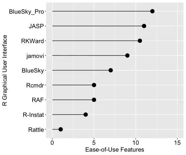
Ease of Use
For ease of use, I’ve defined it primarily by how well each GUI meets its primary goal: avoiding code. They get one point for each of the following abilities, which include being able to install, start, and use the GUI to its maximum effect, including publication-quality output, without knowing anything about the R language itself. Figure one shows the result. R Commander is abbreviated Rcmdr, and R AnalyticFlow is abbreviated RAF. The commercial BlueSky Pro comes out on top by a slim margin, followed closely by JASP and RKWard. None of the GUIs achieved the highest possible score of 14, so there is room for improvement.
Installs without the use of R
Starts without the use of R
Remembers recent files
Hides R code by default
Use its full capability without using R
Data editor included
Pub-quality tables w/out R code steps
Simple menus that grow as needed
Table of Contents to ease navigation
Variable labels ease identification in the output
Easy to move blocks of output
Ease reading columns by freezing headers of long tables
Accepts data pasted from the clipboard
Easy to move header row of pasted data into the variable name field
Figure 1. The number of ease of use features offered by each R GUI.
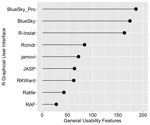
General Usability
This category is dominated by data-wrangling capabilities, where data scientists and statisticians spend most of their time. It also includes various types of data input and output. We see in Figure 2 that both BlueSky versions and R-Instat come out on top not just due to their excellent selection of data-wrangling features but also for their use of the rio package for importing and exporting files. The rio package combines the import/export capabilities of many other packages, and it is easy to use. I expect the other GUIs will eventually adopt it, raising their scores by around 20 points.
Operating systems (how many)
Import data file types (how many)
Import from databases (how many)
Export data file types (how many)
Languages displayable in UI (how many, besides English)
Easy to repeat any step by groups (split-file)
Multiple data files open at once
Multiple output windows
Multiple code windows
Variable metadata view
Variable types (how many)
Variable search/filter in dialogs
Variable sort by name
Variable sort by type
Variable move manually
Model Builder (how many effect types)
Magnify GUI for teaching
R code editor
Comment/uncomment blocks of code
Package management (comes with R and all packages)
Output: word processing features
Output: R Markdown
Output: LaTeX
Data wrangling (how many)
Transform across many variables at once (e.g., row mean)
Transform down many variables at once (e.g., log, sqrt)
Assign factor labels across many variables at once
Project saves/loads data, dialogs, and notes in one file
Figure 2. The number of general usability features in each R GUI.
Graphics
This category consists mainly of the number of graphics each software offers. However, the other items can be very important to completing your work. They should add more than one point to the graphics score, but I scored them one point since some will view them as very important while others might not need them at all. Be sure to see the full reviews or download the Excel file if those features are important to you. Figure 3 shows the total graphics score for each GUI. R-Instat has a solid lead in this category. In fact, this underestimates R-Instat’s ability if you include its options to layer any “geom” on top of another graph. However, that requires knowing the geoms and how to use them. That’s knowledge of R code, of course.
When studying these graphs, it’s important to consider the difference between the relative and absolute performance. For example, relatively speaking, R Commander is not doing well here, but it does offer over 25 types of plots! That absolute figure might be fine for your needs.
BlueSky Statistics is a graphical user interface for the powerful R language. On July 10, 2024, the BlueskyStatistics.com website said:
“…As the BlueSky Statistics version 10 product evolves, we will continue to work on orchestrating the necessary logistics to make the BlueSky Statistics version 10.x application available as an open-source project. This will be done in phases, as we did for the BlueSky Statistics 7.x version. We are currently rearchitecting its key components to allow the broader community to make effective contributions. When this work is complete, we will open-source the components for broader community participation…”
In the current statement (September 5, 2024), the sentence regarding version 10.x becoming open source is gone. This line was added:
“…Revenue from the commercial (Pro) version plays a vital role in funding the R&D needed to continue to develop and support the open-source (BlueSky Statistics 7.x) version and the free version (BlueSky Statistics 10.x Base Edition)…”
I have verified with the founders that they no longer plan to release version 10 with an open-source license. I’m disappointed by this change as I have advocated for and written about open source for many years.
There are many advantages of open-source licensing over proprietary. If the company decides to stop making version 10 free, current users will still have the right to run the currently installed version, but they will only be able to get the next version if they pay. If it were open source, its users could move the code to another repository and base new versions on that. That scenario has certainly happened before, most notably with OpenOffice. BlueSky LLC has announced no plans to charge for future versions of BlueSky Base Edition, but they could.
I have already updated the references on my website to reflect that BlueSky v10 is not open source. I wish I had been notified of this change before telling many people at the JSM 2024 conference that I was demonstrating open-source software. I apologize to them.
Are attending this year’s Joint Statistical Meetings in Toronto? If so, stop by booth 404 to see the latest features of BlueSky Statistics. A menu-based graphical user interface for the R language, BlueSky lets people access the power of R without having to learn to program. Programmers can easily add code to BlueSky’s menus, sharing their expertise with non-programmers. My detailed review of BlueSky is here, a brief comparison to other R GUIs is here, and the BlueSky User Guide is here. I hope to see you in Toronto! [Epilog: at the meeting, I did not know the company had decided to keep the latest version closed-source. Sorry to those I inadvertently misled at the conference.]
I’ve updated The Popularity of Data Science Software‘s market share estimates based on scholarly articles. I posted it below, so you don’t have to sift through the main article to read the new section.
Scholarly Articles
Scholarly articles provide a rich source of information about data science tools. Because publishing requires significant effort, analyzing the type of data science tools used in scholarly articles provides a better picture of their popularity than a simple survey of tool usage. The more popular a software package is, the more likely it will appear in scholarly publications as an analysis tool or even as an object of study.
Since scholarly articles tend to use cutting-edge methods, the software used in them can be a leading indicator of where the overall market of data science software is headed. Google Scholar offers a way to measure such activity. However, no search of this magnitude is perfect; each will include some irrelevant articles and reject some relevant ones. The details of the search terms I used are complex enough to move to a companion article, How to Search For Data Science Articles.
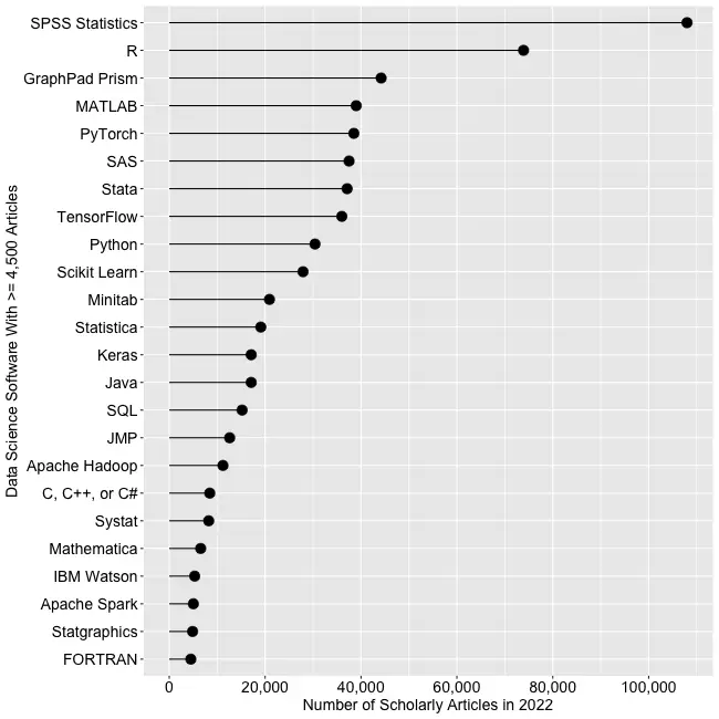
Figure 2a shows the number of articles found for the more popular software packages and languages (those with at least 4,500 articles) in the most recent complete year, 2022.
Figure 2a. The number of scholarly articles found on Google Scholar for data science software. Only those with more than 4,500 citations are shown.
SPSS is the most popular package, as it has been for over 20 years. This may be due to its balance between power and its graphical user interface’s (GUI) ease of use. R is in second place with around two-thirds as many articles. It offers extreme power, but as with all languages, it requires memorizing and typing code. GraphPad Prism, another GUI-driven package, is in third place. The packages from MATLAB through TensorFlow are roughly at the same level. Next comes Python and Scikit Learn. The latter is a library for Python, so there is likely much overlap between those two. Note that the general-purpose languages: C, C++, C#, FORTRAN, Java, MATLAB, and Python are included only when found in combination with data science terms, so view those counts as more of an approximation than the rest. Old stalwart FORTRAN appears last in this plot. While its count seems close to zero, that’s due to the wide range of this scale, and its count is just over the 4,500-article cutoff for this plot.
Continuing on this scale would make the remaining packages appear too close to the y-axis to read, so Figure 2b shows the remaining software on a much smaller scale, with the y-axis going to only 4,500 rather than the 110,000 used in Figure 2a. I chose that cutoff value because it allows us to see two related sets of tools on the same plot: workflow tools and GUIs for the R language that make it work much like SPSS.
Figure 2b. Number of scholarly articles using each data science software found using Google Scholar. Only those with fewer than 4,500 citations are shown.
JASP and jamovi are both front-ends to the R language and are way out front in this category. The next R GUI is R Commander, with half as many citations. Still, that’s far more than the rest of the R GUIs: BlueSky Statistics, Rattle, RKWard, R-Instat, and R AnalyticFlow. While many of these have low counts, we’ll soon see that the use of nearly all is rapidly growing.
Workflow tools are controlled by drawing 2-dimensional flowcharts that direct the flow of data and models through the analysis process. That approach is slightly more complex to learn than SPSS’ simple menus and dialog boxes, but it gets closer to the complete flexibility of code. In order of citation count, these include RapidMiner, KNIME, Orange Data Mining, IBM SPSS Modeler, SAS Enterprise Miner, Alteryx, and R AnalyticFlow. From RapidMiner to KNIME, to SPSS Modeler, the citation rate approximately cuts in half each time. Orange Data Mining comes next, at around 30% less. KNIME, Orange, and R Analytic Flow are all free and open-source.
While Figures 2a and 2b help study market share now, they don’t show how things are changing. It would be ideal to have long-term growth trend graphs for each software, but collecting that much data is too time-consuming. Instead, I’ve collected data only for the years 2019 and 2022. This provides the data needed to study growth over that period.
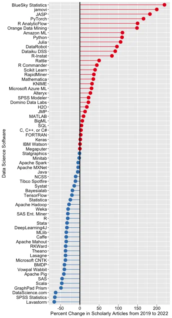
Figure 2c shows the percent change across those years, with the growing “hot” packages shown in red (right side) and the declining or “cooling” ones shown in blue (left side).
Figure 2c. Change in Google Scholar citation rate from 2019 to the most recent complete year, 2022. BlueSky (2,960%) and jamovi (452%) growth figures were shrunk to make the plot more legible.
Seven of the 14 fastest-growing packages are GUI front-ends that make R easy to use. BlueSky’s actual percent growth was 2,960%, which I recoded as 220% as the original value made the rest of the plot unreadable. In 2022 the company released a Mac version, and the Mayo Clinic announced its migration from JMP to BlueSky; both likely had an impact. Similarly, jamovi’s actual growth was 452%, which I recoded to 200. One of the reasons the R GUIs were able to obtain such high percentages of change is that they were all starting from low numbers compared to most of the other software. So be sure to look at the raw counts in Figure 2b to see the raw counts for all the R GUIs.
The most impressive point on this plot is the one for PyTorch. Back on 2a we see that PyTorch was the fifth most popular tool for data science. Here we see it’s also the third fastest growing. Being big and growing fast is quite an achievement!
Of the workflow-based tools, Orange Data Mining is growing the fastest. There is a good chance that the next time I collect this data Orange will surpass SPSS Modeler.
The big losers in Figure 2c are the expensive proprietary tools: SPSS, GraphPad Prism, SAS, BMDP, Stata, Statistica, and Systat. However, open-source R is also declining, perhaps a victim of Python’s rising popularity.
I’m particularly interested in the long-term trends of the classic statistics packages. So in Figure 2d, I have plotted the same scholarly-use data for 1995 through 2016.
Figure 2d. The number of Google Scholar citations for each classic statistics package per year from 1995 through 2016.
SPSS has a clear lead overall, but now you can see that its dominance peaked in 2009, and its use is in sharp decline. SAS never came close to SPSS’s level of dominance, and its usage peaked around 2010. GraphPad Prism followed a similar pattern, though it peaked a bit later, around 2013.
In Figure 2d, the extreme dominance of SPSS makes it hard to see long-term trends in the other software. To address this problem, I have removed SPSS and all the data from SAS except for 2014 and 2015. The result is shown in Figure 2e.
Figure 2e. The number of Google Scholar citations for each classic statistics package from 1995 through 2016, with SPSS removed and SAS included only in 2014 and 2015. The removal of SPSS and SAS expanded scale makes it easier to see the rapid growth of the less popular packages.
Figure 2e shows that most of the remaining packages grew steadily across the time period shown. R and Stata grew especially fast, as did Prism until 2012. The decline in the number of articles that used SPSS, SAS, or Prism is not balanced by the increase in the other software shown in this graph.
These results apply to scholarly articles in general. The results in specific fields or journals are likely to differ.
You can read the entire Popularity of Data Science Software here; the above discussion is just one section.
I have recently updated my extensive analysis of the popularity of data science software. This update covers perhaps the most important section, the one that measures popularity based on the number of job advertisements. I repeat it here as a blog post, so you don’t have to read the entire article.
Job Advertisements
One of the best ways to measure the popularity or market share of software for data science is to count the number of job advertisements that highlight knowledge of each as a requirement. Job ads are rich in information and are backed by money, so they are perhaps the best measure of how popular each software is now. Plots of change in job demand give us a good idea of what will become more popular in the future.
Indeed.com is the biggest job site in the U.S., making its collection of job ads the best around. As their co-founder and former CEO Paul Forster stated, Indeed.com includes “all the jobs from over 1,000 unique sources, comprising the major job boards – Monster, CareerBuilder, HotJobs, Craigslist – as well as hundreds of newspapers, associations, and company websites.” Indeed.com also has superb search capabilities.
Searching for jobs using Indeed.com is easy, but searching for software in a way that ensures fair comparisons across packages is challenging. Some software is used only for data science (e.g., scikit-learn, Apache Spark), while others are used in data science jobs and, more broadly, in report-writing jobs (e.g., SAS, Tableau). General-purpose languages (e.g., Python, C, Java) are heavily used in data science jobs, but the vast majority of jobs that require them have nothing to do with data science. To level the playing field, I developed a protocol to focus the search for each software within only jobs for data scientists. The details of this protocol are described in a separate article, How to Search for Data Science Jobs. All of the results in this section use those procedures to make the required queries.
I collected the job counts discussed in this section on October 5, 2022. To measure percent change, I compare that to data collected on May 27, 2019. One might think that a sample on a single day might not be very stable, but they are. Data collected in 2017 and 2014 using the same protocol correlated r=.94, p=.002. I occasionally double-check some counts a month or so later and always get similar figures.
The number of jobs covers a very wide range from zero to 164,996, with a mean of 11,653.9 and a median of 845.0. The distribution is so skewed that placing them all on the same graph makes reading values difficult. Therefore, I split the graph into three, each with a different scale. A single plot with a logarithmic scale would be an alternative, but when I asked some mathematically astute people how various packages compared on such a plot, they were so far off that I dropped that approach.
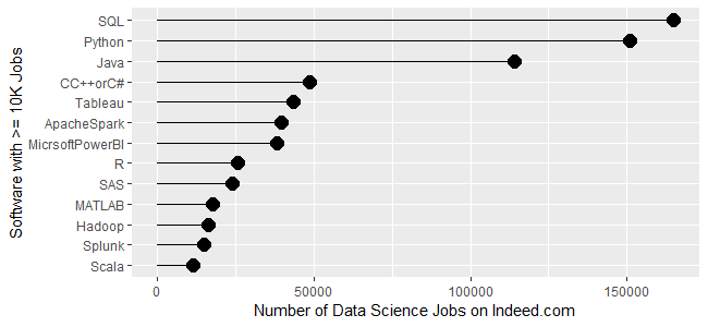
Figure 1a shows the most popular tools, those with at least 10,000 jobs. SQL is in the lead with 164,996 jobs, followed by Python with 150,992 and Java with 113,944. Next comes a set from C++/C# at 48,555, slowly declining to Microsoft’s Power BI at 38,125. Tableau, one of Power BI’s major competitors, is in that set. Next comes R and SAS, both around 24K jobs, with R slightly in the lead. Finally, we see a set slowly declining from MATLAB at 17,736 to Scala at 11,473.
Figure 1a. Number of data science jobs for the more popular software (>= 10,000 jobs).
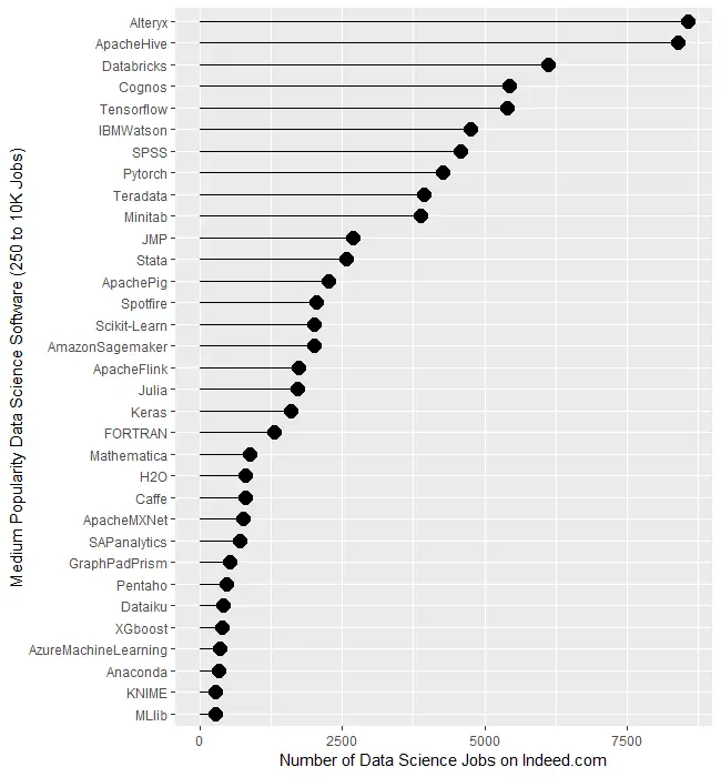
Figure 1b covers tools for which there are between 250 and 10,000 jobs. Alteryx and Apache Hive are at the top, both with around 8,400 jobs. There is quite a jump down to Databricks at 6,117 then much smaller drops from there to Minitab at 3,874. Then we see another big drop down to JMP at 2,693 after which things slowly decline until MLlib at 274.
Figure 1b. Number of jobs for less popular data science software tools, those with between 250 and 10,000 jobs.
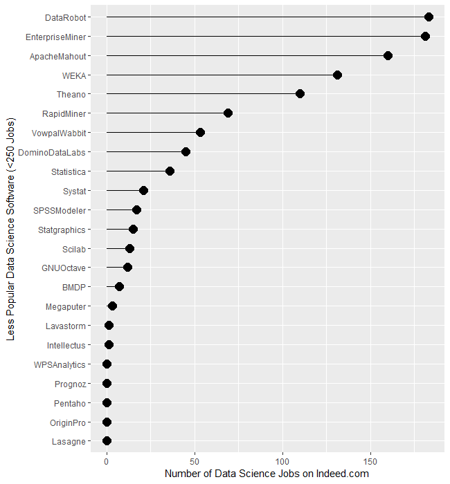
The least popular set of software, those with fewer than 250 jobs, are displayed in Figure 1c. It begins with DataRobot and SAS’ Enterprise Miner, both near 182. That’s followed by Apache Mahout with 160, WEKA with 131, and Theano at 110. From RapidMiner on down, there is a slow decline until we finally hit zero at WPS Analytics. The latter is a version of the SAS language, so advertisements are likely to always list SAS as the required skill.
Figure 1c. Number of jobs for software having fewer than 250 advertisements.
Several tools use the powerful yet easy workflow interface: Alteryx, KNIME, Enterprise Miner, RapidMiner, and SPSS Modeler. The scale of their counts is too broad to make a decent graph, so I have compiled those values in Table 1. There we see Alteryx is extremely dominant, with 30 times as many jobs as its closest competitor, KNIME. The latter is around 50% greater than Enterprise Miner, while RapidMiner and SPSS Modeler are tiny by comparison.
Software
Jobs
Alteryx
8,566
KNIME
281
Enterprise Miner
181
RapidMiner
69
SPSS Modeler
17
Table 1. Job counts for workflow tools.
Let’s take a similar look at packages whose traditional focus was on statistical analysis. They have all added machine learning and artificial intelligence methods, but their reputation still lies mainly in statistics. We saw previously that when we consider the entire range of data science jobs, R was slightly ahead of SAS. Table 2 shows jobs with only the term “statistician” in their description. There we see that SAS comes out on top, though with such a tiny margin over R that you might see the reverse depending on the day you gather new data. Both are over five times as popular as Stata or SPSS, and ten times as popular as JMP. Minitab seems to be the only remaining contender in this arena.
Software
Jobs only for “Statistician”
SAS
1040
R
1012
Stata
176
SPSS
146
JMP
93
Minitab
55
Statistica
2
BMDP
3
Systat
0
NCSS
0
Table 2. Number of jobs for the search term “statistician” and each software.
Next, let’s look at the change in jobs from the 2019 data to now (October 2022), focusing on software that had at least 50 job listings back in 2019. Without such a limitation, software that increased from 1 job in 2019 to 5 jobs in 2022 would have a 500% increase but still would be of little interest. Percent change ranged from -64.0% to 2,479.9%, with a mean of 306.3 and a median of 213.6. There were two extreme outliers, IBM Watson, with apparent job growth of 2,479.9%, and Databricks, at 1,323%. Those two were so much greater than the rest that I left them off of Figure 1d to keep them from compressing the remaining values beyond legibility. The rapid growth of Databricks has been noted elsewhere. However, I would take IBM Watson’s figure with a grain of salt as its growth in revenue seems nowhere near what the Indeed.com’s job figure seems to indicate.
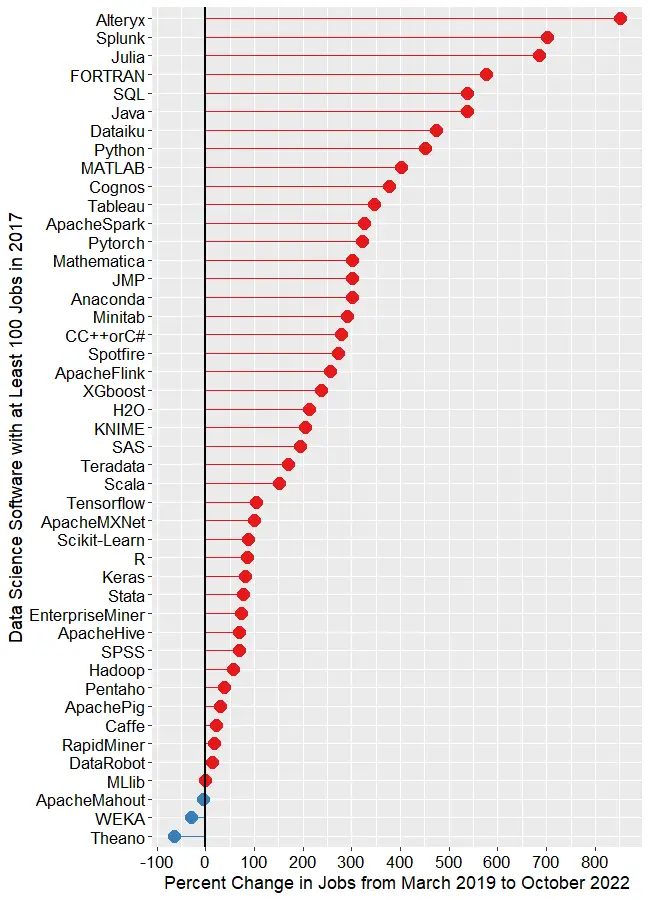
The remaining software is shown in Figure 1d, where those whose job market is “heating up” or growing are shown in red, while those that are cooling down are shown in blue. The main takeaway from this figure is that nearly the entire data science software market has grown over the last 3.5 years. At the top, we see Alteryx, with a growth of 850.7%. Splunk (702.6%) and Julia (686.2%) follow. To my surprise, FORTRAN follows, having gone from 195 jobs to 1,318, yielding growth of 575.9%! My supercomputing colleagues assure me that FORTRAN is still important in their area, but HPC is certainly not growing at that rate. If any readers have ideas on why this could occur, please leave your thoughts in the comments section below.
Figure 1d. Percent change in job listings from March 2019 to October 2022. Only software that had at least 50 jobs in 2019 is shown. IBM (2,480%) and Databricks (1,323%) are excluded to maintain the legibility of the remaining values.
SQL and Java are both growing at around 537%. From Dataiku on down, the rate of growth slows steadily until we reach MLlib, which saw almost no change. Only two packages declined in job advertisements, with WEKA at -29.9%, Theano at -64.1%.
This wraps up my analysis of software popularity based on jobs. You can read my ten other approaches to this task at https://r4stats.com/articles/popularity/. Many of those are based on older data, but I plan to update them in the first quarter of 2023, when much of the needed data will become available. To receive notice of such updates, subscribe to this blog, or follow me on Twitter: https://twitter.com/BobMuenchen.
Data science is being used in many ways to improve healthcare and reduce costs. We have written a textbook, Introduction to Biomedical Data Science, to help healthcare professionals understand the topic and to work more effectively with data scientists. The textbook content and data exercises do not require programming skills or higher math. We introduce open source tools such as R and Python, as well as easy-to-use interfaces to them such as BlueSky Statistics, jamovi, R Commander, and Orange. Chapter exercises are based on healthcare data, and supplemental YouTube videos are available in most chapters.
For instructors, we provide PowerPoint slides for each chapter, exercises, quiz questions, and solutions. Instructors can download an electronic copy of the book, the Instructor Manual, and PowerPoints after first registering on the instructor page.
The book is available in print
and various electronic formats. Because it is self-published, we plan to update it more rapidly than would be
possible through traditional publishers.
Below you will find a detailed table of contents and a list
of the textbook authors.
Table of Contents
OVERVIEW OF BIOMEDICAL DATA SCIENCE
Introduction
Background and history
Conflicting perspectives
the statistician’s perspective
the machine learner’s perspective
the database administrator’s perspective
the data visualizer’s perspective
Data analytical processes
raw data
data pre-processing
exploratory data analysis (EDA)
predictive modeling approaches
types of models
types of software
Major types of analytics
descriptive analytics
diagnostic analytics
predictive analytics (modeling)
prescriptive analytics
putting it all together
Biomedical data science tools
Biomedical data science education
Biomedical data science careers
Importance of soft skills in data science
Biomedical data science resources
Biomedical data science challenges
Future trends
Conclusion
References
SPREADSHEET TOOLS AND TIPS
Introduction
basic spreadsheet functions
download the sample spreadsheet
Navigating the worksheet
Clinical application of spreadsheets
formulas and functions
filter
sorting data
freezing panes
conditional formatting
pivot tables
visualization
data analysis
Tips and tricks
Microsoft Excel shortcuts – windows users
Google sheets tips and tricks
Conclusions
Exercises
References
BIOSTATISTICS PRIMER
Introduction
Measures of central tendency & dispersion
the normal and log-normal distributions
Descriptive and inferential statistics
Categorical data analysis
Diagnostic tests
Bayes’ theorem
Types of research studies
observational studies
interventional studies
meta-analysis
orrelation
Linear regression
Comparing two groups
the independent-samples t-test
the wilcoxon-mann-whitney test
Comparing more than two groups
Other types of tests
generalized tests
exact or permutation tests
bootstrap or resampling tests
Stats packages and online calculators
commercial packages
non-commercial or open source packages
online calculators
Challenges
Future trends
Conclusion
Exercises
References
DATA VISUALIZATION
Introduction
historical data visualizations
visualization frameworks
Visualization basics
Data visualization software
Microsoft Excel
Google sheets
Tableau
R programming language
other visualization programs
Visualization options
visualizing categorical data
visualizing continuous data
Dashboards
Geographic maps
Challenges
Conclusion
Exercises
References
INTRODUCTION TO DATABASES
Introduction
Definitions
A brief history of database models
hierarchical model
network model
relational model
Relational database structure
Clinical data warehouses (CDWs)
Structured query language (SQL)
Learning SQL
Conclusion
Exercises
References
BIG DATA
Introduction
The seven v’s of big data related to health care data
Technical background
Application
Challenges
technical
organizational
legal
translational
Future trends
Conclusion
References
BIOINFORMATICS and PRECISION MEDICINE
Introduction
History
Definitions
Biological data analysis – from data to discovery
Biological data types
genomics
transcriptomics
proteomics
bioinformatics data in public repositories
biomedical cancer data portals
Tools for analyzing bioinformatics data
command line tools
web-based tools
Genomic data analysis
Genomic data analysis workflow
variant calling pipeline for whole exome sequencing data
quality check
alignment
variant calling
variant filtering and annotation
downstream analysis
reporting and visualization
Precision medicine – from big data to patient care
Examples of precision medicine
Challenges
Future trends
Useful resources
Conclusion
Exercises
References
PROGRAMMING LANGUAGES FOR DATA ANALYSIS
Introduction
History
R language
installing R & rstudio
an example R program
getting help in R
user interfaces for R
R’s default user interface: rgui
Rstudio
menu & dialog guis
some popular R guis
R graphical user interface comparison
R resources
Python language
installing Python
an example Python program
getting help in Python
user interfaces for Python
reproducibility
R vs. Python
Future trends
Conclusion
Exercises
References
MACHINE LEARNING
Brief history
Introduction
data refresher
training vs test data
bias and variance
supervised and unsupervised learning
Common machine learning algorithms
Supervised learning
Unsupervised learning
dimensionality reduction
reinforcement learning
semi-supervised learning
Evaluation of predictive analytical performance
classification model evaluation
regression model evaluation
Machine learning software
Weka
Orange
Rapidminer studio
KNIME
Google TensorFlow
honorable mention
summary
Programming languages and machine learning
Machine learning challenges
Machine learning examples
example 1 classification
example 2 regression
example 3 clustering
example 4 association rules
Conclusion
Exercises
References
ARTIFICIAL INTELLIGENCE
Introduction
definitions
History
Ai architectures
Deep learning
Image analysis (computer vision)
Radiology
Ophthalmology
Dermatology
Pathology
Cardiology
Neurology
Wearable devices
Image libraries and packages
Natural language processing
NLP libraries and packages
Text mining and medicine
Speech recognition
Electronic health record data and AI
Genomic analysis
AI platforms
deep learning platforms and programs
Artificial intelligence challenges
General
Data issues
Technical
Socio economic and legal
Regulatory
Adverse unintended consequences
Need for more ML and AI education
Future trends
Conclusion
Exercises
References
Authors
Brenda Griffith Technical Writer Data.World Austin, TX
Robert Hoyt MD, FACP, ABPM-CI, FAMIA Associate Clinical Professor Department of Internal Medicine Virginia Commonwealth University Richmond, VA
David Hurwitz MD, FACP, ABPM-CI Associate CMIO Allscripts Healthcare Solutions Chicago, IL
Madhurima Kaushal MS Bioinformatics Washington University at St. Louis, School of Medicine St. Louis, MO
Robert Leviton MD, MPH, FACEP, ABPM-CI, FAMIA Assistant Professor New York Medical College Department of Emergency Medicine Valhalla, NY
Karen A. Monsen PhD, RN, FAMIA, FAAN Professor School of Nursing University of Minnesota Minneapolis, MN
Robert Muenchen MS, PSTAT Manager, Research Computing Support University of Tennessee Knoxville, TN
Dallas Snider PhD Chair, Department of Information Technology University of West Florida Pensacola, FL
A special thanks to Ann Yoshihashi MD for her help with the publication of this textbook.
The WPS Analytics’ version of the SAS language is now available in a Community Edition. This edition allows you to run SAS code on datasets of any size for free. Purchasing a commercial license will get you tech support and the ability to run it from the command line, instead of just interactively. The software license details are listed in this table.
While the WPS version of the SAS language doesn’t do everything the version from SAS Institute offers, it does do quite a lot. The complete list of features is available here.
Back in 2009, the SAS Institute filed a lawsuit against the creators of WPS Analytics,World Programming Limited (WPL), in the High Court of England and Wales. SAS Institute lost the case on the grounds that copyright law applies to software source code, not to its functionality. WPL never had access to SAS Institute’s source code, but they did use a SAS educational license to study how it works. SAS Institute lost another software copyright battle in North Carolina courts, but won over the use of their educational license. SAS Institute is suing a third time, hoping to do better by carefully choosing a pro-patent court in East Texas.
Although I prefer using R, I’m a big fan of the SAS language, as well as SAS Institute, which offers superb technical support. However, I agree with the first two court findings. Copyright law should not apply to a computer language, only to a particular set of source code that creates the language.
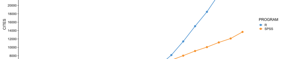
One of us (Muenchen) has been tracking The Popularity of Data Science Software using a variety of different approaches. One approach is to use Google Scholar to count the number of scholarly articles found each year for each software. He chose Google Scholar since it searches “across many disciplines and sources: articles, theses, books, abstracts, and court opinions, from academic publishers, professional societies, online repositories, universities, and other web sites.” Figure 1 shows the results from 1995 through 2016. Data collected in 2018 showed that while SPSS use dropped 39% drop from 2017 to 2018, its use was still 66% higher than R in 2018.
Figure 1. Number of citations per year for each statistics package, found by Google Scholar, from 1995 to 2016.
We see in the plot that SPSS was extremely dominant for most of that time period. Even after its precipitous decline, it still beats the rest by more than a 2 to 1 margin. Over the years, several people questioned the accuracy of Figure 1. In a time when scholarly publications are proliferating, how could SPSS use be in such decline?
One hypothesis that has often been suggested revolves around one of the most bizarre product name changes in the history of marketing. As a result of a legal battle for control of the name “SPSS”, the SPSS company changed the name of the product to “PASW”, an acronym for Predictive Analytics Software. The change made about as much sense as Coke people renaming Coke to “BSW”, for Bubbly Sugar Water. The battle was settled and in 2011 and the product name reverted back to SPSS.
Could that name change account for the apparent
decline in its use? A search on Google Scholar from 2009 to 2012 on the string:
“PASW” -“SPSS”
-“Amos”
yielded 12,000 hits. That sounds like quite a few, but when “SPSS” was substituted for “PASW” in that search, we found 701,000 references. At first glance, it seems that the scholarly use of SPSS was undercounted by 1.7%. However, when searching a vast volume of documents, each string may have problems with over-counting. For example, PASW stands for “Plant Available Soil Water” which accounts for 138 of those 12,000 articles. There may be many other such abbreviations. That’s the type of analysis Muenchen did several years ago, before concluding that PASW was more trouble than it was worth (details are here). In 2018 that search yields only 361 hits, and the title of the very first article begins with, “Projections Analysis of Surface Waves (PASW)…”
Muenchen’s hypothesis regarding the apparent decline of SPSS is that it was caused by competition. Back in 2002, SPSS shared the statistical software market with SAS and a couple of others. Its momentum carried it upward for a few more years, then the competition started chipping away at it. GraphPad Prism improved significantly with the release of its version 5 in 2007 and medical users of SPSS found an alternative that was as easy to use while focusing more on their needs. R added enough useful packages around the same time to become competitive. By now there are probably hundreds of packages that people can use to analyze data, only a few of which are shown in Figure 1.
Mackinnon remained skeptical of this hypothesis because the overall graph appears to show decreases in statistical software citation over time. This would seem to contradict evidence that the number of journal articles published has been increasing at about 3% per year over the last 3 centuries, and about 3.9% per year in the past decade (2018 STM Report, pg. 25). Thus, the total number of citations to statistical software as a collective group should be increasing concurrently with this overall increase.
Mackinnon gathered data from a different source: Scopus. According to Wikipedia, “Scopus covers nearly 36,377 titles from approximately 11,678 publishers, of which 34,346 are peer-reviewed journals in top-level subject fields: life sciences, social sciences, physical sciences, and health sciences.” Mackinnon limited the search to reference lists, reasoning that such citations are likely an indicator of using the software in the paper. Two search strings were used:
REF(“the R software” OR “the R
project” OR “r-project.org” OR “R development core”)
REF(SPSS)
These searches are being a bit generous to SPSS by including Modeler and AMOS, and very conservative for R by not including citations to common packages (e.g., ggplot2). The resulting data are plotted in Figure 2.
Figure 2. Number of citations per year for each statistics package, found by Scopus, from 2000 to 2018.
Above
we see that the citations of R in scholarly journals exceeded that of SPSS back
in 2012. However, the scale of Figure 2 tops out at 30,000 while Figure 1’s
scale peaks at 300,000. Google is finding a lot more documents! So, which of
these software packages is used the most in scholarly work? Good question! We would like to hear your comments below,
especially from readers who collect data from other sources.