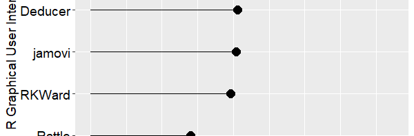
It has been only two months since I summarized my reviews of point-and-click front ends for R, and it’s already out of date! I have converted that post into a regularly-updated article and added a plot of total features, which I repeat below. It shows the total number of features in each package, including the latest versions of BlueSky Statistics, JASP, and jamovi. The reviews which initially appeared as blog posts are now regularly-updated pages.
New Features in JASP
Let’s take a look at some of the new features, starting with the version of JASP that was released three hours ago:
Interface adjustments
Data panel, analysis input panel and results panel can be manipulated much more intuitively with sliders and show/hide buttons
Changed the analysis input panel to have an overview of all opened analyses and added the possibility to change titles, to show documentation, and remove analyses
Enhanced the navigation through the file menu; it is now possible to use arrow keys or simply hover over the buttons
Added possibility to scale the entire application with Ctrl +, Ctrl – and Ctrl 0
Added MANOVA
Added Confirmatory Factor Analysis
Added Bayesian Multinomial Test
Included additional menu preferences to customize JASP to your needs
Added/updated help files for most analyses
R engine updated from 3.4.4 to 3.5.2
Added Šidák correction for post-hoc tests (AN(C)OVA)
A complete list of fixes and features is available here. JASP is available for free from their download page. My comparative review of JASP is here.
New Features in jamovi
Two of the usability features added to jamovi recently are templates and multi-file input. Both are described in detail here.
Templates enable you to save all the steps in your work as a template file. Opening that file in jamovi then lets you open a new dataset and the template will recreate all the previous analyses and graphs using the new data. It provides reusability without having to depend on the R code that GUI users are trying to avoid using.
The multi-file input lets you select many CSV files at once and jamovi will open and stack them all (they must contain common variable names, of course).
Other new analytic features have been added with a set of modeling modules. They’re described in detail here, and a list of some of their capability is below. You can read my full review of jamovi here, and you can download it for free here.
OLS Regression (GLM)
OLS ANOVA (GLM)
OLS ANCOVA (GLM)
Random coefficients regression (Mixed)
Random coefficients ANOVA-ANCOVA (Mixed)
Logistic regression (GZLM)
Logistic ANOVA-like model (GZLM)
Probit regression (GZLM)
Probit ANOVA-like model (GZLM)
Multinomial regression (GZLM)
Multinomial ANOVA-like model (GZLM)
Poisson regression (GZLM)
Poisson ANOVA-like model (GZLM)
Overdispersed Poisson regression (GZLM)
Overdispersed Poisson ANOVA-like model (GZLM)
Negative binomial regression (GZLM)
Negative binomial ANOVA-like model (GZLM)
Continuous and categorical independent variables
Omnibus tests and parameter estimates
Confidence intervals
Simple slopes analysis
Simple effects
Post-hoc tests
Plots for up to three-way interactions for both categorical and continuous independent variables.
Automatic selection of best estimation methods and degrees of freedom selection
Type III estimation
New Features in BlueSky Statistics
The BlueSky developers have been working on adding psychometric methods (for a book that is due out soon) and support for distributions. My full review is here and you can download BlueSky Statistics for free here.
Model Fitting: IRT: Simple Rasch Model
Model Fitting: IRT: Simple Rasch Model (Multi-Faceted)
Model Fitting: IRT: Partial Credit Model
Model Fitting: IRT: Partial Credit Model (Multi-Faceted)
Model Fitting: IRT: Rating Scale Model
Model Fitting: IRT: Rating Scale Model (Multi-Faceted)
Model Statistics: IRT: ICC Plots
Model Statistics: IRT: Item Fit
Model Statistics: IRT: Plot PI Map
Model Statistics: IRT: Item and Test Information
Model Statistics: IRT: Likelihood Ratio and Beta plots
Model Statistics: IRT: Personfit
Distributions: Continuous: BetaProbabilities
Distributions: Continuous: Beta Quantiles
Distributions: Continuous: Plot Beta Distribution
Distributions: Continuous: Sample from Beta Distribution
Distributions: Continuous: Cauchy Probabilities
Distributions: Continuous: Plot Cauchy Distribution
Distributions: Continuous: Cauchy Quantiles
Distributions: Continuous: Sample from Cauchy Distribution
Distributions: Continuous: Sample from Cauchy Distribution
In my ongoing quest to track The Popularity of Data Science Software, I’ve just updated my analysis of the job market. To save you from reading the entire tome, I’m reproducing that section here.
Job Advertisements
One of the best ways to measure the popularity or market share of software for data science is to count the number of job advertisements that highlight knowledge of each as a requirement. Job ads are rich in information and are backed by money, so they are perhaps the best measure of how popular each software is now. Plots of change in job demand give us a good idea of what is likely to become more popular in the future.
Indeed.com is the biggest job site in the U.S., making its collection of job ads the best around. As their co-founder and former CEO Paul Forster stated, Indeed.com includes “all the jobs from over 1,000 unique sources, comprising the major job boards – Monster, CareerBuilder, HotJobs, Craigslist – as well as hundreds of newspapers, associations, and company websites.” Indeed.com also has superb search capabilities. It used to have a job trend plotter, but that tool has apparently been shut down.
Searching for jobs using Indeed.com is easy, but searching for software in a way that ensures fair comparisons across packages is challenging. Some software is used only for data science (e.g. SPSS, Apache Spark) while others are used in data science jobs and more broadly in report-writing jobs (e.g. SAS, Tableau). General-purpose languages (e.g. Python, C, Java) are heavily used in data science jobs, but the vast majority of jobs that use them have nothing to do with data science. To level the playing field, I developed a protocol to focus the search for each software within only jobs for data scientists. The details of this protocol are described in a separate article, How to Search for Data Science Jobs. All of the graphs in this section use those procedures to make the required queries.
I collected the job counts discussed in this section on May 27, 2019 and February 24, 2017. One might think that a sample of on a single day might not be very stable, but the large number of job sources makes the counts in Indeed.com’s collection of jobs quite consistent. Data collected in 2017 and 2014 using the same protocol correlated r=.94, p=.002.
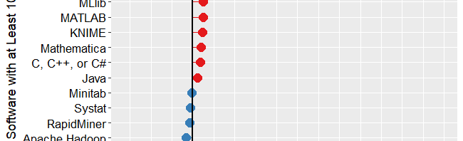
Figure 1a shows that Python is in the lead with 27,374 jobs, followed by SQL with 25,877. Java and Amazon’s Machine Learning (ML) tools are roughly 25% further below, with jobs in the 17,000s. R and the C variants come next with around 13,000. People frequently compare R and Python, but when it comes to getting a data science job, there are only half as many for R as for Python. That doesn’t mean they’re the same sort of job, of course. I still see more statisticians using R and machine learning people preferring Python, but Python is definitely on a roll! From Hadoop on down, there is a slow decline in jobs. R is also frequently compared to SAS, which has only 8,123 compared to R’s 13,800.
The scale of Figure 1a is so wide that the bottom package, H20 appears to be zero, when in fact there are 257 jobs for it.
Figure 1a. Number of data science jobs for the more popular software.
To let us compare the less popular software, I plotted them separately in Figure 1b. Mathematica and Julia are the leaders of this set, with around 219 jobs each. The ancient FORTRAN language is still hanging on to life with 195 jobs. The open source WEKA software and IBM’s Watson are next, with around 185 each. From XGBOOST on down, there is a fairly steady slow decline.
There are several tools that use a workflow interface: Enterprise Miner, KNIME, RapidMiner, and SPSS Modeler. They’re all around the same area between 50 and 100 jobs. In many of the other measures of popularity, RapidMiner beats the very similar KNIME tool, but here there are 50% more jobs for the latter. Alteryx is also a workflow-based tool, however, it has pulled away from the pack, appearing back on Figure 1a with 901 jobs.
Figure 1b. Number of jobs for less popular data science software tools, those with fewer than 250 advertisements.
When interpreting the scale on Figure 1b, what looks like zero is indeed zero. From Systat on down, none of the packages have more than 10 job listings.
It’s important to note that the values shown in Figures 1a and 1b are single points in time. The number of jobs for the more popular software do not change much from day to day. Therefore, the relative rankings of the software shown in Figure 1a is unlikely to change much over the coming year or two. The less popular packages shown in Figure 1b have such low job counts that their ranking is more likely to shift from month to month, though their position relative to the major packages should remain more stable.
Next, let’s look at the change in jobs from the 2017 data to now (2019). Figure 1c shows the percent change for those packages that had at least 100 job listings back in 2017. Without such a limitation, software that goes from 1 job in 2017 to 5 jobs in 2019 would have a 500% increase, but still would be of little interest. Software whose job market is heating up, or growing, is shown in red, while those that are cooling down are shown in blue.
Figure 1c. Percent change in job listings from 2017 to 2019. Only software that had at least 100 jobs in 2017 is shown.
Tensorflow, the deep learning software from Google, is the fastest growing at 523%. Next is Apache Flink, a tool that analyzes streaming data, at 289%. H2O is next, with 150% growth. Caffe is another deep learning framework and its 123% growth reflects the popularity of artificial intelligence algorithms.
Python shows “only” 97% growth, but its popularity was already so high that the 13,471 jobs that it added surpasses the total jobs of many of the other packages!
Tableau is showing a similar rate of growth, though it was a comparably small number of additional jobs, at 4,784.
From the Julia language on down, we see a slowing decrease in growth. I’m surprised to see that jobs for SAS and SPSS are still growing, though barely at 6% and 1%, respectively.
If you enjoyed reading this article, you might be interested in my recent series of reviews on point-and-click front-ends for the R language. I invite you to subscribe to this blog, or follow me on Twitter.
Now that I’ve completed seven detailed reviews of Graphical User Interfaces (GUIs) for R, let’s compare them. It’s easy enough to count their features and plot them, so let’s start there. I’m basing the counts on the number of menu items in each category. That’s not too hard to get, but it’s far from perfect. Some software has fewer menu choices, depending instead on dialog box choices. Studying every menu and dialog box would be too time-consuming, so be aware of this limitation. I’m putting the details of each measure in the appendixso you can adjust the figures and create your own graphs. If you decide to make your own graphs, I’d love to hear from you in the comments below.
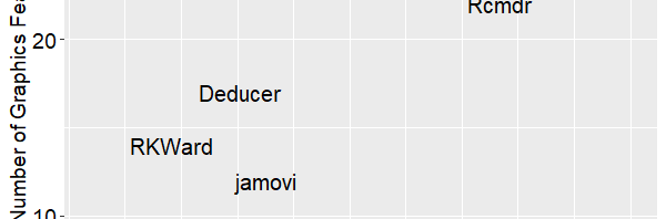
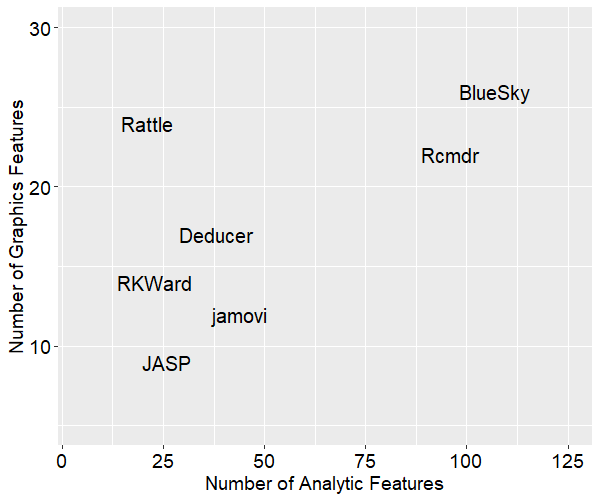
Figure 1 shows the number of analytic methods each software supports on the x-axis and the number of graphics methods on the y-axis. The analytic methods count combines statistical features, machine learning / artificial intelligence ones (ML/AI), and the ability to create R model objects. The graphics features count totals up the number of bar charts, scatterplots, etc. each package can create.
The ideal place to be in this graph is in the upper right corner. We see that BlueSky and R Commander offer quite a lot of both analytic and graphical features. Rattle stands out as having the second greatest number of graphics features. JASP is the lowest on graphics features and 3rd from the bottom on analytic ones.
Next, let’s swap out the y-axis for general usability features. These consist of a variety of features that make your work easier, including data management capabilities (see appendix for details).
Figure 2 shows that BlueSky and R Commander still in the top two positions overall, but now Deducer has nearly caught up with R Commander on the number of general features. That’s due to its reasonably strong set of data management tools, plus its output is in true word processing tables saving you the trouble of formatting it yourself. Rattle is much lower in this plot since, while its graphics capabilities are strong (at least in relation to ML/AI tasks), it has minimal data management capabilities.
These plots help show us three main overall feature sets, but each package offers things that the others don’t. Let’s look at a brief overview of each. Remember that each of these has a detailed review that follows my standard template. I’ll start with the two that have come out on top, then follow in alphabetical order.
The R Commander – This is the oldest GUI, having been around since at least 2005. There are an impressive 41 plug-ins developed for it. It is currently the only R GUI that saves R Markdown files, but it does not create word processing tables by default, as some of the others do. The R code it writes is classic, rarely using the newer tidyverse functions. It works as a partner to R; you install R separately, then use it to install and start R Commander. It makes it easy to blend menu-based analysis with coding. If your goal is to learn to code in classic R, this is an excellent choice.
BlueSky Statistics – This software was created by former SPSS employees and it shares many of SPSS’ features. BlueSky is only a few years old, and it converted from commercial to open source just a few months ago. Although BlueSky and R Commander offer many of the same features, they do them in different ways. When using BlueSky, it’s not initially apparent that R is involved at all. Unless you click the “Syntax” button that every dialog box has, you’ll never see the R code or the code editor. Its output is in publication-quality tables which follow the popular style of the American Psychological Association.
Deducer – This has a very nice-looking interface, and it’s probably the first to offer true word processing tables by default. Being able to just cut and paste a table into your word processor saves a lot of time and it’s a feature that has been copied by several others. Deducer was released in 2008, and when I first saw it, I thought it would quickly gain developers. It got a few, but development seems to have halted. Deducer’s installation is quite complex, and it depends on the troublesome Java software. It also used JGR, which never became as popular as the similar RStudio. The main developer, Ian Fellows, has moved on to another very interesting GUI project called Vivid.
jamovi– The developers who form the core of the jamovi project used to be part of the JASP team. Despite the fact that they started a couple of years later, they’re ahead of JASP in several ways at the moment. Its developers decided that the R code it used should be visible and any R code should be executable, something that differentiated it from JASP. jamovi has an extremely interactive interface that shows you the result of every selection in each dialog box. It also saves the settings in every dialog box, and lets you re-use every step on a new dataset by saving a “template.” That’s extremely useful since GUI users often don’t want to learn R code. jamovi’s biggest weakness its dearth of data management tasks, though there are plans to address that.
JASP– The biggest advantage JASP offers is its emphasis on Bayesian analysis. If that’s your preference, this might be the one for you. At the moment JASP is very different from all the other GUIs reviewed here because it won’t show you the R code it’s writing, and you can’t execute your own R code from within it. Plus the software has not been open to outside developers. The development team plans to address those issues, and their deep pockets should give them an edge.
Rattle– If your work involves ML/AI (a.k.a. data mining) instead of standard statistical methods, Rattle may be the best GUI for you. It’s focused on ML/AI, and its tabbed-based interface makes quick work of it. However, it’s the weakest of them all when it comes to statistical analysis. It also lacks many standard data management features. The only other GUI that offers many ML/AI features is BlueSky.
RKWard– This GUI blends a nice point-and-click interface with an integrated development environment that is the most advanced of all the other GUIs reviewed here. It’s easy to install and start, and it saves all your dialog box settings, allowing you to rerun them. However, that’s done step-by-step, not all at once as jamovi’s templates allow. The code RKWard creates is classic R, with no tidyverse at all.
Conclusion
I hope this brief comparison will help you choose the R GUI that is right for you. Each offers unique features that can make life easier for non-programmers. If one catches your eye, don’t forget to read the full review of it here.
Acknowledgements
Writing this set of reviews has been a monumental undertaking. It would not have been possible without the assistance of Bruno Boutin, Anil Dabral, Ian Fellows, John Fox, Thomas Friedrichsmeier, Rachel Ladd, Jonathan Love, Ruben Ortiz, Christina Peterson, Josh Price, Eric-Jan Wagenmakers, and Graham Williams.
Appendix: Guide to Scoring
In figures 1 and 2, Analytic Features adds up: statistics, machine learning / artificial intelligence, the ability to create R model objects, and the ability to validate models using techniques such as k-fold cross-validation. The Graphics Features is the sum of two rows, the number of graphs the software can create plus one point for small multiples, or facets, if it can do them. Usability is everything else, with each row worth 1 point, except where noted.
Feature
Definition
Simple installation
Is it done in one step?
Simple start-up
Does it start on its own without starting R, loading packages, etc.?
Import Data Files
How many files types can it import?
Import Database
How many databases can it read from?
Export Data Files
How many file formats can it write to?
Data Editor
Does it have a data editor?
Can work on >1 file
Can it work on more than one file at a time?
Variable View
Does it show metadata in a variable view, allowing for many fast edits to metadata?
Data Management
How many data management tasks can it do?
Transform Many
Can it transform many variables at once?
Graph Types
How many graph types does it have?
Small Multiples
Can it show small multiples (facets)?
Model Objects
Can it create R model objects?
Statistics
How many statistical methods does it have?
ML/AI
How many ML / AI methods does it have?
Model Validation
Does it offer model validation (k-fold, etc.)?
R Code IDE
Can you edit and execute R code?
GUI Reuse
Does it let you re-use work without code?
Code Reuse
Does it let you rerun all using code?
Package Management
Does it manage packages for you?
Table of Contents
Does output have a table of contents?
Re-order
Can you re-order output?
Publication Quality
Is output in publication quality by default?
R Markdown
Can it create R Markdown?
Add comments
Can you add comments to output?
Group-by
Does it do group-by repetition of any other task?
Output as Input
Does it save equivalent to broom’s tidy, glance, augment? (They earn 1 point for each)
JASP is a free and open source statistics package that targets beginners looking to point-and-click their way through analyses. This article is one of a series of reviews which aim to help non-programmers choose the Graphical User Interface (GUI) for R, which best meets their needs. Most of these reviews also include cursory descriptions of the programming support that each GUI offers.
JASP stands for Jeffreys’ Amazing Statistics Program, a nod to the Bayesian statistician, Sir Harold Jeffreys. It is available for Windows, Mac, Linux, and there is even a cloud version. One of JASP’s key features is its emphasis on Bayesian analysis. Most statistics software emphasizes a more traditional frequentist approach; JASP offers both. However, while JASP uses R to do some of its calculations, it does not currently show you the R code it uses, nor does it allow you to execute your own. The developers hope to add that to a future version. Some of JASP’s calculations are done in C++, so getting that converted to R will be a necessary first step on that path.
Figure 1. JASP’s main screen.
Terminology
There are various definitions of user interface types, so here’s how I’ll be using these terms:
GUI = Graphical User Interface using menus and dialog boxes to avoid having to type programming code. I do not include any assistance for programming in this definition. So, GUI users are people who prefer using a GUI to perform their analyses. They don’t have the time or inclination to become good programmers.
IDE = Integrated Development Environment which helps programmers write code. I do not include point-and-click style menus and dialog boxes when using this term. IDE users are people who prefer to write R code to perform their analyses.
Installation
The various user interfaces available for R differ quite a lot in how they’re installed. Some, such as BlueSky Statistics, jamovi, and RKWard, install in a single step. Others install in multiple steps, such as R Commander (two steps), and Deducer (up to seven steps). Advanced computer users often don’t appreciate how lost beginners can become while attempting even a simple installation. The HelpDesks at most universities are flooded with such calls at the beginning of each semester!
JASP’s single-step installation is extremely easy and includes its own copy of R. So if you already have a copy of R installed, you’ll have two after installing JASP. That’s a good idea though, as it guarantees compatibility with the version of R that it uses, plus a standard R installation by itself is harder than JASP’s.
Plug-in Modules
When choosing a GUI, one of the most fundamental questions is: what can it do for you? What the initial software installation of each GUI gets you is covered in the Graphics, Analysis, and Modeling sections of this series of articles. Regardless of what comes built-in, it’s good to know how active the development community is. They contribute “plug-ins” which add new menus and dialog boxes to the GUI. This level of activity ranges from very low (RKWard, Deducer) to very high (R Commander).
For JASP, plug-ins are called “modules” and they are found by clicking the “+” sign at the top of its main screen. That causes a new menu item to appear. However, unlike most other software, the menu additions are not saved when you exit JASP; you must add them every time you wish to use them.
JASP’s modules are currently included with the software’s main download. However, future versions will store them in their own repository rather than on the Comprehensive R Archive Network (CRAN) where R and most of its packages are found. This makes locating and installing JASP modules especially easy.
Currently there are only four add-on modules for JASP:
Summary Stats – provides variations on the methods included in the Common menu
SEM – Structural Equation Modeling using lavaan (this is actually more of a window in which you type R code than a GUI dialog)
Meta Analysis
Network Analysis
Three modules are currently in development: Machine Learning, Circular analyses, and Auditing.
Startup
Some user interfaces for R, such as BlueSky, jamovi, and Rkward, start by double-clicking on a single icon, which is great for people who prefer to not write code. Others, such as R commander and Deducer, have you start R, then load a package from your library, and then call a function to finally activate the GUI. That’s more appropriate for people looking to learn R, as those are among the first tasks they’ll have to learn anyway.
You start JASP directly by double-clicking its icon from your desktop, or choosing it from your Start Menu (i.e. not from within R itself). It interacts with R in the background; you never need to be aware that R is running.
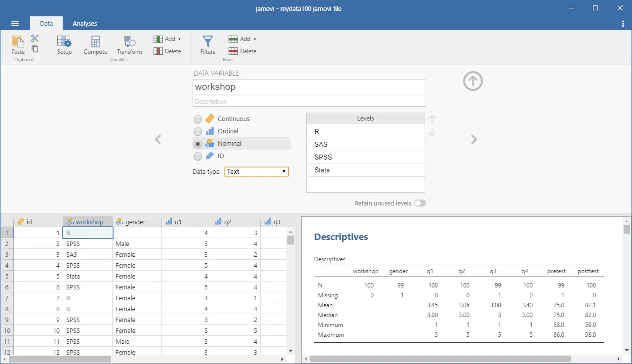
Data Editor
A data editor is a fundamental feature in data analysis software. It puts you in touch with your data and lets you get a feel for it, if only in a rough way. A data editor is such a simple concept that you might think there would be hardly any differences in how they work in different GUIs. While there are technical differences, to a beginner what matters the most are the differences in simplicity. Some GUIs, including BlueSky and jamovi, let you create only what R calls a data frame. They use more common terminology and call it a data set: you create one, you save one, later you open one, then you use one. Others, such as RKWard trade this simplicity for the full R language perspective: a data set is stored in a workspace. So the process goes: you create a data set, you save a workspace, you open a workspace, and choose a dataset from within it.
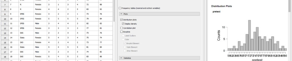
JASP is the only program in this set of reviews that lacks a data editor. It has only a data viewer (Figure 2, left). If you point to a cell, a message pops up to say, “double-click to edit data” and doing so will transfer the data to another program where you can edit it. You can choose which program will be used to edit your data in the “Preferences>Data Editing” tab, located under the “hamburger” menu in the upper-right corner. The default is Excel.
When JASP opens a data file, it automatically assigns metadata to the variables. As you can see in Figure 2, it has decided my variable “pretest” was a factor and provided a bar chart showing the counts of every value. For the extremely similar “posttest” variable it decided it was numeric, so it binned the values and provided a more appropriate histogram.
While JASP lacks the ability to edit data directly, it does allow you to edit some of the metadata, such as variable scale and variable (factor levels). I fixed the problem described above by clicking on the icon to the left of each variable name, and changing it from a Venn diagram representing “nominal”, to a ruler for “scale”. Note the use of terminology here, which is statistical rather than based on R’s use of “factor” and “numeric” abxyxas respectively. Teaching R is not part of JASP’s mission.
JASP cannot handle date/time variables other than to read them as character and convert them to factor. Once JASP decides a character or date/time variable is a factor, it cannot be changed.
Clicking on the name of a factor will open a small window on the top of the data viewer where you can over-write the existing labels. Variable names however, cannot be changed without going back to Excel, or whatever editor you used to enter the data.
Figure 2. The JASP data viewer is shown on the left-hand side.
Data Import
The ability to import data from a wide variety of formats is extremely important; you can’t analyze what you can’t access. Most of the GUIs evaluated in this series can open a wide range of file types and even pull data from relational databases. JASP can’t read data from databases, but it can import the following file formats:
Comma Separated Values (.csv)
Plain text files (.txt)
SPSS (.sav, but not .zsav, .por)
Open Document Spreadsheet (.ods)
The ability to read SAS and Stata files is planned for a future release. Though based on R, JASP cannot read R data files!
Data Export
The ability to export data to a wide range of file types helps when you need multiple tools to complete a task. Research is commonly a team effort, and in my experience, it’s rare to have all team members prefer to use the same tools. For these reasons, GUIs such as BlueSky, Deducer, and jamovi offer many export formats. Others, such as R Commander and RKward can create only delimited text files.
A fairly unique feature of JASP is that it doesn’t save just a dataset, but instead it saves the combination of a dataset plus its associated analyses. To save just the dataset, you go to the “File” tab and choose “Export data.” The only export format is comma separated value file (.csv).
Data Management
It’s often said that 80% of data analysis time is spent preparing the data. Variables need to be computed, transformed, scaled, recoded, or binned; strings and dates need to be manipulated; missing values need to be handled; datasets need to be sorted, stacked, merged, aggregated, transposed, or reshaped (e.g. from “wide” format to “long” and back).
A critically important aspect of data management is the ability to transform many variables at once. For example, social scientists need to recode many survey items, biologists need to take the logarithms of many variables. Doing these types of tasks one variable at a time is tedious.
Some GUIs, such as BlueSky and R Commander can handle nearly all of these tasks. Others, such as jamovi and RKWard handle only a few of these functions.
JASP’s data management capabilities are minimal. It has a simple calculator that works by dragging and dropping variable names and math or statistical operators. Alternatively, you can type formulas using R code. Using this approach, you can only modify one variable at time, making day-to-day analysis quite tedious. It’s also unable to apply functions across rows (jamovi handles this via a set of row-specific functions). Using the calculator, I could never figure out how to later edit the formula or even delete a variable if I made an error. I tried to recreate one, but it told me the name was already in use.
You can filter cases to work on a subset of your data. However, JASP can’t sort, stack, merge, aggregate, transpose, or reshape datasets. The lack of combining datasets may be a result of the fact that JASP can only have one dataset open in a given session.
Menus & Dialog Boxes
The goal of pointing and clicking your way through an analysis is to save time by recognizing menu settings rather than performing the more difficult task of recalling programming commands. Some GUIs, such as BlueSky and jamovi, make this easy by sticking to menu standards and using simpler dialog boxes; others, such as RKWard, use non-standard menus that are unique to it and hence require more learning.
JASP’s interface uses tabbed windows and toolbars in a way that’s similar to Microsoft Office. As you can see in Figure 3, the “File” tab contains what is essentially a menu, but it’s already in the dropped-down position so there’s no need to click on it. Depending on your selections there, a side menu may pop out, and it stays out without holding the mouse button down.
Figure 3. The File tab which shows menu and sub-menu, which are always “dropped down”.
The built-in set of analytic methods are contained under the “Common” tab. Choosing that yields a shift from menus to toolbar icons shown in Figure 4.
Figure 4. Analysis icons shown on the Common tab.
Clicking on any icon on the toolbar causes a standard dialog box to pop out the right side of the data viewer (Figure 2, center). You select variables to place into their various roles. This is accomplished by either dragging the variable names or by selecting them and clicking an arrow located next to the particular role box. As soon as you fill in enough options to perform an analysis, its output appears instantly in the output window to the right. Thereafter, every option chosen adds to the output immediately; every option turned off removes output. The dialog box does have an “OK” button, but rather than cause the analysis to run, it merely hides the dialog box, making room for more space for the data viewer and output. Clicking on the output itself causes the associated dialog to reappear, allowing you to make changes.
While nearly all GUIs keep your dialog box settings during your session, JASP keeps those settings in its main file. This allows you to return to a given analysis at a future date and try some model variations. You only need to click on the output of any analysis to have the dialog box appear to the right of it, complete with all settings intact.
Output is saved by using the standard “File> Save” selection.
Documentation & Training
The JASP Materials web page provides links to a helpful array of information to get you started. The How to Use JASP web page offers a cornucopia of training materials, including blogs, GIFs, and videos. The free book, Statistical Analysis in JASP: A Guide for Students, covers the basics of using the software and includes a basic introduction to statistical analysis.
Help
R GUIs provide simple task-by-task dialog boxes which generate much more complex code. So for a particular task, you might want to get help on 1) the dialog box’s settings, 2) the custom functions it uses (if any), and 3) the R functions that the custom functions use. Nearly all R GUIs provide all three levels of help when needed. The notable exception that is the R Commander, which lacks help on the dialog boxes themselves.
JASP’s help files are activated by choosing “Help” from the hamburger menu in the upper right corner of the screen (Figure 5). When checked, a window opens on the right of the output window, and its contents change as you scroll through the output. Given that everything appears in a single window, having a large screen is best.
The help files are very well done, explaining what each choice means, its assumptions, and even journal citations. While there is no reference to the R functions used, nor any link to their help files, the overall set of R packages JASP uses is listed here.
Figure 5. JASP with help file open on the left. Click to see a bigger image.
Graphics
The various GUIs available for R handle graphics in several ways. Some, such as RKWard, focus on R’s built-in graphics. Others, such as BlueSky, focus on R’s popular ggplot graphics. GUIs also differ quite a lot in how they control the style of the graphs they generate. Ideally, you could set the style once, and then all graphs would follow it.
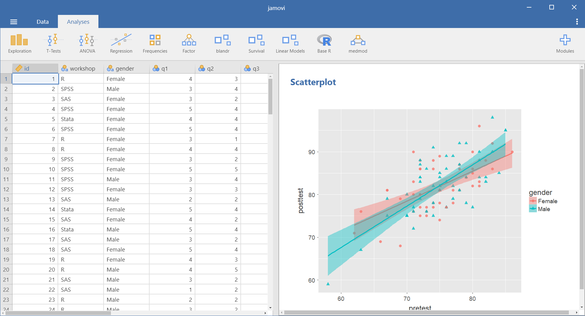
There is no “Graphics” menu in JASP; all the plots are created from within the data analysis dialogs. For example, boxplots are found in “Common> Descriptives> Plots.” To get a scatterplot I tried “Common> Regression> Plots” but only residual plots are found there. Next I tried “Common> Descriptives> Plots> Correlation plots” and was able to create the image shown in Figure 6. Apparently, there is no way to get just a single scatterplot.
The plots JASP creates are well done, with a white background and axes that don’t touch at the corners. It’s not clear which R functions are used to create them as their style is not the default from the R’s default graphics package, ggplot2, or lattice.
Figure 6. The popular scatterplot is only available as part of a scatterplot matrix.
The most important graphical ability that JASP lacks is the ability to do “small multiples” or “facets”. Faceted plots allow you to compare groups by showing a set of the same type of plot repeated by levels of a categorical variable.
Setting the dots-per-inch is the only graphics adjustment JASP offers. It doesn’t support styles or templates. However, plot editing is planned for a future release.
Here is the selection of plots JASP can create.
Histogram
Density
Box Plots
Violin Plots
Strip Plots
Bar Plots
Scatterplot matrix
Scatter – of residuals
Confidence intervals
Modeling
The way statistical models (which R stores in “model objects”) are created and used, is an area on which R GUIs differ the most. The simplest and least flexible approach is taken by RKWard. It tries to do everything you might need in a single dialog box. To an R programmer, that sounds extreme, since R does a lot with model objects. However, neither SAS nor SPSS were able to save models for their first 35 years of existence, so each approach has its merits.
Other GUIs, such as BlueSky and R Commander save R model objects, allowing you to use them for scoring tasks, testing the difference between two models, etc. JASP saves a complete set of analyses, including the steps used to create models. It offers a “Sync Data” option on its File menu that allows you to re-use the entire analysis on a new dataset. However, it does not let you save R model objects.
Analysis Methods
All of the R GUIs offer a decent set of statistical analysis methods. Some also offer machine learning methods. As you can see from the table below, JASP offers the basics of statistical analysis. Included in many of these are Bayesian measures, such as credible intervals. See Plug-in Modules section above for more analysis types.
Analysis
Frequentist
Bayesian
1. ANOVA
✓
✓
2. ANCOVA
✓
✓
3. Binomial Test
✓
✓
4. Contingency Tables (incl. Chi-Squared Test)
✓
✓
5. Correlation: Pearson, Spearman, Kendall
✓
✓
6. Exploratory Factor Analysis (EFA)
✓
–
7. Linear Regression
✓
✓
8. Logistic Regression
✓
–
9. Log-Linear Regression
✓
✓
10. Multinomial
✓
–
11. Principal Component Analysis (PCA)
✓
–
12. Repeated Measures ANOVA
✓
✓
13. Reliability Analyses: α, λ6, and ω
✓
–
14. Structural Equation Modeling (SEM)
✓
–
15. Summary Stats
–
✓
16. T-Tests: Independent, Paired, One-Sample
✓
✓
Generated R Code
One of the aspects that most differentiates the various GUIs for R is the code they generate. If you decide you want to save code, what type of code is best for you? The base R code as provided by the R Commander which can teach you “classic” R? The tidyverse code generated by BlueSky Statistics? The completely transparent (and complex) traditional code provided by RKWard, which might be the best for budding R power users?
JASP uses R code behind the scenes, but currently, it does not show it to you. There is no way to extract that code to run in R by itself. The JASP developers have that on their to-do list.
Support for Programmers
Some of the GUIs reviewed in this series of articles include extensive support for programmers. For example, RKWard offers much of the power of Integrated Development Environments (IDEs) such as RStudio or Eclipse StatET. Others, such as jamovi or the R Commander, offer just a text editor with some syntax checking and code completion suggestions.
JASP’s mission is to make statistical analysis easy through the use of menus and dialog boxes. It installs R and uses it internally, but it doesn’t allow you to access that copy (other than in its data calculator.) If you wish to code in R, you need to install a second copy.
Reproducibility & Sharing
One of the biggest challenges that GUI users face is being able to reproduce their work. Reproducibility is useful for re-running everything on the same dataset if you find a data entry error. It’s also useful for applying your work to new datasets so long as they use the same variable names (or the software can handle name changes). Some scientific journals ask researchers to submit their files (usually code and data) along with their written report so that others can check their work.
As important a topic as it is, reproducibility is a problem for GUI users, a problem that has only recently been solved by some software developers. Most GUIs (e.g. the R Commander, Rattle) save only code, but since GUI users don’t write the code, they also can’t read it or change it! Others such as jamovi, RKWard, and the newest version of SPSS, save the dialog box entries and allow GUI users to have reproducibility in the form they prefer.
JASP records the steps of all analyses, providing exact reproducibility. In addition, if you update a data value, all the analyses that used that variable are recalculated instantly. That’s a very useful feature since people coming from Excel expect this to happen. You can also use “File> Sync Data” to open a new data file and rerun all analyses on that new dataset. However, the dataset must have exactly the same variable names in the same order for this to work. Still, it’s a very feature that GUI users will find very useful. If you wish to share your work with a colleague so they too can execute it, they must be JASP users. There is no way to export an R program file for them to use. You need to send them only your JASP file; It contains both the data and the steps you used to analyze it.
Package Management
A topic related to reproducibility is package management. One of the major advantages to the R language is that it’s very easy to extend its capabilities through add-on packages. However, updates in these packages may break a previously functioning analysis. Years from now you may need to run a variation of an analysis, which would require you to find the version of R you used, plus the packages you used at the time. As a GUI user, you’d also need to find the version of the GUI that was compatible with that version of R.
Some GUIs, such as the R Commander and Deducer, depend on you to find and install R. For them, the problem is left for you to solve. Others, such as BlueSky, distribute their own version of R, all R packages, and all of its add-on modules. This requires a bigger installation file, but it makes dealing with long-term stability as simple as finding the version you used when you last performed a particular analysis. Of course, this depends on all major versions being around for long-term, but for open-source software, there are usually multiple archives available to store software even if the original project is defunct.
JASP if firmly in the latter camp. It provides nearly everything you need in a single download. This includes the JASP interface, R itself, and all R packages that it uses. So for the base package, you’re all set.
Output & Report Writing
Ideally, output should be clearly labeled, well organized, and of publication quality. It might also delve into the realm of word processing through R Markdown, knitr or Sweave documents. At the moment, none of the GUIs covered in this series of reviews meets all of these requirements. See the separate reviews to see how each of the other packages is doing on this topic.
The labels for each of JASP’s analyses are provided by a single main title which is editable, and subtitles, which are not. Pointing at a title will cause a black triangle to appear, and clicking that will drop a menu down to edit the title (the single main one only) or to add a comment below (possible with all titles).
The organization of the output is in time-order only. You can remove an analysis, but you cannot move it into an order that may make more sense after you see it.
While tables of contents are commonly used in GUIs to let you jump directly to a section, or to re-order, rename, or delete bits of output, that feature is not available in JASP.
Those limitations aside, JASP’s output quality is very high, with nice fonts and true rich text tables (Figure 7). Tabular output is displayed in the popular style of the American Psychological Association. That means you can right-click on any table and choose “Copy” and the formatting is retained. That really helps speed your work as R output defaults to mono-spaced fonts that require additional steps to get into publication form (e.g. using functions from packages such as xtable or texreg). You can also export an entire set of analyses to HTML, then open the nicely-formatted tables in Word.
Figure 7. Output as it appers after pasting into Word. All formatting came directly from JASP.
LaTeX users can right-click on any output table and choose “Copy special> LaTeX code” to to recreate the table in that text formatting language.
Group-By Analyses
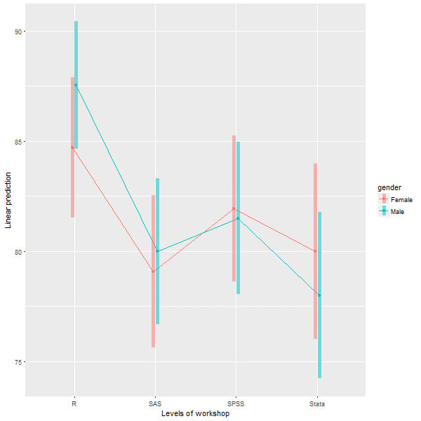
Repeating an analysis on different groups of observations is a core task in data science. Software needs to provide an ability to select a subset one group to analyze, then another subset to compare it to. All the R GUIs reviewed in this series can do this task. JASP allows you to select the observation to analyze in two ways. First, clicking the funnel icon located at the upper left corner of the data viewer opens a window that allows you to enter your selection logic, such as “gender = Female”. From an R code perspective, it does not use R’s “==” symbol for logical equivalence, nor does it allow you to put value labels in quotes. It generates a subset that you can analyze in the same way as the entire dataset. Second, you can click on the name of a factor, then check or un-check the values you wish to keep. Either way, the data viewer grays out the excluded data lines to give you a visual cue.
Software also needs the ability to automate such selections so that you might generate dozens of analyses, one group at a time. While this has been available in commercial GUIs for decades (e.g. SPSS “split-file”, SAS “by” statement), BlueSky is the only R GUI reviewed here that includes this feature. The closest JASP gets on this topic is to offer a “split” variable selection box in its Descriptives procedure.
Output Management
Early in the development of statistical software, developers tried to guess what output would be important to save to a new dataset (e.g. predicted values, factor scores), and the ability to save such output was built into the analysis procedures themselves. However, researchers were far more creative than the developers anticipated. To better meet their needs, output management systems were created and tacked on to existing tools (e.g. SAS’ Output Delivery System, SPSS’ Output Management System). One of R’s greatest strengths is that every bit of output can be readily used as input. However, for the simplification that GUIs provide, that’s a challenge.
Output data can be observation-level, such as predicted values for each observation or case. When group-by analyses are run, the output data can also be observation-level, but now the (e.g.) predicted values would be created by individual models for each group, rather than one model based on the entire original data set (perhaps with group included as a set of indicator variables).
You can also use group-by analyses to create model-level data sets, such as one R-squared value for each group’s model. You can also create parameter-level data sets, such as the p-value for each regression parameter for each group’s model. (Saving and using single models is covered under “Modeling” above.)
For example, in our organization, we have 250 departments and want to see if any of them have a gender bias on salary. We write all 250 regression models to a dataset, and then search to find those whose gender parameter is significant (hoping to find none, of course!)
BlueSky is the only R GUI reviewed here that does all three levels of output management. JASP not only lacks these three levels of output management, it even lacks the fundamental observation-level saving that SAS and SPSS offered in their first versions back in the early 1970s. This entails saving predicted values or residuals from regression, or scores from principal components analysis or factor analysis. The developers plan to add that capability to a future release.
Developer Issues
While most of the R GUI projects encourage module development by volunteers, the JASP project hasn’t done so. However, this is planned for a future release.
Conclusion
JASP is easy to learn and use. The tables and graphs it produces follow the guidelines of the Americal Psychological Association, making them acceptable by many scientific journals without any additional formatting. Its developers have chosen their options carefully so that each analysis includes what a researcher would want to see. Its coverage of Bayesian methods is the most extensive I’ve seen in this series of software reviews.
As nice as JASP is, it lacks important features, including: a data editor, an R code editor, the ability to see the R code it writes, the ability to handle date/time variables, the ability to read/write R, SAS, and Stata data files, the ability to perform many more fundamental data management tasks, the ability to save new variables such as predicted values or factor scores, the ability to save models so they can be tested on hold-out samples or new data sets, and the ability to reuse an analysis on new data sets using the GUI. While those are quite a few features to add, JASP is funded by several large grants from the Dutch Science Foundation and the ERC, allowing them to guarantee continuous and ongoing development.
Acknowledgements
Thanks to Eric-Jan Wagenmakers and Bruno Boutin for their help in understanding JASP’s finer points. Thanks also to Rachel Ladd, Ruben Ortiz, Christina Peterson, and Josh Price for their editorial suggestions. Edit
In my neverending quest to track The Popularity of Data Science Software, it’s time to update the section on Scholarly Articles. The rapid growth of R could not go on forever and, as you’ll see below, its use actually declined over the last year.
Scholarly Articles
Scholarly articles provide a rich source of information about data science tools. Because publishing requires significant amounts of effort, analyzing the type of data science tools used in scholarly articles provides a better picture of their popularity than a simple survey of tool usage. The more popular a software package is, the more likely it will appear in scholarly publications as an analysis tool, or even as an object of study.
Since scholarly articles tend to use cutting-edge methods, the software used in them can be a leading indicator of where the overall market of data science software is headed. Google Scholar offers a way to measure such activity. However, no search of this magnitude is perfect; each will include some irrelevant articles and reject some relevant ones. The details of the search terms I used are complex enough to move to a companion article, How to Search For Data Science Articles. Since Google regularly improves its search algorithm, each year I collect data again for the previous years (with one exception noted below).
Figure 2a shows the number of articles found for the more popular software packages and languages (those with at least 1,700 articles) in the most recent complete year, 2018. To allow ample time for publication, insertion into online databases, and indexing, the was data collected on 3/28/2019.
Figure 2a. The number of scholarly articles found on Google Scholar, for data science software. Only those with more than 1,700 citations are shown.
SPSS is by far the most dominant package, as it has been for over 20 years. This may be due to its balance between power and ease-of-use. R is in second place with around half as many articles. It offers extreme power, though with less ease of use. SAS is in third place, with a slight lead over Stata, MATLAB, and GraphPad Prism, which are nearly tied.
Note that the general-purpose languages: C, C++, C#, FORTRAN, Java, MATLAB, and Python are included only when found in combination with data science terms, so view those counts as more of an approximation than the rest.
The next group of packages goes from Python through C, with usage declining slowly. The next set starts at Caffe, dropping nearly 50%, and continuing to IBM Watson with a slow decline.
The last two packages in Fig 2a are Weka and Theano, which are quite a drop from IBM Watson, though it’s getting harder to see as the lines shrink.
To continue on this scale would make the remaining packages all appear too close to the y-axis to read, so Figure 2b shows the remaining software on a much smaller scale, with the y-axis going to only 1,700 rather than the 80,000 used on Figure 2a.
Figure 2b. Number of scholarly articles using each data science software found using Google Scholar. Only those with fewer than 1,700 citations are shown.
I chose to begin Figure 2b with software that has fewer than 1,700 articles because it allows us to see RapidMiner and KNIME on the same scale. They are both workflow-driven tools with very similar capabilities. This plot shows RapidMiner with 49% greater usage than KNIME. RapidMiner uses more marketing, while KNIME depends more on word-of-mouth recommendations and a more open source model. The IT advisory firms Gartner and Forrester rate them as tools able to hold their own against the commercial titans, IBM’s SPSS and SAS. Given that SPSS has roughly 50 times the usage in academia, that seems like quite a stretch. However, as we will soon see, usage of these newer packages are growing, while the use of the older ones is shrinking quite rapidly.
Figure 2b also lets us see IBM’s SPSS Modeler, SAS Enterprise Miner, and Alteryx on the same plot. These three are also workflow-driven tools which are quite expensive. None are doing as well here as RapidMiner or KNIME, tools that much less expensive – or free – depending on how you use them (KNIME desktop is free but server is not; RapidMiner is free for analyzing fewer than 10,000 cases).
Another interesting comparison on Figure 2b is JASP and jamovi. Both are open-source tools that focus on statistics rather than machine learning or artificial intelligence. They both use graphical user interfaces (GUIs) in a style that is similar to SPSS. Both also use R behind the scenes to do their calculations. JASP emphasizes Bayesian Analysis and hides its R code; jamovi has a more frequentist orientation, it lets you see its R code, and it lets you execute your own R code directly from within it. JASP currently has nine times as many citations here, though jamovi’s use is growing much more rapidly.
Even newer on the GUI for R scene is BlueSky Statistics, which doesn’t appear on the plot at all since it has zero scholarly articles so far. It was created by a new company and only adopted an open source model a few months ago.
While Figures 2a and 2b are useful for studying market share as it stands now, they don’t show how things are changing. It would be ideal to have long-term growth trend graphs for each of the analytics packages, but collecting that much data annually is too time-consuming. What I’ve done instead is collect data only for the past two complete years, 2017 and 2018. This provides the data needed to study year-over-year changes.
Figure 2c shows the percent change across those years, with the growing “hot” packages shown in red (right side); the declining or “cooling” are shown in blue (left side). Since the number of articles tends to be in the thousands or tens of thousands, I have removed any software that had fewer than 1,000 articles in 2015. A package that grows from 1 article to 5 may demonstrate 500% growth but is still of little interest.
Figure 2c. Change in Google Scholar citation rate in the most recent complete two years, 2017 and 2018.
The recent changes in data science software can be summarized succinctly: AI/ML up; statistics down. The software that is growing contains none of the packages that are associated more with statistical analysis. The software in decline is dominated by the classic packages of statistics: SPSS Statistics, SAS, GraphPad Prism, Stata, Statgraphics, R, Statistica, Systat, and Minitab. JMP is the only traditional statistics package whose scholarly usage is growing. Of the machine learning software that’s declining in usage, there are rough equivalents that are growing (e.g. Mahout down, Spark up).
Of course another summary is: cheap (or free) up; expensive down. Of the growing packages, 13 out of 17 are available in open source. Of those in decline, only 5 out of 13 are open source.
Statistics software has been around much longer than AI/ML software, started back in the days before open source. Stat vendors have been adding AI/ML methods to their software, making them the more comprehensive solutions. The AI/ML vendors or projects are missing an opportunity to add more comprehensive statistics capabilities. Some, such as RapidMiner and KNIME, are indeed expanding in this direction, but very slowly indeed.
At the top of Figure 2c, we see that the deep learning packages Keras and TensorFlow are the fastest growing at nearly 150%. PyTorch is not shown here because it did not have enough usage in the previous year. However, its citation rate went from 616 to 4,670, a substantial 658% growth rate! There are other packages that are not shown here, including JASP with 223% growth, and jamovi with 720% growth. Despite such high growth, the latter still only has 108 citations in 2018. The rapid growth of JASP and jamovi lend credence to the perspective that the overall pattern of change shown in Figure 2c may be more of a result of free vs. expensive software. Neither of them offers any AI/ML features.
Scikit Learn, the Python machine learning library, was a fast grower with a 60% increase.
I was surprised to see IBM Watson growing a healthy 34% as much of the news about it has not been good. It’s awesome at Jeopardy though!
In the RapidMiner vs. KNIME contest, we saw previously that RapidMiner was ahead. From this plot, we that KNIME growing slightly (5.7%) while RapidMiner is declining slightly (1.8%).
The biggest losers in Figure 2c are SPSS, down 39%, and SAS, Prism, and Mahout, all down 24%. Even R is down 13%. Recall that Figure 2a shows that despite recent years of decline, SPSS is still extremely dominant for scholarly use, and R and SAS are still the #2 and #3 most widely used packages in this arena.
I’m particularly interested in the long-term trends of the classic statistics packages. So in Figure 2d I have plotted the same scholarly-use data for 1995 through 2016.
Figure 2d. The number of Google Scholar citations for each classic statistics package per year from 1995 through 2016.
SPSS has a clear lead overall, but now you can see that its dominance peaked in 2009 and its use is in sharp decline. SAS never came close to SPSS’ level of dominance, and its use peaked around 2010. GraphPAD Prism followed a similar pattern, though it peaked a bit later, around 2013.
In Figure 2d, the extreme dominance of SPSS makes it hard to see long-term trends in the other software. To address this problem, I have removed SPSS and all the data from SAS except for 2014 and 1015. The result is shown in Figure 2e.
Figure 2e. The number of Google Scholar citations for each classic statistics package from 1995 through 2016, this time with SPSS removed and SAS included only in 2014 and 2015. The removal of SPSS and SAS expanded scale makes it easier to see the rapid growth of the less popular packages.
Figure 2e makes it easy to see that most of the remaining packages grew steadily across the time period shown. R and Stata grew especially fast, as did Prism until 2012. Note that the decline in the number of articles that used SPSS, SAS, or Prism is not balanced by the increase in the other software shown in this particular graph. Even adding up all the other software shown in Figures 2a and 2b doesn’t account for the overall decline. However, I’m looking at only 58 out of over 100 data science tools.
While Figures 2d and 2e show the historical trend that ended in 2016, Figure 2f shows a fresh set of data collected in March, 2019. Since Google’s algorithm changes, preventing the new data from matching exactly with the old, this new data starts at 2015 so the two sets overlap. SPSS is not shown on this graph because its dominance would compress the y-axis, making trends in the others harder to see. However, keep in mind that despite SPSS’ 39% drop from 2017 to 2018, its use is still 66% higher than R’s in 2018! Apparently people are willing to pay for ease of use.
Figure 2f. The number of Google Scholar citations for each classic statistics package per year from 2015 through 2018.
In Figure 2f we can see that the downward trends of SAS, Prism, and Statistica are continuing. We also see that the long and rapid growth of R and Stata has come to an end. Growth that rapid can’t go on forever. It will be interesting to see next year to see if this is merely a flattening of usage or the beginning of a declining trend. As I pointed out in my book, R for Stata Users, there are many commonalities between R and Stata. As a result of this, and the fact that R is open source, I expect R use to stabilize at this level while use of Stata continues to slowly decline.
SPSS’ long-term rapid decline has to level out at some point. They have been chipped away at by many competitors. However, until recently these competitors have either been free and code-based such as R, or menu-based and proprietary, such as Prism. With the fairly recent arrival of JASP, jamovi, and BlueSky Statistics, SPSS now faces software that is both free and menu-based. Previous projects to add menus to R, such as the R Commander and Deducer, were also free and open source, but they required installing R separately and then using R code to activate the menus.
These results apply to scholarly articles in general. The results in specific fields or journals are very likely to be different.
To see many other ways to estimate the market share of this type of software, see my ongoing article, The Popularity of Data Science Software. My next post will update the job advertisements that list science software. You may also be interested in my in-depth reviews of point-and-click user interfaces to R. I invite you to subscribe to my blog or follow me on twitter where I announce new posts. Happy computing!
Update: an earlier version of this post included figures that I’ve removed at the request of Forrester, Inc.
In my previous post, I discussed Gartner’s reviews of data science software companies. In this post, I describe Forrester’s coverage and discuss how radically different it is. As usual, this post is already integrated into my regularly-updated article, The Popularity of Data Science Software.
Forrester Research, Inc. is a leading global research and advisory firm that reviews data science software vendors. Studying their reports and comparing them to Gartner’s can provide a deeper understanding of the software these vendors provide.
Historically, Forrester has conducted their analyses similarly to Gartner’s. That approach compares software that uses point-and-click style software like KNIME, to software that emphasizes coding, such as Anaconda. To make apples-to-apples comparisons, Forrester decided to spit the two types of software into separate reports.
The Forrester Wave: Multimodal Predictive Analytics and Machine Learning Solutions, Q3, 2018 covers software that is controllable by various means such as menus, workflows, wizards, or code (as of 23/22/2019 available free here). Forrester plans to cover tools for automated modeling in a separate report, due out in 2019. Given that automation is now a widely adopted feature of the several companies covered in this report, that seems like an odd approach.
Forrester divides the vendors into four categories: Leaders, Strong Performers, Contenders, and Challengers.
In the Leaders category, they include IBM, while Gartner viewed them as a middle-of-the-pack Visionary. Forrester and Gartner both view SAS and RapidMiner as leaders.
The Strong Performers category includes KNIME, which Gartner considered a Leader. Datawatch and Tibco are tied in this segment while Gartner had them far apart, with Datawatch put in very last place by Gartner. Forrester has KNIME and SAP next to each other in this category, while Gartner had them far apart, with KNIME a Leader and SAP a Niche Player. Dataiku is here too, with a similar rating to Gartner.
The Contenders segment contains Microsoft and Mathworks, in positions similar to Gartner’s. Fico is here too; Gartner did not evaluate them.
Forrester’s Challengers segment includes World Programming, which sells SAS-compatible software, and Minitab, which purchased Salford Systems. Neither were considered by Gartner.
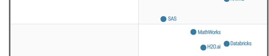
Forrester rates some of the notebook-based vendors very differently than Gartner. Here Domino Data Labs is a Leader while Gartner had them at the extreme other end of their plot, in the Niche Players quadrant. Oracle is also shown as a Leader, though its strength is this market is minimal.
In the Strong Performers category are Databricks and H2O.ai, in very similar positions compared to Gartner. Civis Analytics and OpenText are also in this category; neither were reviewed by Gartner. Cloudera is here as well; it too was left out by Gartner.
Forrester’s Condenders category contains Google, in a similar position compared to Gartner’s analysis. Anaconda is here too, in a position quite a bit higher than in Gartner’s plot.
The only two companies rated by Gartner but ignored by Forrester are Alteryx and DataRobot. The latter will no doubt be covered in Forrester’s report on automated modelers, due out this summer.
As with my coverage of Gartner’s report, my summary here barely scratches the surface of the two Forrester reports. Both provide insightful analyses of the vendors and the software they create. I recommend reading both (and learning more about open source software) before making any purchasing decisions.
To see many other ways to estimate the market share of this type of software, see my ongoing article, The Popularity of Data Science Software. My next post will update the scholarly use of data science software, a leading indicator. You may also be interested in my in-depth reviews of point-and-click user interfaces to R. I invite you to subscribe to my blog or follow me on twitter where I announce new posts. Happy computing!
I’ve just updated The Popularity of Data Science Software to reflect my take on Gartner’s 2019 report, Magic Quadrant for Data Science and Machine Learning Platforms. To save you the trouble of digging through all 40+ pages of my report, here’s just the updated section:
IT Research Firms
IT research firms study software products and corporate strategies. They survey customers regarding their satisfaction with the products and services and provide their analysis in reports that they sell to their clients. Each research firm has its own criteria for rating companies, so they don’t always agree. However, I find the detailed analysis that these reports contain extremely interesting reading. The reports exclude open source software that has no specific company backing, such as R, Python, or jamovi. Even open source projects that do have company backing, such as BlueSky Statistics, are excluded if they have yet to achieve sufficient market adoption. However, they do cover how company products integrate open source software into their proprietary ones.
While these reports are expensive, the companies that receive good ratings usually purchase copies to give away to potential customers. An Internet search of the report title will often reveal companies that are distributing them. On the date of this post, Datarobot is offering free copies.
Gartner, Inc. is one of the research firms that write such reports. Out of the roughly 100 companies selling data science software, Gartner selected 17 which offered “cohesive software.” That software performs a wide range of tasks including data importation, preparation, exploration, visualization, modeling, and deployment.
Gartner analysts rated the companies on their “completeness of vision” and their “ability to execute” that vision. Figure 3a shows the resulting “Magic Quadrant” plot for 2019, and 3b shows the plot for the previous year. Here I provide some commentary on their choices, briefly summarize their take, and compare this year’s report to last year’s. The main reports from both years contain far more detail than I cover here.
Figure 3a. Gartner Magic Quadrant for Data Science and Machine Learning Platforms from their 2019 report (plot done in November 2018, report released in 2019).
The Leaders quadrant is the place for companies whose vision is aligned with their customer’s needs and who have the resources to execute that vision. The further toward the upper-right corner of the plot, the better the combined score.
RapidMiner and KNIME reside in the best part of the Leaders quadrant this year and last. This year RapidMiner has the edge in ability to execute, while KNIME offers more vision. Both offer free and open source versions, but the companies differ quite a lot on how committed they are to the open source concept. KNIME’s desktop version is free and open source and the company says it will always be so. On the other hand, RapidMiner is limited by a cap on the amount of data that it can analyze (10,000 cases) and as they add new features, they usually come only via a commercial license with “difficult-to-navigate pricing conditions.” These two offer very similar workflow-style user interfaces and have the ability to integrate many open sources tools into their workflows, including R, Python, Spark, and H2O.
Tibco moved from the Challengers quadrant last year to the Leaders this year. This is due to a number of factors, including the successful integration of all the tools they’ve purchased over the years, including Jaspersoft, Spotfire, Alpine Data, Streambase Systems, and Statistica.
SAS declined from being solidly in the Leaders quadrant last year to barely being in it this year. This is due to a substantial decline in its ability to execute. Given SAS Institute’s billions in revenue, that certainly can’t be a financial limitation. It may be due to SAS’ more limited ability to integrate as wide a range of tools as other vendors have. The SAS language itself continues to be an important research tool among those doing complex mixed-effects linear models. Those models are among the very few that R often fails to solve.
The companies in the Visionaries Quadrant are those that have good future plans but which may not have the resources to execute that vision.
Mathworks moved forward substantially in this quadrant due to MATLAB’s ability to handle unconventional data sources such as images, video, and the Internet of Things (IoT). It has also opened up more to open source deep learning projects.
H2O.ai is also in the Visionaries quadrant. This is the company behind the open source H2O software, which is callable from many other packages or languages including R, Python, KNIME, and RapidMiner. While its own menu-based interface is primitive, its integration into KNIME and RapidMiner makes it easy to use for non-coders. H2O’s strength is in modeling but it is lacking in data access and preparation, as well as model management.
IBM dropped from the top of the Visionaries quadrant last year to the middle. The company has yet to fully integrate SPSS Statistics and SPSS Modeler into its Watson Studio. IBM has also had trouble getting Watson to deliver on its promises.
Databricks improved both its vision and its ability to execute, but not enough to move out of the Visionaries quadrant. It has done well with its integration of open-source tools into its Apache Spark-based system. However, it scored poorly in the predictability of costs.
Datarobot is new to the Gartner report this year. As its name indicates, its strength is in the automation of machine learning, which broadens its potential user base. The company’s policy of assigning a data scientist to each new client gets them up and running quickly.
Google’s position could be clarified by adding more dimensions to the plot. Its complex collection of a dozen products that work together is clearly aimed at software developers rather than data scientists or casual users. Simply figuring out what they all do and how they work together is a non-trivial task. In addition, the complete set runs only on Google’s cloud platform. Performance on big data is its forte, especially problems involving image or speech analysis/translation.
Microsoft offers several products, but only its cloud-only Azure Machine Learning (AML) was comprehensive enough to meet Gartner’s inclusion criteria. Gartner gives it high marks for ease-of-use, scalability, and strong partnerships. However, it is weak in automated modeling and AML’s relation to various other Microsoft components is overwhelming (same problem as Google’s toolset).
Figure 3b. Last year’s Gartner Magic Quadrant for Data Science and Machine Learning Platforms (January, 2018)
Those in the Challenger’s Quadrant have ample resources but less customer confidence in their future plans, or vision.
Alteryx dropped slightly in vision from last year, just enough to drop it out of the Leaders quadrant. Its workflow-based user interface is very similar to that of KNIME and RapidMiner, and it too gets top marks in ease-of-use. It also offers very strong data management capabilities, especially those that involve geographic data, spatial modeling, and mapping. It comes with geo-coded datasets, saving its customers from having to buy it elsewhere and figuring out how to import it. However, it has fallen behind in cutting edge modeling methods such as deep learning, auto-modeling, and the Internet of Things.
Dataiku strengthed its ability to execute significantly from last year. It added better scalability to its ease-of-use and teamwork collaboration. However, it is also perceived as expensive with a “cumbersome pricing structure.”
Members of the Niche Players quadrant offer tools that are not as broadly applicable. These include Anaconda, Datawatch (includes the former Angoss), Domino, and SAP.
Anaconda provides a useful distribution of Python and various data science libraries. They provide support and model management tools. The vast army of Python developers is its strength, but lack of stability in such a rapidly improving world can be frustrating to production-oriented organizations. This is a tool exclusively for experts in both programming and data science.
Datawatch offers the tools it acquired recently by purchasing Angoss, and its set of “Knowledge” tools continues to get high marks on ease-of-use and customer support. However, it’s weak in advanced methods and has yet to integrate the data management tools that Datawatch had before buying Angoss.
Domino Data Labs offers tools aimed only at expert programmers and data scientists. It gets high marks for openness and ability to integrate open source and proprietary tools, but low marks for data access and prep, integrating models into day-to-day operations, and customer support.
SAP’s machine learning tools integrate into its main SAP Enterprise Resource Planning system, but its fragmented toolset is weak, and its customer satisfaction ratings are low.
To see many other ways to rate this type of software, see my ongoing article, The Popularity of Data Science Software. You may also be interested in my in-depth reviews of point-and-click user interfaces to R. I invite you to subscribe to my blog or follow me on twitter where I announce new posts. Happy computing!
Last February I reviewed the jamovi menu-based front end to R. I’ve reviewed five more user interfaces since then, and have developed a more comprehensive template to make it easier to compare them all. Now I’m cycling back to jamovi, using that template to write a far more comprehensive review. I’ve added this review to the previous set, and I’m releasing it as a blog post so that it will be syndicated on R-Bloggers, StatsBlogs, et al.
Introduction
jamovi (spelled with a lower-case “j”) is a free and open source graphical user interface for the R software that targets beginners looking to point-and-click their way through analyses. It is available for Windows, Mac, Linux, and even ChromeOS. Versions are also planned for servers and tablets.
This post is one of a series of reviews which aim to help non-programmers choose the Graphical User Interface (GUI) for R that is best for them. Additionally, these reviews include cursory descriptions of the programming support that each GUI offers.
Figure 1. jamovi’s main screen.
Terminology
There are various definitions of user interface types, so here’s how I’ll be using these terms:
GUI = Graphical User Interface using menus and dialog boxes to avoid having to type programming code. I do not include any assistance for programming in this definition. So, GUI users are people who prefer using a GUI to perform their analyses. They don’t have the time or inclination to become good programmers.
IDE = Integrated Development Environment which helps programmers write code. I do not include point-and-click style menus and dialog boxes when using this term. IDE users are people who prefer to write R code to perform their analyses.
Installation
The various user interfaces available for R differ quite a lot in how they’re installed. Some, such as BlueSky Statistics or RKWard, install in a single step. Others install in multiple steps, such as R Commander (two steps), and Deducer (up to seven steps). Advanced computer users often don’t appreciate how lost beginners can become while attempting even a simple installation. The HelpDesks at most universities are flooded with such calls at the beginning of each semester!
jamovi’s single-step installation is extremely easy and includes its own copy of R. So if you already have a copy of R installed, you’ll have two after installing jamovi. That’s a good idea though, as it guarantees compatibility with the version of R that it uses, plus a standard R installation by itself is harder than jamovi’s. Python is also installed with jamovi, but it is used only for internal purposes. You can directly control only R through jamovi.
Plug-in Modules
When choosing a GUI, one of the most fundamental questions is: what can it do for you? What the initial software installation of each GUI gets you is covered in the Graphics, Analysis, and Modeling sections of this series of articles. Regardless of what comes built-in, it’s good to know how active the development community is. They contribute “plug-ins” which add new menus and dialog boxes to the GUI. This level of activity ranges from very low (RKWard, Deducer) to very high (R Commander).
For jamovi, plug-ins are called “modules” and they are found in the “jamovi library” rather than on the Comprehensive R Archive Network (CRAN) where R and most of its packages are found. This makes locating and installing jamovi modules especially easy.
Although jamovi is one of the most recent GUIs to appear on the R scene, it has already attracted a respectable number of developers. The list of modules at publication time is listed below. You can check on the latest ones on this web page.
Base R – converts jamovi analyses into standard R functions
blandr – Bland-Altman method comparison analysis, and is also available as an R package from CRAN
Death Watch – survival analysis
Distraction – quantiles and probabilities of continuous and discrete distributions
GAMLj – general linear model, linear mixed model, generalized linear models, etc.
jpower – power analysis for common research designs
MAJOR – meta-analysis based on R’s metafor package
medmod – basic mediation and moderation analysis
jAMM – advanced mediation analysis (similar to the popular Process Macro for SAS and SPSS)
R Data Sets
RJ – editor to run R code inside jamovi
scatr – scatter plots with marginal density or box plots
Statkat – helps you choose a statistical test.
TOSTER – tests of equivalence for t-tests and correlation
Walrus – robust descriptive stats & tests
jamovi Arcade – hangman & blackjack games
Startup
Some user interfaces for R, such as BlueSky and Rkward, start by double-clicking on a single icon, which is great for people who prefer to not write code. Others, such as R commander and JGR, have you start R, then load a package from your library, and then call a function to finally activate the GUI. That’s more appropriate for people looking to learn R, as those are among the first tasks they’ll have to learn anyway.
You start jamovi directly by double-clicking its icon from your desktop, or choosing it from your Start Menu (i.e. not from within R itself). It interacts with R in the background; you never need to be aware that R is running.
Data Editor
A data editor is a fundamental feature in data analysis software. It puts you in touch with your data and lets you get a feel for it, if only in a rough way. A data editor is such a simple concept that you might think there would be hardly any differences in how they work in different GUIs. While there are technical differences, to a beginner what matters the most are the differences in simplicity. Some GUIs, including BlueSky, let you create only what R calls a data frame. They use more common terminology and call it a data set: you create one, you save one, later you open one, then you use one. Others, such as RKWard trade this simplicity for the full R language perspective: a data set is stored in a workspace. So the process goes: you create a data set, you save a workspace, you open a workspace, and choose a dataset from within it.
jamovi’s data editor appears at start-up (Figure 1, left) and prompts you to enter data with an empty spreadsheet-style data editor. You can start entering data immediately, though at first, the variables are simply named A, B, C….
To change metadata, such as variable names, you double click on a name, and window (Figure 2) will slide open from the top with settings for variable name, description, measurement level (continuous, ordinal, nominal, or ID), data type (integer, decimal, text), variable levels (labels) and a “retain unused levels” switch. Currently, jamovi has no date format, which is a serious limitation if you deal with that popular data format.
Figure 2. The jamovi data editor with the variable attributes window open, allowing you to make changes.
When choosing variable terminology, R GUI designers have two choices: follow what most statistics books use, or instead use R jargon. The jamovi designers have opted for the statistics book terminology. For example, what jamovi calls categorical, decimal, or text are called factor, numeric, or character in R. Both sets of terms are fairly easy to learn, but given that some jamovi users may wish to learn R code, I find that choice puzzling. Changing variable settings can be done to many variables at once, which is an important time saver.
You can enter integer, decimal, or character data in the editor right after starting jamovi. It will recognize those types and set their metadata accordingly.
To enter nominal/factor data, you are free to enter numbers, such as 1/2 and later set levels to see Male/Female appear. Or you can set it up in advance and enter the numbers which will instantly turn into labels. That is a feature that saves time and helps assure accuracy. All data editors should offer that choice!
Adding variables or observations is as simple as scrolling beyond the set’s current limits and entering additional data. jamovi does not require “add more” buttons as some of its competitors (e.g. BlueSky) do. Adding variables or observations in between existing ones is also easy. Under the “Data” tab, there are two sets of “Add” and “Delete” buttons. The first set deals with variables and the second with cases. You can use the first set to insert, compute, transform variables or delete variables. The second inserts, appends, or deletes cases. These two sets of buttons are labeled “Variables” and “Rows”, but the font used is so small that I used jamovi for quite a while before noticing these labels.
Data Import
The ability to import data from a wide variety of formats is extremely important; you can’t analyze what you can’t access. Most of the GUIs evaluated in this series can open a wide range of file types and even pull data from relational databases. jamovi can’t read data from databases, but it can import the following file formats:
Comma Separated Values (.csv)
Plain text files (.txt)
SPSS (.sav, .zsav, .por)
SAS binary files (.sas7bdat, .xpt)
JASP (.jasp)
While jamovi doesn’t support true date/time variables, when you import a dataset that contains them, it will convert them to an integer value representing the number of days since 1970-01-01 and assign them labels in the YYYY-MM-DD format.
Data Export
The ability to export data to a wide range of file types helps when you have to use multiple tools to complete a task. Research is commonly a team effort, and in my experience, it’s rare to have all team members prefer to use the same tool. For these reasons, GUIs such as BlueSky and Deducer offer many export formats. Others, such as R Commander and RKward can create only delimited text files.
A fairly unique feature of jamovi is that it doesn’t save just a dataset, but instead it saves the combination of a dataset plus its associated analyses. To save just the dataset, you use the menu (a.k.a. hamburger) menu to select “Export” then “Data.” The export formats supported are the same as those provided for import, except for the more rarely-used ones such as SAS xpt and SPSS por and zsav:
Comma Separated Values (.csv)
Plain text files (.txt)
SPSS (.sav)
SAS binary files (.sas7bdat)
Data Management
It’s often said that 80% of data analysis time is spent preparing the data. Variables need to be transformed, recoded, or created; strings and dates need to be manipulated; missing values need to be handled; datasets need to be sorted, stacked, merged, aggregated, transposed, or reshaped (e.g. from “wide” format to “long” and back).
A critically important aspect of data management is the ability to transform many variables at once. For example, social scientists need to recode many survey items, biologists need to take the logarithms of many variables. Doing these types of tasks one variable at a time is tedious.
Some GUIs, such as BlueSky and R Commander can handle nearly all of these tasks. Others, such as RKWard handle only a few of these functions.
jamovi’s data management capabilities are minimal. You can transform or recode variables, and doing so across many variables is easy. The transformations are stored in the variable itself, making it easy to see what it was by double-clicking its name. However, the R code for the transformation is not available, even in with Syntax Mode turned on.
You can also filter cases to work on a subset of your data. However, jamovi can’t sort, stack, merge, aggregate, transpose, or reshape datasets. The lack of combining datasets may be a result of the fact that jamovi can only have one dataset open in a given session.
Menus & Dialog Boxes
The goal of pointing and clicking your way through an analysis is to save time by recognizing menu settings rather than performing the more difficult task of recalling programming commands. Some GUIs, such as BlueSky, make this easy by sticking to menu standards and using simpler dialog boxes; others, such as RKWard, use non-standard menus that are unique to it and hence require more learning.
jamovi uses standard menu choices for running steps listed on the Data and Analyses tabs. Dialog boxes appear and you select variables to place into their various roles. This is accomplished by either dragging the variable names or by selecting them and clicking an arrow located next to the particular role box. A unique feature of jamovi is that as soon as you fill in enough options to perform an analysis, its output appears instantly. There is no “OK” or “Run” button as the other GUIs reviewed here have. Thereafter, every option chosen adds to the output immediately; every option turned off is removed.
While nearly all GUIs keep your dialog box settings during your session, jamovi keeps those settings in its main “workspace” file. This allows you to return to a given analysis at a future date and try some model variations. You only need to click on the output of any analysis to have the dialog box appear to the right of it, complete with all settings intact.
Under the triple-dot menu on the upper right side of the screen, you can choose to run “Syntax Mode.” When you turn that on, the R syntax appears immediately, and when you turn it off, it vanishes just as quickly. Turning on syntax mode is the only way a jamovi user would be aware that R is doing the work in the background.
Output is saved by using the standard “Menu> Save” selection.
Documentation & Training
The jamovi User Guide covers the basics of using the software. The Resources by the Community web page provides links to a helpful array of documentation and tutorials in written and video form.
Help
R GUIs provide simple task-by-task dialog boxes which generate much more complex code. So for a particular task, you might want to get help on 1) the dialog box’s settings, 2) the custom functions it uses (if any), and 3) the R functions that the custom functions use. Nearly all R GUIs provide all three levels of help when needed. The notable exception that is the R Commander, which lacks help on the dialog boxes themselves.
jamovi doesn’t offer any integrated help files, only the documentation described in the Documentation & Training section above. The search for help can become very confusing. For example, after doing the scatterplot shown in the next section, I wondered if the scat() function offered a facet argument, normally this would be an easy question to answer. My initial attempt was to go to RStudio, load jamovi’s jmv package knowing that I routinely get help from it. However, the scat() function is not built into jamovi (or jmv); it comes in the scatr add-on module. So I had to return to jamovi and install Rj Editor module. That module lets you execute R code from within jamovi. However, running “help(scat)” yielded no result. After so much confusion, I never was able to find any help on that function. Hopefully, this situation will improve as jamovi matures.
Graphics
The various GUIs available for R handle graphics in several ways. Some, such as RKWard, focus on R’s built-in graphics. Others, such as BlueSky, focus on R’s popular ggplot graphics. GUIs also differ quite a lot in how they control the style of the graphs they generate. Ideally, you could set the style once, and then all graphs would follow it.
jamovi uses its own graphics functions to create plots. By default, they have the look of the popular ggplot2 package. jamovi is the only R GUI reviewed that lets you set the plot style in advance, and all future plots will use that style. It does this using four popular themes. jamovi also lets you choose color palettes in advance, from a set of eight.
It has been just a few months since I reviewed five free and open-source point-and-click graphical user interfaces (GUIs) to the R language. I plan to keep those reviews up to date as new features are added. BlueSky’s interface would be immediately familiar to anyone who had used SPSS, as its developers model it on that popular software. The BlueSky developers’ goal is to help people use R without having to learn to write computer code.
While the previous version of BlueSky offered dozens of fairly advanced modeling methods such as generalized linear models, random forests, and support vector machines, it lacked some simpler features. Version 5.40 (correction: this was previously listed as version 6.04) adds a dialog for logistic regression, which is essentially its glm dialog simplified to do only logistic regression.
The Multi-Way ANOVA output has also been greatly enhanced, with the addition of a wide range of contrasts from the emmeans package, support for all three types of sums of squares, and plots for both post-hoc main-effects comparisons and interaction plots like this one:
Users of RStudio will be pleased that the BlueSky’s program editor now submits lines of code like RStudio does so you can step your way through a program line-by-line, by clicking the Run button repeatedly.
The new version also has functions to do string-to-date vice versa, which led me to realize I had totally missed the string and date functions that it already had. In the “Data> Compute” dialog, the functions for Arithmetic, Logical, Math, and String(1) are visible. But if you click on the “>>” arrow on the right, you’ll also see String (2), Conversion, Statistical, Random Numbers, and four different menus of Date functions.
The complete set of new features and bug fixes is below. You can read my full review of BlueSky here, and you download the software for free here. I plan to write about new features in other R GUIs, so stay tuned to my blog or follow me on twitter where I announce new posts. Happy computing!
NEW FEATURES:
=============
1) Added support for weighted datasets. This option is available in Data -> Set Weights. Once you specify the weighting variable we create a new dataset with rows replicated as defined in the weights. This is similar to what SPSS does internally. When you run frequencies, independent sample t-tests, graphics commands, statistical tests etc on the new dataset (in BlueSky Statistics) with the rows replicated you will see results identical to those in SPSS.
2) Added the option to specify a weighting variable in Linear and Logistic Regression. This allows an optional vector of weights to be used during the fitting process (i.e. the weighted least-squares solution).
3) Added support for logistic regression under ‘Model Fitting’. Once the model is built, you can score the dataset, optionally obtain a confusion matrix, model statistics, and a ROC curve by selecting the model and clicking score. This is available on the top right-hand corner of the main application window.
4) We have updated the “Multi Way Anova” dialog with following capabilities:
display contrasts.
interaction plots.
support for type I, type II and type III tests.
pairwise comparison.
5) New reshape dialog with simplified R syntax has been added, using the tidyr package.
6) The “Multi variable one sample T-Test” and “Multi variable independent sample T-Test(with factor)” have been updated to allow you to specify the alternative hypothesis.
7) Added capabilities to support date manipulations.
The “String to date” dialog allows you to convert string to POSIXct date class.
The “Date to string” dialog allows you to convert the date (POSIXct and Date class) to string.
8) Simplified the syntax for frequencies and factor analysis.
9) If you launch a second instance of BlueSky Statistics the message that gets displayed has been improved. NOTE: You can only have one BlueSky Statistics instance running at a time.
10) We have improved the ability to browse the contents of the output window in BlueSky Statistics. This can be accessed from the menu (Layout > Show Navigation Tree).
11) Items in the output window can now be deleted. To delete an item from the output, just right click on the item(table/text/graphics) and choose the “Delete” option.
12) To make the output visually more appealing, we have introduced an option to hide the R syntax that gets displayed in the output window. This is controlled by an option in the configuration window ( Tools > Configuration Settings > Output tab ). By default we hide the R syntax in the output window.
13) When the option to show R syntax in the output is turned on ( Tools > Configuration Settings > Output tab ) and you resize the output window, we wrap the R syntax so that it is always visible.
14) To run any line of R syntax just place the cursor on that line and hit the RUN button, you don’t have to select the entire line.
15) If you want to run your R script line by line, place your cursor on the first line and hit RUN, the cursor will automatically move to the next line and you can hit the RUN button again.
This feature will work for simple R syntax which does not span multiple lines.
Example 1: 3 lines below work
a=10
b=20
c=a+b
Example 2: 4 lines below will not work
if(TRUE)
{
print(“Great”)
}
16)Added helpful hints to indicate you have reached the beginning and end of a dataset when scrolling wide datasets. This is available on the paging controls on the bottom right-hand corner of the screen.
17) Application launch is now faster.
18) In the BlueSky Statistics syntax editor, just like a comma, the pipe (%>%) can be used to break a long R code statement.
19) When the application launches, we open a new blank dataset this has been populated with zeros. You can right click on a row to delete a row or go into ‘Data -> Delete Variables’ to delete variables.
20) Clicking on a variable name in the data grid sorts in ascending order by that variable name. Clicking again sorts in descending order.
BUG FIXES:
=============
1) Fixed an issue with factor analysis when saving scores using the regression method.
2) Fixed an issue when re-editing factor levels that were previously changed in the variable grid. This would result in the dialog not functioning correctly and incorrect levels being added.
3) Fixed an issue when you closed the empty dataset that gets created when BlueSky Statistics is launched and then attempted to save open datasets- those datasets would not get saved correctly.
4) Fixed an issue that was limiting the number of variables that Factor Analysis can be run across.
5) Within block commands that use ‘local()’, cat(“\n”) can now be printed in the output to leave some extra spaces.
6) When you added a new factor variable and renamed the variable using the user interface and then tried to add new levels – this did not work and has been fixed.
7) Add new factor variable. Click in the cell where the new variable name is shown. Cell goes in edit mode. Now add new factor levels to this new variable. Switch to the data grid and select a different level. Switch back to ‘Variables’ tab and the application crashes. This has been fixed.
8) When any existing factor level name is modified using the user interface, a blank level automatically gets added. If you try to modify the level, it does not take effect. This has been addressed.
9) Disable data grid navigation buttons (on the lower right-hand side of the data grid) if there are less than 16 columns in the dataset.
10) Changing factor levels was not working because one or more levels had a single quote in the level name.
11) Aggregate control fixed: Text above the drop-down (that contains mean, median etc.) was getting chopped off. Similar issue with the label text above a textbox (which was almost at the bottom of the dialog).
12) Fixed significance codes for:
One Sample T Test and Independent Sample T Test
Multivariable one sample t-test and Multivariable Independent one sample t-test (with factor)
13) Fixed a defect: Select some syntax and hit RUN. After execution, the cursor goes to the top of the script. Now it moves to the next line.
14) Data grid navigation buttons are disabled if either end of the datagrid is reached. If there are no more columns on the right, the right navigation button is disabled. If there are no more columns on the left then left navigation button is disabled.
15) Left navigation tree in the output window is fixed for look and feel. It now has a cleaner look. To access left navigation, go to Layout -> Show navigation tree
16) In the R syntax editor, we now ignore square, curly and round brackets that appear inside single or double quotes. See example below:
The R Commander is a free and open source user interface for the R software, one that focuses on helping users learn R commands by point-and-clicking their way through analyses. The R Commander is available on Windows, Mac, and Linux; there is no server version.
This is one of a series of reviews which aim to help non-programmers choose the user interface for R which is best for them. Each review also includes a cursory description of the programming support that each interface offers.
Figure 1. The main R Commander window is in the upper left. A typical dialog box is in the front, and the graph it created is on the right. The data editor is on the upper right.
Terminology
There are various definitions of user interface types, so here’s how I’ll be using these terms:
GUI = Graphical User Interface specifically using menus and dialog boxes to avoid having to type programming code. I do not include any assistance for programming in this definition. So GUI users are people who prefer using a GUI to perform their analyses. They don’t have the time or inclination to become good programmers.
IDE = Integrated Development Environment which helps programmers write code. I do not include point-and-click style menus and dialog boxes when using this term. IDE users are people who prefer to write R code to perform their analyses.
Installation
The various user interfaces available for R differ quite a lot in how they’re installed. Some, such as jamovi, BlueSky, or RKWard, install in a single step. Others, such as Deducer, install in multiple steps. Advanced computer users often don’t appreciate how lost beginners can become while attempting even a single-step installation. The HelpDesks at most universities are flooded with such calls at the beginning of each semester!
As described on the R Commander main web site, the installation basics are as follows:
Download R from CRAN and install it in the manner appropriate to your operating system. If you have an old version of R — that is, older than the current version — then it’s generally a good idea to install the current version of R before installing the Rcmdr package. On Windows, opt for a customized startup and select the single-document interface (“SDI,” see the Windows notes below for details).
On Mac OS X only, download and install XQuartz, and reboot your computer (see the Mac notes below for greater detail).
Start R, and at the > command prompt, type the command install.packages(“Rcmdr”).
Once it is installed, to load the Rcmdr package, just enter the command library(“Rcmdr”).
Optionally install Pandoc and LaTeX to get publication-quality output (via “Tools> Install auxiliary software”)
Complete installation notes are here. They’re worth reading as they go on to point out several things that can go wrong. These include having an incompatible version of R (i.e. you skipped step 1), and R packages which fail to install.
While these multiple steps are more challenging that single-step installations, they are in line with the developer’s goal of helping people learn to program in R. That audience would have to learn to install R and R packages, then load packages anyway.
Plug-ins
When choosing a GUI, one of the most fundamental questions is: what can do for you? What the initial software installation of each GUI gets you is covered in the Graphics, Analysis, and Modeling section of this series of articles. Regardless of what comes built-in, it’s good to know how active the development community is. They contribute “plug-ins” which add new menus and dialog boxes to the GUI. This level of activity ranges from very low (RKWard, BlueSky, Deducer) through moderate (jamovi) to very active.
R Commander’s development community is by far the most active, with 45 add-ons available. The add-ons are stored on CRAN and installed like any other software. You install them using the install.packages function, then choose “Tools> Load Rcmdr plug-ins…”, select the plug-in, and click OK. R Commander will then tell you that you need to restart R Commander to have it appear on the menus. The R Commander stores your list of plug-ins in your .Rprofile and will edit it for you. That’s important as editing it is a non-trivial task (see Installation, step 6).
Some user interfaces for R, such as jamovi and BlueSky Statistics, start by double-clicking on a single icon, which is great for people who prefer to not write code. Others, such as Deducer, have you start R, then load a package from your library, then call a function. That’s better for people looking to learn R, as those are among the first tasks they’ll have to learn anyway.
You start R Commander by first starting the RGUI program that comes with the main R package. You can also start it from any program that offers an R console, such as the one that comes with the main R installation. Once R is started, you start the R Commander by loading it from your library by typing this command and pressing the Enter key: “library(“Rcmdr”).” The main control screen will then appear (Figure 1, upper left) along with a graphics screen (Figure 1, right).
If you want to have the R Commander start automatically each time you start R, it’s possible to do so, but it is not a task for beginners. The R Commander creates an “.Rprofile” in your main directory and it includes instructions about how to “uncomment” a few lines by removing the leading “#” characters. However, files whose names consist only of an “.extension” are hidden by your file system, and if edited using the Notepad application, cannot be saved with that non-standard type of name. You can save it to a regular name like “Rprofile.txt”. You then must use operating system commands to rename it, as the Windows file manager also won’t let you choose a file name that is only an extension.
Data Editor
A data editor is a fundamental feature in data analysis software. It puts you in touch with your data, lets you get a feel for it, if only in a rough way. A data editor is such a simple concept that you might think there would be hardly any differences in how they work in different GUIs. While there are technical differences (single-click sorting, icons that show excluded observations, etc.), to a beginner what matters the most are the differences in simplicity. Some GUIs, including jamovi, Bluesky, let you create only what R calls a data frame. They use more common terminology and call it a data set: you create one, you save one, later you open one, then you use one. Others, such as RKWard trade this simplicity for the full R language perspective: a data set is stored in a workspace. So the process goes: you create a data set, you save a workspace, you open a workspace, and choose a data set from within it.
You start the R Commander’s Data Editor by choosing “Data> New data set…” You can enter data immediately, though at first the variables are named simply V1, V2… and the rows are named 1,2,3…. You can click on the names to change them (see Figure 2). Clicking on the “Add row” or “Add column” buttons do just that, though the Enter key is a quicker way to get a new row. You can enter simple numeric data or character data; no scientific notation, no dates. The latter is converted to a factor, but there is no way to enter the underlying values such as 1, 2 and have the editor display Male, Female, for example. That slows down data entry.
There is no way to enter or change any metadata other than variable and row names.
Saving the data provides a lesson on R data structures. Since you started the process by creating a new “data set”, you might start looking on the menus for where to save such a thing. Instead, you have to know that in R, data sets reside in something called a “workspace”. So “Data: New data set…” is balanced by “File: Save R workspace”. It would be nice if there was some instruction explaining this situation.
Figure 2. The R Commander’s data editor.
Data Import
The R Commander can import the file formats: CSV, TXT, Excel, Minitab, SPSS, SAS, and Stata. It can even import data directly from a URL, which is a rare feature for a GUI. These are all located under “Data> Import Data”. A particularly handy feature is the ability to explore and load data sets that are included with installed packages. That’s done via “Data> Data in packages…”.
To get data from SQL database formats, you’ll have to use R code.
Data Management
It’s often said that 80% of data analysis time is spent preparing the data. Variables need to be transformed, recoded, or created; missing values need to be handled; datasets need to be stacked or merged, aggregated, transposed, or reshaped (e.g. from wide to long and back). A critically important aspect of data management is the ability to transform many variables at once. For example, social scientists need to recode many survey items, biologists need to take the logarithms of many variables. Doing such tasks one variable at a time is tedious. Some GUIs, such as BlueSky, handle nearly all of these challenges. Others, such as RKWard offer just a handful of data management functions.
The R Commander is able to recode many variables, adding an optional prefix to each name like “recoded_” to each variable that you choose to recode. It can also standardize many variables at once, but can only over-write the original values. Make a copy of your data set before doing that! Unfortunately, when it comes to other popular transformations such as the logarithm, you have to apply them one variable at time.
For reshaping data sets, the R Commander can stack one set of variables into a single variable and create a factor to classify those values, but it can’t take along other relevant variables, nor can it do the reverse of this process by going from “long” to “wide” data structures.
Overall, the R Commander offers a very useful set of data management tools:
For managing the active data set as a whole:
View data
Select active data set
Refresh active data set
Help on active data set
Variables in active data set
Set case names
Subset active data set
Sort active data set
Aggregate variables in the active data set
Remove row(s) from active data set
Stack variables in active data set (half of reshaping discussed above)
Remove cases with missing data
Save active data set
Export active data set
For managing variables in the active data set:
Recode variables (able to do many variables)
Compute new variables (can create only one new variable at a time)
Add observation numbers to data set
Standardize variables (able to do many variables at once)
Convert numeric variables to factors
Bin numeric variable
Reorder factor levels
Drop unused factor levels
Define contrasts for a factor
Rename variables
Delete variables from data set
Menus & Dialog Boxes
The goal of pointing & clicking your way through an analysis is to save time by recognizing menu settings rather than spend it on the memorization and practice required by programming. Some GUIs, such as jamovi make this easy by sticking to menu standards and using simpler dialog boxes; others, such as RKWard, use non-standard menus that are unique to it and hence require more learning.
Figure 1 shows a common screen layout. The main R Commander window is in the upper left. A typical dialog box is in the front, and the graph it created is on the right. The data editor is on the upper right.
The R Commander’s menu structure contains some unique choices. No operations on data files are located on the usual “File” menu. For example, existing data sets or files are not opened using the usual “File> Open…”, but instead using “Data> Load data set…” menu. Also, everything on the models menu applies not to data but from models that you’ve already created from data. The other menus follow Windows standards. When switching between software packages, I found myself usually looking for data under the File menu. The rationale behind the R Commander’s approach is that the R function that opens files is named “load”. So this structure will help people learn more about R code (whether they’re headed that way or not!)
The dialog boxes have their own style too, but one that is easy to learn. Rather than have empty role boxes that you drag or click variables into, the role boxes contain the full list of relevant variables, and you click on one (or more) to select them (see “X variable (pick one) in Fig. 1). In the cases where there is an empty role box, or you double-click a variable name to move it from a list to box. The R Commander does a nice job of helping you avoid asking for absurdities, such as the mean of a factor, by not displaying them in certain dialog boxes.
The two objects you might be working on are shown on the toolbar right below the main menus. Clicking the “Data set:” tool will allow you to choose which data set most of the dialog boxes will refer to by default. That’s filled in automatically when you load, enter, or import a data set. Similarly, clicking the “Model:” tool will let you select a model which most of the choices on the Models menu will relate to. It too is filled in automatically each time you create a new model. See more on this in the Modeling section below.