Update to Data Science Software Popularity

I’ve updated The Popularity of Data Science Software‘s market share estimates based on scholarly articles. I posted it below, so you don’t have to sift through the main article to read the new section.

Scholarly Articles

Scholarly articles provide a rich source of information about data science tools. Because publishing requires significant effort, analyzing the type of data science tools used in scholarly articles provides a better picture of their popularity than a simple survey of tool usage. The more popular a software package is, the more likely it will appear in scholarly publications as an analysis tool or even as an object of study.

Since scholarly articles tend to use cutting-edge methods, the software used in them can be a leading indicator of where the overall market of data science software is headed. Google Scholar offers a way to measure such activity. However, no search of this magnitude is perfect; each will include some irrelevant articles and reject some relevant ones. The details of the search terms I used are complex enough to move to a companion article, How to Search For Data Science Articles.  

Figure 2a shows the number of articles found for the more popular software packages and languages (those with at least 4,500 articles) in the most recent complete year, 2022.
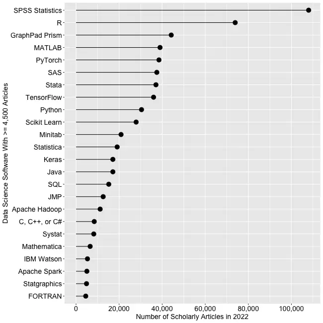
Figure 2a. The number of scholarly articles found on Google Scholar for data science software. Only those with more than 4,500 citations are shown.

SPSS is the most popular package, as it has been for over 20 years. This may be due to its balance between power and its graphical user interface’s (GUI) ease of use. R is in second place with around two-thirds as many articles. It offers extreme power, but as with all languages, it requires memorizing and typing code. GraphPad Prism, another GUI-driven package, is in third place. The packages from MATLAB through TensorFlow are roughly at the same level. Next comes Python and Scikit Learn. The latter is a library for Python, so there is likely much overlap between those two. Note that the general-purpose languages: C, C++, C#, FORTRAN, Java, MATLAB, and Python are included only when found in combination with data science terms, so view those counts as more of an approximation than the rest. Old stalwart FORTRAN appears last in this plot. While its count seems close to zero, that’s due to the wide range of this scale, and its count is just over the 4,500-article cutoff for this plot.

Continuing on this scale would make the remaining packages appear too close to the y-axis to read, so Figure 2b shows the remaining software on a much smaller scale, with the y-axis going to only 4,500 rather than the 110,000 used in Figure 2a. I chose that cutoff value because it allows us to see two related sets of tools on the same plot: workflow tools and GUIs for the R language that make it work much like SPSS.

Figure 2b. Number of scholarly articles using each data science software found using Google Scholar. Only those with fewer than 4,500 citations are shown.

JASP and jamovi are both front-ends to the R language and are way out front in this category. The next R GUI is R Commander, with half as many citations. Still, that’s far more than the rest of the R GUIs: BlueSky Statistics, Rattle, RKWard, R-Instat, and R AnalyticFlow. While many of these have low counts, we’ll soon see that the use of nearly all is rapidly growing.

Workflow tools are controlled by drawing 2-dimensional flowcharts that direct the flow of data and models through the analysis process. That approach is slightly more complex to learn than SPSS’ simple menus and dialog boxes, but it gets closer to the complete flexibility of code. In order of citation count, these include RapidMiner, KNIME, Orange Data Mining, IBM SPSS Modeler, SAS Enterprise Miner, Alteryx, and R AnalyticFlow. From RapidMiner to KNIME, to SPSS Modeler, the citation rate approximately cuts in half each time. Orange Data Mining comes next, at around 30% less. KNIME, Orange, and R Analytic Flow are all free and open-source.

While Figures 2a and 2b help study market share now, they don’t show how things are changing. It would be ideal to have long-term growth trend graphs for each software, but collecting that much data is too time-consuming. Instead, I’ve collected data only for the years 2019 and 2022. This provides the data needed to study growth over that period.

Figure 2c shows the percent change across those years, with the growing “hot” packages shown in red (right side) and the declining or “cooling” ones shown in blue (left side).
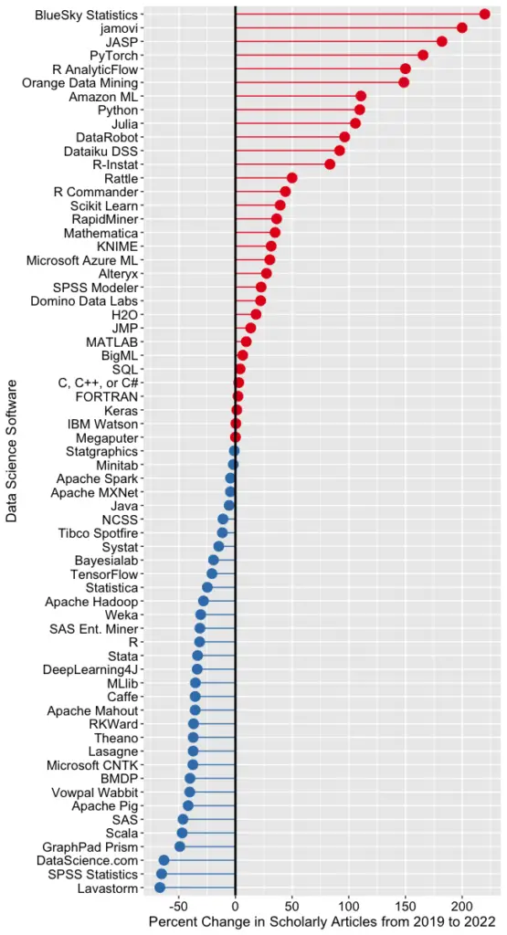
Figure 2c. Change in Google Scholar citation rate from 2019 to the most recent complete year, 2022. BlueSky (2,960%) and jamovi (452%) growth figures were shrunk to make the plot more legible.

Seven of the 14 fastest-growing packages are GUI front-ends that make R easy to use. BlueSky’s actual percent growth was 2,960%, which I recoded as 220% as the original value made the rest of the plot unreadable. In 2022 the company released a Mac version, and the Mayo Clinic announced its migration from JMP to BlueSky; both likely had an impact. Similarly, jamovi’s actual growth was 452%, which I recoded to 200. One of the reasons the R GUIs were able to obtain such high percentages of change is that they were all starting from low numbers compared to most of the other software. So be sure to look at the raw counts in Figure 2b to see the raw counts for all the R GUIs.

The most impressive point on this plot is the one for PyTorch. Back on 2a we see that PyTorch was the fifth most popular tool for data science. Here we see it’s also the third fastest growing. Being big and growing fast is quite an achievement!

Of the workflow-based tools, Orange Data Mining is growing the fastest. There is a good chance that the next time I collect this data Orange will surpass SPSS Modeler.

The big losers in Figure 2c are the expensive proprietary tools: SPSS, GraphPad Prism, SAS, BMDP, Stata, Statistica, and Systat. However, open-source R is also declining, perhaps a victim of Python’s rising popularity.

I’m particularly interested in the long-term trends of the classic statistics packages. So in Figure 2d, I have plotted the same scholarly-use data for 1995 through 2016.

Figure 2d. The number of Google Scholar citations for each classic statistics package per year from 1995 through 2016.

SPSS has a clear lead overall, but now you can see that its dominance peaked in 2009, and its use is in sharp decline. SAS never came close to SPSS’s level of dominance, and its usage peaked around 2010. GraphPad Prism followed a similar pattern, though it peaked a bit later, around 2013.

In Figure 2d, the extreme dominance of SPSS makes it hard to see long-term trends in the other software. To address this problem, I have removed SPSS and all the data from SAS except for 2014 and 2015. The result is shown in Figure 2e.

Figure 2e. The number of Google Scholar citations for each classic statistics package from 1995 through 2016, with SPSS removed and SAS included only in 2014 and 2015. The removal of SPSS and SAS expanded scale makes it easier to see the rapid growth of the less popular packages.

Figure 2e shows that most of the remaining packages grew steadily across the time period shown. R and Stata grew especially fast, as did Prism until 2012. The decline in the number of articles that used SPSS, SAS, or Prism is not balanced by the increase in the other software shown in this graph.

These results apply to scholarly articles in general. The results in specific fields or journals are likely to differ.

You can read the entire Popularity of Data Science Software here; the above discussion is just one section.
Data Science Software Popularity Update

I have recently updated my extensive analysis of the popularity of data science software. This update covers perhaps the most important section, the one that measures popularity based on the number of job advertisements. I repeat it here as a blog post, so you don’t have to read the entire article.

Job Advertisements

One of the best ways to measure the popularity or market share of software for data science is to count the number of job advertisements that highlight knowledge of each as a requirement. Job ads are rich in information and are backed by money, so they are perhaps the best measure of how popular each software is now. Plots of change in job demand give us a good idea of what will become more popular in the future.

Indeed.com is the biggest job site in the U.S., making its collection of job ads the best around. As their  co-founder and former CEO Paul Forster stated, Indeed.com includes “all the jobs from over 1,000 unique sources, comprising the major job boards – Monster, CareerBuilder, HotJobs, Craigslist – as well as hundreds of newspapers, associations, and company websites.” Indeed.com also has superb search capabilities.

Searching for jobs using Indeed.com is easy, but searching for software in a way that ensures fair comparisons across packages is challenging. Some software is used only for data science (e.g., scikit-learn, Apache Spark), while others are used in data science jobs and, more broadly, in report-writing jobs (e.g., SAS, Tableau). General-purpose languages (e.g., Python, C, Java) are heavily used in data science jobs, but the vast majority of jobs that require them have nothing to do with data science. To level the playing field, I developed a protocol to focus the search for each software within only jobs for data scientists. The details of this protocol are described in a separate article, How to Search for Data Science Jobs. All of the results in this section use those procedures to make the required queries.

I collected the job counts discussed in this section on October 5, 2022. To measure percent change, I compare that to data collected on May 27, 2019. One might think that a sample on a single day might not be very stable, but they are. Data collected in 2017 and 2014 using the same protocol correlated r=.94, p=.002. I occasionally double-check some counts a month or so later and always get similar figures.

The number of jobs covers a very wide range from zero to 164,996, with a mean of 11,653.9 and a median of 845.0. The distribution is so skewed that placing them all on the same graph makes reading values difficult. Therefore, I split the graph into three, each with a different scale. A single plot with a logarithmic scale would be an alternative, but when I asked some mathematically astute people how various packages compared on such a plot, they were so far off that I dropped that approach.

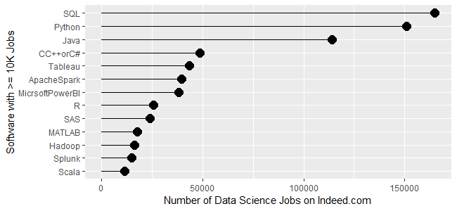
Figure 1a shows the most popular tools, those with at least 10,000 jobs. SQL is in the lead with 164,996 jobs, followed by Python with  150,992 and Java with 113,944. Next comes a set from C++/C# at 48,555, slowly declining to Microsoft’s Power BI at 38,125. Tableau, one of Power BI’s major competitors, is in that set. Next comes R and SAS, both around 24K jobs, with R slightly in the lead. Finally, we see a set slowly declining from MATLAB at 17,736 to Scala at 11,473.

Figure 1a. Number of data science jobs for the more popular software (>= 10,000 jobs).

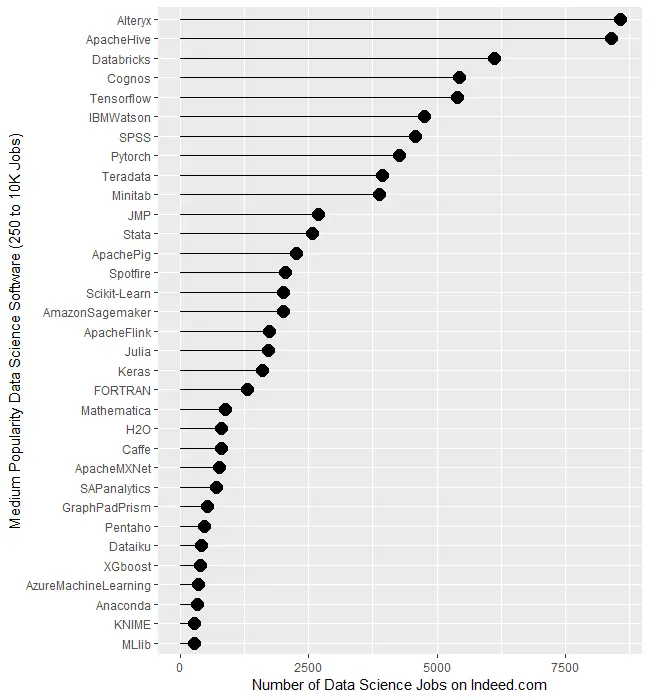
Figure 1b covers tools for which there are between 250 and 10,000 jobs. Alteryx and Apache Hive are at the top, both with around 8,400 jobs. There is quite a jump down to Databricks at 6,117 then much smaller drops from there to Minitab at 3,874. Then we see another big drop down to JMP at 2,693 after which things slowly decline until MLlib at 274.

Figure 1b. Number of jobs for less popular data science software tools, those with between 250 and 10,000 jobs.

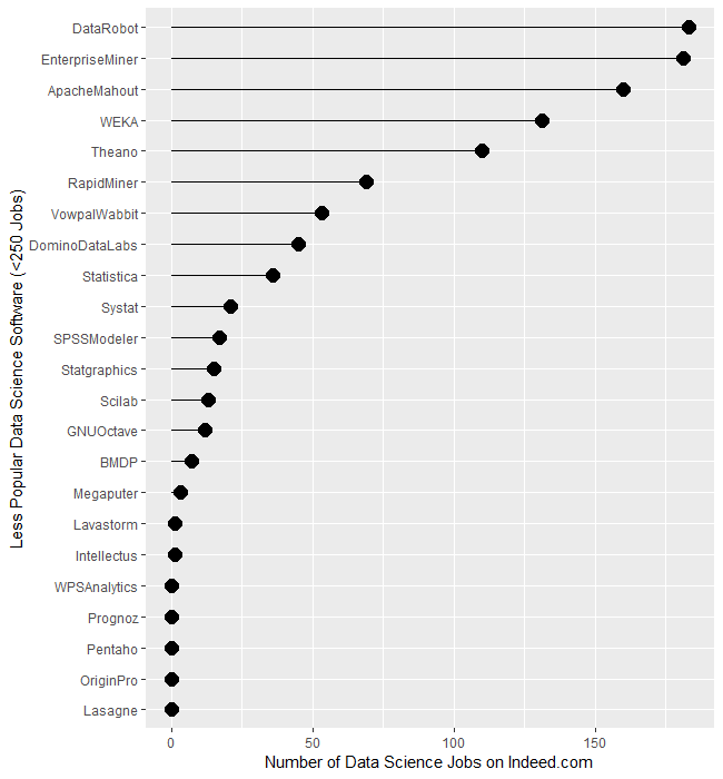
The least popular set of software, those with fewer than 250 jobs, are displayed in Figure 1c. It begins with DataRobot and SAS’ Enterprise Miner, both near 182. That’s followed by Apache Mahout with 160, WEKA with 131, and Theano at 110. From RapidMiner on down, there is a slow decline until we finally hit zero at WPS Analytics. The latter is a version of the SAS language, so advertisements are likely to always list SAS as the required skill.

Figure 1c. Number of jobs for software having fewer than 250 advertisements.

Several tools use the powerful yet easy workflow interface: Alteryx, KNIME, Enterprise Miner, RapidMiner, and SPSS Modeler. The scale of their counts is too broad to make a decent graph, so I have compiled those values in Table 1. There we see Alteryx is extremely dominant, with 30 times as many jobs as its closest competitor, KNIME. The latter is around 50% greater than Enterprise Miner, while RapidMiner and SPSS Modeler are tiny by comparison.

SoftwareJobs
Alteryx8,566
KNIME281
Enterprise Miner181
RapidMiner69
SPSS Modeler17
Table 1. Job counts for workflow tools.

Let’s take a similar look at packages whose traditional focus was on statistical analysis. They have all added machine learning and artificial intelligence methods, but their reputation still lies mainly in statistics. We saw previously that when we consider the entire range of data science jobs, R was slightly ahead of SAS. Table 2 shows jobs with only the term “statistician” in their description. There we see that SAS comes out on top, though with such a tiny margin over R that you might see the reverse depending on the day you gather new data. Both are over five times as popular as Stata or SPSS, and ten times as popular as JMP. Minitab seems to be the only remaining contender in this arena.

SoftwareJobs only for “Statistician”
SAS1040
R1012
Stata176
SPSS146
JMP93
Minitab55
Statistica2
BMDP3
Systat0
NCSS0
Table 2. Number of jobs for the search term “statistician” and each software.

Next, let’s look at the change in jobs from the 2019 data to now (October 2022), focusing on software that had at least 50 job listings back in 2019. Without such a limitation, software that increased from 1 job in 2019 to 5 jobs in 2022 would have a 500% increase but still would be of little interest. Percent change ranged from -64.0% to 2,479.9%, with a mean of 306.3 and a median of 213.6. There were two extreme outliers, IBM Watson, with apparent job growth of 2,479.9%, and Databricks, at 1,323%. Those two were so much greater than the rest that I left them off of Figure 1d to keep them from compressing the remaining values beyond legibility. The rapid growth of Databricks has been noted elsewhere. However, I would take IBM Watson’s figure with a grain of salt as its growth in revenue seems nowhere near what the Indeed.com’s job figure seems to indicate.

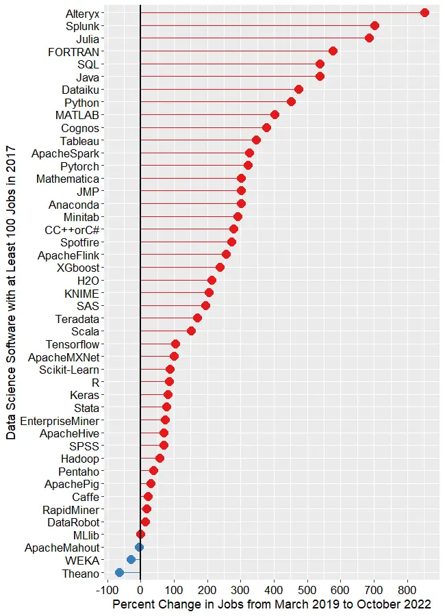
The remaining software is shown in Figure 1d, where those whose job market is “heating up” or growing are shown in red, while those that are cooling down are shown in blue. The main takeaway from this figure is that nearly the entire data science software market has grown over the last 3.5 years. At the top, we see Alteryx, with a growth of 850.7%. Splunk (702.6%) and Julia (686.2%) follow. To my surprise, FORTRAN follows, having gone from 195 jobs to 1,318, yielding growth of 575.9%! My supercomputing colleagues assure me that FORTRAN is still important in their area, but HPC is certainly not growing at that rate. If any readers have ideas on why this could occur, please leave your thoughts in the comments section below.

Figure 1d. Percent change in job listings from March 2019 to October 2022. Only software that had at least 50 jobs in 2019 is shown. IBM (2,480%) and Databricks (1,323%) are excluded to maintain the legibility of the remaining values.

SQL and Java are both growing at around 537%. From Dataiku on down, the rate of growth slows steadily until we reach MLlib, which saw almost no change. Only two packages declined in job advertisements, with WEKA at -29.9%, Theano at -64.1%.

This wraps up my analysis of software popularity based on jobs. You can read my ten other approaches to this task at https://r4stats.com/articles/popularity/. Many of those are based on older data, but I plan to update them in the first quarter of 2023, when much of the needed data will become available. To receive notice of such updates, subscribe to this blog, or follow me on Twitter: https://twitter.com/BobMuenchen.

Biomedical Data Science Textbook Available

By Bob Hoyt & Bob Muenchen

Data science is being used in many ways to improve healthcare and reduce costs. We have written a textbook, Introduction to Biomedical Data Science, to help healthcare professionals understand the topic and to work more effectively with data scientists. The textbook content and data exercises do not require programming skills or higher math. We introduce open source tools such as R and Python, as well as easy-to-use interfaces to them such as BlueSky Statistics, jamovi, R Commander, and Orange. Chapter exercises are based on healthcare data, and supplemental YouTube videos are available in most chapters.

For instructors, we provide PowerPoint slides for each chapter, exercises, quiz questions, and solutions. Instructors can download an electronic copy of the book, the Instructor Manual, and PowerPoints after first registering on the instructor page.

The book is available in print and various electronic formats. Because it is self-published, we plan to update it more rapidly than would be possible through traditional publishers.

Below you will find a detailed table of contents and a list of the textbook authors.

Table of Contents​

​OVERVIEW OF BIOMEDICAL DATA SCIENCE

  1. Introduction
  2. Background and history
  3. Conflicting perspectives
    1. the statistician’s perspective
    2. the machine learner’s perspective
    3. the database administrator’s perspective
    4. the data visualizer’s perspective
  4. Data analytical processes
    1. raw data
    2. data pre-processing
    3. exploratory data analysis (EDA)
    4. predictive modeling approaches
    5. types of models
    6. types of software
  5. Major types of analytics
    1. descriptive analytics
    2. diagnostic analytics
    3. predictive analytics (modeling)
    4. prescriptive analytics
    5. putting it all together
  6. Biomedical data science tools
  7. Biomedical data science education
  8. Biomedical data science careers
  9. Importance of soft skills in data science
  10. Biomedical data science resources
  11. Biomedical data science challenges
  12. Future trends
  13. Conclusion
  14. References

​​SPREADSHEET TOOLS AND TIPS

  1. Introduction
    1. basic spreadsheet functions
    1. download the sample spreadsheet
  2. Navigating the worksheet
  3. Clinical application of spreadsheets
    1. formulas and functions
    2. filter
    3. sorting data
    4. freezing panes
    5. conditional formatting
    6. pivot tables
    7. visualization
    8. data analysis
  4. Tips and tricks
    1. Microsoft Excel shortcuts – windows users
    2. Google sheets tips and tricks
  5. Conclusions
  6. Exercises
  7. References

​​BIOSTATISTICS PRIMER

  1. Introduction
  2. Measures of central tendency & dispersion
    1. the normal and log-normal distributions
  3. Descriptive and inferential statistics
  4. Categorical data analysis
  5. Diagnostic tests
  6. Bayes’ theorem
  7. Types of research studies
    1. observational studies
    2. interventional studies
    3. meta-analysis
    4. orrelation
  8. Linear regression
  9. Comparing two groups
    1. the independent-samples t-test
    2. the wilcoxon-mann-whitney test
  10. Comparing more than two groups
  11. Other types of tests
    1. generalized tests
    2. exact or permutation tests
    3. bootstrap or resampling tests
  12. Stats packages and online calculators
    1. commercial packages
    2. non-commercial or open source packages
    3. online calculators
  13. Challenges
  14. Future trends
  15. Conclusion
  16. Exercises
  17. References

​​DATA VISUALIZATION

  1. Introduction
    1. historical data visualizations
    2. visualization frameworks
  2. Visualization basics
  3. Data visualization software
    1. Microsoft Excel
    2. Google sheets
    3. Tableau
    4. R programming language
    5. other visualization programs
  4. Visualization options
    1. visualizing categorical data
    2. visualizing continuous data
  5. Dashboards
  6. Geographic maps
  7. Challenges
  8. Conclusion
  9. Exercises
  10. References

​​INTRODUCTION TO DATABASES

  1. Introduction
  2. Definitions
  3. A brief history of database models
    1. hierarchical model
    2. network model
    3. relational model
  4. Relational database structure
  5. Clinical data warehouses (CDWs)
  6. Structured query language (SQL)
  7. Learning SQL
  8. Conclusion
  9. Exercises
  10. References

BIG DATA

  1. Introduction
  2. The seven v’s of big data related to health care data
  3. Technical background
  4. Application
  5. Challenges
    1. technical
    2. organizational
    3. legal
    4. translational
  6. Future trends
  7. Conclusion
  8. References

​​BIOINFORMATICS and PRECISION MEDICINE

  1. Introduction
  2. History
  3. Definitions
  4. Biological data analysis – from data to discovery
  5. Biological data types
    1. genomics
    2. transcriptomics
    3. proteomics
    4. bioinformatics data in public repositories
    5. biomedical cancer data portals
  6. Tools for analyzing bioinformatics data
    1. command line tools
    2. web-based tools
  7. Genomic data analysis
  8. Genomic data analysis workflow
    1. variant calling pipeline for whole exome sequencing data
    2. quality check
    3. alignment
    4. variant calling
    5. variant filtering and annotation
    6. downstream analysis
    7. reporting and visualization
  9. Precision medicine – from big data to patient care
  10. Examples of precision medicine
  11. Challenges
  12. Future trends
  13. Useful resources
  14. Conclusion
  15. Exercises
  16. References

​​PROGRAMMING LANGUAGES FOR DATA ANALYSIS

  1. Introduction
  2. History
  3. R language
    1. installing R & rstudio
    2. an example R program
    3. getting help in R
    4. user interfaces for R
    5. R’s default user interface: rgui
    6. Rstudio
    7. menu & dialog guis
    8. some popular R guis
    9. R graphical user interface comparison
    10. R resources
  4. Python language
    1. installing Python
    2. an example Python program
    3. getting help in Python
    4. user interfaces for Python
  5. reproducibility
  6. R vs. Python
  7. Future trends
  8. Conclusion
  9. Exercises
  10. References

​​MACHINE LEARNING

  1. Brief history
  2. Introduction
    1. data refresher
    2. training vs test data
    3. bias and variance
    4. supervised and unsupervised learning
  3. Common machine learning algorithms
  4. Supervised learning
  5. Unsupervised learning
    1. dimensionality reduction
    2. reinforcement learning
    3. semi-supervised learning
  6. Evaluation of predictive analytical performance
    1. classification model evaluation
    2. regression model evaluation
  7. Machine learning software
    1. Weka
    2. Orange
    3. Rapidminer studio
    4. KNIME
    5. Google TensorFlow
    6. honorable mention
    7. summary
  8. Programming languages and machine learning
  9. Machine learning challenges
  10. Machine learning examples
    1. example 1 classification
    2. example 2 regression
    3. example 3 clustering
    4. example 4 association rules
  11. Conclusion
  12. Exercises
  13. References

​​ARTIFICIAL INTELLIGENCE

  1. Introduction
    1. definitions
  2. History
  3. Ai architectures
  4. Deep learning
  5. Image analysis (computer vision)
    1. Radiology
    2. Ophthalmology
    3. Dermatology
    4. Pathology
    5. Cardiology
    6. Neurology
    7. Wearable devices
    8. Image libraries and packages
  6. Natural language processing
    1. NLP libraries and packages
    2. Text mining and medicine
    3. Speech recognition
  7. Electronic health record data and AI
  8. Genomic analysis
  9. AI platforms
    1. deep learning platforms and programs
  10. Artificial intelligence challenges
    1. General
    2. Data issues
    3. Technical
    4. Socio economic and legal
    5. Regulatory
    6. Adverse unintended consequences
    7. Need for more ML and AI education
  11. Future trends
  12. Conclusion
  13. Exercises
  14. References

Authors

Brenda Griffith
Technical Writer
Data.World
Austin, TX

Robert Hoyt MD, FACP, ABPM-CI, FAMIA
Associate Clinical Professor
Department of Internal Medicine
Virginia Commonwealth University
Richmond, VA

David Hurwitz MD, FACP, ABPM-CI
Associate CMIO
Allscripts Healthcare Solutions
Chicago, IL

Madhurima Kaushal MS
Bioinformatics
Washington University at St. Louis, School of Medicine
St. Louis, MO

Robert Leviton MD, MPH, FACEP, ABPM-CI, FAMIA
Assistant Professor
New York Medical College
Department of Emergency Medicine
Valhalla, NY

Karen A. Monsen PhD, RN, FAMIA, FAAN
Professor
School of Nursing
University of Minnesota
Minneapolis, MN

Robert Muenchen MS, PSTAT
Manager, Research Computing Support
University of Tennessee
Knoxville, TN

Dallas Snider PhD
Chair, Department of Information Technology
University of West Florida
Pensacola, FL

​A special thanks to Ann Yoshihashi MD for her help with the publication of this textbook.

Data Science Jobs Report 2019: Python Way Up, Tensorflow Growing Rapidly, R Use Double SAS

In my ongoing quest to track The Popularity of Data Science Software, I’ve just updated my analysis of the job market. To save you from reading the entire tome, I’m reproducing that section here.

Job Advertisements

One of the best ways to measure the popularity or market share of software for data science is to count the number of job advertisements that highlight knowledge of each as a requirement. Job ads are rich in information and are backed by money, so they are perhaps the best measure of how popular each software is now. Plots of change in job demand give us a good idea of what is likely to become more popular in the future.

Indeed.com is the biggest job site in the U.S., making its collection of job ads the best around. As their  co-founder and former CEO Paul Forster stated, Indeed.com includes “all the jobs from over 1,000 unique sources, comprising the major job boards – Monster, CareerBuilder, HotJobs, Craigslist – as well as hundreds of newspapers, associations, and company websites.” Indeed.com also has superb search capabilities. It used to have a job trend plotter, but that tool has apparently been shut down.

Searching for jobs using Indeed.com is easy, but searching for software in a way that ensures fair comparisons across packages is challenging. Some software is used only for data science (e.g. SPSS, Apache Spark) while others are used in data science jobs and more broadly in report-writing jobs (e.g. SAS, Tableau). General-purpose languages (e.g. Python, C, Java) are heavily used in data science jobs, but the vast majority of jobs that use them have nothing to do with data science. To level the playing field, I developed a protocol to focus the search for each software within only jobs for data scientists. The details of this protocol are described in a separate article, How to Search for Data Science Jobs. All of the graphs in this section use those procedures to make the required queries.

I collected the job counts discussed in this section on May 27, 2019 and February 24, 2017. One might think that a sample of on a single day might not be very stable, but the large number of job sources makes the counts in Indeed.com’s collection of jobs quite consistent. Data collected in 2017 and 2014 using the same protocol correlated r=.94, p=.002.

Figure 1a shows that Python is in the lead with 27,374 jobs, followed by SQL with  25,877. Java and Amazon’s Machine Learning (ML) tools are roughly 25% further below, with jobs in the 17,000s. R and the C variants come next with around 13,000. People frequently compare R and Python, but when it comes to getting a data science job, there are only half as many for R as for Python. That doesn’t mean they’re the same sort of job, of course. I still see more statisticians using R and machine learning people preferring Python, but Python is definitely on a roll! From Hadoop on down, there is a slow decline in jobs. R is also frequently compared to SAS, which has only 8,123 compared to R’s 13,800.

The scale of Figure 1a is so wide that the bottom package, H20 appears to be zero, when in fact there are 257 jobs for it. 

Figure 1a. Number of data science jobs for the more popular software.

To let us compare the less popular software, I plotted them separately in Figure 1b. Mathematica and Julia are the leaders of this set, with around 219 jobs each. The ancient FORTRAN language is still hanging on to life with 195 jobs. The open source WEKA software and IBM’s Watson are next, with around 185 each. From XGBOOST on down, there is a fairly steady slow decline.

There are several tools that use a workflow interface: Enterprise Miner, KNIME, RapidMiner, and SPSS Modeler. They’re all around the same area between 50 and 100 jobs. In many of the other measures of popularity, RapidMiner beats the very similar KNIME tool, but here there are 50% more jobs for the latter. Alteryx is also a workflow-based tool, however, it has pulled away from the pack, appearing back on Figure 1a with 901 jobs.

Figure 1b. Number of jobs for less popular data science software tools, those with fewer than 250 advertisements.

When interpreting the scale on Figure 1b, what looks like zero is indeed zero. From Systat on down, none of the packages have more than 10 job listings.

It’s important to note that the values shown in Figures 1a and 1b are single points in time. The number of jobs for the more popular software do not change much from day to day. Therefore, the relative rankings of the software shown in Figure 1a is unlikely to change much over the coming year or two. The less popular packages shown in Figure 1b have such low job counts that their ranking is more likely to shift from month to month, though their position relative to the major packages should remain more stable.

Next, let’s look at the change in jobs from the 2017 data to now (2019). Figure 1c shows the percent change for those packages that had at least 100 job listings back in 2017. Without such a limitation, software that goes from 1 job in 2017 to 5 jobs in 2019 would have a 500% increase, but still would be of little interest. Software whose job market is heating up, or growing, is shown in red, while those that are cooling down are shown in blue.

Figure 1c. Percent change in job listings from 2017 to 2019. Only software that had at least 100 jobs in 2017 is shown.

Tensorflow, the deep learning software from Google, is the fastest growing at 523%. Next is Apache Flink, a tool that analyzes streaming data, at 289%. H2O is next, with 150% growth. Caffe is another deep learning framework and its 123% growth reflects the popularity of artificial intelligence algorithms.

Python shows “only” 97% growth, but its popularity was already so high that the 13,471 jobs that it added surpasses the total jobs of many of the other packages!

Tableau is showing a similar rate of growth, though it was a comparably small number of additional jobs, at 4,784.

From the Julia language on down, we see a slowing decrease in growth. I’m surprised to see that jobs for SAS and SPSS are still growing, though barely at 6% and 1%, respectively. 

If you enjoyed reading this article, you might be interested in my recent series of reviews on point-and-click front-ends for the R language. I invite you to subscribe to this blog, or follow me on Twitter.

Data Science Software Used in Journals: Stat Packages Declining (including R), AI/ML Software Growing

In my neverending quest to track The Popularity of Data Science Software, it’s time to update the section on Scholarly Articles. The rapid growth of R could not go on forever and, as you’ll see below, its use actually declined over the last year.

Scholarly Articles

Scholarly articles provide a rich source of information about data science tools. Because publishing requires significant amounts of effort, analyzing the type of data science tools used in scholarly articles provides a better picture of their popularity than a simple survey of tool usage. The more popular a software package is, the more likely it will appear in scholarly publications as an analysis tool, or even as an object of study.

Since scholarly articles tend to use cutting-edge methods, the software used in them can be a leading indicator of where the overall market of data science software is headed. Google Scholar offers a way to measure such activity. However, no search of this magnitude is perfect; each will include some irrelevant articles and reject some relevant ones. The details of the search terms I used are complex enough to move to a companion article, How to Search For Data Science Articles.  Since Google regularly improves its search algorithm, each year I collect data again for the previous years (with one exception noted below).

Figure 2a shows the number of articles found for the more popular software packages and languages (those with at least 1,700 articles) in the most recent complete year, 2018. To allow ample time for publication, insertion into online databases, and indexing, the was data collected on 3/28/2019.

Figure 2a. The number of scholarly articles found on Google Scholar, for data science software. Only those with more than 1,700 citations are shown.

SPSS is by far the most dominant package, as it has been for over 20 years. This may be due to its balance between power and ease-of-use. R is in second place with around half as many articles. It offers extreme power, though with less ease of use. SAS is in third place, with a slight lead over Stata, MATLAB, and GraphPad Prism, which are nearly tied.

Note that the general-purpose languages: C, C++, C#, FORTRAN, Java, MATLAB, and Python are included only when found in combination with data science terms, so view those counts as more of an approximation than the rest.

The next group of packages goes from Python through C, with usage declining slowly. The next set starts at Caffe, dropping nearly 50%, and continuing to IBM Watson with a slow decline.

The last two packages in Fig 2a are Weka and Theano, which are quite a drop from IBM Watson, though it’s getting harder to see as the lines shrink.

To continue on this scale would make the remaining packages all appear too close to the y-axis to read, so Figure 2b shows the remaining software on a much smaller scale, with the y-axis going to only 1,700 rather than the 80,000 used on Figure 2a.

Figure 2b. Number of scholarly articles using each data science software found using Google Scholar. Only those with fewer than 1,700 citations are shown.

I chose to begin Figure 2b with software that has fewer than 1,700 articles because it allows us to see RapidMiner and KNIME on the same scale. They are both workflow-driven tools with very similar capabilities. This plot shows RapidMiner with 49% greater usage than KNIME. RapidMiner uses more marketing, while KNIME depends more on word-of-mouth recommendations and a more open source model. The IT advisory firms Gartner and Forrester rate them as tools able to hold their own against the commercial titans, IBM’s SPSS and SAS. Given that SPSS has roughly 50 times the usage in academia, that seems like quite a stretch. However, as we will soon see, usage of these newer packages are growing, while the use of the older ones is shrinking quite rapidly.

Figure 2b also lets us see IBM’s SPSS Modeler, SAS Enterprise Miner, and Alteryx on the same plot. These three are also workflow-driven tools which are quite expensive. None are doing as well here as RapidMiner or KNIME, tools that much less expensive – or free – depending on how you use them (KNIME desktop is free but server is not; RapidMiner is free for analyzing fewer than 10,000 cases).

Another interesting comparison on Figure 2b is JASP and jamovi. Both are open-source tools that focus on statistics rather than machine learning or artificial intelligence. They both use graphical user interfaces (GUIs) in a style that is similar to SPSS. Both also use R behind the scenes to do their calculations. JASP emphasizes Bayesian Analysis and hides its R code; jamovi has a more frequentist orientation, it lets you see its R code, and it lets you execute your own R code directly from within it. JASP currently has nine times as many citations here, though jamovi’s use is growing much more rapidly.

Even newer on the GUI for R scene is BlueSky Statistics, which doesn’t appear on the plot at all since it has zero scholarly articles so far. It was created by a new company and only adopted an open source model a few months ago.

While Figures 2a and 2b are useful for studying market share as it stands now, they don’t show how things are changing. It would be ideal to have long-term growth trend graphs for each of the analytics packages, but collecting that much data annually is too time-consuming. What I’ve done instead is collect data only for the past two complete years, 2017 and 2018. This provides the data needed to study year-over-year changes.

Figure 2c shows the percent change across those years, with the growing “hot” packages shown in red (right side); the declining or “cooling” are shown in blue (left side). Since the number of articles tends to be in the thousands or tens of thousands, I have removed any software that had fewer than 1,000 articles in 2015. A package that grows from 1 article to 5 may demonstrate 500% growth but is still of little interest.

Figure 2c. Change in Google Scholar citation rate in the most recent complete two years, 2017 and 2018.

The recent changes in data science software can be summarized succinctly: AI/ML up; statistics down. The software that is growing contains none of the packages that are associated more with statistical analysis. The software in decline is dominated by the classic packages of statistics: SPSS Statistics, SAS, GraphPad Prism, Stata, Statgraphics, R, Statistica, Systat, and Minitab. JMP is the only traditional statistics package whose scholarly usage is growing. Of the machine learning software that’s declining in usage, there are rough equivalents that are growing (e.g. Mahout down, Spark up).

Of course another summary is: cheap (or free) up; expensive down. Of the growing packages, 13 out of 17 are available in open source. Of those in decline, only 5 out of 13 are open source.

Statistics software has been around much longer than AI/ML software, started back in the days before open source. Stat vendors have been adding AI/ML methods to their software, making them the more comprehensive solutions. The AI/ML vendors or projects are missing an opportunity to add more comprehensive statistics capabilities. Some, such as RapidMiner and KNIME, are indeed expanding in this direction, but very slowly indeed.

At the top of Figure 2c, we see that the deep learning packages Keras and TensorFlow are the fastest growing at nearly 150%. PyTorch is not shown here because it did not have enough usage in the previous year. However, its citation rate went from 616 to 4,670, a substantial 658% growth rate! There are other packages that are not shown here, including JASP with 223% growth, and jamovi with 720% growth. Despite such high growth, the latter still only has 108 citations in 2018. The rapid growth of JASP and jamovi lend credence to the perspective that the overall pattern of change shown in Figure 2c may be more of a result of free vs. expensive software. Neither of them offers any AI/ML features.

Scikit Learn, the Python machine learning library, was a fast grower with a 60% increase.

I was surprised to see IBM Watson growing a healthy 34% as much of the news about it has not been good. It’s awesome at Jeopardy though!

In the RapidMiner vs. KNIME contest, we saw previously that RapidMiner was ahead. From this plot, we that KNIME growing slightly (5.7%) while RapidMiner is declining slightly (1.8%).

The biggest losers in Figure 2c are SPSS, down 39%, and SAS, Prism, and Mahout, all down 24%. Even R is down 13%. Recall that Figure 2a shows that despite recent years of decline, SPSS is still extremely dominant for scholarly use, and R and SAS are still the #2 and #3 most widely used packages in this arena.

I’m particularly interested in the long-term trends of the classic statistics packages. So in Figure 2d I have plotted the same scholarly-use data for 1995 through 2016.

Figure 2d. The number of Google Scholar citations for each classic statistics package per year from 1995 through 2016.

SPSS has a clear lead overall, but now you can see that its dominance peaked in 2009 and its use is in sharp decline. SAS never came close to SPSS’ level of dominance, and its use peaked around 2010. GraphPAD Prism followed a similar pattern, though it peaked a bit later, around 2013.

In Figure 2d, the extreme dominance of SPSS makes it hard to see long-term trends in the other software. To address this problem, I have removed SPSS and all the data from SAS except for 2014 and 1015. The result is shown in Figure 2e.

Figure 2e. The number of Google Scholar citations for each classic statistics package from 1995 through 2016, this time with SPSS removed and SAS included only in 2014 and 2015. The removal of SPSS and SAS expanded scale makes it easier to see the rapid growth of the less popular packages.

Figure 2e makes it easy to see that most of the remaining packages grew steadily across the time period shown. R and Stata grew especially fast, as did Prism until 2012. Note that the decline in the number of articles that used SPSS, SAS, or Prism is not balanced by the increase in the other software shown in this particular graph. Even adding up all the other software shown in Figures 2a and 2b doesn’t account for the overall decline. However, I’m looking at only 58 out of over 100 data science tools.

While Figures 2d and 2e show the historical trend that ended in 2016, Figure 2f shows a fresh set of data collected in March, 2019. Since Google’s algorithm changes, preventing the new data from matching exactly with the old, this new data starts at 2015 so the two sets overlap. SPSS is not shown on this graph because its dominance would compress the y-axis, making trends in the others harder to see. However, keep in mind that despite SPSS’ 39% drop from 2017 to 2018, its use is still 66% higher than R’s in 2018! Apparently people are willing to pay for ease of use.


Figure 2f. The number of Google Scholar citations for each classic statistics package per year from 2015 through 2018.

In Figure 2f we can see that the downward trends of SAS, Prism, and Statistica are continuing. We also see that the long and rapid growth of R and Stata has come to an end. Growth that rapid can’t go on forever. It will be interesting to see next year to see if this is merely a flattening of usage or the beginning of a declining trend. As I pointed out in my book, R for Stata Users, there are many commonalities between R and Stata. As a result of this, and the fact that R is open source, I expect R use to stabilize at this level while use of Stata continues to slowly decline.

SPSS’ long-term rapid decline has to level out at some point. They have been chipped away at by many competitors. However, until recently these competitors have either been free and code-based such as R, or menu-based and proprietary, such as Prism. With the fairly recent arrival of JASP, jamovi, and BlueSky Statistics, SPSS now faces software that is both free and menu-based. Previous projects to add menus to R, such as the R Commander and Deducer, were also free and open source, but they required installing R separately and then using R code to activate the menus.

These results apply to scholarly articles in general. The results in specific fields or journals are very likely to be different.

To see many other ways to estimate the market share of this type of software, see my ongoing article, The Popularity of Data Science Software. My next post will update the job advertisements that list science software. You may also be interested in my in-depth reviews of point-and-click user interfaces to R. I invite you to subscribe to my blog or follow me on twitter where I announce new posts. Happy computing!

Gartner’s 2019 Take on Data Science Software

I’ve just updated The Popularity of Data Science Software to reflect my take on Gartner’s 2019 report, Magic Quadrant for Data Science and Machine Learning Platforms. To save you the trouble of digging through all 40+ pages of my report, here’s just the updated section:

IT Research Firms

IT research firms study software products and corporate strategies. They survey customers regarding their satisfaction with the products and services and provide their analysis in reports that they sell to their clients. Each research firm has its own criteria for rating companies, so they don’t always agree. However, I find the detailed analysis that these reports contain extremely interesting reading. The reports exclude open source software that has no specific company backing, such as R, Python, or jamovi. Even open source projects that do have company backing, such as BlueSky Statistics, are excluded if they have yet to achieve sufficient market adoption. However, they do cover how company products integrate open source software into their proprietary ones.

While these reports are expensive, the companies that receive good ratings usually purchase copies to give away to potential customers. An Internet search of the report title will often reveal companies that are distributing them. On the date of this post, Datarobot is offering free copies.

Gartner, Inc. is one of the research firms that write such reports.  Out of the roughly 100 companies selling data science software, Gartner selected 17 which offered “cohesive software.” That software performs a wide range of tasks including data importation, preparation, exploration, visualization, modeling, and deployment.

Gartner analysts rated the companies on their “completeness of vision” and their “ability to execute” that vision. Figure 3a shows the resulting “Magic Quadrant” plot for 2019, and 3b shows the plot for the previous year. Here I provide some commentary on their choices, briefly summarize their take, and compare this year’s report to last year’s. The main reports from both years contain far more detail than I cover here.

Gartner-2019

Figure 3a. Gartner Magic Quadrant for Data Science and Machine Learning Platforms from their 2019 report (plot done in November 2018, report released in 2019).

The Leaders quadrant is the place for companies whose vision is aligned with their customer’s needs and who have the resources to execute that vision. The further toward the upper-right corner of the plot, the better the combined score.

  • RapidMiner and KNIME reside in the best part of the Leaders quadrant this year and last. This year RapidMiner has the edge in ability to execute, while KNIME offers more vision. Both offer free and open source versions, but the companies differ quite a lot on how committed they are to the open source concept. KNIME’s desktop version is free and open source and the company says it will always be so. On the other hand, RapidMiner is limited by a cap on the amount of data that it can analyze (10,000 cases) and as they add new features, they usually come only via a commercial license with “difficult-to-navigate pricing conditions.” These two offer very similar workflow-style user interfaces and have the ability to integrate many open sources tools into their workflows, including R, Python, Spark, and H2O.
  • Tibco moved from the Challengers quadrant last year to the Leaders this year. This is due to a number of factors, including the successful integration of all the tools they’ve purchased over the years, including Jaspersoft, Spotfire, Alpine Data, Streambase Systems, and Statistica.
  • SAS declined from being solidly in the Leaders quadrant last year to barely being in it this year. This is due to a substantial decline in its ability to execute. Given SAS Institute’s billions in revenue, that certainly can’t be a financial limitation. It may be due to SAS’ more limited ability to integrate as wide a range of tools as other vendors have. The SAS language itself continues to be an important research tool among those doing complex mixed-effects linear models. Those models are among the very few that R often fails to solve.

The companies in the Visionaries Quadrant are those that have good future plans but which may not have the resources to execute that vision.

  • Mathworks moved forward substantially in this quadrant due to MATLAB’s ability to handle unconventional data sources such as images, video, and the Internet of Things (IoT). It has also opened up more to open source deep learning projects.
  • H2O.ai is also in the Visionaries quadrant. This is the company behind the open source  H2O software, which is callable from many other packages or languages including R, Python, KNIME, and RapidMiner. While its own menu-based interface is primitive, its integration into KNIME and RapidMiner makes it easy to use for non-coders. H2O’s strength is in modeling but it is lacking in data access and preparation, as well as model management.
  • IBM dropped from the top of the Visionaries quadrant last year to the middle. The company has yet to fully integrate SPSS Statistics and SPSS Modeler into its Watson Studio. IBM has also had trouble getting Watson to deliver on its promises.
  • Databricks improved both its vision and its ability to execute, but not enough to move out of the Visionaries quadrant. It has done well with its integration of open-source tools into its Apache Spark-based system. However, it scored poorly in the predictability of costs.
  • Datarobot is new to the Gartner report this year. As its name indicates, its strength is in the automation of machine learning, which broadens its potential user base. The company’s policy of assigning a data scientist to each new client gets them up and running quickly.
  • Google’s position could be clarified by adding more dimensions to the plot. Its complex collection of a dozen products that work together is clearly aimed at software developers rather than data scientists or casual users. Simply figuring out what they all do and how they work together is a non-trivial task. In addition, the complete set runs only on Google’s cloud platform. Performance on big data is its forte, especially problems involving image or speech analysis/translation.
  • Microsoft offers several products, but only its cloud-only Azure Machine Learning (AML) was comprehensive enough to meet Gartner’s inclusion criteria. Gartner gives it high marks for ease-of-use, scalability, and strong partnerships. However, it is weak in automated modeling and AML’s relation to various other Microsoft components is overwhelming (same problem as Google’s toolset).

Figure 3b. Last year’s Gartner Magic Quadrant for Data Science and Machine Learning Platforms (January, 2018)

Those in the Challenger’s Quadrant have ample resources but less customer confidence in their future plans, or vision.

  • Alteryx dropped slightly in vision from last year, just enough to drop it out of the Leaders quadrant. Its workflow-based user interface is very similar to that of KNIME and RapidMiner, and it too gets top marks in ease-of-use. It also offers very strong data management capabilities, especially those that involve geographic data, spatial modeling, and mapping. It comes with geo-coded datasets, saving its customers from having to buy it elsewhere and figuring out how to import it. However, it has fallen behind in cutting edge modeling methods such as deep learning, auto-modeling, and the Internet of Things.
  • Dataiku strengthed its ability to execute significantly from last year. It added better scalability to its ease-of-use and teamwork collaboration. However, it is also perceived as expensive with a “cumbersome pricing structure.”

Members of the Niche Players quadrant offer tools that are not as broadly applicable. These include Anaconda, Datawatch (includes the former Angoss), Domino, and SAP.

  • Anaconda provides a useful distribution of Python and various data science libraries. They provide support and model management tools. The vast army of Python developers is its strength, but lack of stability in such a rapidly improving world can be frustrating to production-oriented organizations. This is a tool exclusively for experts in both programming and data science.
  • Datawatch offers the tools it acquired recently by purchasing Angoss, and its set of “Knowledge” tools continues to get high marks on ease-of-use and customer support. However, it’s weak in advanced methods and has yet to integrate the data management tools that Datawatch had before buying Angoss.
  • Domino Data Labs offers tools aimed only at expert programmers and data scientists. It gets high marks for openness and ability to integrate open source and proprietary tools, but low marks for data access and prep, integrating models into day-to-day operations, and customer support.
  • SAP’s machine learning tools integrate into its main SAP Enterprise Resource Planning system, but its fragmented toolset is weak, and its customer satisfaction ratings are low.

To see many other ways to rate this type of software, see my ongoing article, The Popularity of Data Science Software. You may also be interested in my in-depth reviews of point-and-click user interfaces to R. I invite you to subscribe to my blog or follow me on twitter where I announce new posts. Happy computing!

Gartner’s 2018 Take on Data Science Tools

I’ve just updated The Popularity of Data Science Software to reflect my take on Gartner’s 2018 report, Magic Quadrant for Data Science and Machine Learning Platforms. To save you the trouble of digging though all 40+ pages of my report, here’s just the new section:

IT Research Firms

IT research firms study software products and corporate strategies, they survey customers regarding their satisfaction with the products and services, and then provide their analysis on each in reports they sell to their clients. Each research firm has its own criteria for rating companies, so they don’t always agree. However, I find the detailed analysis that these reports contain extremely interesting reading. While these reports focus on companies, they often also describe how their commercial tools integrate open source tools such as R, Python, H2O, TensoFlow, and others.

While these reports are expensive, the companies that receive good ratings usually purchase copies to give away to potential customers. An Internet search of the report title will often reveal the companies that are distributing such free copies.

Gartner, Inc. is one of the companies that provides such reports.  Out of the roughly 100 companies selling data science software, Gartner selected 16 which had either high revenue, or lower revenue combined with high growth (see full report for details). After extensive input from both customers and company representatives, Gartner analysts rated the companies on their “completeness of vision” and their “ability to execute” that vision. Hereafter, I refer to these as simply vision and ability. Figure 3a shows the resulting “Magic Quadrant” plot for 2018, and 3b shows the plot for the previous year.

The Leader’s Quadrant is the place for companies who have a future direction in line with their customer’s needs and the resources to execute that vision. The further to the upper-right corner, the better the combined score. KNIME is in the prime position, with H2O.ai showing greater vision but lower ability to execute. This year KNIME gained the ability to run H2O.ai algorithms, so these two may be viewed as complementary tools rather than outright competitors.

Alteryx and SAS have nearly the same combined scores, but note that Gartner studied only SAS Enterprise Miner and SAS Visual Analytics. The latter includes Visual Statistics, and Visual Data Mining and Machine Learning. Excluded was the SAS System itself since Gartner focuses on tools that are integrated. This lack of integration may explain SAS’ decline in vision from last year.

KNIME and RapidMiner are quite similar tools as they are both driven by an easy to use and reproducible workflow interface. Both offer free and open source versions, but the companies differ quite a lot on how committed they are to the open source concept. KNIME’s desktop version is free and open source and the company says it will always be so. On the other hand, RapidMiner is limited by a cap on the amount of data that it can analyze (10,000 cases) and as they add new features, they usually come only via a commercial license. In the previous year’s Magic Quadrant, RapidMiner was slightly ahead, but now KNIME is in the lead.

Figure 3a. Gartner Magic Quadrant for Data Science and Machine Learning Platforms

Figure 3b. Gartner Magic Quadrant for Data Science Platforms 2017.

The companies in the Visionaries Quadrant are those that have a good future plans but which may not have the resources to execute that vision. Of these, IBM took a big hit by landing here after being in the Leader’s Quadrant for several years. Now they’re in a near-tie with Microsoft and Domino. Domino shot up from the bottom of that quadrant to towards the top. They integrate many different open source and commercial software (e.g. SAS, MATLAB) into their Domino Data Science Platform. Databricks and Dataiku offer cloud-based analytics similar to Domino, though lacking in access to commercial tools.

Those in the Challenger’s Quadrant have ample resources but less customer confidence on their future plans, or vision. Mathworks, the makers of MATLAB, continues to “stay the course” with its proprietary tools while most of the competition offers much better integration into the ever-expanding universe of open source tools.  Tibco replaces Quest in this quadrant due to their purchase of Statistica. Whatever will become of the red-headed stepchild of data science? Statistica has been owned by four companies in four years! (Statsoft, Dell, Quest, Tibco) Users of the software have got to be considering other options. Tibco also purchased Alpine Data in 2017, accounting for its disappearance from Figure 3b to 3a.

Members of the Niche Players quadrant offer tools that are not as broadly applicable. Anaconda is new to Gartner coverage this year. It offers in-depth support for Python. SAP has a toolchain that Gartner calls “fragmented and ambiguous.”  Angoss was recently purchased by Datawatch. Gartner points out that after 20 years in business, Angoss has only 300 loyal customers. With competition fierce in the data science arena, one can’t help but wonder how long they’ll be around. Speaking of deathwatches, once the king of Big Data, Teradata has been hammered by competition from open source tools such as Hadoop and Spark. Teradata’s net income was higher in 2008 than it is today.

As of 2/26/2018, RapidMiner is giving away copies of the Gartner report here.

Data Science Tool Market Share Leading Indicator: Scholarly Articles

Below is the latest update to The Popularity of Data Science Software. It contains an analysis of the tools used in the most recent complete year of scholarly articles. The section is also integrated into the main paper itself.

New software covered includes: Amazon Machine Learning, Apache Mahout, Apache MXNet, Caffe, Dataiku, DataRobot, Domino Data Labs, GraphPad Prism, IBM Watson, Pentaho, and Google’s TensorFlow.

Software dropped includes: Infocentricity (acquired by FICO), SAP KXEN (tiny usage), Tableau, and Tibco. The latter two didn’t fit in with the others due to their limited selection of advanced analytic methods.

Scholarly Articles

Scholarly articles provide a rich source of information about data science tools. Their creation requires significant amounts of effort, much more than is required to respond to a survey of tool usage. The more popular a software package is, the more likely it will appear in scholarly publications as an analysis tool, or even an object of study.

Since graduate students do the great majority of analysis in such articles, the software used can be a leading indicator of where things are headed. Google Scholar offers a way to measure such activity. However, no search of this magnitude is perfect; each will include some irrelevant articles and reject some relevant ones. Searching through concise job requirements (see previous section) is easier than searching through scholarly articles; however only software that has advanced analytical capabilities can be studied using this approach. The details of the search terms I used are complex enough to move to a companion article, How to Search For Data Science Articles.  Since Google regularly improves its search algorithm, each year I re-collect the data for the previous years.

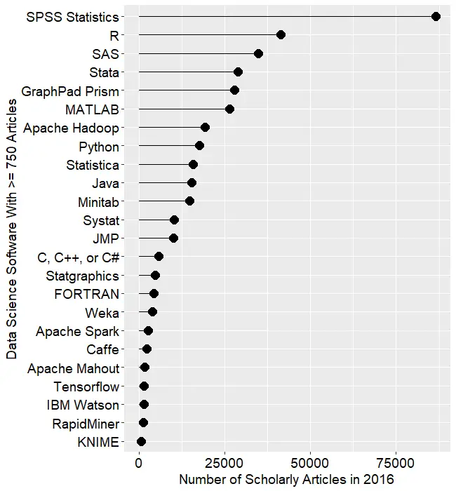
Figure 2a shows the number of articles found for the more popular software packages (those with at least 750 articles) in the most recent complete year, 2016. To allow ample time for publication, insertion into online databases, and indexing, the was data collected on 6/8/2017.

SPSS is by far the most dominant package, as it has been for over 15 years. This may be due to its balance between power and ease-of-use. R is in second place with around half as many articles. SAS is in third place, still maintaining a substantial lead over Stata, MATLAB, and GraphPad Prism, which are nearly tied. This is the first year that I’ve tracked Prism, a package that emphasizes graphics but also includes statistical analysis capabilities. It is particularly popular in the medical research community where it is appreciated for its ease of use. However, it offers far fewer analytic methods than the other software at this level of popularity.

Note that the general-purpose languages: C, C++, C#, FORTRAN, MATLAB, Java, and Python are included only when found in combination with data science terms, so view those counts as more of an approximation than the rest.

Figure 2a. Number of scholarly articles found in the most recent complete year (2016) for the more popular data science software. To be included, software must be used in at least 750 scholarly articles.

The next group of packages goes from Apache Hadoop through Python, Statistica, Java, and Minitab, slowly declining as they go.

Both Systat and JMP are packages that have been on the market for many years, but which have never made it into the “big leagues.”

From C through KNIME, the counts appear to be near zero, but keep in mind that each are used in at least 750 journal articles. However, compared to the 86,500 that used SPSS, they’re a drop in the bucket.

Toward the bottom of Fig. 2a are two similar packages, the open source Caffe and Google’s Tensorflow. These two focus on “deep learning” algorithms, an area that is fairly new (at least the term is) and growing rapidly.

The last two packages in Fig 2a are RapidMiner and KNIME. It has been quite interesting to watch the competition between them unfold for the past several years. They are both workflow-driven tools with very similar capabilities. The IT advisory firms Gartner and Forester rate them as tools able to hold their own against the commercial titans, SPSS and SAS. Given that SPSS has roughly 75 times the usage in academia, that seems like quite a stretch. However, as we will soon see, usage of these newcomers are growing, while use of the older packages is shrinking quite rapidly. This plot shows RapidMiner with nearly twice the usage of KNIME, despite the fact that KNIME has a much more open source model.

Figure 2b shows the results for software used in fewer than 750 articles in 2016. This change in scale allows room for the “bars” to spread out, letting us make comparisons more effectively. This plot contains some fairly new software whose use is low but growing rapidly, such as Alteryx, Azure Machine Learning, H2O, Apache MXNet, Amazon Machine Learning, Scala, and Julia. It also contains some software that is either has either declined from one-time greatness, such as BMDP, or which is stagnating at the bottom, such as Lavastorm, Megaputer, NCSS, SAS Enterprise Miner, and SPSS Modeler.

Figure 2b. The number of scholarly articles for the less popular data science (those used by fewer than 750 scholarly articles in 2016.

While Figures 2a and 2b are useful for studying market share as it stands now, they don’t show how things are changing. It would be ideal to have long-term growth trend graphs for each of the analytics packages, but collecting that much data annually is too time consuming. What I’ve done instead is collect data only for the past two complete years, 2015 and 2016. This provides the data needed to study year-over-year changes.

Figure 2c shows the percent change across those years, with the “hot” packages whose use is growing shown in red (right side); those whose use is declining or “cooling” are shown in blue (left side). Since the number of articles tends to be in the thousands or tens of thousands, I have removed any software that had fewer than 500 articles in 2015. A package that grows from 1 article to 5 may demonstrate 500% growth, but is still of little interest.


Figure 2c. Change in the number of scholarly articles using each software in the most recent two complete years (2015 to 2016). Packages shown in red are “hot” and growing, while those shown in blue are “cooling down” or declining.

Caffe is the data science tool with the fastest growth, at just over 150%. This reflects the rapid growth in the use of deep learning models in the past few years. The similar products Apache MXNet and H2O also grew rapidly, but they were starting from a mere 12 and 31 articles respectively, and so are not shown.

IBM Watson grew 91%, which came as a surprise to me as I’m not quite sure what it does or how it does it, despite having read several of IBM’s descriptions about it. It’s awesome at Jeopardy though!

While R’s growth was a “mere” 14.7%, it was already so widely used that the percent translates into a very substantial count of 5,300 additional articles.

In the RapidMiner vs. KNIME contest, we saw previously that RapidMiner was ahead. From this plot we also see that it’s continuing to pull away from KNIME with quicker growth.

From Minitab on down, the software is losing market share, at least in academia. The variants of C and Java are probably losing out a bit to competition from several different types of software at once.

In just the past few years, Statistica was sold by Statsoft to Dell, then Quest Software, then Francisco Partners, then Tibco! Did its declining usage drive those sales? Did the game of musical chairs scare off potential users? If you’ve got an opinion, please comment below or send me an email.

The biggest losers are SPSS and SAS, both of which declined in use by 25% or more. Recall that Fig. 2a shows that despite recent years of decline, SPSS is still extremely dominant for scholarly use.

I’m particularly interested in the long-term trends of the classic statistics packages. So in Figure 2d I have plotted the same scholarly-use data for 1995 through 2016.

Figure 2d. The number of scholarly articles found in each year by Google Scholar. Only the top six “classic” statistics packages are shown.

As in Figure 2a, SPSS has a clear lead overall, but now you can see that its dominance peaked in 2009 and its use is in sharp decline. SAS never came close to SPSS’ level of dominance, and its use peaked around 2010. GraphPAD Prism followed a similar pattern, though it peaked a bit later, around 2013.

Note that the decline in the number of articles that used SPSS, SAS, or Prism is not balanced by the increase in the other software shown in this particular graph. Even adding up all the other software shown in Figures 2a and 2b doesn’t account for the overall decline. However, I’m looking at only 46 out of over 100 data science tools. SQL and Microsoft Excel could be taking up some of the slack, but it is extremely difficult to focus Google Scholar’s search on articles that used either of those two specifically for data analysis.

Since SAS and SPSS dominate the vertical space in Figure 2d by such a wide margin, I removed those two curves, leaving only two points of SAS usage in 2015 and 2016. The result is shown in Figure 2e.


Figure 2e. The number of scholarly articles found in each year by Google Scholar for classic statistics packages after the curves for SPSS and SAS have been removed.

Freeing up so much space in the plot allows us to see that the growth in the use of R is quite rapid and is pulling away from the pack. If the current trends continue, R will overtake SPSS to become the #1 software for scholarly data science use by the end of 2018. Note however, that due to changes in Google’s search algorithm, the trend lines have shifted before as discussed here. Luckily, the overall trends on this plot have stayed fairly constant for many years.

The rapid growth in Stata use seems to be finally slowing down.  Minitab’s growth has also seemed to stall in 2016, as has Systat’s. JMP appears to have had a bit of a dip in 2015, from which it is recovering.

The discussion above has covered but one of many views of software popularity or market share. You can read my analysis of several other perspectives here.

Dueling Data Science Surveys: KDnuggets & Rexer Go Live

What tools do we use most for data science, machine learning, or analytics? Python, R, SAS, KNIME, RapidMiner,…? How do we use them? We are about to find out as the two most popular surveys on data science tools have both just gone live. Please chip in and help us all get a better understanding of the tools of our trade.

For 18 consecutive years, Gregory Piatetsky has been asking people what software they have actually used in the past twelve months on the KDnuggets Poll.  Since this poll contains just one question, it’s very quick to take and you’ll get the latest results immediately. You can take the KDnuggets poll here.

Every other year since 2007 Rexer Analytics has surveyed data science professionals, students, and academics regarding the software they use.  It is a more detailed survey which also asks about goals, algorithms, challenges, and a variety of other factors.  You can take the Rexer Analytics survey here (use Access Code M7UY4).  Summary reports from the seven previous Rexer surveys are FREE and can be downloaded from their Data Science Survey page.

As always, as soon as the results from either survey are available, I’ll post them on this blog, then update the main results in The Popularity of Data Science Software, and finally send out an announcement on Twitter (follow me as @BobMuenchen).


Keeping Up with Your Data Science Options

The field of data science is changing so rapidly that it’s quite hard to keep up with it all. When I first started tracking The Popularity of Data Science Software in 2010, I followed only ten packages, all of them classic statistics software. The term data science hadn’t caught on yet, data mining was still a new thing. One of my recent blog posts covered 53 packages, and choosing them from a list of around 100 was a tough decision!

To keep up with the rapidly changing field, you can read the information on a package’s web site, see what people are saying on blog aggregators such as R-Bloggers.com or StatsBlogs.com, and if it sounds good, download a copy and try it out. What’s much harder to do is figure out how they all relate to one another. A helpful source of information on that front is the book Disruptive Analtyics, by Thomas Dinsmore.

I was lucky enough to be the technical reviewer for the book, during which time I ended up reading it twice. I still refer to it regularly as it covers quite a lot of material. In a mere 262 pages, Dinsmore manages to describe each of the following packages, how they relate to one another, and how they fit into the big picture of data science:

  • Alluxio
  • Alpine Data
  • Alteryx
  • APAMA
  • Apex
  • Arrow
  • Caffe
  • Cloudera
  • Deeplearning4J
  • Drill
  • Flink
  • Giraph
  • Hadoop
  • HAWQ
  • Hive
  • IBM SPSS Modeler
  • Ignite
  • Impala
  • Kafka
  • KNIME Analytics Platform
  • Kylin
  • MADLib
  • Mahout
  • MapR
  • Microsoft R Aerver
  • Phoenix
  • Pig
  • Python
  • R
  • RapidMiner
  • Samza
  • SAS
  • SINGA
  • Skytree Server
  • Spark
  • Storm
  • Tajo
  • Tensorflow
  • Tez
  • Theano
  • Trafodion

As you can tell from the title, a major theme of the book is how open source software is disrupting the data science marketplace. Dinsmore’s blog, ML/DL: Machine Learning, Deep Learning, extends the book’s coverage as data science software changes from week to week.

I highly recommend both the book and the blog. Have fun keeping up with the field!