jamovi for R: Easy but Controversial

[An updated version of this post is located here.]

jamovi is software that aims to simplify two aspects of using R. It offers a point-and-click graphical user interface (GUI). It also provides functions that combines the capabilities of many others, bringing a more SPSS- or SAS-like method of programming to R.

The ideal researcher would be an expert at their chosen field of study, data analysis, and computer programming. However, staying good at programming requires regular practice, and data collection on each project can take months or years. GUIs are ideal for people who only analyze data occasionally,  since they only require you to recognize what you need in menus and dialog boxes, rather than having to recall programming statements from memory. This is likely why GUI-based research tools have been widely used in academic research for many years.

Several attempts have been made to make the powerful R language accessible to occasional users, including R Commander, Deducer, Rattle, and Bluesky Statistics. R Commander has been particularly successful, with over 40 plug-ins available for it. As helpful as those tools are, they lack the key element of reproducibility (more on that later).

jamovi’s developers designed its GUI to be familiar to SPSS users. Their goal is to have the most widely used parts of SPSS implemented by August of 2018, and they are well on their way. To use it, you simply click on Data>Open and select a comma separate values file (other formats will be supported soon). It will guess at the type of data in each column, which you can check and/or change by choosing Data>Setup and picking from: Continuous, Ordinal, Nominal, or Nominal Text.

Alternately, you could enter data manually in jamovi’s data editor. It accepts numeric, scientific notation, and character data, but not dates. Its default format is numeric, but when given text strings, it converts automatically to Nominal Text. If that was a typo, deleting it converts it immediately back to numeric. I missed some features such as finding data values or variable names, or pinning an ID column in place while scrolling across columns.

To analyze data, you click on jamovi’s Analysis tab. There, each menu item contains a drop-down list of various popular methods of statistical analysis. In the image below, I clicked on the ANOVA menu, and chose ANOVA to do a factorial analysis. I dragged the variables into the various model roles, and then chose the options I wanted. As I clicked on each option, its output appeared immediately in the window on the right. It’s well established that immediate feedback accelerates learning, so this is much better than having to click “Run” each time, and then go searching around the output to see what changed.

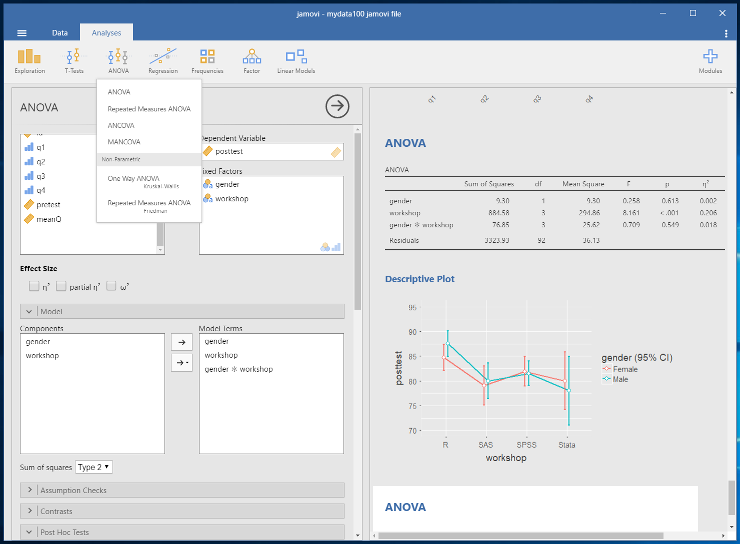
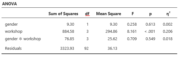
The tabular output is done in academic journal style by default, and when pasted into Microsoft Word, it’s a table object ready to edit or publish:

You have the choice of copying a single table or graph, or a particular analysis with all its tables and graphs at once. Here’s an example of its graphical output:

Interaction plot from jamovi using the “Hadley” style. Note how it offsets the confidence intervals to for each workshop automatically to make them easier to read when they overlap.

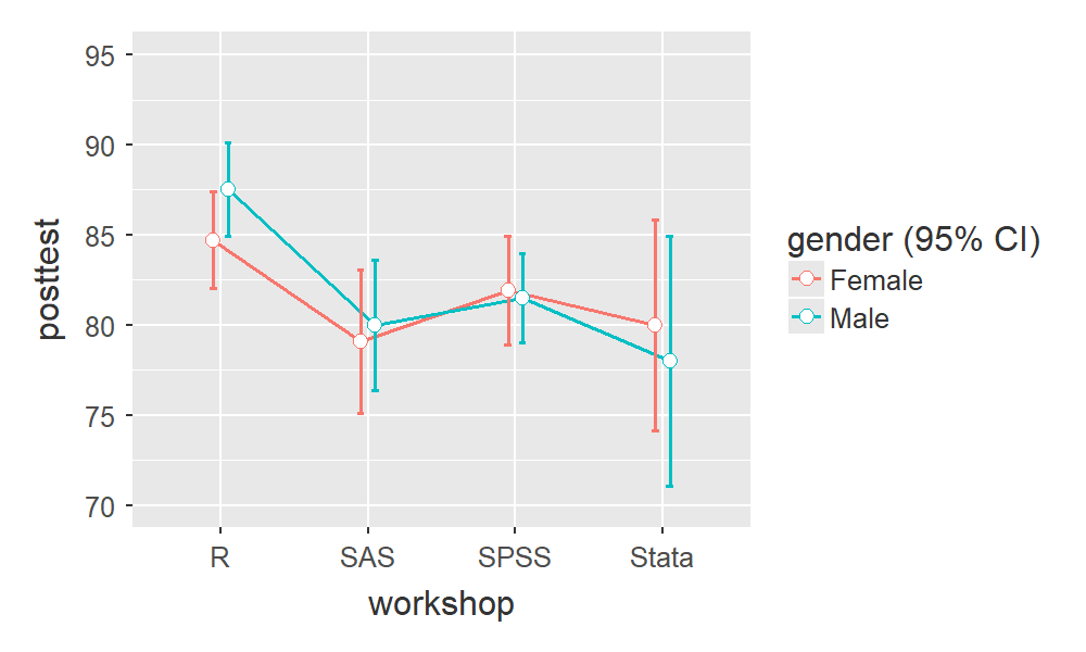
jamovi offers four styles for graphics: default a simple one with plain background, minimal which – oddly enough – adds a grid at the major tick-points; I♥SPSS, which copies the look of that software; and Hadley, which follows the style of Hadley Wickham’s popular ggplot2 package.

At the moment, nearly all graphs are produced through analyses. A set of graphics menus is in the works. I hope the developers will be able to offer full control over custom graphics similar to Ian Fellows’ powerful Plot Builder used in his Deducer GUI.

The graphical output looks fine on a computer screen, but when using copy-paste into Word, it is a fairly low-resolution bitmap. To get higher resolution images, you must right click on it and choose Save As from the menu to write the image to SVG, EPS, or PDF files. Windows users will see those options on the usual drop-down menu, but a bug in the Mac version blocks that. However, manually adding the appropriate extension will cause it to write the chosen format.

jamovi offers full reproducibility, and it is one of the few menu-based GUIs to do so. Menu-based tools such as SPSS or R Commander offer reproducibility via the programming code the GUI creates as people make menu selections. However, the settings in the dialog boxes are not currently saved from session to session. Since point-and-click users are often unable to understand that code, it’s not reproducible to them. A jamovi file contains: the data, the dialog-box settings, the syntax used, and the output. When you re-open one, it is as if you just performed all the analyses and never left. So if your data collection process came up with a few more observations, or if you found a data entry error, making the changes will automatically recalculate the analyses that would be affected (and no others).

While jamovi offers reproducibility, it does not offer reusability. Variable transformations and analysis steps are saved, and can be changed, but the data input data set cannot be changed. This is tantalizingly close to full reusability; if the developers allowed you to choose another data set (e.g. apply last week’s analysis to this week’s data) it would be a powerful and fairly unique feature. The new data would have to contain variables with the same names, of course. At the moment, only workflow-based GUIs such as KNIME offer re-usability in a graphical form.

As nice as the output is, it’s missing some very important features. In a complex analysis, it’s all too easy to lose track of what’s what. It needs a way to change the title of each set of output, and all pieces of output need to be clearly labeled (e.g. which sums of squares approach was used). The output needs the ability to collapse into an outline form to assist in finding a particular analysis, and also allow for dragging the collapsed analyses into a different order.

Another output feature that would be helpful would be to export the entire set of analyses to Microsoft Word. Currently you can find Export>Results under the main “hamburger” menu (upper left of screen). However, that saves only PDF and HTML formats. While you can force Word to open the HTML document, the less computer-savvy users that jamovi targets may not know how to do that. In addition, Word will not display the graphs when the output is exported to HTML. However, opening the HTML file in a browser shows that the images have indeed been saved.

Behind the scenes, jamovi’s menus convert its dialog box settings into a set of function calls from its own jmv package. The calculations in these functions are borrowed from the functions in other established packages. Therefore the accuracy of the calculations should already be well tested. Citations are not yet included in the package, but adding them is on the developers’ to-do list.

If functions already existed to perform these calculations, why did jamovi’s developers decide to develop their own set of functions? The answer is sure to be controversial: to develop a version of the R language that works more like the SPSS or SAS languages. Those languages provide output that is optimized for legibility rather than for further analysis. It is attractive, easy to read, and concise. For example, to compare the t-test and non-parametric analyses on two variables using base R function would look like this:

> t.test(pretest ~ gender, data = mydata100)

Welch Two Sample t-test

data: pretest by gender
t = -0.66251, df = 97.725, p-value = 0.5092
alternative hypothesis: true difference in means is not equal to 0
95 percent confidence interval:
 -2.810931 1.403879
sample estimates:
mean in group Female mean in group Male 
 74.60417 75.30769

> wilcox.test(pretest ~ gender, data = mydata100)

Wilcoxon rank sum test with continuity correction

data: pretest by gender
W = 1133, p-value = 0.4283
alternative hypothesis: true location shift is not equal to 0

> t.test(posttest ~ gender, data = mydata100)

Welch Two Sample t-test

data: posttest by gender
t = -0.57528, df = 97.312, p-value = 0.5664
alternative hypothesis: true difference in means is not equal to 0
95 percent confidence interval:
 -3.365939 1.853119
sample estimates:
mean in group Female mean in group Male 
 81.66667 82.42308

> wilcox.test(posttest ~ gender, data = mydata100)

Wilcoxon rank sum test with continuity correction

data: posttest by gender
W = 1151, p-value = 0.5049
alternative hypothesis: true location shift is not equal to 0

While the same comparison using the jamovi GUI, or its jmv package, would look like this:

Output from jamovi or its jmv package.

Behind the scenes, the jamovi GUI was executing the following function call from the jmv package. You could type this into RStudio to get the same result:

library("jmv")
ttestIS(
 data = mydata100,
 vars = c("pretest", "posttest"),
 group = "gender",
 mann = TRUE,
 meanDiff = TRUE)

In jamovi (and in SAS/SPSS), there is one command that does an entire analysis. For example, you can use a single function to get: the equation parameters, t-tests on the parameters, an anova table, predicted values, and diagnostic plots. In R, those are usually done with five functions: lm, summary, anova, predict, and plot. In jamovi’s jmv package, a single linReg function does all those steps and more.

The impact of this design is very significant. By comparison, R Commander’s menus match R’s piecemeal programming style. So for linear modeling there are over 25 relevant menu choices spread across the Graphics, Statistics, and Models menus. Which of those apply to regression? You have to recall. In jamovi, choosing Linear Regression from the Regression menu leads you to a single dialog box, where all the choices are relevant. There are still over 20 items from which to choose (jamovi doesn’t do as much as R Commander yet), but you know they’re all useful.

jamovi has a syntax mode that shows you the functions that it used to create the output (under the triple-dot menu in the upper right of the screen). These functions come with the jmv package, which is available on the CRAN repository like any other. You can use jamovi’s syntax mode to learn how to program R from memory, but of course it uses jmv’s all-in-one style of commands instead of R’s piecemeal commands. It will be very interesting to see if the jmv functions become popular with programmers, rather than just GUI users. While it’s a radical change, R has seen other radical programming shifts such as the use of the tidyverse functions.

jamovi’s developers recognize the value of R’s piecemeal approach, but they want to provide an alternative that would be easier to learn for people who don’t need the additional flexibility.

As we have seen, jamovi’s approach has simplified its menus, and R functions, but it offers a third level of simplification: by combining the functions from 20 different packages (displayed when you install jmv), you can install them all in a single step and control them through jmv function calls. This is a controversial design decision, but one that makes sense to their overall goal.

Extending jamovi’s menus is done through add-on modules that are stored in an online repository called the jamovi Library. To see what’s available, you simply click on the large “+ Modules” icon at the upper right of the jamovi window. There are only nine available as I write this (2/12/2018) but the developers have made it fairly easy to bring any R package into the jamovi Library. Creating a menu front-end for a function is easy, but creating publication quality output takes more work.

A limitation in the current release is that data transformations are done one variable at a time. As a result, setting measurement level, taking logarithms, recoding, etc. cannot yet be done on a whole set of variables. This is on the developers to-do list.

Other features I miss include group-by (split-file) analyses and output management. For a discussion of this topic, see my post, Group-By Modeling in R Made Easy.

Another feature that would be helpful is the ability to correct p-values wherever dialog boxes encourage multiple testing by allowing you to select multiple variables (e.g. t-test, contingency tables). R Commander offers this feature for correlation matrices (one I contributed to it) and it helps people understand that the problem with multiple testing is not limited to post-hoc comparisons (for which jamovi does offer to correct p-values).

Though only at version 0.8.1.2.0, I only found only two minor bugs in quite a lot of testing. After asking for post-hoc comparisons, I later found that un-checking the selection box would not make them go away. The other bug I described above when discussing the export of graphics. The developers consider jamovi to be “production ready” and a number of universities are already using it in their undergraduate statistics programs.

In summary, jamovi offers both an easy to use graphical user interface plus a set of functions that combines the capabilities of many others. If its developers, Jonathan Love, Damian Dropmann, and Ravi Selker, complete their goal of matching SPSS’ basic capabilities, I expect it to become very popular. The only skill you need to use it is the ability to use a spreadsheet like Excel. That’s a far larger population of users than those who are good programmers. I look forward to trying jamovi 1.0 this August!

Acknowledgements

Thanks to Jonathon Love, Josh Price, and Christina Peterson for suggestions that significantly improved this post.

Data Science Tool Market Share Leading Indicator: Scholarly Articles

Below is the latest update to The Popularity of Data Science Software. It contains an analysis of the tools used in the most recent complete year of scholarly articles. The section is also integrated into the main paper itself.

New software covered includes: Amazon Machine Learning, Apache Mahout, Apache MXNet, Caffe, Dataiku, DataRobot, Domino Data Labs, GraphPad Prism, IBM Watson, Pentaho, and Google’s TensorFlow.

Software dropped includes: Infocentricity (acquired by FICO), SAP KXEN (tiny usage), Tableau, and Tibco. The latter two didn’t fit in with the others due to their limited selection of advanced analytic methods.

Scholarly Articles

Scholarly articles provide a rich source of information about data science tools. Their creation requires significant amounts of effort, much more than is required to respond to a survey of tool usage. The more popular a software package is, the more likely it will appear in scholarly publications as an analysis tool, or even an object of study.

Since graduate students do the great majority of analysis in such articles, the software used can be a leading indicator of where things are headed. Google Scholar offers a way to measure such activity. However, no search of this magnitude is perfect; each will include some irrelevant articles and reject some relevant ones. Searching through concise job requirements (see previous section) is easier than searching through scholarly articles; however only software that has advanced analytical capabilities can be studied using this approach. The details of the search terms I used are complex enough to move to a companion article, How to Search For Data Science Articles.  Since Google regularly improves its search algorithm, each year I re-collect the data for the previous years.

Figure 2a shows the number of articles found for the more popular software packages (those with at least 750 articles) in the most recent complete year, 2016. To allow ample time for publication, insertion into online databases, and indexing, the was data collected on 6/8/2017.

SPSS is by far the most dominant package, as it has been for over 15 years. This may be due to its balance between power and ease-of-use. R is in second place with around half as many articles. SAS is in third place, still maintaining a substantial lead over Stata, MATLAB, and GraphPad Prism, which are nearly tied. This is the first year that I’ve tracked Prism, a package that emphasizes graphics but also includes statistical analysis capabilities. It is particularly popular in the medical research community where it is appreciated for its ease of use. However, it offers far fewer analytic methods than the other software at this level of popularity.

Note that the general-purpose languages: C, C++, C#, FORTRAN, MATLAB, Java, and Python are included only when found in combination with data science terms, so view those counts as more of an approximation than the rest.

Figure 2a. Number of scholarly articles found in the most recent complete year (2016) for the more popular data science software. To be included, software must be used in at least 750 scholarly articles.

The next group of packages goes from Apache Hadoop through Python, Statistica, Java, and Minitab, slowly declining as they go.

Both Systat and JMP are packages that have been on the market for many years, but which have never made it into the “big leagues.”

From C through KNIME, the counts appear to be near zero, but keep in mind that each are used in at least 750 journal articles. However, compared to the 86,500 that used SPSS, they’re a drop in the bucket.

Toward the bottom of Fig. 2a are two similar packages, the open source Caffe and Google’s Tensorflow. These two focus on “deep learning” algorithms, an area that is fairly new (at least the term is) and growing rapidly.

The last two packages in Fig 2a are RapidMiner and KNIME. It has been quite interesting to watch the competition between them unfold for the past several years. They are both workflow-driven tools with very similar capabilities. The IT advisory firms Gartner and Forester rate them as tools able to hold their own against the commercial titans, SPSS and SAS. Given that SPSS has roughly 75 times the usage in academia, that seems like quite a stretch. However, as we will soon see, usage of these newcomers are growing, while use of the older packages is shrinking quite rapidly. This plot shows RapidMiner with nearly twice the usage of KNIME, despite the fact that KNIME has a much more open source model.

Figure 2b shows the results for software used in fewer than 750 articles in 2016. This change in scale allows room for the “bars” to spread out, letting us make comparisons more effectively. This plot contains some fairly new software whose use is low but growing rapidly, such as Alteryx, Azure Machine Learning, H2O, Apache MXNet, Amazon Machine Learning, Scala, and Julia. It also contains some software that is either has either declined from one-time greatness, such as BMDP, or which is stagnating at the bottom, such as Lavastorm, Megaputer, NCSS, SAS Enterprise Miner, and SPSS Modeler.

Figure 2b. The number of scholarly articles for the less popular data science (those used by fewer than 750 scholarly articles in 2016.

While Figures 2a and 2b are useful for studying market share as it stands now, they don’t show how things are changing. It would be ideal to have long-term growth trend graphs for each of the analytics packages, but collecting that much data annually is too time consuming. What I’ve done instead is collect data only for the past two complete years, 2015 and 2016. This provides the data needed to study year-over-year changes.

Figure 2c shows the percent change across those years, with the “hot” packages whose use is growing shown in red (right side); those whose use is declining or “cooling” are shown in blue (left side). Since the number of articles tends to be in the thousands or tens of thousands, I have removed any software that had fewer than 500 articles in 2015. A package that grows from 1 article to 5 may demonstrate 500% growth, but is still of little interest.


Figure 2c. Change in the number of scholarly articles using each software in the most recent two complete years (2015 to 2016). Packages shown in red are “hot” and growing, while those shown in blue are “cooling down” or declining.

Caffe is the data science tool with the fastest growth, at just over 150%. This reflects the rapid growth in the use of deep learning models in the past few years. The similar products Apache MXNet and H2O also grew rapidly, but they were starting from a mere 12 and 31 articles respectively, and so are not shown.

IBM Watson grew 91%, which came as a surprise to me as I’m not quite sure what it does or how it does it, despite having read several of IBM’s descriptions about it. It’s awesome at Jeopardy though!

While R’s growth was a “mere” 14.7%, it was already so widely used that the percent translates into a very substantial count of 5,300 additional articles.

In the RapidMiner vs. KNIME contest, we saw previously that RapidMiner was ahead. From this plot we also see that it’s continuing to pull away from KNIME with quicker growth.

From Minitab on down, the software is losing market share, at least in academia. The variants of C and Java are probably losing out a bit to competition from several different types of software at once.

In just the past few years, Statistica was sold by Statsoft to Dell, then Quest Software, then Francisco Partners, then Tibco! Did its declining usage drive those sales? Did the game of musical chairs scare off potential users? If you’ve got an opinion, please comment below or send me an email.

The biggest losers are SPSS and SAS, both of which declined in use by 25% or more. Recall that Fig. 2a shows that despite recent years of decline, SPSS is still extremely dominant for scholarly use.

I’m particularly interested in the long-term trends of the classic statistics packages. So in Figure 2d I have plotted the same scholarly-use data for 1995 through 2016.

Figure 2d. The number of scholarly articles found in each year by Google Scholar. Only the top six “classic” statistics packages are shown.

As in Figure 2a, SPSS has a clear lead overall, but now you can see that its dominance peaked in 2009 and its use is in sharp decline. SAS never came close to SPSS’ level of dominance, and its use peaked around 2010. GraphPAD Prism followed a similar pattern, though it peaked a bit later, around 2013.

Note that the decline in the number of articles that used SPSS, SAS, or Prism is not balanced by the increase in the other software shown in this particular graph. Even adding up all the other software shown in Figures 2a and 2b doesn’t account for the overall decline. However, I’m looking at only 46 out of over 100 data science tools. SQL and Microsoft Excel could be taking up some of the slack, but it is extremely difficult to focus Google Scholar’s search on articles that used either of those two specifically for data analysis.

Since SAS and SPSS dominate the vertical space in Figure 2d by such a wide margin, I removed those two curves, leaving only two points of SAS usage in 2015 and 2016. The result is shown in Figure 2e.


Figure 2e. The number of scholarly articles found in each year by Google Scholar for classic statistics packages after the curves for SPSS and SAS have been removed.

Freeing up so much space in the plot allows us to see that the growth in the use of R is quite rapid and is pulling away from the pack. If the current trends continue, R will overtake SPSS to become the #1 software for scholarly data science use by the end of 2018. Note however, that due to changes in Google’s search algorithm, the trend lines have shifted before as discussed here. Luckily, the overall trends on this plot have stayed fairly constant for many years.

The rapid growth in Stata use seems to be finally slowing down.  Minitab’s growth has also seemed to stall in 2016, as has Systat’s. JMP appears to have had a bit of a dip in 2015, from which it is recovering.

The discussion above has covered but one of many views of software popularity or market share. You can read my analysis of several other perspectives here.

Dueling Data Science Surveys: KDnuggets & Rexer Go Live

What tools do we use most for data science, machine learning, or analytics? Python, R, SAS, KNIME, RapidMiner,…? How do we use them? We are about to find out as the two most popular surveys on data science tools have both just gone live. Please chip in and help us all get a better understanding of the tools of our trade.

For 18 consecutive years, Gregory Piatetsky has been asking people what software they have actually used in the past twelve months on the KDnuggets Poll.  Since this poll contains just one question, it’s very quick to take and you’ll get the latest results immediately. You can take the KDnuggets poll here.

Every other year since 2007 Rexer Analytics has surveyed data science professionals, students, and academics regarding the software they use.  It is a more detailed survey which also asks about goals, algorithms, challenges, and a variety of other factors.  You can take the Rexer Analytics survey here (use Access Code M7UY4).  Summary reports from the seven previous Rexer surveys are FREE and can be downloaded from their Data Science Survey page.

As always, as soon as the results from either survey are available, I’ll post them on this blog, then update the main results in The Popularity of Data Science Software, and finally send out an announcement on Twitter (follow me as @BobMuenchen).


Keeping Up with Your Data Science Options

The field of data science is changing so rapidly that it’s quite hard to keep up with it all. When I first started tracking The Popularity of Data Science Software in 2010, I followed only ten packages, all of them classic statistics software. The term data science hadn’t caught on yet, data mining was still a new thing. One of my recent blog posts covered 53 packages, and choosing them from a list of around 100 was a tough decision!

To keep up with the rapidly changing field, you can read the information on a package’s web site, see what people are saying on blog aggregators such as R-Bloggers.com or StatsBlogs.com, and if it sounds good, download a copy and try it out. What’s much harder to do is figure out how they all relate to one another. A helpful source of information on that front is the book Disruptive Analtyics, by Thomas Dinsmore.

I was lucky enough to be the technical reviewer for the book, during which time I ended up reading it twice. I still refer to it regularly as it covers quite a lot of material. In a mere 262 pages, Dinsmore manages to describe each of the following packages, how they relate to one another, and how they fit into the big picture of data science:

  • Alluxio
  • Alpine Data
  • Alteryx
  • APAMA
  • Apex
  • Arrow
  • Caffe
  • Cloudera
  • Deeplearning4J
  • Drill
  • Flink
  • Giraph
  • Hadoop
  • HAWQ
  • Hive
  • IBM SPSS Modeler
  • Ignite
  • Impala
  • Kafka
  • KNIME Analytics Platform
  • Kylin
  • MADLib
  • Mahout
  • MapR
  • Microsoft R Aerver
  • Phoenix
  • Pig
  • Python
  • R
  • RapidMiner
  • Samza
  • SAS
  • SINGA
  • Skytree Server
  • Spark
  • Storm
  • Tajo
  • Tensorflow
  • Tez
  • Theano
  • Trafodion

As you can tell from the title, a major theme of the book is how open source software is disrupting the data science marketplace. Dinsmore’s blog, ML/DL: Machine Learning, Deep Learning, extends the book’s coverage as data science software changes from week to week.

I highly recommend both the book and the blog. Have fun keeping up with the field!

Jobs for “Data Science” Up 7-fold, for “Statistician” Down by Half

The Bureau of Labor Statistics projects that jobs for statisticians will grow by 34% between 2014 and 2024. However, according to the nation’s largest job web site, the number of companies looking for “statisticians” is actually in sharp decline. Those jobs are likely being replaced by postings for “data scientists.”

I regularly monitor the Popularity of Data Science Software, and as an offshoot of that project, I collected data that helps us understand how the term “data science” is defined. I began by finding jobs that required expertise in software used for data science such as R or SPSS. I then examined the tasks that the jobs entailed, such as “analyze data,” and looked up jobs based only on one task at a time. I switched back and forth between searching for software and for the terms used to describe the jobs, until I had a comprehensive list of both.  In the end, I had searched for over 50 software packages and over 40 descriptive terms or tasks. I had also skimmed thousands of job advertisements. (Additional details are here).


Search Terms 2/26/2017 2/17/2014 Ratio
Big Data 20,646            10,378 1.99
Data analytics 15,774              6,209 2.54
Machine learning 12,499              3,658 3.42
Statistical analysis 11,397              9,719 1.17
Data mining   9,757              7,776 1.25
Data Science 6,873                  973 7.06
Quantitative analysis 4,095              3,365 1.22
Business analytics  4,043              2,867 1.41
Advanced Analytics 3,479              1,497 2.32
Data Scientist 3,272                 974 3.36
Statistical software 2,835              2,102 1.35
Predictive analytics                 2,411              1,497 1.61
Artificial intelligence  2,404                 794 3.03
Predictive modeling 2,264              1,804 1.25
Statistical modeling 2,040              1,462 1.40
Quantitative research                 1,837              1,380 1.33
Research analyst                 1,756              1,722 1.02
Statistical tools                 1,414              1,121 1.26
Statistician 904              1,711 0.53
Statistical packages                    784                 559 1.40
Survey research 440                 559 0.79
Quantitative modeling                    352                  322 1.09
Statistical research 208                  174 1.20
Statistical computing                    153                  108 1.42
Research computing                    133                    97 1.37
Statistical analyst                    125                  141 0.89
Data miner 34                    19 1.79

Many terms were used outside the realm of data science. Other terms were used both in data science jobs and in jobs that require little analytic skill. Terms that could not be used to specifically find data science jobs were: analytics, data visualization, graphics, data graphics, statistics, statistical, survey, research associate, and business intelligence. One term, econometric(s), required deep analytical skills, but was too focused on one field.

The search terms that were well-focused on data science, but not overly focused in a single field are listed in the following table. The table is sorted by the number of jobs found on Indeed.com on February 26, 2017. While each column displays counts taken on a single day, the large size of Indeed.com’s database of jobs keeps its counts stable. The correlation between the logs of the two counts is quite strong, r=.95, p= 4.7e-14.

During this three-year period, the overall unemployment rate dropped from 6.7% to 4.7%, indicating a period of job growth for most fields. Three terms grew very rapidly indeed with “data science” growing 7-fold, and both “data scientist” and “artificial intelligence” tripling in size. The biggest surprise was that the use of the term “statistician” took a huge hit, dropping to only 53% of its former value.

That table covers a wide range of terms, but only on two dates. What does the long-term trend look like? Indeed.com has a trend-tracking page that lets us answer that question. The figure below shows solid the growth in the percentage of advertisements that used the term “data scientist” (blue, top right), while those using the term “statistician” (yellow, lower right) are steadily declining.

The plot on the company’s site is interactive (the one shown here is not) allowing me to see that the most recent data points were recorded on December 27, 2016. On that date, the percentage of jobs for data scientist were 474% of those for statistician.

As an accredited professional statistician, am I worried about this trend? Not at all. Statistical analysis software has broadened its scope to include many new capabilities including: machine learning, artificial intelligence, Structured Query Language, advanced visualization techniques, interfaces to Python, R, and Apache Spark. The software has changed because the job known as “statistician” has changed. Statisticians aren’t going away, their jobs are evolving into what we now know as data science. And that field is growing quite nicely!

Data Science Job Report 2017: R Passes SAS, But Python Leaves Them Both Behind

I’ve just updated another section of The Popularity of Data Science Software. It is reproduced below to save you the trouble of reading the entire article. If your organization is looking for training in the R language, you might consider my books, R for SAS and SPSS Users or R for Stata Users, or my on-site workshops.

Job Advertisements

One of the best ways to measure the popularity or market share of software for data science is to count the number of job advertisements for each. Job advertisements are rich in information and are backed by money so they are perhaps the best measure of how popular each software is now. Plots of job trends give us a good idea of what is likely to become more popular in the future.

Indeed.com is the biggest job site in the U.S., making its collection the best around. As their  co-founder and former CEO Paul Forster stated, Indeed.com includes “all the jobs from over 1,000 unique sources, comprising the major job boards – Monster, Careerbuilder, Hotjobs, Craigslist – as well as hundreds of newspapers, associations, and company websites.” Indeed.com also has superb search capabilities and it includes a tool for tracking long-term trends.

Searching for jobs using Indeed.com is easy, but searching for software in a way that ensures fair comparisons across packages is tricky. Some software is used only for data science (e.g. SPSS, Apache Spark) while others are used in data science jobs and more broadly in report-writing jobs (e.g. SAS, Tableau). General-purpose languages (e.g. C, Java) are heavily used in data science jobs, but the vast majority of jobs that use them have nothing to do with data science. To level the playing field I developed a protocol to focus the search for each software within only jobs for data scientists. The details of this protocol are described in a separate article, How to Search for Data Science Jobs. All of the graphs in this section use those procedures to make the required queries.

I collected the job counts discussed in this section on February 24, 2017. One might think that a sample of on a single day might not be very stable, but the large number of job sources makes the counts in Indeed.com’s collection of jobs quite consistent. The last time I collected this data was February 20, 2014, and those that were collected using the same protocol (the general purpose languages) yielded quite similar results. They grew between 7% and 11%, and correlated r=.94, p=.002.

Figure 1a shows that SQL is in the lead with nearly 18,000 jobs, followed by Python and Java in the 13,000’s. Hadoop comes next with just over 10,000 jobs, then R, the C variants, and SAS. (The C, C++, and C# are combined in a single search since job advertisements usually seek any of them). This is the first time this report has shown more jobs for R than SAS, but keep in mind these are jobs specific to data science. If you open up the search to include jobs for report writing, you’ll find twice as many SAS jobs.

Next comes Apache Spark, which was too new to be included in the 2014 report. It has come a long way in an incredibly short time. For a detailed analysis of Spark’s status, see Spark is the Future of Analytics, by Thomas Dinsmore.

Tableau follows, with around 5,000 jobs. The 2014 report excluded Tableau due to its jobs being dominated by report writing. Including report writing will quadruple the number of jobs for Tableau expertise to just over 2o,ooo.

Figure 1a. The number of data science jobs for the more popular software (those with 250 jobs or more, 2/2017).

Apache Hive is next, with around 3,900 jobs, then a very diverse set of software comes next, with Scala, SAP, MATLAB, and SPSS, each having just over 2,500 data science jobs. After those, we see a slow decline from Teradata on down.

Much of the software had fewer than 250 job listings. When displayed on the same graph as the industry leaders, their job counts appear to be zero; therefore I have plotted them separately in Figure 1b. Alteryx comes out the leader of this group with 240 jobs. Microsoft was a difficult search since it appears in data science ads that mention other Microsoft products such as Windows or SQL Server. To eliminate such over-counting, I treated Microsoft different from the rest by including product names such as Azure Machine Learning and Microsoft Cognitive Toolkit. So there’s a good chance I went from over-emphasizing Microsoft to under-emphasizing it with only 157 jobs.

Figure 1b. The number of analytics jobs for the less popular software (under 250 jobs, 2/2017).

Next comes the fascinating new high-performance language Julia. I added FORTRAN just for fun and was surprised to see it still hanging in there after all these years. Apache Flink is also in this grouping, which all have around 125 jobs.

H2O follows, with just over 100 jobs.

I find it fascinating that SAS Enterprise Miner, RapidMiner, and KNIME appear with a similar number of jobs (around 90). Those three share a similar workflow user interface that make them particularly easy to use. The companies advertise the software as not needing much training, so it may be possible that companies feel little need to hire expertise if their existing staff picks it up more easily. SPSS Modeler also uses that type of interface, but its job count is about half that of the others, at 50 jobs.

Bringing up the rear is Statistica, which was sold to Dell, then sold to Quest. Its 36 jobs trails far behind its similar competitor, SPSS, which has a staggering 74-fold job advantage.

The open source MXNet deep learning framework, shows up next with 34 jobs. Tensorflow is a similar project with a 12-fold job advantage, but these two are both young enough that I expect both will be growing rapidly in the future.

In the final batch that has few, if any, jobs, we see a few newcomers such as DataRobot and Domino Data Labs. Others have been around for years, leaving us to wonder how they manage to stay afloat given all the competition.

It’s important to note that the values shown in Figures 1a and 1b are single points in time. The number of jobs for the more popular software do not change much from day to day. Therefore the relative rankings of the software shown in Figure 1a is unlikely to change much over the coming year. The less popular packages shown in Figure 1b have such low job counts that their ranking is more likely to shift from month to month, though their position relative to the major packages should remain more stable.

Each software has an overall trend that shows how the demand for jobs changes across the years. You can plot these trends using Indeed.com’s Job Trends tool. However, as before, focusing just on analytics jobs requires carefully constructed queries, and when comparing two trends at a time, they both have to fit in the same query limit. Those details are described here.

I’m particularly interested in trends involving R so let’s see how it compares to SAS. In Figure 1c we see that the number of data science jobs for SAS has remained relatively flat from 2012 until February 28, 2017 when I made this plot. During that same period, jobs for R grew steadily and finally surpassed jobs for SAS in early 2016. As noted in a blog post (and elsewhere in this report), use of R in scholarly publications surpassed those for SAS in 2015.

Figure 1c. Data science job trends for R (blue) and SAS (orange).

A long-standing debate has been taking place on the Internet regarding the relative place of Python and R. Ironically, this debate about data science software has involved very little actual data. However, it is possible now to at least study the job trends. Figure 1a showed us that Python is well out in front of R, at least on that single day the searches were run. What has the data looked like over time? The answer is shown in Figure 1d.

Figure 1d. Jobs trends for R (blue & lower) and Python (orange & upper).

As we see, Python surpassed R in terms of data science jobs back in 2013. These are, of course, very different languages and a quick scan of job descriptions will show that the R jobs are much more focused on the use of existing methods of analysis, while the Python jobs have more of a custom-programming angle to them.


Knoxville, TN: R for Text Analysis Workshop

The Knoxville R Users Group is presenting a workshop on text analysis using R by Bob Muenchen. The workshop is free and open to the public. You can join the group at https://www.meetup.com/Knoxville-R-Users-Group. A description of the workshop follows.

Seeking Cloud

R for Text Analysis

When analyzing text using R, it’s hard to know where to begin. There are 37 packages available and there is quite a lot of overlap in what they can do. This workshop will demonstrate how to do three popular approaches: dictionary-based content analysis, latent semantic analysis, and latent Dirichlet allocation. We will spend much of the time on the data preparation steps that are important to all text analysis methods including data acquisition, word stemming/lemmatization, removal of punctuation and other special characters, phrase discovery, tokenization, and so on. While the examples will focus on the automated extraction of topics in the text files, we will also briefly cover the analysis of sentiment (e.g. how positive is customer feedback?) and style (who wrote this? are they telling the truth?)

The results of each text analysis approach will be the topics found, and a numerical measure of each topic in each document. We will then merge that with numeric data and do analyses combining both types of data.

The R packages used include quanteda, lsa, topicmodels, tidytext and wordcloud; with brief coverage of tm and SnowballC. While the workshop will not be hands-on due to time constraints, the programs and data files will be available afterwards.

Where: University of Tennessee Humanities and Social Sciences Building, room 201. If the group gets too large, the location may move and a notice will be sent to everyone who RSVPs on Meetup.com or who registers at the UT workshop site below. You can also verify the location the day before via email with Bob at muenchen@utk.edu.

When: 9:05-12:05 Friday 1/27/17

Prerequisite: R language basics

Members of UT Community register at: http://workshop.utk.edu under Researcher Focused

Members of other groups please RSVP on your respective sites so I can bring enough handouts.

R Passes SAS in Scholarly Use (finally)

Way back in 2012 I published a forecast that showed that the use of R for scholarly publications would likely pass the use of SAS in 2015. But I didn’t believe the forecast since I expected the sharp decline in SAS and SPSS use to level off. In 2013, the trend accelerated and I expected R to pass SAS in the middle of 2014. As luck would have it, Google changed their algorithm, somehow finding vast additional quantities of SAS and SPSS articles. I just collected data on the most recent complete year of scholarly publications, and it turns out that 2015 was indeed the year that R passed SAS to garner the #2 position. Once again, models do better than “expert” opinion!  I’ve updated The Popularity of Data Analysis Software to reflect this new data and include it here to save you the trouble of reading the whole 45 pages of it.

If you’re interested in learning R, you might consider reading my books R for SAS and SPSS Users, or R for Stata Users. I also teach workshops on R, but I’m currently booked through mid October, so please plan ahead.

Figure 2a. Number of scholarly articles found in the most recent complete year (2015) for each software package.

Scholarly Articles

Scholarly articles are also rich in information and backed by significant amounts of effort. The more popular a software package is, the more likely it will appear in scholarly publications as an analysis tool or even an object of study. The software that is used in scholarly articles is what the next generation of analysts will graduate knowing, so it’s a leading indicator of where things are headed. Google Scholar offers a way to measure such activity. However, no search of this magnitude is perfect; each will include some irrelevant articles and reject some relevant ones. The details of the search terms I used are complex enough to move to a companion article, How to Search For Data Science Articles. Since Google regularly improves its search algorithm, each year I re-collect the data for all years.

Figure 2a shows the number of articles found for each software package for the most recent complete year, 2015. SPSS is by far the most dominant package, as it has been for over 15 years. This may be due to its balance between power and ease-of-use. For the first time ever, R is in second place with around half as many articles. Although now in third place, SAS is nearly tied with R. Stata and MATLAB are essentially tied for fourth and fifth place. Starting with Java, usage slowly tapers off. Note that the general-purpose software C, C++, C#, MATLAB, Java, and Python are included only when found in combination with data science terms, so view those as much rougher counts than the rest. Since Scala and Julia have a heavy data science angle to them, I cut them some slack by not adding any data science terms to the search, not that it helped them much!

From Spark on down, the counts appear to be zero. That’s not the case, the counts are just very low compared to the more popular packages, used in tens of thousands articles. Figure 2b shows the software only for those packages that have fewer than 1,200 articles (i.e. the bottom part of Fig. 2a), so we can see how they compare. Spark and RapidMiner top out the list of these packages, followed by KNIME and BMDP. There’s a slow decline in the group that goes from Enterprise Miner to Salford Systems. Then comes a group of mostly relative new arrivals beginning with Microsoft’s Azure Machine Learning. A package that’s not a new arrival is from Megaputer, whose Polyanalyst software has been around for many years now, with little progress to show for it. Dead last is Lavastorm, which to my knowledge is the only commercial package that includes Tibco’s internally written version of R, TERR.

Fig_2b_ScholarlyImpact2015
Figure 2b. The number of scholarly articles for software that was used by fewer than 1,200 scholarly articles (i.e. the bottom part of Fig. 2a, rescaled.)

Figures 2a and 2b are useful for studying market share as it is now, but they don’t show how things are changing. It would be ideal to have long-term growth trend graphs for each of the analytics packages, but collecting such data is too time consuming since it must be re-collected every year (since Google’s search algorithms change). What I’ve done instead is collect data only for the past two complete years, 2014 and 2015. Figure 2c shows the percent change across those years, with the “hot” packages whose use is growing shown in red. Those whose use is declining or “cooling” are shown in blue. Since the number of articles tends to be in the thousands or tens of thousands, I have removed any software that had fewer than 500 articles in 2014.

Figure 2c. Change in the number of scholarly articles using each software in the most recent two complete years (2013 to 2014). Packages shown in red are "hot" and growing, while those shown in blue are "cooling down" or declining.
Figure 2c. Change in the number of scholarly articles using each software in the most recent two complete years (2014 to 2015). Packages shown in red are “hot” and growing, while those shown in blue are “cooling down” or declining.

Python is the fastest growing. Note that the Python figures are strictly for data science use as defined here. The open-source KNIME and RapidMiner are the second and third fastest growing, respectively. Both use the easy yet powerful workflow approach to data science. Figure 2b showed that RapidMiner has almost twice the marketshare of KNIME, but here we see use of KNIME is growing faster. That may be due to KNIME’s greater customer satisfaction, as shown in the Rexer Analytics Data Science Survey. The companies are two of only four chosen by IT advisory firm Gartner, Inc. as having both a complete vision of the future and the ability to execute that vision (Fig. 3a).

R is in fourth place in growth, and given its second place in overall marketshare, it is in an enviable position.

At the other end of the scale are SPSS and SAS, both of which declined in use by 25% or more. Recall that Fig. 2a shows that despite recent years of decline, SPSS is still extremely dominant for scholarly use. Hadoop use declined slightly, perhaps as people turned to alternatives Spark and H2O.

I’m particularly interested in the long-term trends of the classic statistics packages. So in Figure 2d I’ve plotted the same scholarly-use data for 1995 through 2015, the last complete year of data when this graph was made. As in Figure 2a, SPSS has a clear lead, but now you can see that its dominance peaked in 2008 and its use is in sharp decline. SAS never came close to SPSS’ level of dominance, and it also peaked around 2008. Note that the decline in the number of articles that used SPSS or SAS is not balanced by the increase in the other software shown in this particular graph. However, if you add up all the other software shown in Figure 2a, you come close. There still seems to be a slight decline in people reporting the particular software tool they used.

Fig_2d_ScholarlyImpact
Figure 2d. The number of scholarly articles found in each year by Google Scholar. Only the top six “classic” statistics packages are shown.

Since SAS and SPSS dominate the vertical space in Figure 2d by such a wide margin, I removed those two curves, leaving only a single point of SAS usage in 2015. The the result is shown in Figure 2e. Freeing up so much space in the plot now allows us to see that the growth in the use of R is quite rapid and is pulling away from the pack (recall that the curve for SAS has a steep downward slope). If the current trends continue, R will cross SPSS to become the #1 software for scholarly data science use by the end of 2017. Stata use is also growing more quickly than the rest. Note that trends have shifted before as discussed here. The use of Statistica, Minitab, Systat and JMP are next in popularity, respectively, with their growth roughly parallel to one another.

Figure 2e. The number of scholarly articles found in each year by Google Scholar for classic statistics packages after market leaders SPSS and SAS have been removed.
Figure 2e. The number of scholarly articles found in each year by Google Scholar for classic statistics packages after the curves for SPSS and SAS have been removed.

Using a logarithmic y-axis scales down the more popular packages, allowing us to see the full picture in a single image (Figure 2f.)  This view makes it more clear that R use has passed that of SAS, and that Stata use is closing in on it. However, even when one studies the y-axis values carefully, it can be hard to grasp how much the logarithmic transformation has changed the values. For example, in 2015 value for SPSS is well over twice the value for R. The original scale shown in Figure 2d makes that quite clear.

Fig_2f_ScholarlyImpactLogs
Figure 2f. A logarithmic view of the number of scholarly articles found in each year by Google Scholar. This combines the previous two figures into one by compressing the y-axis with a base 10 logarithm.


Rexer Data Science Survey: Satisfaction Results

by Bob Muenchen

I previously reported on the initial results of Rexer Analytics’ 2015 survey of data science tools here. More results are now available, and the comprehensive report should be released soon.  One of the more interesting questions on the survey was, “Please rate your overall satisfaction with [your previously chosen software].” Most of the measures I report in my regularly-updated article, The Popularity of Data Analysis Software are raw measures of usage, so it’s nice to have data that goes beyond usage and into satisfaction. The results are show in the figure below for the more popular software (other software had very small sample sizes and so are not shown).

Rexer-2015-Satisfaction
Results from the question, “Please rate your overall satisfaction with [your previously chosen software].” Only software with substantial number of responses shown.
People reported being somewhat satisfied with their chosen tool, which doesn’t come a much of a surprise. If they weren’t at least somewhat satisfied, they would be likely to move on to another tool. What really differentiated the tools was the percent of people who reported being extremely satisfied. The free and open source KNIME program came out #1 with 69% of its users being extremely satisfied. (KNIME is also the 2nd fastest growing data science package among scholarly researchers).  IBM SPSS Modeler came in second with 60%, followed closely by R with 57%.

Both of the top two packages use the workflow user interface which has many advantages that I’ve written about here and here. However, RapidMiner and SAS Enterprise Miner also use the workflow interface, and their percent of extremely satisfied customers were less than half at 32% and 29%, respectively. We might wonder if people are more satisfied with KNIME because they’re using the free desktop version, but RapidMiner also has a free version, so cost isn’t a factor on that comparison.

Although both R and SAS have menu-based interfaces, they are predominantly programming languages. R has almost triple the number of extremely satisfied users, which may be the result of its being generally viewed as the more powerful language, albeit somewhat harder to learn. The fact that R is free while SAS is not may also be a factor in that difference.

Advanced Analytics Software’s Most Important Feature? Gartner Says it’s VCF

The IT research firm, Gartner, Inc. has released its February 2016 report, Magic Quadrant for Advanced Analytics Platforms. The report’s main graph shows the completeness of each company’s vision plotted against its ability to achieve that vision (Figure 1.) I include this plot each year in my continuously updated article, The Popularity of Data Analysis Software, along with a brief summary of its major points. The full report is always interesting reading and, if you act fast, you can download it free from RapidMiner’s web site.

Figure 1. Gartner Magic Quadrant for 2016. What’s missing?

If you compare Figure 1 to last year’s plot (Figure 2), you’ll see a few noteworthy changes, but you’re unlikely to catch the radical shift that has occurred between the two. Both KNIME and RapidMiner have increased their scores slightly in both dimensions. KNIME is now rated as having the greatest vision within the Leaders quadrant. Given how much smaller KNIME Inc. is than IBM and SAS Institute, that’s quite an accomplishment. Dell has joined them in the Leaders quadrant through its acquisition of Statistica. Microsoft increased its completeness of vison, in part by buying Revolution Analytics. Accenture joined the category through its acquisition of i4C Analytics. LavaStorm and Megaputer entered the plot in 2016, though Gartner doesn’t specify why. These are all interesting changes, but they don’t represent the biggest change of all.

The watershed change between these two plots is hinted at by two companies that are missing in the more recent one: Salford Systems and Tibco. The important thing is why they’re missing. Gartner excluded them this year, “…due to not satisfying the [new] visual composition framework [VCF] inclusion criteria.” VCF is the term they’re using to describe the workflow (also called streams or flowcharts) style of Graphical User Interface (GUI). To be included in the 2016 plot, companies must have offered software that uses the workflow GUI. What Garter is saying is, in essence, advanced analytics software that does not use the workflow interface is not worth following!

Gartner2015

Figure 2. Gartner Magic Quadrant for 2015.

Though the VCF terminology is new, I’ve long advocated its advantages (see What’s Missing From R). As I described there:

“While menu-driven interfaces such as R Commander, Deducer or SPSS are somewhat easier to learn, the flowchart interface has two important advantages. First, you can often get a grasp of the big picture as you see steps such as separate files merging into one, or several analyses coming out of a particular data set. Second, and more important, you have a precise record of every step in your analysis. This allows you to repeat an analysis simply by changing the data inputs. Instead, menu-driven interfaces require that you switch to the programs that they create in the background if you need to automatically re-run many previous steps. That’s fine if you’re a programmer, but if you were a good programmer, you probably would not have been using that type of interface in the first place!”

As a programming-oriented consultant who works with many GUI-oriented clients, I also appreciate the blend of capabilities that workflow GUIs provide. My clients can set up the level of analysis they’re comfortable with, and if I need to add some custom programming, I can do so in R or Python, blending my code right into their workflow. We can collaborate, each using his or her preferred approach. If my code is widely applicable, I can put it into distribution as a node icon that anyone can drag into their workflow diagram.

The Gartner report offers a more detailed list of workflow features. They state that such interfaces should support:

  • Interactive design of workflows from data sources to visualization, modeling and deployment using dragging and dropping of building blocks on a visual pallet
  • Ability to parameterize the building blocks
  • Ability to save workflows into files and libraries for later reuse
  • Creation of new building blocks by composing sets of building blocks
  • Creation of new building blocks by allowing a scripting language (R, JavaScript, Python and others) to describe the functionality of the input/output behavior

I would add the ability to color-code and label sections of the workflow diagram. That, combined with the creation of metanodes or supernodes (creating one new building block from a set of others) help keep a complex workflow readable.

Implications

If Gartner’s shift in perspective resulted in them dropping only two companies from their reports, does this shift really amount to much of a change? Hasn’t it already been well noted and dealt with? No, the plot is done at the company level. If it were done at the product level, many popular packages such as SAS (with its default Display Manager System interface) and SPSS Statistics would be excluded.

The fields of statistics, machine learning, and artificial intelligence have been combined psychologically by their inclusion into broader concepts such as advanced analytics or data science. But the separation of those fields is still quite apparent in the software tools themselves. Tools that have their historical roots in machine learning and artificial intelligence are far more likely to have implemented workflow GUIs.  However, while they have a more useful GUI, they tend to still lack a full array of common statistical methods. For example, KNIME and RapidMiner can only handle very simple analysis of variance problems. When such companies turn their attention to this deficit, the more statistically oriented companies will face much stiffer completion. Recent versions of KNIME have already made progress on this front.

SPSS Modeler can access the full array of SPSS Statistics routines through its dialog boxes, but the two products lack full integration. Most users of SPSS Statistics are unaware that IBM offers control of their software through a better interface. IBM could integrate the Modeler interface into SPSS Statistics so that all its users would see that interface when they start the software. Making their standard menu choices could begin building a workflow diagram. SPSS Modeler could still be sold as a separate package, one that added features to SPSS Statistics’ workflow interface.

A company that is on the cutting edge of GUI design is SAS Institute. Their SAS Studio is, to the best of my knowledge, unique in its ability to offer four major ways of working. Its program editor lets you type code from memory using features far advanced from their aging Display Manager System. It also offers a “snippets” feature that lets you call up code templates for common tasks and edit them before execution. That still requires some programming knowledge, but users can depend less on their memory. The software also has a menu & dialog approach like SPSS Statistics, and it even has a workflow interface. Kudos to SAS Institute for providing so much flexibility! When students download the SAS University Edition directly from SAS Institute, this is the only interface they see.

SAS Studio currently supports a small, but very useful, percent of SAS’ overall capability. That needs to be expanded to provide as close to 100% coverage as possible. If the company can eventually phase out their many other GUIs (Enterprise Guide, Enterprise Miner, SAS/Assist, Display Manager System, SAS/IML Studio, etc.), merging that capability into SAS Studio, they might finally earn a reputation for ease of use that they have lacked.

In conclusion, the workflow GUI has already become a major type of interface for advanced analytics. My hat is off to the Gartner Group for taking a stand on encouraging its use. In the coming years, we can expect to see the machine learning/AI software adding statistical features, and the statistically oriented companies continuing to add more to their workflow capabilities until the two groups meet in the middle. The companies that get there first will have a significant strategic advantage.

Acknowledgements

Thanks to Jon Peck for suggestions that improved this post.